Web design is always evolving. A website that looked amazing a few years ago may come across as dated to someone visiting it today. If you don’t keep up with the latest trends, however, it can be hard to know when it’s time to update your site’s design.
Fortunately, that issue can be resolved with a little research. Then, once you have an idea of what you want, it’s easy to update your web designs using WordPress. In most cases, just choosing the right theme can go a long way towards helping you implement your changes.
In this article, we’re going to talk about why you should consider redesigning your WordPress website. Then we’ll discuss five of the latest trends in web design, explain what their upsides are, and provide you with a few tips on how to implement them. Let’s take a look!
Why You Might Need to Redesign Your WordPress Website
There are a lot of reasons it makes sense to freshen up your website from time to time. In some cases, your site might even warrant a full makeover. Some of the most common reasons include:
- You’re looking to drive more conversions. If you’re anything like us, you don’t trust websites that look outdated. Trust plays an important role when it comes to spending money online, so it’s essential that your site appears modern and professional.
- You want to improve user experience. Redesigning a website isn’t just about looks. A more streamlined design can help improve the overall user experience, and make your visitors want to stay around for longer.
- You want to put some new skills to use. In a lot of cases, when you build your first website, you won’t know much about what you’re doing. Once you have a little experience, it can be a good idea to re-visit your site’s design and see if you can improve it.
These are all very practical arguments. However, we shouldn’t ignore the subjective element here. If you’re not happy with the way your website looks, that’s all the excuse you need for a redesign. You just have to make sure that whatever changes you make improve the overall experience for your users as well.
Of course, many people put off redesigning their websites because it can seem like a lot of work. Even small sites tend to have multiple pages, and you’ll need to rework all of them to keep your design consistent. However, as a WordPress user you have an advantage, since there are tools that can make your life easier when creating new pages and redesigning them.
Our own Uncode theme, for example, includes a dedicated page builder that uses modules to help you create websites more efficiently. With this theme, you’ll be able to customize each page to look nearly any way you’d like. Plus, it also offers a broad collection of modern templates you can use to kickstart your designs.
The advantage of using one of our templates to start with is that we keep up with the latest trends in web design. That means your site will look effortlessly modern, and all you’ll have to do is add in some personal touches. However, it’s still a smart idea to stay informed about what’s going on in the world of web design, if you want to maximize your chances for success.
5 of the Latest Web Design Trends to Use on Your WordPress Website
Starting work on a new web design is always a little intimidating. You never quite know how all the pieces are going to fit together until it’s all done. That’s why drawing inspiration from other designs can be so effective – you see something you like and you try to replicate it, adding your own tweaks in the process.
With that in mind, here are five of our favorite current web design trends, to get your own creative juices flowing!
1. Asymmetric Layouts
If you pay attention, you’ll notice that a lot of websites use fairly symmetrical designs for their layouts. Take our blog, for example – we use a symmetrical grid to give equal weight to each article. The goal, in this case, is to make sure each element gets a similar share of visitor attention:
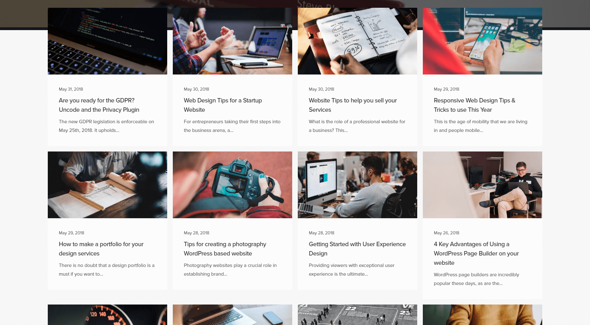
There are, of course, other factors that can affect which posts stand out, such as their titles and featured images. However, the point is that your layout sets the tone for how people are encouraged to browse your website.
Now, let’s check out an example of a blog that uses a more asymmetrical layout:
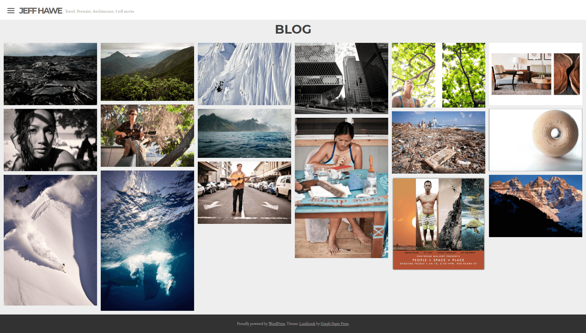
This is also a grid-based layout, but some elements have been given more weight than others. An asymmetric layout is a simple technique that enables you to draw your visitors’ eyes to specific sections. For example, if you publish an article you want to feature, asymmetrical grids are a perfect way to do that.
However, there are plenty of other ways to implement asymmetric layouts, even if you’re not using grids. Take this website, for example:
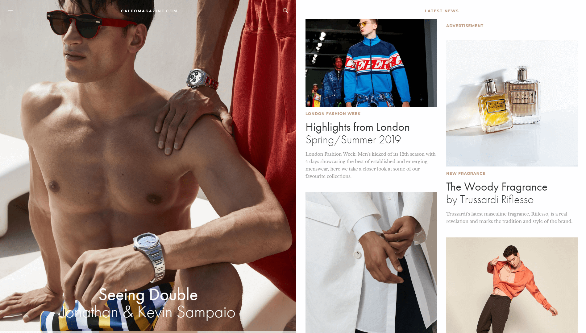
At first glance, it looks haphazard because it doesn’t use a standard layout. However, you can see that each element has been given a different size, which helps your brain assign a level of importance to it. That’s what asymmetrical design is all about at its core – using visual hierarchy to highlight what matters.
If you want to experiment with this type of design, Uncode provides several tools to get you started. For example, you can use masonry galleries to implement asymmetrical grid designs. There’s also a feature called Shape Dividers, which provides you with a broad range of separators you can use to break up sections in creative ways:
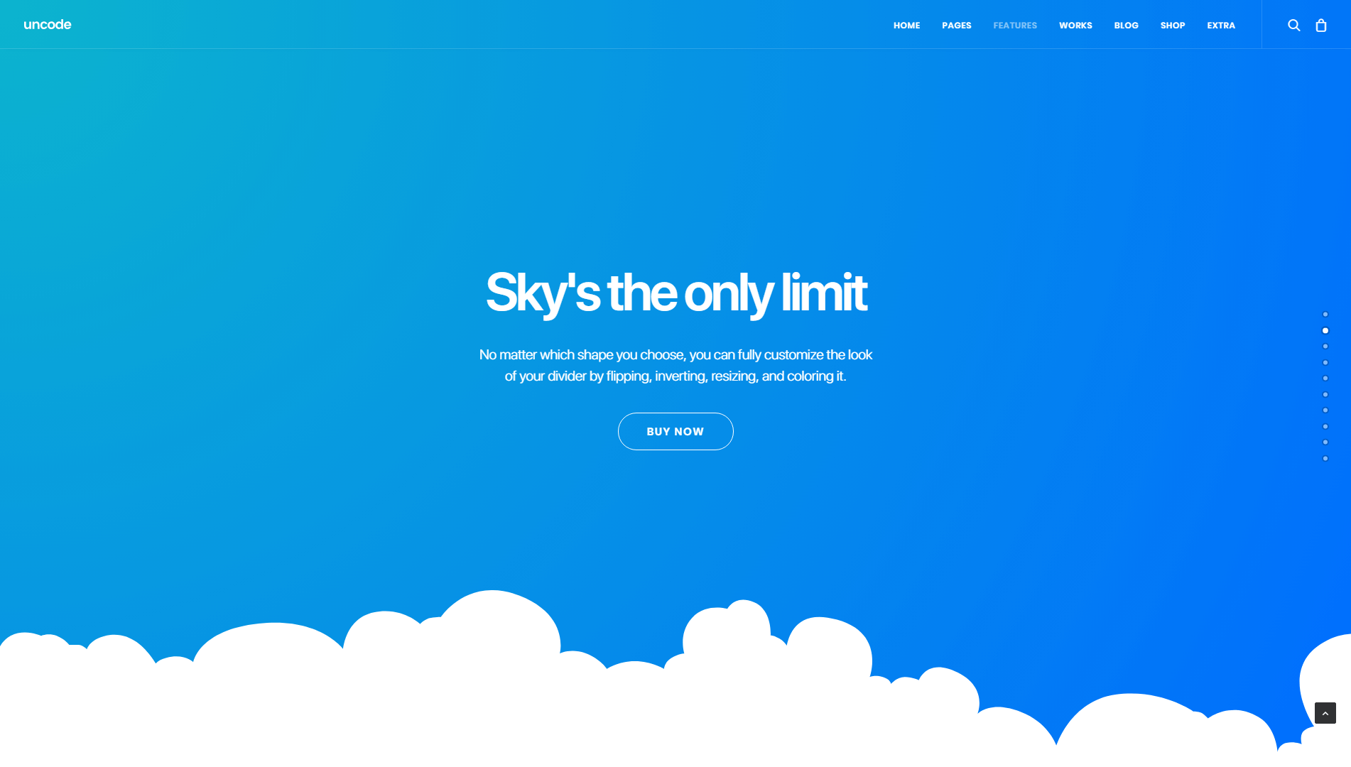
A lot of the dividers you can choose from are asymmetrical in design. For example, you can use cloud-based separators and diagonals, both of which make for a nice vacation from classic grids.
2. Unusual Color Palettes
Most websites use colors in a very ‘safe’ way. Take staples such as Facebook and Twitter, for example. They both focus on tones of blue, white, and black. Those colors work well together, but the combination is nothing to write home about:
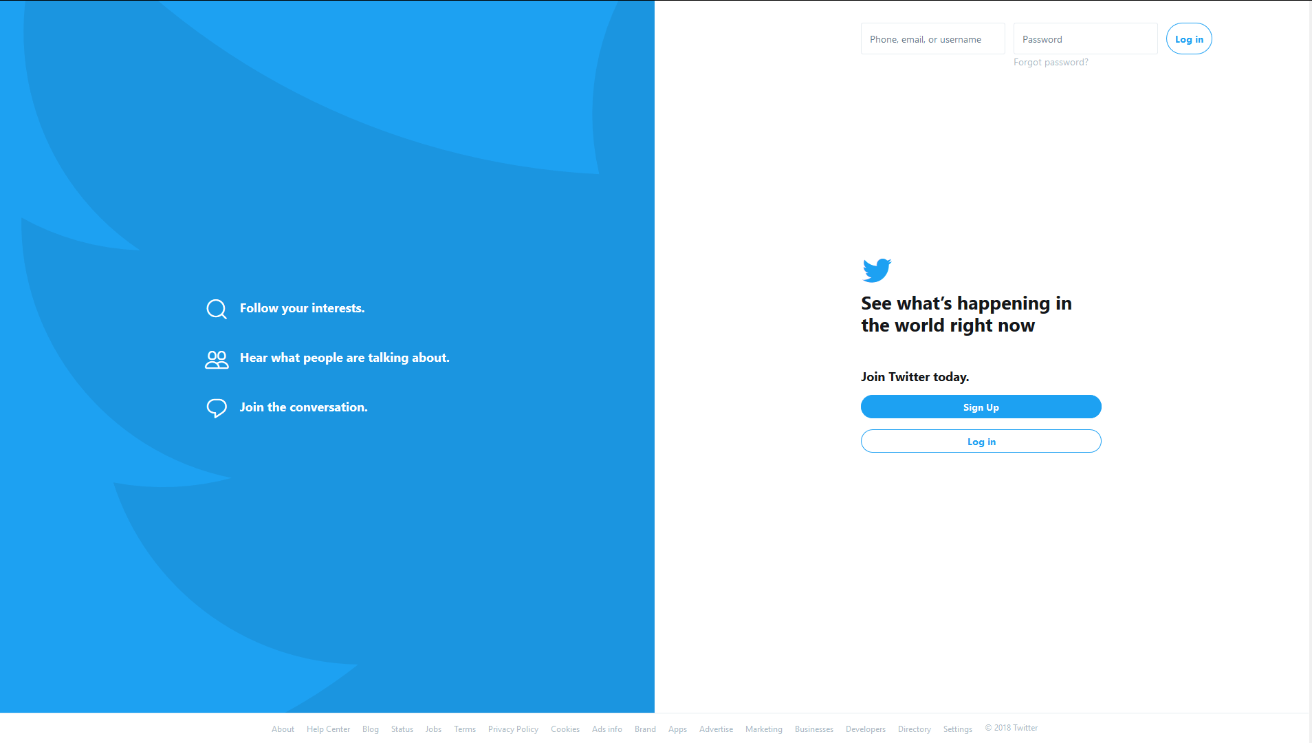
The reason a lot of websites stick to familiar color palettes is that they want to cater to as many users as possible. However, you have nearly infinite combinations of colors to choose from, and there’s no reason you can’t have some fun with them while maintaining usability.
One trend that’s been gaining traction is the use of saturated color palettes, as in the example below:
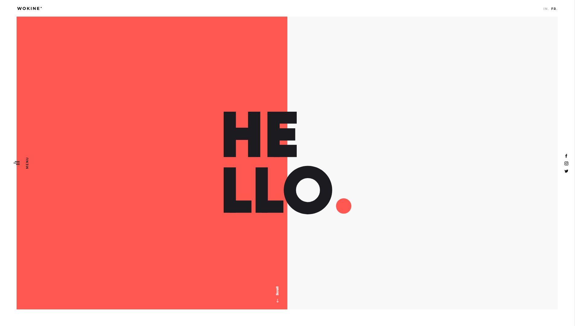
On this page, you can see tones of red, black, and an off-white. The red steals the show, of course, and the particular shade is unusual enough for a website that it automatically makes you pay attention. However, once you look beyond the color choices, you’ll notice that the design otherwise sticks to fundamentals, in order to keep everything usable.
For example, the links and text are in white, which provides a nice contrast that makes them easy to spot:
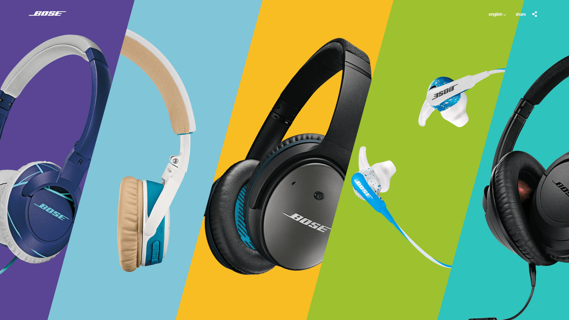
Overall, this is an excellent example of how unusual color palettes can help you spice things up without too much effort. A smart place to start is by using a color wheel to come up with a complimentary color palette. Then, experiment with changing just one of those colors, and choosing a tone your visitors won’t expect.
After that, all you have to do is add the new colors to your site’s design. Fortunately, Uncode enables you to fully customize the colors you use in individual modules, as well as across your entire site.
3. Creative Typography
Just as with colors, a lot of people play it safe when choosing fonts for their websites. It’s easy to assume that fonts don’t matter much, besides making your text easy to read.
However, fonts are just like any other element on your website. They help to attract attention, create a visual identity, and so on. It’s a smart idea to play around with some different options, in order to achieve a unique look.
Sometimes, all it takes to make a statement is to experiment with font sizes:
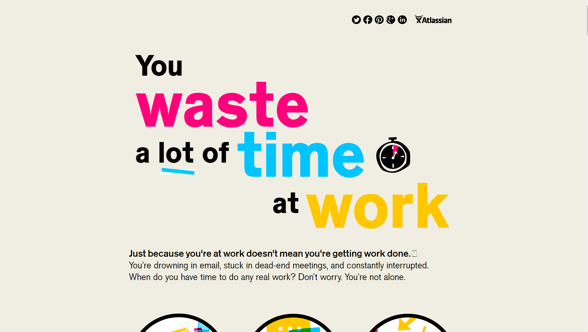
Big, bold typography is very ‘in’ these days, and it offers you a perfect way to get important messages across to your visitors. Plus, large fonts look great when used as headers.
Of course, you still need to make sure the fonts you use are easy to read. Here’s an example of a page that doesn’t quite hit the mark:
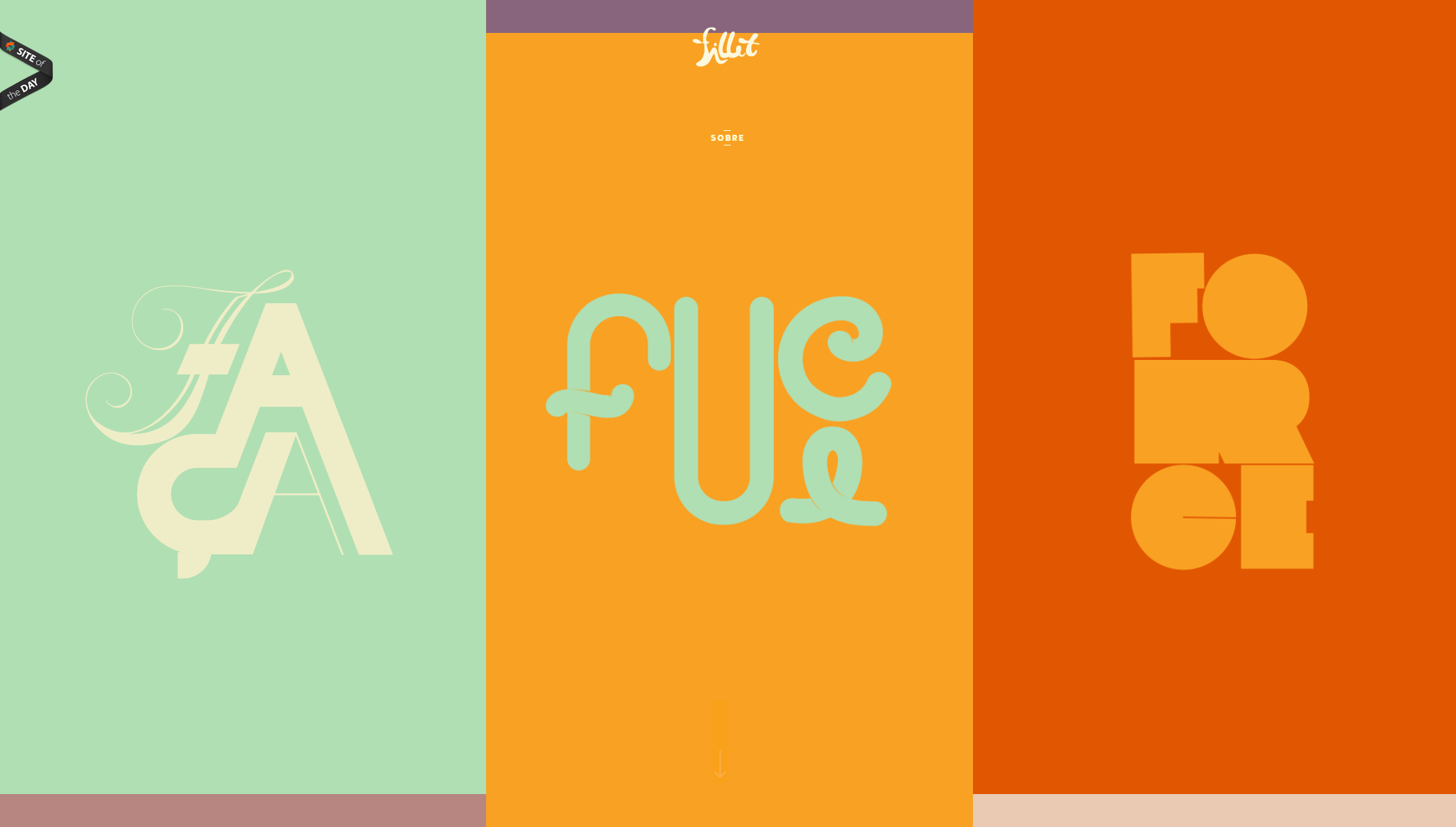
This may look creative, but usability is paramount when it comes to text on the web. So you want to strike a balance between fonts that look compelling and are still understandable.
The good news is that Uncode offers a built-in feature that enables you to import fonts. You can bring in possibilities from Google Fonts, Typekit, and much more. That means you have thousands of options to choose from, so finding the perfect fonts for your site shouldn’t be difficult.
4. Microinteractions
Back in the day, it wasn’t rare to find entire websites were everything was animated. That might have looked good in some cases, but it made those sites hard to use and slow to load – both of which are things you don’t want.
Since then, animations on websites have evolved a lot. Often, they take the form of ‘microinteractions’. These are simple animations that respond to specific user actions, such as clicking on a field, submitting a form, or mousing over an element. Here’s a quick example:
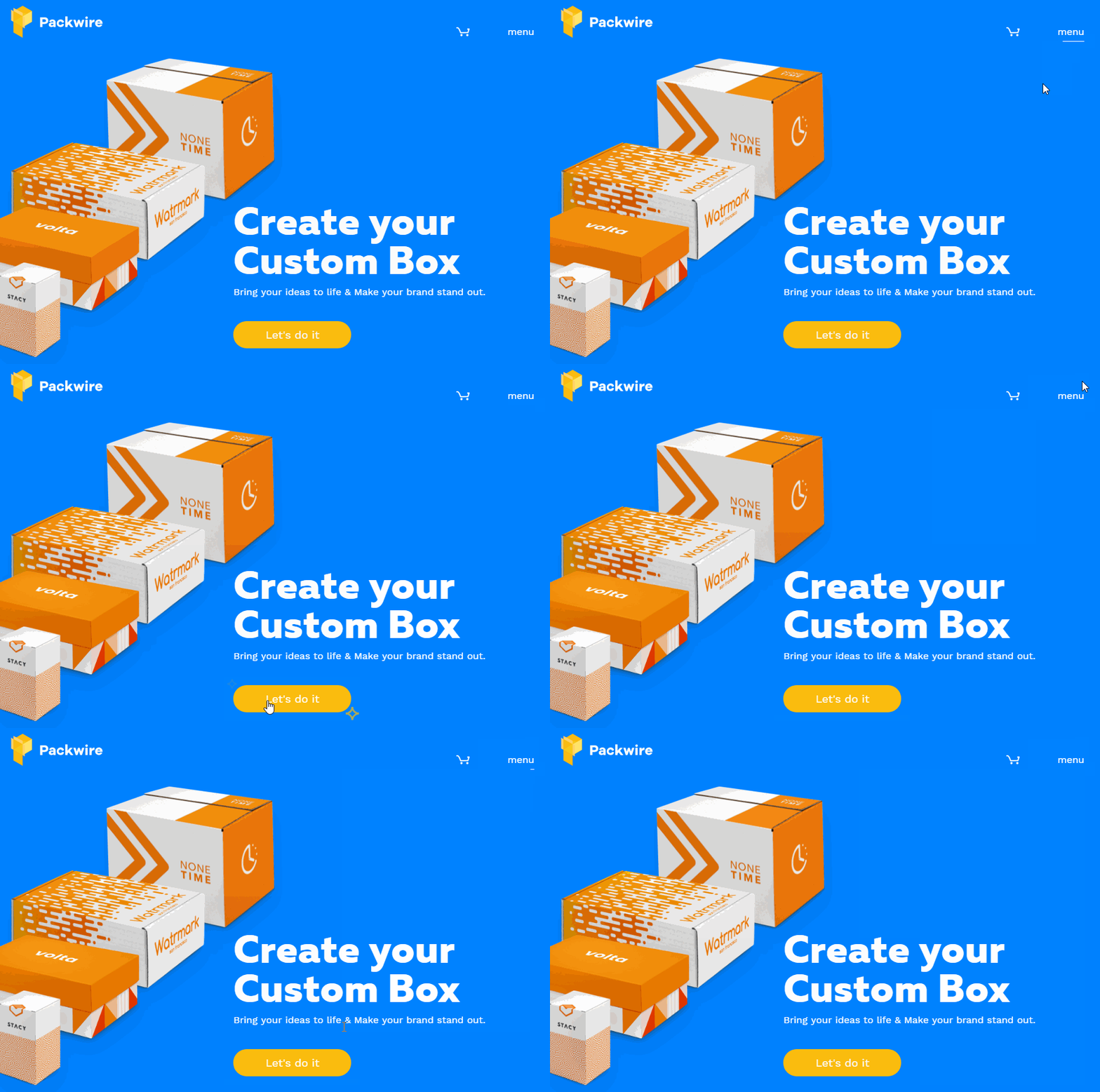
The great thing about microinteractions is that they make your website feel dynamic, without slowing everything down or overwhelming your visitors. Of course, implementing animations of any type can be difficult if you don’t have a background in coding.
With Uncode, however, you can add animations to several kinds of modules. Transitions, for example, are one of the most common types of microinteractions. Uncode offers several styles of transitions you can use through its Slides Scroll feature, which lets you turn any page into a compelling presentation.
5. Maximalism
Minimalist web design has been all the rage for a few years now. However, now its lesser-known sister is knocking on the door. ‘Maximalism’ is all about excess. It eschews white space and traditional color palettes, in order to create designs that overwhelm the senses.
Here’s an example of a website we’d call maximalist:
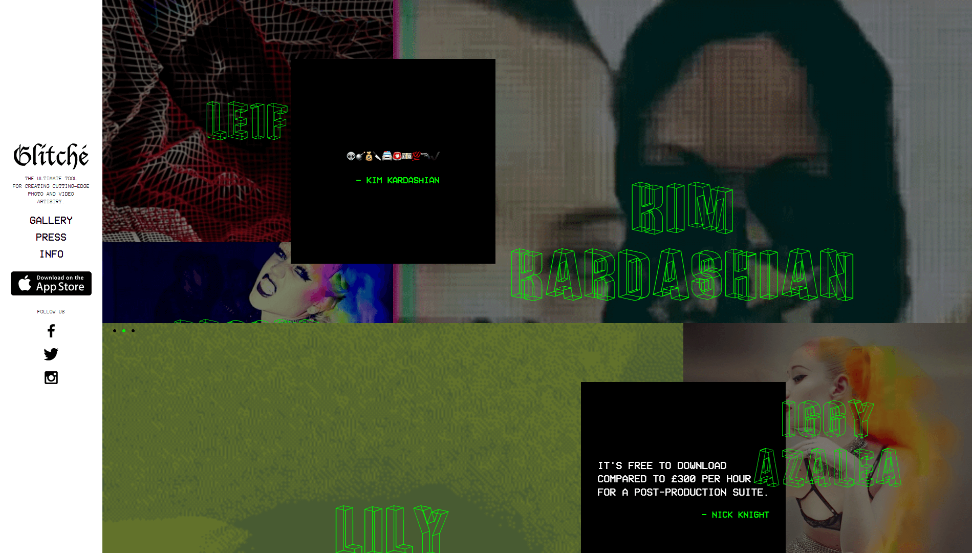
In many cases, being this bold with your designs is the perfect way to stand out amid a crowd of cookie-cutter websites. However, there should always be a little order within the chaos for maximalism to work properly. For example, using patterns or grids can help users differentiate between the various sections of your website:
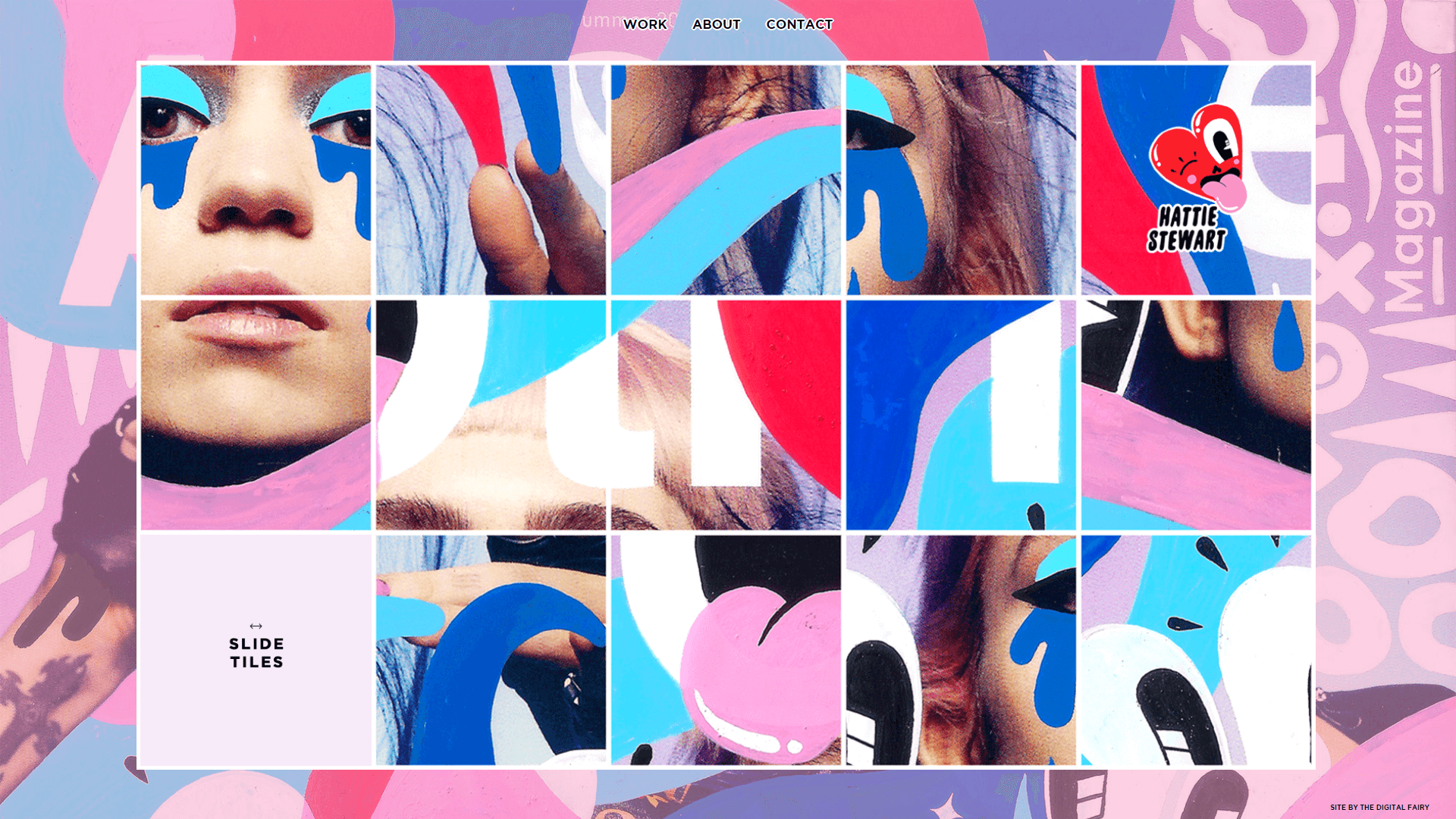
Moreover, you still need to make sure your website is easy to use. This means that, at the very least, you should stick to simple navigation schemes and make sure visitors can find the information they want. Using high-contrasting colors is a great way to achieve this effect, and you can still tweak your color palette to be as bold as you want.
When it comes to maximalism, the best way to get started is to begin from scratch. Open up the Uncode page builder, and get to work on a new design without using a layout as a base. Also, don’t be afraid to play around with each module’s settings to get your design just right.
Conclusion
Every website needs a makeover once in a while. As good as your site might look now, any design can become dated in just a few years. Fortunately, if you’re using WordPress, you can revamp your website’s appearance simply by using the right theme.
Uncode, for example, provides you with plenty of tools to help you design modern pages in record time. If you’re looking for inspiration to get you started, there are always new trends in web design you can emulate. In particular, asymmetrical layouts and bold typography are worth trying out on your own site.
Do you have any questions about how to redesign your website using Uncode? Ask away in the comments section below!
The Undsgn Newsletter
Sign up to stay up to date with the latest news!
(You will be forwarded to our subscribe form hosted by Mailchimp)
You might also like...
January 24, 2017
10 WordPress Design Trends that Will Dominate 2017
Astonishingly, WordPress powers over a quarter of all the world's…
August 16, 2016
Web Design 101: Make sure your site is responsive
More than 50% of searches on Google are done with smartphones or…
March 19, 2018
Web design trends in 2018: what to look out for!
Web design, a digital medium that is subject to shifts and changes in…


