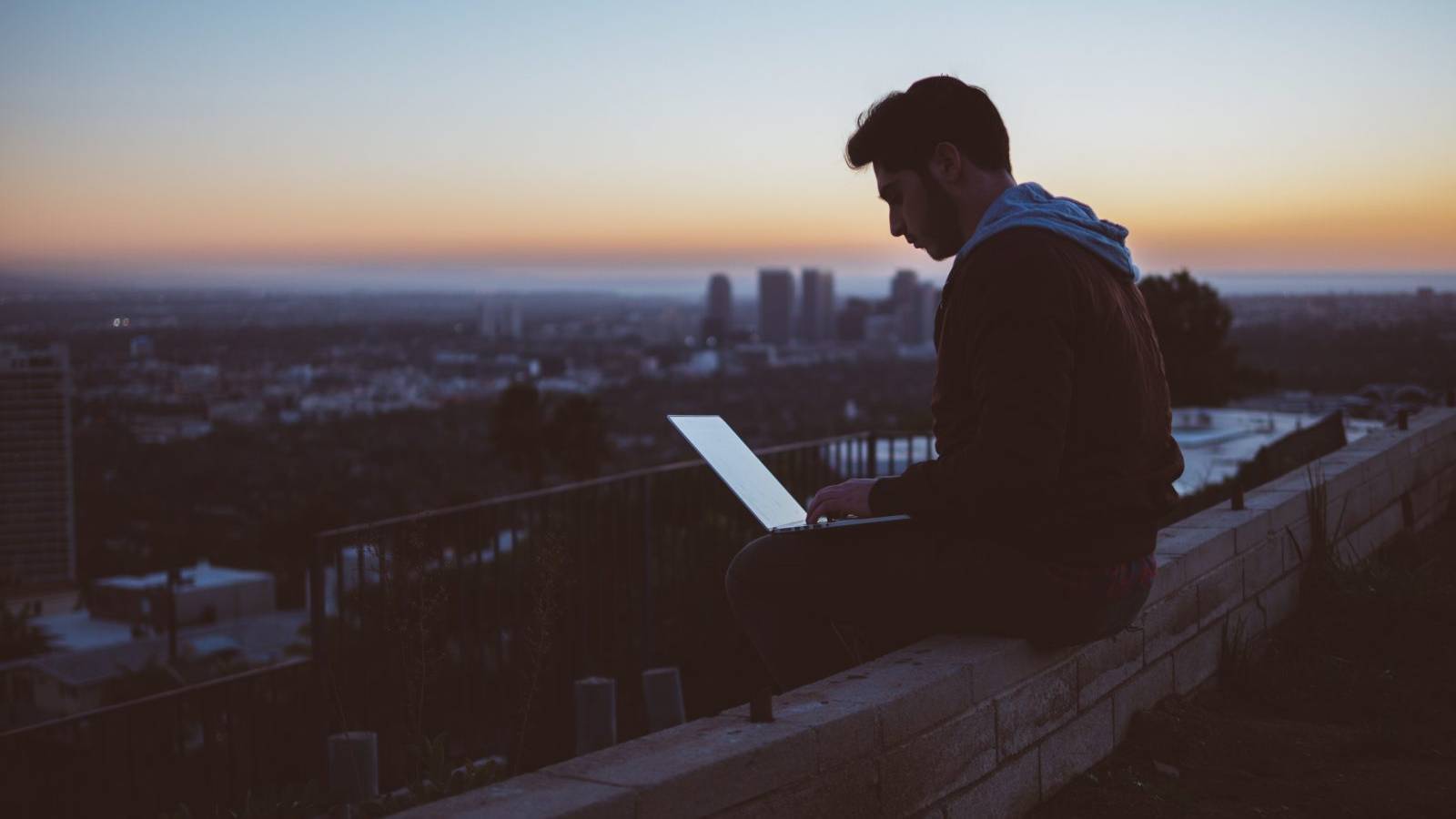
As both hardware and software are lunging toward next updates and improvements, designers are struggling to follow the latest web design trends while creating sites that are beautiful, user-friendly, innovative, and adaptable to every new device.
In 2017 we witnessed mobile usage overtaking desktop browsing, which indicates full utilization of mobile functionality in this year. That leads to desktops having to develop to stay relevant in building cutting edge websites.
Keeping this in mind, let us take a look at some striking website trends that will change the modern website design in 2018.
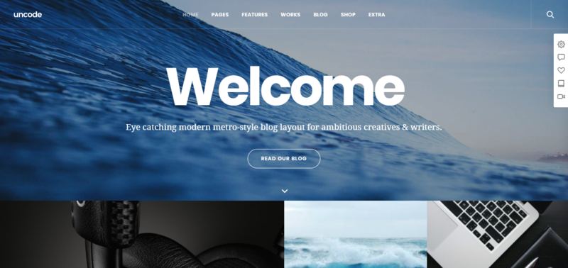
Playing with shadows and depth
I have to hit “pause” before you say “Old news, buddy”. Working with shadows has been a staple of web design for quite some time, but with improvements to web browsers, we can see some exciting variations.
Using grids and parallax layouts, designers can create an even better illusion of depth behind the screen.
New headline positions and more saturated colour schemes
I am more than interested in seeing how bolder colours, customisation and personalisation will be displayed on all platforms. The current web design trends are clinging to web-safe colours, but in 2018 more vibrant and saturated colour schemes are showing up in new websites designs.
Modern website design reimagined position of headlines; they are no longer just horizontal, but with slashes and sharp angles.
Technological advancement in monitors and displays now provides a better reproduction of lively colours. This feature now allows new web design trends to attract attention to their page instantly – which is a great way to set your website design apart from those that are traditional and “web-safe”.
Particle backgrounds in 2018
Using particle backgrounds is a great way to solve many website performance issues when running into a video background. Having these animations will cut down the pages’ load time, and will appear more natural while hooking visitor’s attention and leaving a memorable impression.
Particle backgrounds are undoubtedly a part of innovative website designs, and will inevitably become more widespread on social media, providing a beautiful animation that will attract hits on landing pages.
New and updated design tools
It seems like almost every day a new app, tool or feature from InVision, Adobe XD, Figma, and others, would be ready for download. We wanted to highlight Sketch, whose update brings open file format single-handedly changed the trends in web design.
All aboard the WebVR train
We can not talk about web design trends in 2018 without mentioning WebVR because we are (pun intended) so close to the first polished VR experience. We are expecting a plethora of creative websites to pop up from agencies that connect mobile gaming, apps, experience, and the web itself.
Why?
Because best website designs are going to take advantage of two significant features of WebVR:
One: There will be fewer obstacles for the users to use what you build. They will only have to worry about putting on the VR headset
Two: When WebVR has been made for one platform, it should work on new ones, which is hugely beneficial to the further development and progression of VR hardware.
Ethical design trends in 2018
We are going to see a lot more sustainable and inclusive designs as ethics is becoming more critical. Top website designers are already taking the first steps – thinking about possible moral outcomes of their work – and we should follow them.
Taking into consideration psychological or environmental consequences of one’s design will undoubtedly bring positive user reviews.
Building voice user interfaces
Alexa, Siri, Cortana.
With every new release, display screens of our devices are shrinking, hence the necessity of developing voice user interfaces. Designers are faced with a challenge and must expand their knowledge and toolbox to keep up with technological growth.
Web design trends of tomorrow will unquestionably require from UX designers to understand how to build a functioning and elegant voice interfaces.
Traditional vs Innovative website designs
As days go by, more and more designers are bravely choosing to step away from the traditional-looking homepage. Instead, they are going for more dynamic entry points such as a personalized website visit based on your location, browser history, and other data that can be used to improve the experience.
Ye olde desktop browsing
In the introduction, we already mentioned that mobile browsing had exceeded desktop because it is much more convenient. Nowadays, with the world being a global shopping mall, you can purchase and order almost whatever you desire with a few taps on your smartphone.
Designers were trying to understand how to get a decent looking and functional menu, its submenu (and its submenus) on such small displays. They might have to kick out the large space-eating photos from the websites’ mobile version and use icons instead.
Asymmetry – is it a web design trend?
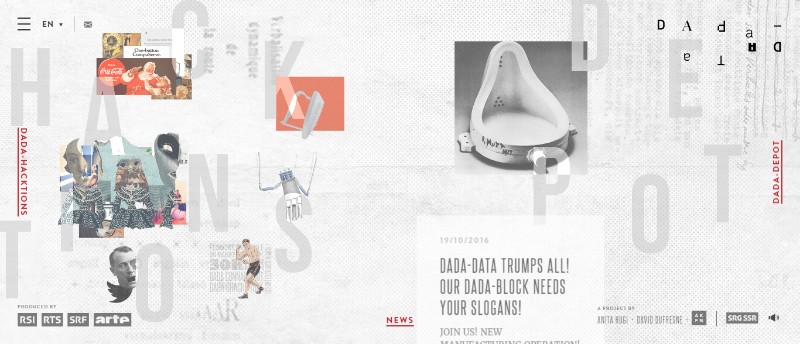
I was a big fan of symmetry in website designs, but in 2017 I witnessed the introduction of unique broken grid layouts, and I fell in love with it. The asymmetrical designs seem to be more appealing, experimental, and distinctive, which modern website designs need.
This trend is going to be even better and more widespread in 2018, primarily in bigger brand names as they can afford the risk. On the other hand, I think that traditional companies will not be interested in such unconventional layouts.
Ending thoughts on web design trends:
Bright colours, shadows, and animations… Oh, boy, 2018 is going to be the most exciting year in web design. But what can the top website designers do to push the boundaries even further? We cannot wait to find out.