
If you’re in the photography business, running your own website is a must. A photography site is a great way to show off your work, attract new business, and even sell your images directly. However, your site will need to be compelling and well-designed if you want it to be successful.
That’s why you’ll need to take the time to carefully plan out and develop your photography site so it stands out from the crowd. For WordPress users, this means choosing a theme that will provide the options and functionality you need. With the right theme in place, you can start displaying your work to maximum effect in no time.
In this article, we’ll explain why Uncode is a smart choice, and summarize the features it brings to the table. Then we’ll show you ten awesome examples of photography sites built with Uncode. Say cheese!
Why WordPress and Uncode Are the Perfect Combination for Your Photography Site
Deciding to build your photography site using WordPress is a smart way to start off on the right foot. It’s a powerful, flexible platform that can be easily adapted to all kinds of websites. Plus, it’s secure, popular, and well-supported.
However, possibly the strongest reason to use WordPress for your photography site is the wide range of plugins and themes you’ll get access to. These tools will enable you to personalize your site so it looks and acts just right.
You can find photography-specific WordPress themes, which at first glance may seem enticing. Unfortunately, these choices can frequently be limiting in terms of features. Instead, your best option is often to go with a customizable, general-purpose theme that offers practically everything you need for your photography site – such as Uncode.
There are many reasons Uncode is an excellent choice for your photography site:
- It’s highly flexible. Appearance is crucial when you’re in the photography business, and Uncode gives you maximum control over how your site looks.
- There are over 40 pre-built ‘concepts’ to get you started. These include many that prioritize images, portfolios, and storefronts (which enable you to sell your photos).
- Creating galleries is simple. Displaying your work using photo galleries is a smart design choice, and Uncode offers a number of layout and carousel options.
- Uncode supports adaptive images. This is vital, since it ensures your photographs will look their best no matter what device viewers are using.
This is just a taste of what Uncode brings to the table. Plus, it’s a user-friendly theme that is easy to get started with. For more proof, check out the following ten photography sites built using our flagship theme!
14 Awesome Photography Sites Built With Uncode
Now that you understand what Uncode has to offer your website, let’s take a look at ten outstanding examples of photography sites using our theme. These sites were selected for their unique feel and professional look, as well as for the wide variety of niches they serve.
We’ll briefly explain what makes each site unique and interesting. However, we also encourage you to explore each at your own pace. Our goal in presenting these sites is to give you a taste of what you can accomplish with Uncode, and provide inspiration for your own website.
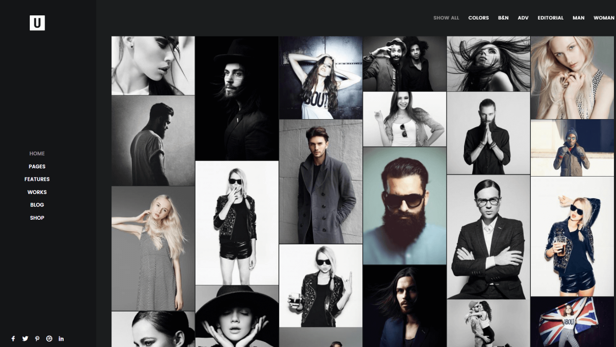
1. Tom Robak
Tom Robak is a wedding photographer, his website and work are anything but cliched. Along with having a great eye for capturing intimate moments, Robak also manages to highlight the unique locations of each wedding he shoots. His website showcases this skill using a broad collection of full-width shots, and it even includes an itinerary for Robak’s upcoming travel plans.
As far as navigation goes, Robak’s site keeps things simple. Even though every page is packed with detail, they’re all well organized and easy to use. Some other key design ideas to take away from this site include the pricing tables Robak uses for his wedding photography packages, and the excellent use of calls to action throughout the site.
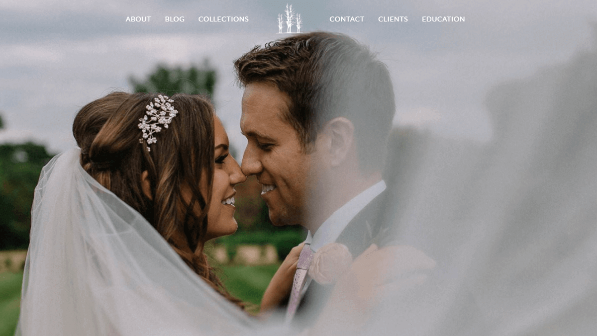
2. Hilario Sanchez
Hilario Sanchez’s wedding photography website might be in Spanish, but you don’t need to understand the language to appreciate a top-notch design. Sanchez opted for a very minimalist design that enables visitors to focus entirely on his photographs. Every image on his website towers over the all-lowercase text, which makes for a great contrast that pulls viewers in.
On top of that, this website features a very simple sidebar that enables you to jump to any page on the site at a moment’s notice. There are also plenty of links to Sanchez’s other social media pages for even more exposure. Finally, if you’re looking for inspiration for your next contact form, you’d do well to check out this site’s minimalist take on them, which is both clean and easy to use.
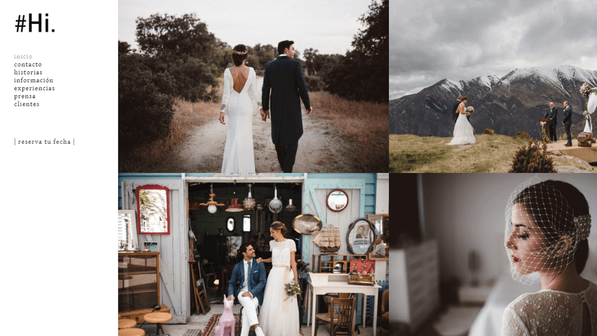
3. Thomas Schuppisser
Thomas Schuppisser’s portfolio is one of the simplest websites we’ve featured so far. However, that doesn’t make it any less effective. At first glance, you may think the website is too bare – after all, it’s mostly images with very little text. However, this design choice forces you to pay attention to Thomas’ work and decide for yourself what you think about his photographs.
In case you want to know more about the photographer himself, his website also features a thorough biographical section, includes all his past work, and lets you get in touch with him via a contact page. The latter is very minimalist – as you might expect – but it gets the job done. Overall, Thomas Schuppisser’s site exemplifies that if you’re a photographer, sometimes you just have to let your work speak for itself.
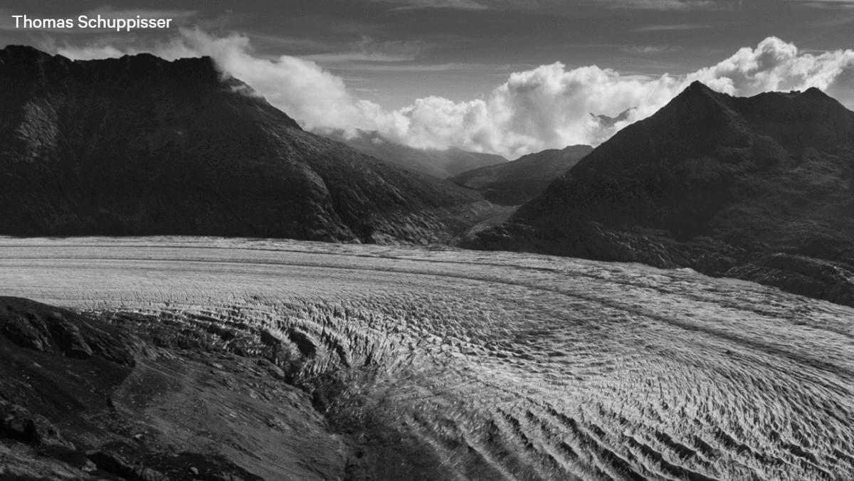
4. Lucía Correa
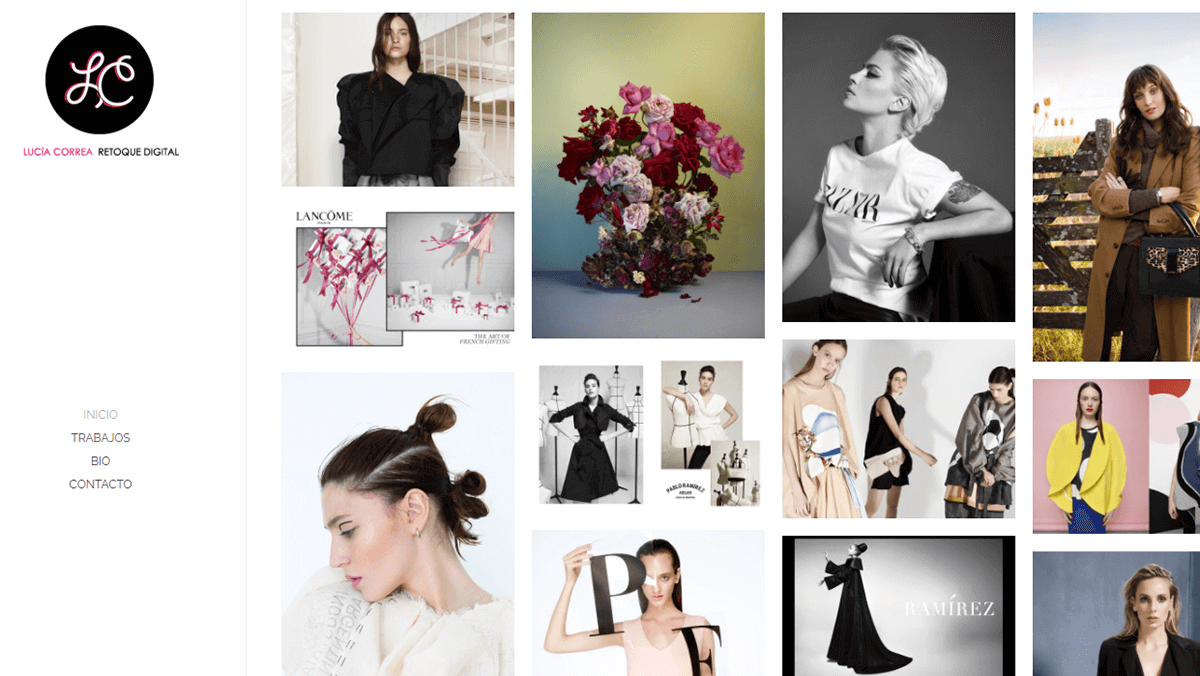
Lucía Correa’s website is another great example of a modern photography portfolio with a sidebar-based design. The first thing you’ll notice once the site loads are the colorful fashion photographs and the elegant grid-based design. Plus, the use of a masonry grid enables Correa to highlight specific photos without having to add elements that would detract from the minimalist design, such as borders.
If you have a keen eye, you’ll probably realize this website also features a lazy loading feature, which is perfect for media-heavy sites. This enables the website to remain fast without having to cut down on the number of images it displays – which is something you don’t want to do when you’re running a photography website.
5. Hello Little Studios
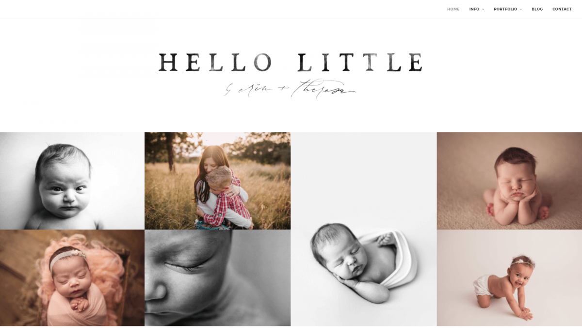
The first thing you’ll likely notice about this site is the front-page image gallery. Hello Little Studios makes a strong first impression by limiting the initial text you’ll see to a title and basic menu, and putting the focus on their photographs. This strategy gives the viewer an immediate impression of the studio’s focus and target audience.
You’ll find additional photo galleries on the various Portfolio pages, and they do an excellent job of showcasing Hello Little’s experience and expertise. Uncode offers a number of easy-to-use gallery options, and this site takes advantage of that feature effectively. Both the landing page gallery and the sheer volume of portfolio pieces are strategies worth considering for your own photography site.
6. Milon Quayim
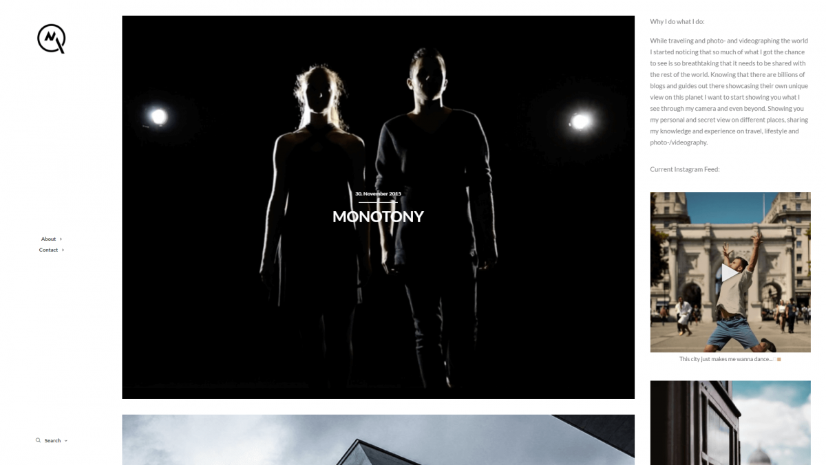
Milon Quayim made the smart choice to keep his photography site simple and minimalist. The front page contains a short menu, samples of his work, and a personal biography. There’s also a strong call to action – an incorporated Instagram feed with a Follow me! button. The permanently enabled overlay text on images is also a nice touch that adds a sense of progression to the featured works.
It can be tempting to clutter your site with information and extra features. However, this example demonstrates the value of including only what is absolutely necessary. This strategy keeps the site focused, professional, and clean. Plus, it puts the spotlight on Quayim’s photography and videos. The three-column layout is also a creative choice, and helps the site look and feel distinct.
7. R99 Photography
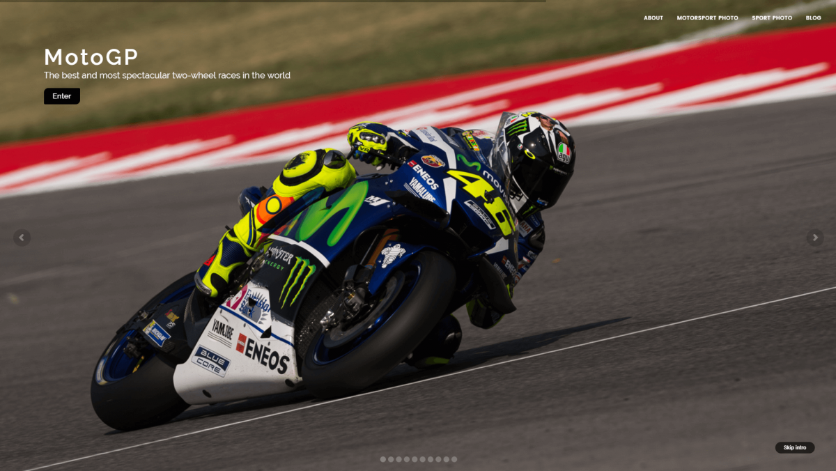
As this website for R99 Photography demonstrates, a full-screen carousel is an excellent way to put the focus immediately on your work. The carousel has been set so that users must navigate manually from slide to slide. This lets them take their time and immerse themselves within each image. For busier visitors, the handy Skip Intro button takes you straight to the main website.
Carousels are a compelling addition to just about any photography site, whether they’re full-screen (as in this example), or less prominent. As with Hello Little Studios above, this website is also a strong example of how to make your primary focus immediately apparent. Often the best way to distinguish yourself from other photography sites is to position yourself firmly in a particular niche – such as motor racing.
8. Max Sukhomlin
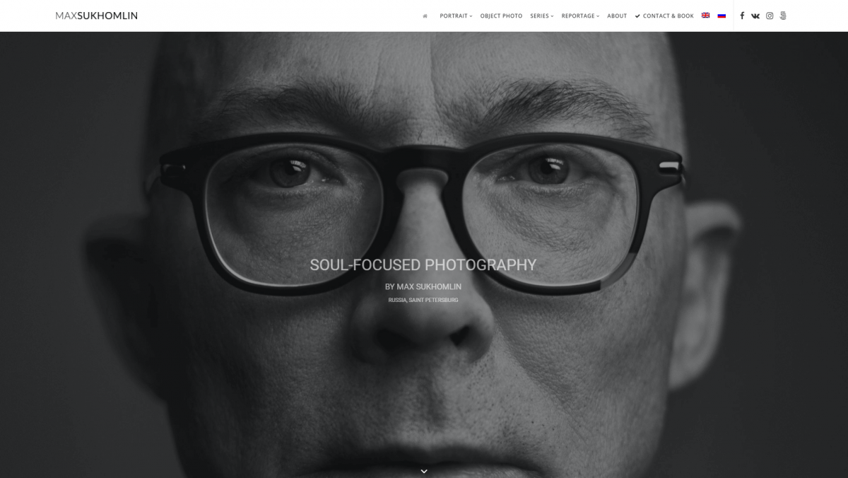
While some photography sites like to make a first impression with a diverse photo gallery, others prefer a more streamlined approach. Max Sukhomlin, for example, chose to include a single full-sized image on his portfolio’s home page. This bold image grabs the visitor’s attention, demonstrates the quality of the artist’s work, and helps introduce his focus (portraits) – all at once.
Another key takeaway from this particular site is the smart use of calls-to-action. There are several on the home page alone. They include a Contact & Book option in the top menu, a Book Now button at the bottom of the page, and social media sharing buttons in the top right corner. The latter is a particularly strong choice for your own photography site, since it encourages visitors to share your work.
9. JamStudio Photography
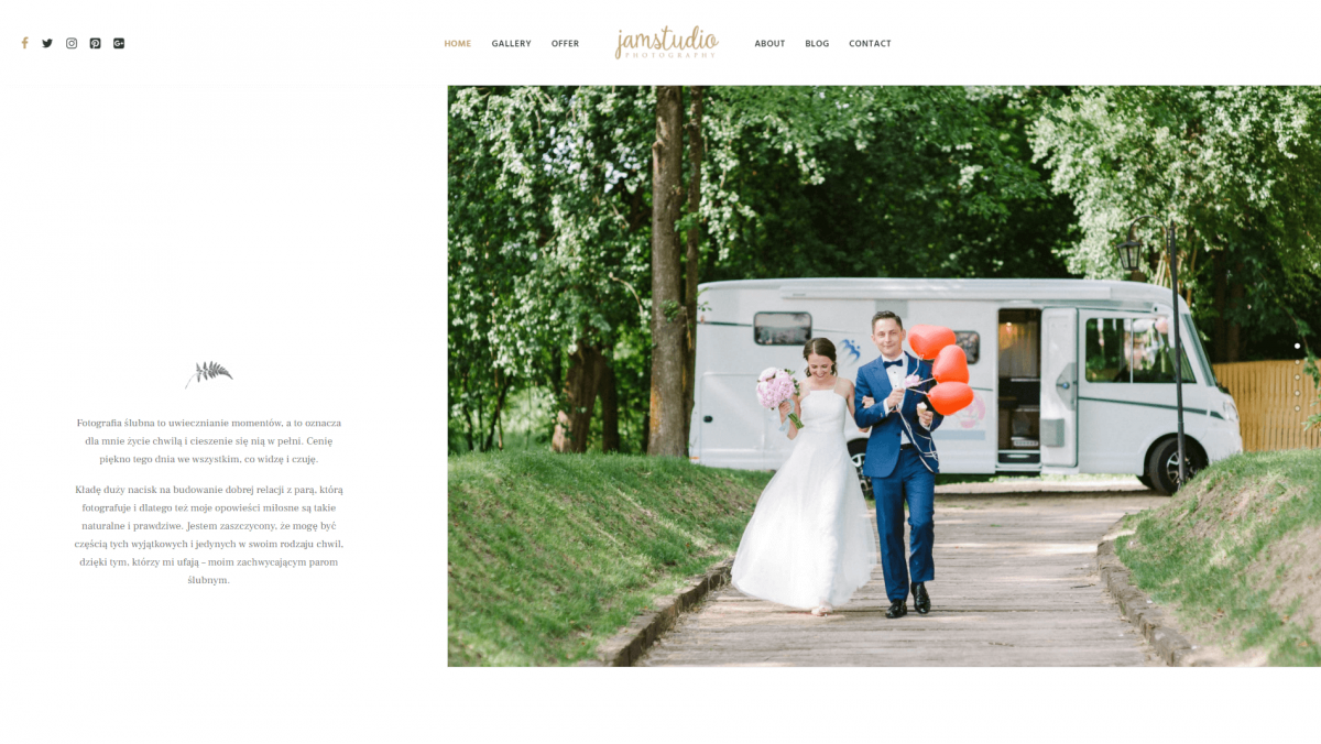
The JamStudio Photography website is another excellent example of minimalist design at work. In particular, this site makes excellent use of white space, a technique that lets key elements on the screen really stand out. Adopting this approach enables you to focus your visitors’ attention on what matters most.
In this case, the primary element is the slideshow of images showcasing the studio’s experience with wedding photography. Scrolling down the page reveals more compelling examples of JamStudio’s work. Although most of the site is not presented in English, it’s still easy to see how the design benefits from the sparse use of text interspersed with visuals.
10. Stephane Legrand Photography
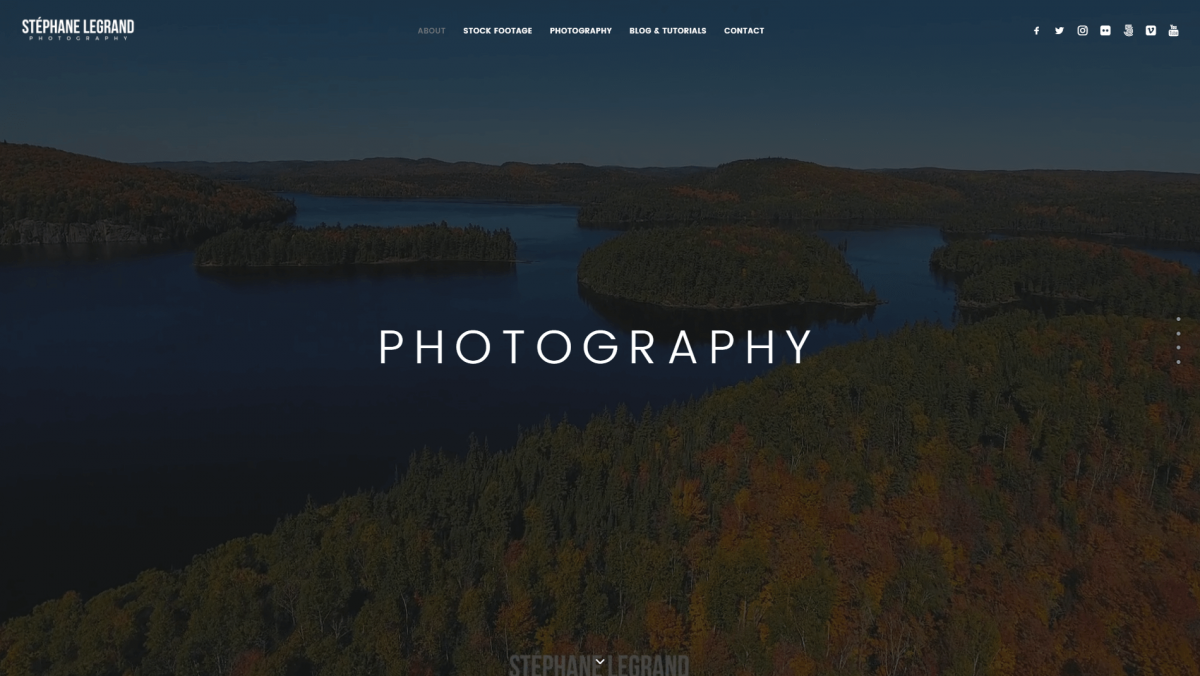
This site’s most striking feature is the full-screen header video you’re presented with upon entering. It shows off some striking architectural photography in a way that will grab the visitor’s attention. Simple text overlays provide a list of key services, and each of these sections can easily be navigated to from the menu at the top of the site.
Video backgrounds are a perfect way to make your site feel unique, and leave visitors with a strong first impression. We’d recommend spending some time perusing the rest of this site as well, since it displays a number of valuable techniques. These include prominent calls-to-action, client testimonials, and the stylish use of image galleries.
11. Raumrot
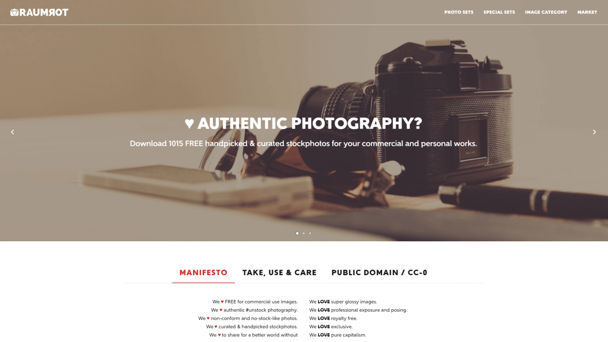
Although this site is more traditional in design than some of the other entries on our list, that doesn’t detract from its effectiveness. Raumrot’s smart use of basic design concepts gives it a professional look, and there are plenty of individual elements to take note of. For example, the full-width image carousel on the home page shows off some compelling examples of the studio’s work. At the same time, it leaves room ‘above the fold’ for key information about their services.
Also of note is the ‘sticky’ header, which remains on the page even as the user scrolls down. This is useful when your pages have a lot of content, so your visitors remain oriented. The menu even changes color depending on whether or not you’re at the top of the page, which is a nice visual touch. If you scroll to the bottom of the site, you’ll also notice it uses footer widgets to include plenty of useful information and links.
12. Hamish Robertson
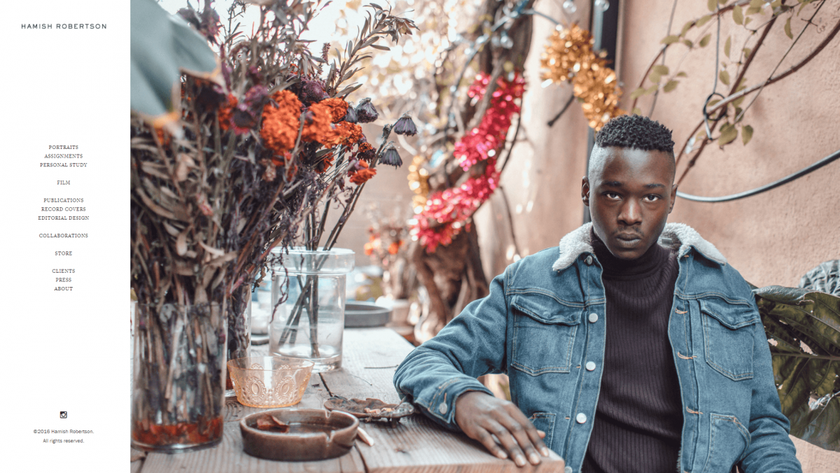
Although most websites display their main menu at the top of the screen, that’s not your only option. You need only browse through Hamish Robertson’s photography site to see an example of a well-designed sidebar menu. This simple feature can make your website stand out, and draws attention to crucial links – such as your portfolio and contact information.
This website also features a store, which is something many photographers look to include on their websites. Hamish Robertson’s setup is simple and minimalist, so as not to detract from the imagery. It also makes stylish use of a simple media gallery setup to feature both categories and specific works. If you click on a photograph, you’ll even be taken to a comprehensive product page.
13. Peak Aerials
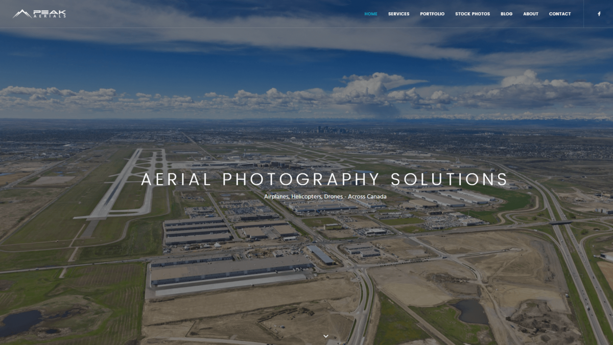
The Peak Aerials website makes use of many of the elements we’ve already discussed, such as a full-screen header on the home page, a sticky menu, and social media sharing buttons. However, there are some unique features to check out. For example, if you scroll down the home page you’ll find a well-designed grid that intersperses photography with text and call-to-action buttons.
Clicking on Meet Our Team will take you to the team member profiles page. Since most photography studios are quite small, a portfolio page or personal biography is a smart touch that gives your site a more personal feel. Visitors will appreciate knowing who’s behind the photography. Plus, humanizing your site and company is a great way to increase your credibility and build trust in your work.
14. Prophoto
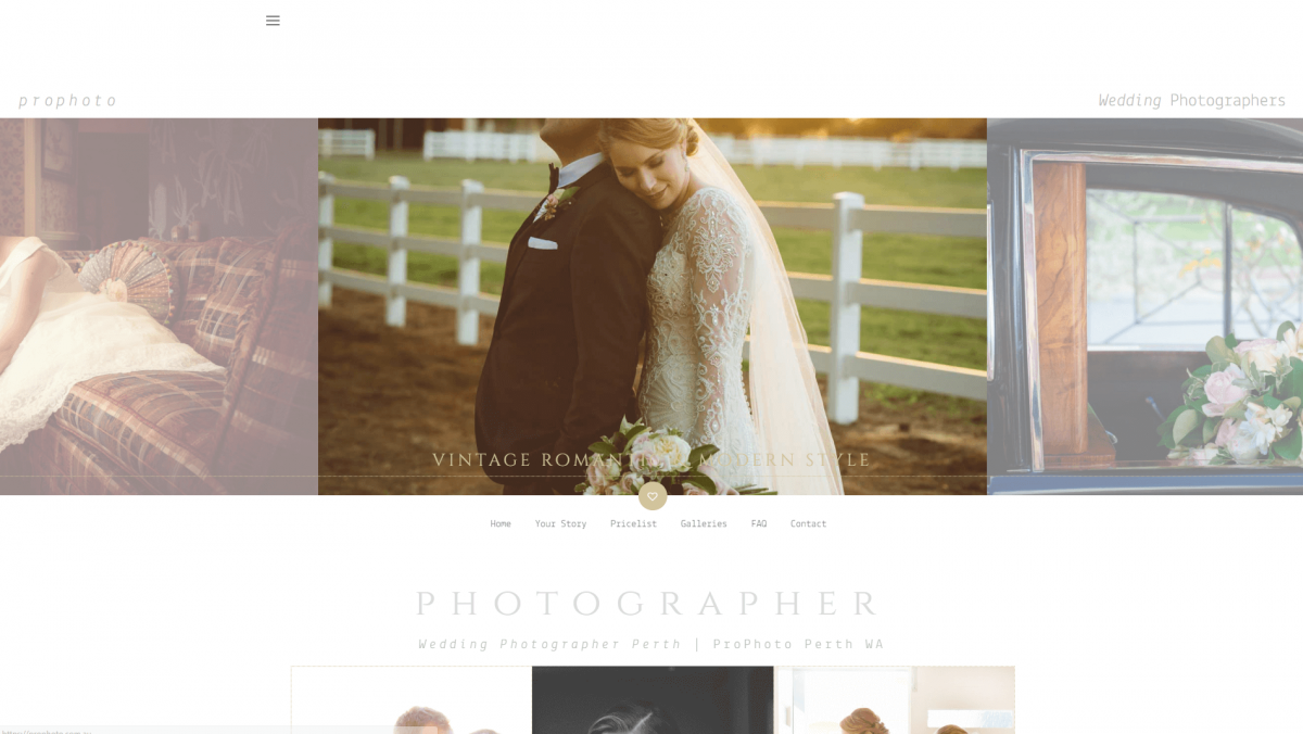
If you’re looking for a wedding photographer, you want a studio that can pull off both style and elegance. Prophoto demonstrates competence in this area through its website design as well as its actual photography, amplifying its credibility. The diverse selection of images, a creative but readable font, and a simple white background are all a solid match to this company’s particular niche.
Offering multiple navigation options can be a smart move for your own photography website, since it encourages users to visit key pages. Another clever feature you may not notice at first is this site’s collapsible sidebar menu. You can click on the icon in the top left corner to make the menu hide or appear, which gives the user some control over their experience of the site. At the same time, the primary menu remains at the bottom of the media carousel.
Conclusion
Your photography website is a reflection of both you and your work, so it needs to be both professional and visually appealing. Fortunately, using Uncode can help your site really shine, thanks to its flexibility and broad range of features.
If you’re not sure where to start, the ten sites listed above can serve as inspiration and demonstrate what you can accomplish. Whether you’re building a wedding photography site, a stock photo store, or an online portfolio, Uncode can help you get there.
Do you have any questions about how to create an awesome photography website with Uncode? Drop us a line in the comments section below!