
Sometimes when you are working with finding solutions you get that idea. The idea that not only can this problem be fixed, but if you are willing to walk the extra mile you can make a big difference by fixing it. That’s the case with Uncode’s solution to image loading. And that’s what we do with Uncode. We walk that extra mile.
A lot of things are done better in the Uncode theme compared to most WordPress themes. Other things are unique for Uncode, solutions not found in any other commercial themes. Such is the case with our take on Adaptive Images.
You may have heard of Adaptive Images?
Adaptive Images is a great thing for user experience on the web. Adaptive Images helps minimize loading time by detecting your site visitor’s screen size and then deliver device appropriate, re-scaled versions of images on you site. That means you can upload images suitable for the biggest retina or 5K screens without having to manually create a version for the small mobile device on a LTE network. An image with good enough quality is created, and download time is thereby kept as low as possible. WordPress added support for a similar solution, Responsive Images, last year. Adaptive Images is actually a better solution. But what if it could be done even better?
What screen is the image viewed on?
Here’s where that idea comes in. A big difference can be made here. Image responsiveness in general and Adaptive Images in particular is based on screen size/resolution. The logic being that you don’t need images optimized for a screen larger than the one you’re using. That makes sense. But that creates unnecessary big images. Not all images are used as legend or full screen images.
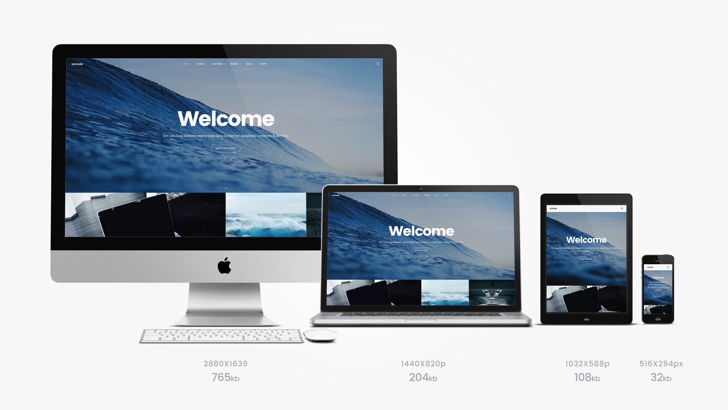
How is the image used?
Let’s say you have images on your webpage like the above example, displayed in a post index or image gallery. You uploaded big files because you want the visitor to be able to see them in a lightbox with high quality. Or they are also used in the post as header images. Responsive Images and Adaptive Images would now create images in the size suitable for your visitor with a 2560 x 1600 px resolution. They would do so by asking your browser what size it’s window is. Uncode’s Adaptive Images solution goes further and looks for a way to divide that size and make the image smaller. In this case it makes sense to take in to count the relative size of the surface showing the picture. In the case above that is 640 x 500 px – a fraction of the full screen size . Thus creating a much smaller and lighter image. When it comes to saving load time, every pixel counts.
Asynch works in sync with caching plugins
To increase the already good performance of Uncode, we have also implemented a great feature we call Asynchronous Adaptive Image in the latest version of the theme (1.4 and above).
With Asynchronous Adaptive Image your pages’ loading time will decrease and ratings from website metrics tools (PageSpeed, GTMetrix, etc.) will increase.
This means images will first be loaded together with the rest of the content with a very low resolution. When the page is loaded the images will be replaced by the adaptive image fitting the visitor’s device. This will reduce the loading time dramatically. It is also a crucial function if you are using page caching systems like WP3 Total Cache, Varnish, or similar solutions.
Adaptive Images out of the box – and beyond
Uncode is the only WordPress theme providing the powerful Adaptive Images solution out of the box. But as showed above Uncode goes beyond that in our strive to cut loading time and enhance performance. And we will continue to do so.