If you’re using your website as a way to introduce yourself to clients and drum up more business, then it needs to look just right. The problem is that not every WordPress theme offers the features you’ll need to build an agency website that stands out.
With Uncode, however, you get access to a lot of features that are a perfect fit for agency sites, such as stylish Team Member and Service page templates. Plus, the theme also integrates with a lot of other plugins that can come in handy, such as contact form tools.
In this article, we’re going to explain why Uncode is such an excellent fit for agency websites. Then we’ll show you seven agency sites built with the theme, and discuss what makes each one stand out. Let’s give your agency a facelift!
Why Uncode Is a Perfect Fit for Agency Websites
Uncode is what’s called a multi-purpose WordPress theme. That means it packs a lot of different features, which you can use across all types of websites and designs. For example, you can use Uncode to set up a stylish blog, a one-page site, or even an online store.
With that in mind, it should come as no surprise that Uncode is also a great fit for agency websites. To understand why that is, let’s talk about some of the most common elements agency websites share:
- Galleries and case study pages, which you can use to display past projects
- Team member sections, where you can introduce visitors to the rest of your agency
- Contact forms, so potential clients can get in touch quickly
- About Us pages, to explore the agency’s history and purpose
You’ll find plenty of other features within most agency websites, of course. However, those make up the core functionality any agency requires for an effective online presence.
The great news is that Uncode includes functionality you can use to implement all of these elements, just about anywhere on your site. For example, you get access to advanced Media Gallery and Team Member modules that you can add with just a few clicks. You can also use any of our pre-built layouts for About Us pages, or create customized contact forms quickly. In short, thanks to Uncode you can create a professional agency website without the need for any additional tools.
7 Outstanding Agency Websites Built with Uncode
Although agency websites share plenty of elements, that doesn’t mean they all have to look the same. The best part about using Uncode is that you can customize every part of your site, which makes it easy to create something unique. Let’s check out some examples of agency websites that were built with Uncode!
1. Les Tropiques
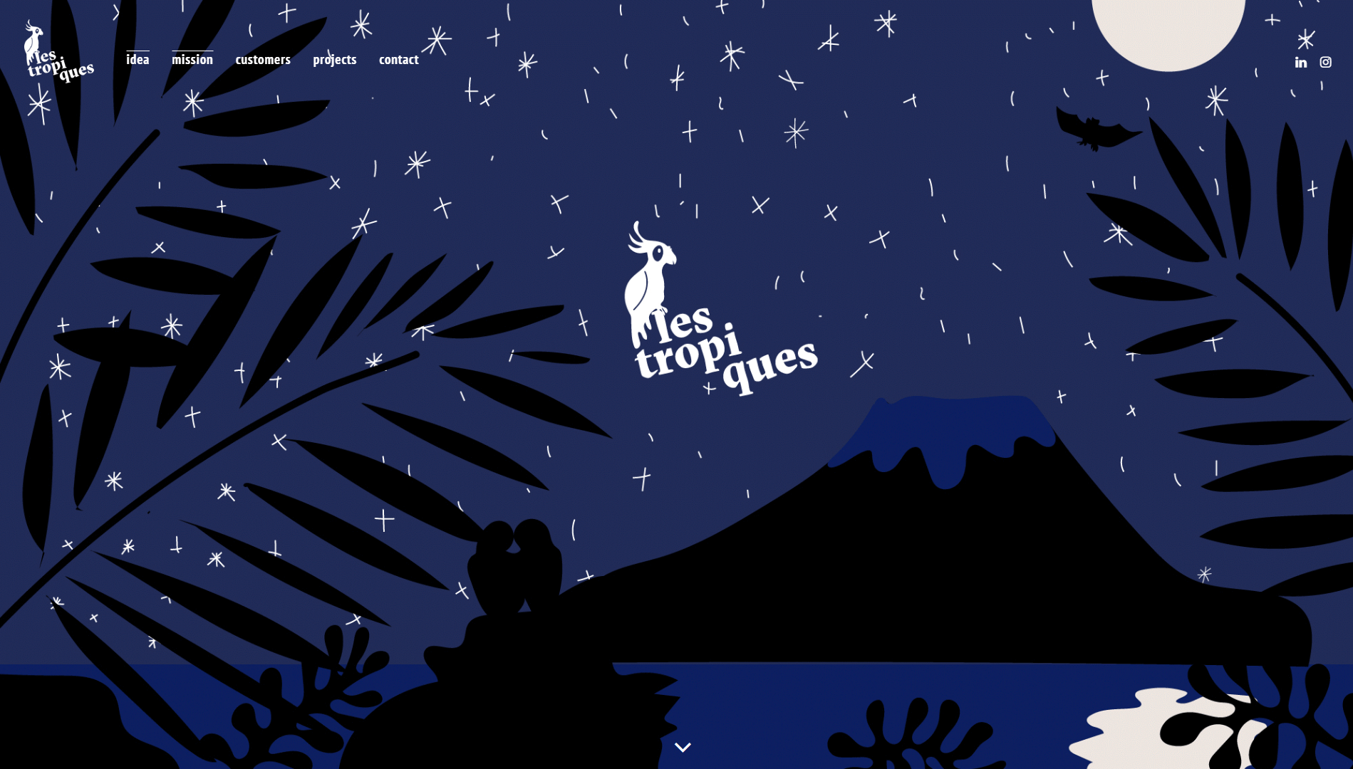
Les Tropiques is nothing if not colorful. As soon as you load this website, you’re assaulted by bright colors and drawings of exotic tropical birds. The site itself is very well-optimized, and deceptively simple.
However, its design stands out thanks to an excellent use of rows, which can be added with a few clicks using Uncode’s Visual Editor. Les Tropiques also nails the use of parallax backgrounds, which adds a dynamic feel to the website.
2. Edelstrom Design
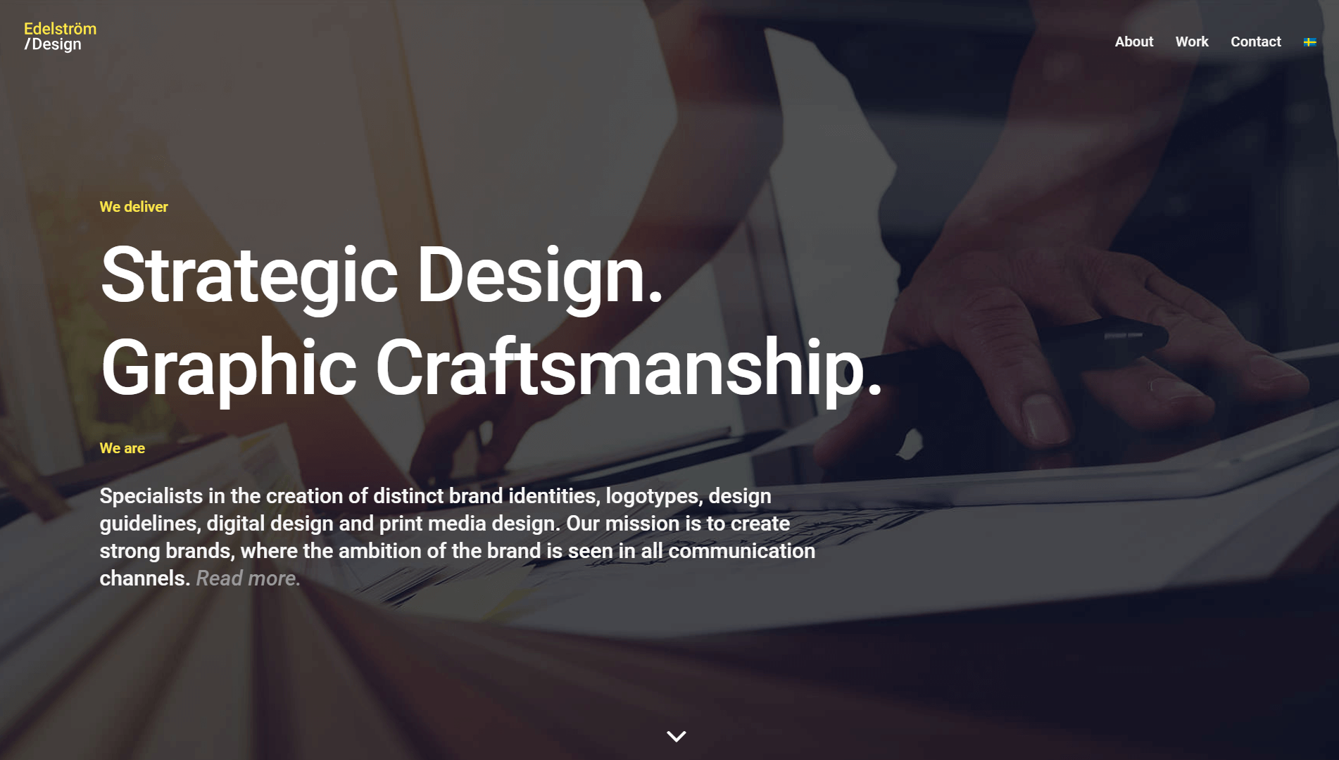
Edelstrom Design’s style is much more muted than our previous pick, but that doesn’t make it any less appealing. In fact, this design might be more to your liking if you prefer to keep things professional.
Our favorite aspect of Edelstrom Design is the way the company’s portfolio is incorporated into the home page. To do this, the developers used Uncode’s Isotope Grid module with an asymmetric design. Each element of that grid represents a project, and even includes a dynamic mouseover effect. When you click on an element, you get to read more about the project in question, which is a perfect way to entice new clients.
3. Hjaerta

Hjaerta’s design is very simple, based on black backgrounds with white letters and a hero header image. However, this agency site makes excellent use of several Uncode features to complement that basic foundation.
For example, it uses the Icon Box module to introduce visitors to the services the company offers. The website also features in-row tabs, which enables it to pack more information within smaller sections. This also lets visitors jump to the tabs they’re interested in right away.
Overall, Hjaerta is a perfect example of the fact that you don’t need a flashy website to communicate the services you offer. It just needs to work and look professional, so that visitors will take you seriously.
4. BRAIN Communicatie
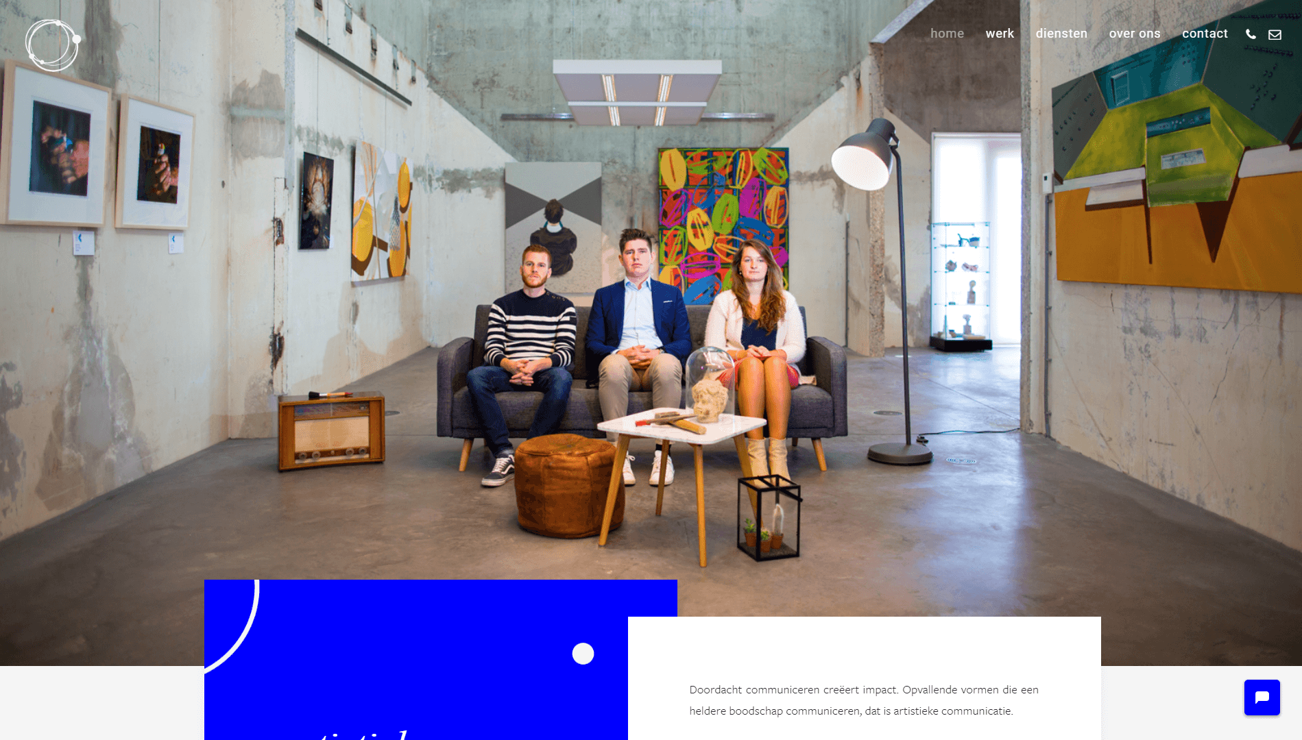
BRAIN Communicatie is one of our favorite agency sites, because of the creative way it uses Uncode. To start with, the way it overlays sections is a nice break from classic row designs. Likewise, BRAIN includes a fantastic sliding image gallery, with simple mouseover effects that highlight its brand colors.
Finally, you can see a great example of the Team Members module at work here. The way the team photos flow together makes for a stand-out visual effect, and adds a personalized element to the site.
5. Yump
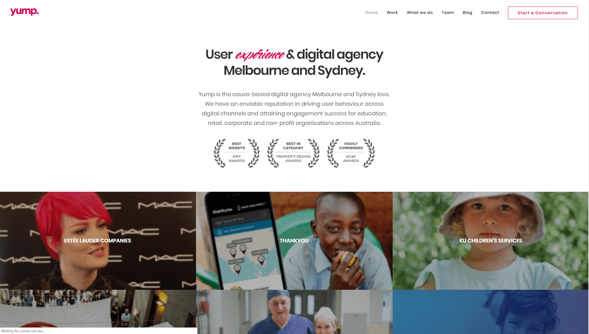
Most people who visit an agency’s website want to find out two things; what services the agency offers and what projects it’s worked on. Yump tackles both of those answers right away, with a quick introduction to what the agency does, the awards it’s won, and a showcase of its top projects.
The showcase in particular is an excellent use of an Uncode grid gallery with a classic design. If you keep going down, you’ll also find more information about the agency, displayed using Icon Box modules. To wrap everything up neatly, an effective Call To Action (CTA) created using Uncode’s Button module encourages visitors to get in touch.
6. Kult Design
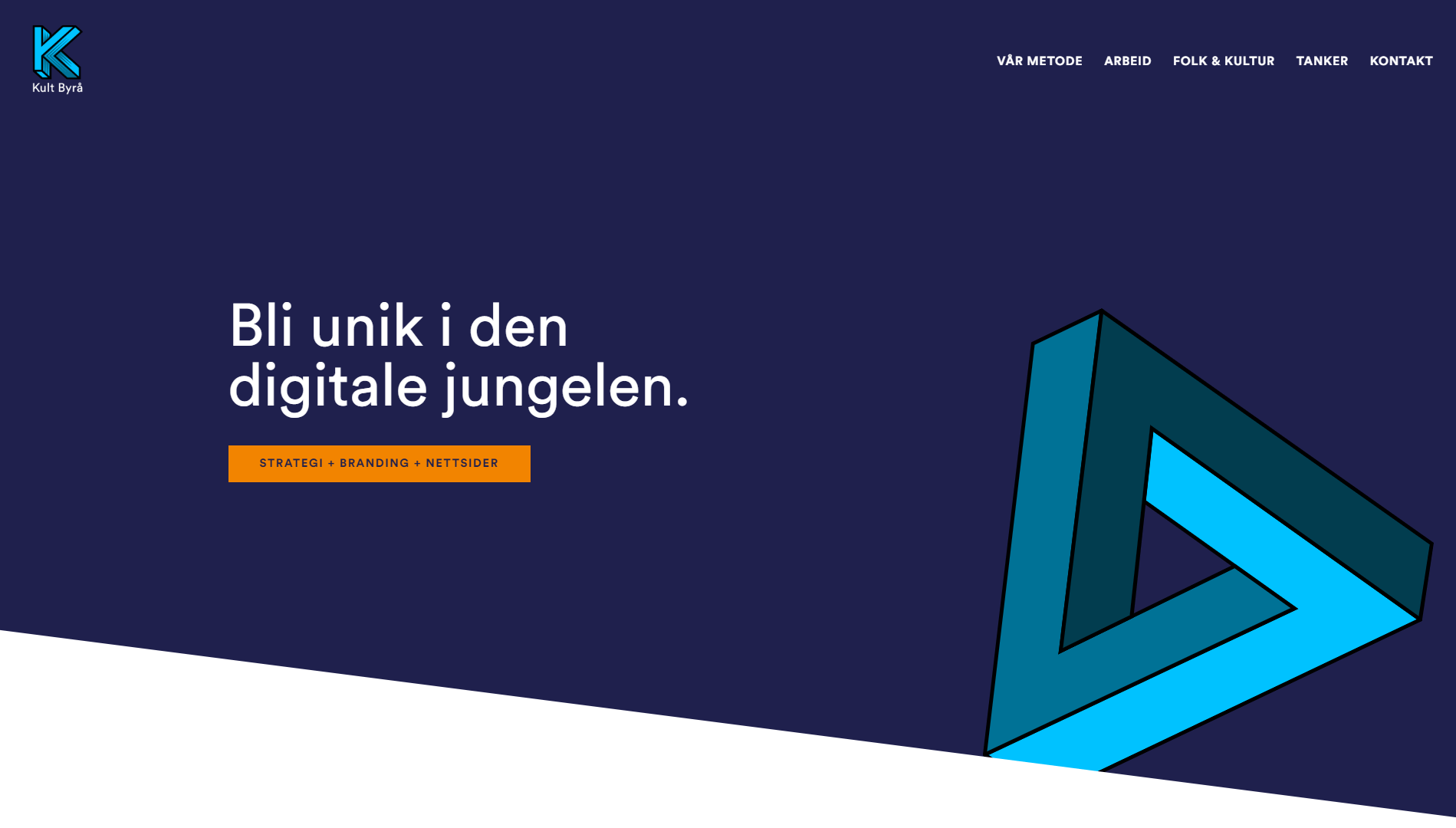
Most websites are very similar in the way they separate one section from another. By that, we mean they use lots of horizontal lines. There’s nothing wrong with that approach, but it does get a bit boring after a while.
With Uncode, you can use Shape Dividers to separate each section of a page. Kult Design puts this feature to great use, using simple slope dividers to delineate sections. It’s a simple design change, but it makes the page look much more dynamic. On top of that, Kult Design also uses a unique color palette, which helps its CTAs stand out visually.
7. oktoNet
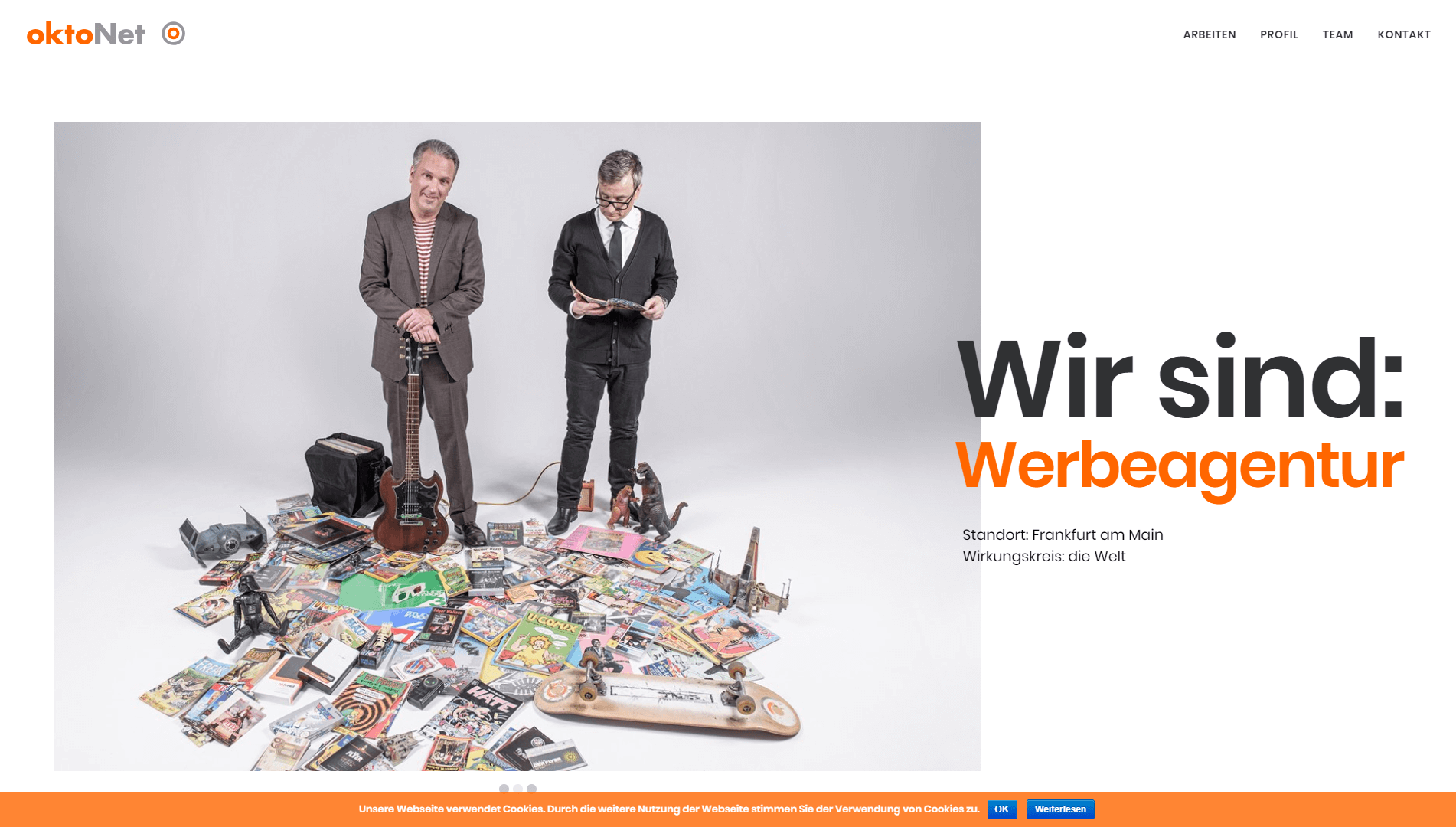
Finally, oktoNet is a fantastic example of an agency website with an immaculate layout and design. Each element stands out, thanks to the asymmetry used throughout the entire page. The project showcase, for example, uses an uneven grid that directs your attention towards the items the designers wanted you to notice first.
Aside from that, oktoNet largely relies on typography to catch your eye. That goes to show that you don’t need to pack your website full of advanced elements to make it look appealing. Plus, with Uncode you can easily customize the typography for your site as a whole, or for individual modules.
Conclusion
When you’re running an agency, you’re always on the lookout for more business. A professional-looking website is a perfect way to attract leads, but it can take a lot of work to build one. WordPress makes the process more straightforward, but you still need to find the right theme for your agency.
That’s where Uncode comes in to the picture. With Uncode, you get access to features you can use to build almost any type of site you might imagine. In particular, Uncode is an excellent fit for agency websites, not the least of which is thanks to its many gallery options and multiple portfolio layouts.
Do you have any questions about how to build an agency website using Uncode? Let’s talk about them in the comments section below!
Image credit: Pixabay.
The Undsgn Newsletter
Sign up to stay up to date with the latest news!
(You will be forwarded to our subscribe form hosted by Mailchimp)
You might also like...
September 5, 2017
14 Gorgeous Agency Websites Built With the Uncode WordPress Theme
Landing new clients as an agency can be hard. In many cases, you'll…
October 30, 2017
10 Modern Store Websites Built Using Uncode
Online stores are a fantastic way to build a business from the ground…
October 22, 2017
10 Top Portfolio Websites That Run on Uncode Theme
A professional-looking portfolio is crucial for any freelancer or…


