Landing new clients as an agency can be hard. In many cases, you’ll have to compete with people who are willing to undercut you or who promise deadlines you can’t match. One of the best ways to position yourself ahead of the pack is with a website that shows everyone your agency is the real deal.
That’s where Uncode comes in. Our flagship WordPress theme enables you to create modern and professional sites with a combination of pre-built elements and advanced, easy-to-use features. With a little time and effort, you can use it to put together a website that rivals any other professional agency.
In this article, we’re going to talk about what makes WordPress and Uncode the perfect fit for your agency website. Then we’ll introduce you to 14 examples that illustrate our point. Let’s get to work!
How WordPress and Uncode Can Help You Create a Gorgeous Agency Website
WordPress is renown for its ease of use, but what you may not know is that the platform works just as well for users with complex needs. For example, consider agency websites. They need to showcase your team’s work, its members, contact information, and more. You can build these elements using any platform you want, but WordPress can save you a lot of time thanks to its theme system.
Themes enable you to cut down on the time it takes to create a professional website, because they tend to include a lot of useful built-in elements. Uncode stands out in this respect. Our flagship product is what’s known as a multipurpose theme, which means it enables you to build almost any type of website you want.
As far as agencies go, Uncode supports all the crucial features we mentioned just a moment ago. It includes built-in functionality to display your team members, your portfolio, and much more.
Along with cutting down on the amount of time it takes to build a modern agency website, using a theme like Uncode means you may not have to hire someone to do the work for you. All you need to do is purchase the theme and spend some time with its documentation. Uncode has a bit of a learning curve, but if you have any experience using WordPress, you’ll pick it up in no time.
14 Gorgeous Agency Websites Built With the Uncode WordPress Theme
Instead of spending more time just talking about what Uncode can do for you, we think it’s best to for you to see it in action. What follows are 14 of our favorite agency websites that were built using our theme. Let’s find out what makes them each unique!
1. Brain Communicatie

You don’t need to speak Dutch to see that Brain Communicatie’s site looks good. Its homepage alone includes all the information you could want from a modern agency site. It tells you what the company can do for you, showcases some of its projects, introduces you to the team, and provides contact information.
The design in this case is simple, but effective. Brain Communicatiae’s site uses a simple blue and white color scheme and Uncode’s grid feature to showcase its projects side by side. The site itself is straightforward from a technical standpoint, but still manages to look stylish.
2. Dispatch

Dispatch’s site jumps out at you thanks to its bold lettering and aggressive black and red color scheme. It features a full-width heading slider that mixes images with video to catch your attention, then reels you in with the textual descriptions.
This website only includes a handful of pages, but an agency doesn’t need to overwhelm its customers in order to impress them. Everything that matters is present: a portfolio, roster of services, contact page, and the company’s value statement. As long as your message is strong and your site looks professional – as in this example – a simple design can serve your agency well.
3. Tenfold Creative

A lot of websites use one-page designs these days. You might think an agency would need more than a single page to convince new clients to jump onboard, but Tenfold Creative begs to differ. Its entire website is a massive grid-based portfolio showcasing its best work.
Clicking on any of the featured projects will show you more information about it. Once you’re ready to sign up with the agency, you can access a simple contact form from anywhere on its site by clicking on an icon at the right. We’re big fans of this approach to contact forms, because it makes it simpler for users to get in touch with you quickly.
4. Stay Golden

Stay Golden’s website is more packed than anything we’ve seen thus far, but that’s not necessarily a bad thing. The site’s main draw lies in its projects section, which lists dozens of past jobs using Uncode’s grid system (which is a popular choice, as you might have noticed).
Our favorite feature, however, is Stay Golden’s service page, which uses simple lists to outline everything it can do for its customers. This page isn’t a standout visually, but it succeeds in communicating a massive amount of information through short sections. Plus, it makes excellent use of Uncode’s icon boxes feature.
5. Hero Collective

Hero Collective features one of the most minimalistic designs in our roundup, but that doesn’t mean it looks dull. This particular agency takes advantage of Uncode’s blog modules to bring the latest news to its customers, which is always a smart way to drum up business.
If you’re looking to add a blog to your own agency website, check out how Hero Collective formats its posts. It uses a very clean-cut layout that’s easy on the eyes, and it includes tons of social media sharing options. Its website could probably use a few more splashes of color, but it still features an excellent design.
6. Yump

Typography is an essential element to any website, and Yump understands this fact. Throughout its site, it mixes up fonts from time to time so its key elements can stand out. It also makes excellent use of contrast to increase readability, which is a smart trick that’s easy to implement.
This site also features an outstanding team members page that uses Uncode’s built-in module to power it. Sometimes, letting potential customers know a bit more about you and your co-workers can be a great way to woo them, so you should strongly consider including this type of section on your agency site.
7. Infographic.ly

The Infographic.ly agency boasts some notable customers, including TED and MasterCard, so you can be sure it knows what it’s doing. Its website is a strong testament to that fact. It showcases a black-and-white design, with splashes of color that jump out at you and make you pay special attention to the highlighted sections.
This agency decided to combine its team and service pages into one section, so customers get all the information they need in a single serving. This approach is worth considering for your own site. Also, check out the site’s icon boxes for a great example of how to show customers the many ways your agency can benefit them.
8. RGB Love

RGB Love is one of the simplest yet most colorful agency pages we’ve seen so far (which makes sense, given its name). Every single project it showcases on its portfolio grid makes excellent use of color. Even the menu –which uses Uncode’s overlay feature – is colorful to the extreme.
Normally, we’re not big fans of hiding your menu items. In this case, however, it works well with Rgb Love’s overall design. If we had to change a single element of its page, we might go with a little less white space on the homepage header. This is the first item your visitors will see, so it’s important that you make the most out of the available space (without cluttering it up).
9. Illusio

A quick look at Illusio’s website tells you one thing – the designers had fun putting it together. Everything from the agency’s slogan to the individual elements on the website looks lovingly crafted, and the site makes great use of Uncode.
For example, there are in-page tabs within the Services page, which enable them to showcase lots of information without taking up too much space. Illusio is also the first agency on this list to use a live chat feature, which is an excellent way to connect with potential customers at any time (if you’re confident that you can answer quickly).
10. Design Cards

So far, we’ve covered a lot of web design agencies, so let’s take a moment to focus on a website that’s more old-school. The Design Cards agency does exactly on what its name implies, and its work looks incredibly elegant – just like its site.
The first thing you’ll notice as soon as the website loads is the parallax background at the top of the page, featuring a transparent menu. It’s a combination that looks stylish and professional. This site also implements Uncode’s asynchronous adaptive images feature to improve loading times. Performance is critical, regardless of what type of site you’re building, so you’d do well to check this feature out.
11. Logotypo

As you might infer from its name, the Logotypo agency is all about logos. At first glance, its website shares a lot of characteristics with our last entry – it also features a full-width header with a transparent menu, although it uses video instead of a parallax background. The result is just as visually striking.
This website also features two elements that we’re particularly fond of. First, it enables you to jump between sections of a page using a lateral dot menu, and it includes some basic prices for the agency’s services. That last element isn’t a common inclusion, because no two projects are the same. However, providing potential clients with some idea about your rates is usually a smart move.
12. VeeberMedia
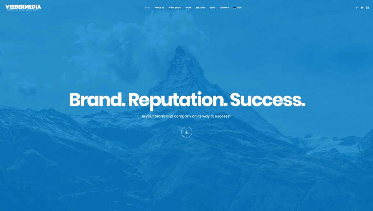
Next on our list, check out VeeberMedia. This agency packs a lot of information into its homepage, including sections about who they are, what they do, a small portfolio, social media links, and more. Still, it somehow manages to keep everything looking clean and uncluttered. Each section is distinguishable at a glance, and there are also individual pages that go more in-depth into all that information.
This approach works because some people will only check out your homepage, so it makes sense to include as much detail as possible there. As far as design goes, VeeberMedia uses a soothing blue and white palette with strong typography that’s easy to read. This website looks very simple, but it features tons of attention to detail and is highly usable, which is the hallmark of a great design.
13. Tall Concepts

Tall Concepts is a design agency with a deceptively simple website. It kicks things off right away with a full-width sliding gallery that showcases some of its top projects, linking to individual case studies for more information. The slider itself is nothing out of the ordinary, but showcasing case studies right away is a smart move. After all, this enables discerning customers to jump right in and discover what makes the agency stand out and what it can do.
Moving on, the Tall Concepts homepage makes excellent use of Uncode’s icon boxes feature to showcase their strategy, design, and engineering pages. Instead of just inserting a few plain icons, they’ve achieved a very nice effect by using contrasting backgrounds and text colors. Aside from those standout sections, you may also notice the way images subtly transition onto your screen. This technique is a simple way to liven up your website, without the need to use complex CSS or JavaScript.
14. oktoNet

Last but not least, oktoNet’s website is an excellent example of how to let your work do the talking as an agency. If you’re involved in the world of design, chances are that most of your visitors will want to check out your work right away instead of reading mountains of text. That’s exactly what oktoNet makes possible with their website.
To be fair, the agency does feature detailed information pages for each of the projects in its portfolio. However, its homepage is all about showcasing the agency’s best work, using Uncode’s grid feature. In this case, they went with a masonry layout, which enables you to highlight pieces of your portfolio by rendering the images on a grid at different sizes. It’s a very popular look these days, and you can implement it with Uncode by using accompanying titles or just your portfolio images.
Conclusion
In this day and age, your agency’s website is critical to landing clients. Even if you’re aren’t working in a tech-related field, your customers will expect your site to look professional and work smoothly. If it doesn’t, some of those potential clients might get the wrong impression and go over to your competitors instead.
Using WordPress and Uncode isn’t the only way to go about setting up a website for your agency, but it’s a killer combination. With these two tools, you can save a lot of time and money, and still get access to all the functionality you need. Take another look back at Infographic.ly and Dispatch, for example – both sites look amazing, and you’d be surprised at how easily this effect can be achieved.
Do you have any questions about how Uncode can help you set up a website for your agency? Let’s talk about them in the comments section below!