
One of the best ways to make sure people don’t skip over important parts of your website to find methods for calling attention to them. Some people use bold colors, and others go for eye-catching images. However, there are other, more creative approaches you can take.
Shape dividers, for example, enable you to separate key sections from each other and highlight vital information. The more unique the shapes you use are, the more effectively they’ll grab people’s attention and improve the overall appearance of your website.
In this article, we’re going to take a closer look at dividers in web design, and check out some examples of them in action. Then we’ll introduce you to Uncode Shape Dividers, which are a much bolder take on this feature. Let’s get to work!
What Dividers Are (And Why They’re Useful)
Dividers are very simple elements, and their name essentially sums up what they do. In a nutshell, dividers are the separations between two distinct sections on a page. Many websites simply use one background for a page’s entire design. In contrast, dividers can provide a visual cue about where one section ends and the next begins.
For example, imagine that you have an About Us section in the middle of your home page, followed by a contact form. With a divider, you can clearly separate the two elements. Plus, you can make each stand out with unique colors and backgrounds.
In most cases, you’d need to use come coding in order to add dividers to your pages. However, this task is much easier if you have the right tool for the job.
Introducing the Uncode Shape Dividers Feature

Adding dividers to your pages usually involves some amount of design work. However, we wanted to make the process as simple as possible for Uncode users, hence our new Shape Dividers feature.
Uncode enables you to choose from among 24 shapes, which you can set as dividers between your page sections. Among these shapes, there are several types of curves, as well as arrows, clouds, and even city skylines. Plus, you can add your own Scalable Vector Graphics (SVGs) to use as Shape Dividers, so the feature is very flexible.
As you might imagine, your dividers themselves are fully customizable. For example, you can invert shapes, and customize their height, color, and opacity. There’s even an option that enables you to hide the dividers on mobile devices, if you think it may help improve navigation on smaller screens.
If you want to go ahead and start tinkering with Uncode Shape Dividers, all you have to do is locate the Dividers tab within our visual builder. It should be right between the Row and Inner Row sections. If you like, you can read more about how to add Shape Dividers in our dedicated tutorial. For now, let’s show you some of the cool things you can do with this feature.
Uncode Shape Dividers in Action
As we mentioned earlier, there are many types of Shape Dividers in Uncode. Each has its own advantages and use cases. To illustrate the point, we’re going to show you a few of our favorite dividers in action. If you want to see the rest, you’ll have to test out the feature for yourself!
Curves
A common trend among dividers is the use of common shapes. Curves, for example, are as straightforward a shape as you can use, but that doesn’t mean they can’t look striking:
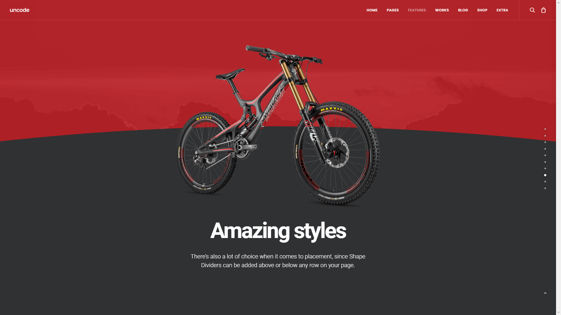
In this example, we use the curve to highlight a product we want you to pay attention to. The positioning of the bike makes it look like it’s about to leap off the screen, and it’s all thanks to a simple curved shape divider, which you can add in minutes using Uncode. As with all Uncode shape dividers, you can play around with your curve’s settings, such as its height and direction, in this case.
Clouds
Clouds are perhaps one of our favorite shapes when it comes to dividers. People often stick with simple shapes, such as lines and curves. However, there’s something to be said for adding a nice fluffy cloud to the middle of one of your pages:
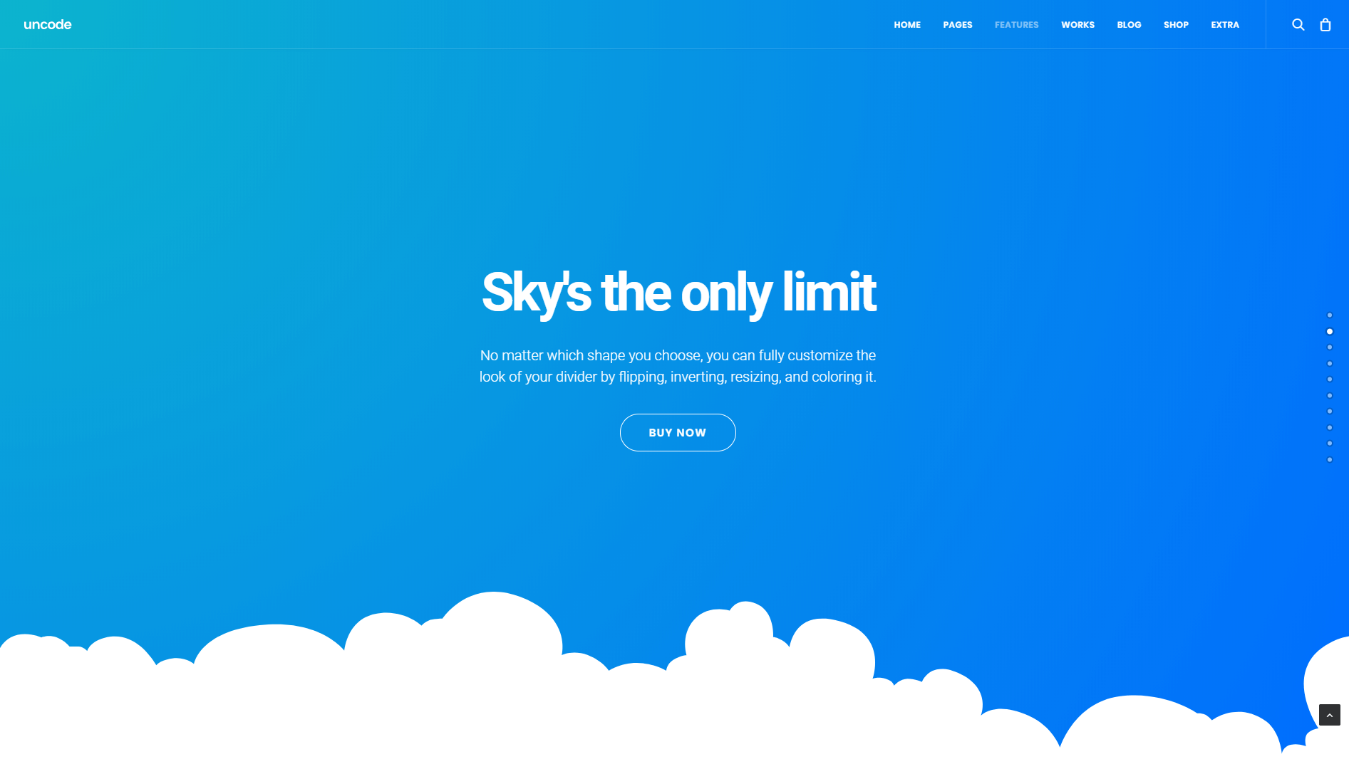
While clouds are fantastic for light-hearted and personal sites, keep in mind that they might not fit as well on more serious websites. However, it’s up to you to decide when to use each kind of Shape Divider.
Tilt
If you’re a fan of clean lines, then the tilt Shape Divider will probably be one of your top options. With a tilt, you get all the benefits of modern Shape Dividers, while still keeping your website looking professional and clean:
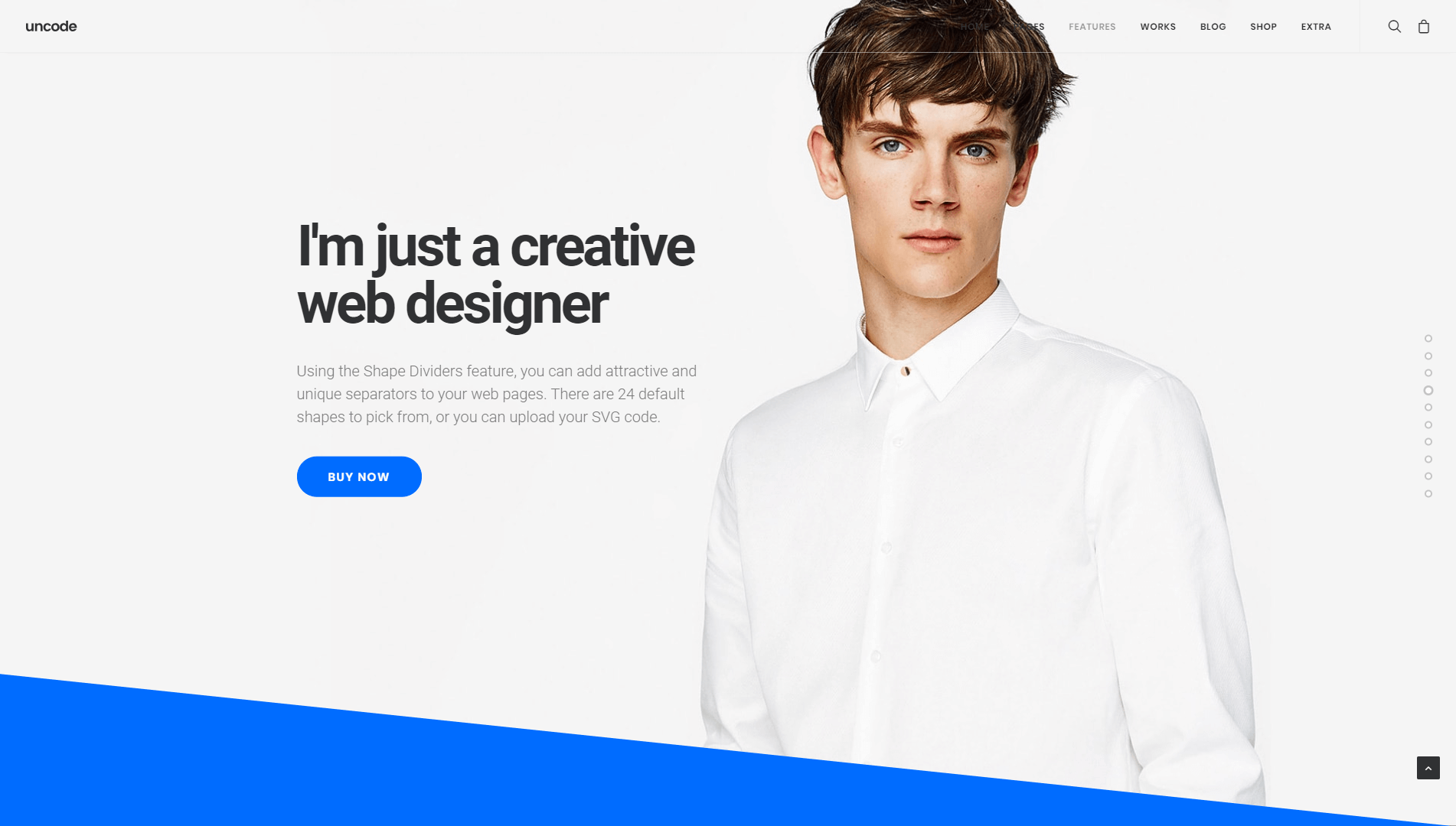
However, if you do want to have some fun with your tilt, remember that Uncode enables you to customize all your Shape Dividers. In this case, for example, you might invert the tilt to create some contrast between sections. You can also increase its height, in order to make it more pronounced.
Ray and Fan Opacity
If you want your website to really stand out, you’ll probably want to check out the ray and fan opacity Shape Dividers, which you can see in action below:
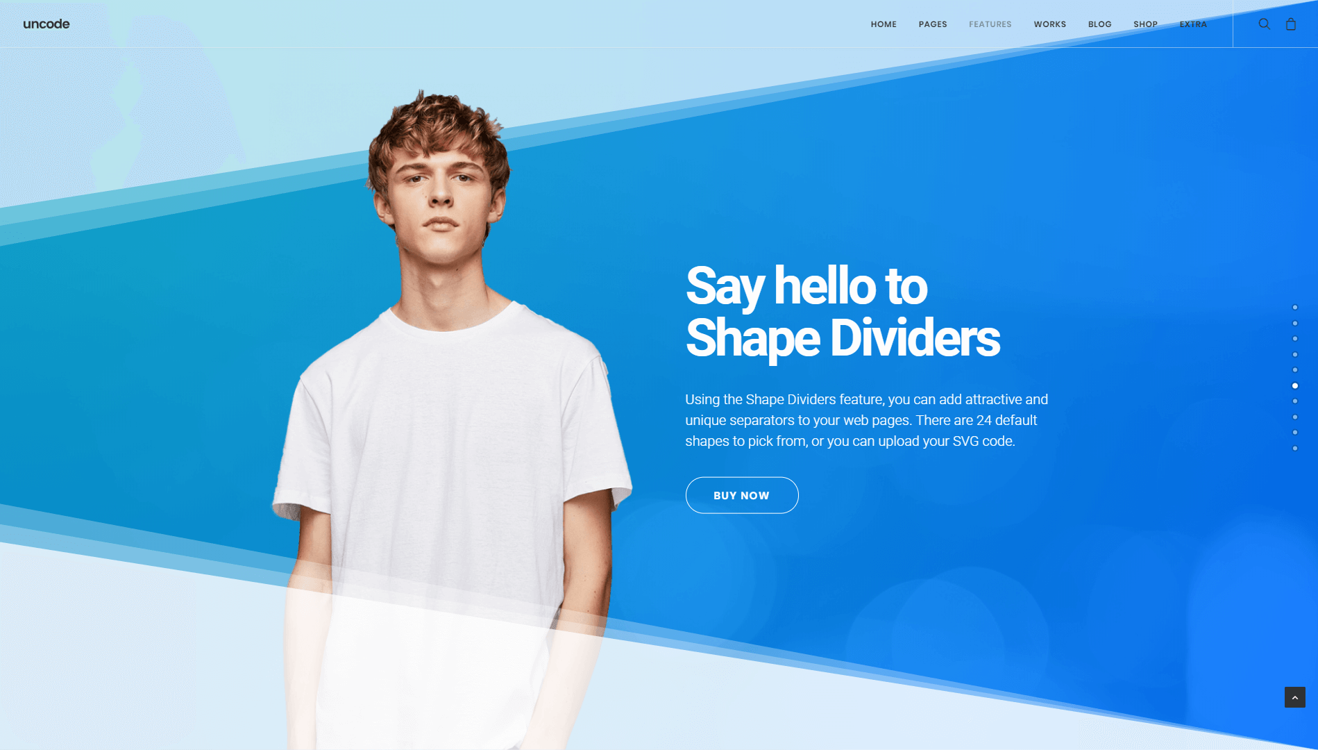
These shapes are essentially tilts with a gradient effect, which makes the lines look less severe. Plus, you can easily achieve a look similar to the example you see above, just by playing around with the dividers’ heights and colors.
Hills
Last but not least, let’s check out hills, which are Shape Dividers that feature multiple curves. By default, the curves themselves aren’t that pronounced, as you can see below:

The resulting look is perfect if you really want to highlight a specific section of your website. For extra points, you can try to achieve an effect like the one you see above, by using an image that ‘melds’ naturally into the section below the hills.
Options
The Shape Dividers options are located inside the Row and Inner Row sections, in the tab labeled Dividers. Here you find 12 useful settings, which can be mixed and matched to create awesome dividers:
- Shape Divider: select Default to use a pre-made shape, or choose Custom to upload your own Shape Divider using an SVG code.
- Shape Type: pick from one of 24 default shapes Curve, Curve Opacity, Curve Asymmetrical, Curve Asymmetrical Opacity, Book, Spear, Arrow, Mountains, Clouds, City, Triangle, Pyramids, Tilt, Tilt Opacity, Ray Opacity, Fan Opacity, Swoosh, Swoosh Opacity, Waves, Waves Opacity, Hills, Hills Opacity, Flow, and Flow Opacity.
- Shape SVG: select a custom SVG code. Unless modified by the color option, your custom SVG will retain the original color. When using a custom SVG, it is important that the SVG is inserted as SVG code and not as SVG file. You can do this using the Add Multimedia option by simply entering the SVG code. This way, the custom SVG will be easy to assign and modify in various parts of your site. Plus, you’ll be able to apply your own custom color.
- Shape Inverted: choose this option to use the inverted shape.
- Shape Flip: this option will flip the Shape Divider horizontally.
- Shape Height: set a custom height, in pixels or percentage, for your Shape Divider. When a height is specified in pixels, Shape Dividers use breakpoints to scale harmoniously in response to smaller devices or viewports. A display size above 1500 pixels will use the original height value, a display size from 1499px to 1180px scales to 80%, from 1179px to 960px scales to 65%, from 959px to 570px scales to 50%, and under 569px scales to 25% of the first breakpoint shape divider’s height.
- Shape Color: choose a solid color for the Shape Divider. Default color is white. Please note that it’s not possible to use a gradient, unless you upload your own SVG that already includes one.
- Shape Opacity: set a custom opacity for the Shape Divider.
- Shape Ratio: this setting preserves the shape aspect ratio: your shape will be enlarged outside the canvas to preserve its original ratio between width and height. This option is useful if your divider must maintain a precise shape, as with the Clouds or City default shapes.
- Shape Safe: select this option to enable a safe padding area. This option sets a the position relative to the content to avoid any overlap.
- Shape Z-Index: set to position the Shape Divider above or below your content. Z-Index controls are also available on Uncode on Rows, Inner Rows, and Columns. When Z-Index options are combined, you can create beautiful effects based on the overlap and intersections between multiple levels.
- Shape Hidden on Mobile: picking this option enable the Shape Divider visibility options for small devices and tablets.
Conclusion
When it comes to your website’s design, there’s always room for improvement. Adding Shape Dividers is something you can do rather quickly if you’re using Uncode, and it can really make your pages stand out visually.
With Uncode, you can choose from 24 unique shapes, depending on your site’s style and niche. Just remember that in order to get the most out of your Shape Dividers, you’ll want to use them to highlight important sections and information.