
Flexibility is a key feature of the Uncode theme. Browse through our showcase of real client works and you will see that building countless of different sites with Uncode without having to repeat yourself is not just an idea. It is a reality and it is done every day.
We continue introduce some of our beloved showcase creatives. Third out is Quba Michalski a Creative Director, Motion Artist, Filmmaker, and Creative Thinker with over two decades of experience in various disciplines of design.
Tell us about your business and your experiences with web design?
I am a freelance creative director and visual artist, working primarily in VR and AR. Over the past two decades or so, I have worked in many different disciplines of design – from DTP, through interactive, motion, VFX, live action. Most recently I have settled on Virtual Reality as my medium of choice – and have been working in this medium exclusively for the past 2 years.
Back in the 90’s (and early 00’s) I used to do a lot of web design myself. I started quite early, before WWW was really that popular (way before the introduction of modern web browsers like Netscape or IE). I taught myself HTML, then CSS, PHP and ASP and coded my designs in old-school text editor! Over time I moved from web to animation and motion, but I still fondly remember these early days.
What made you choose Uncode among thousands of other themes?
With my background in design, I wanted to be able to… well… design my own site. There are so many themes out there, but most have very little “wiggle room” – ending up with me having to adjust my content to what the theme designer wanted to achieve and not vice-versa.
I have found a few themes before Uncode, that I thought I could use, they would usually either lack one or more certain features I really wanted, or use some weird propitiatory CMS method – leaving me no path to migrate out should I chose to.
This went for years. My site grew meanwhile, running on a very old theme full of holes and vulnerabilities that were either discovered over time or introduced by me, attempting to update a no longer supported skin. When I learned about Uncode I’ve put it through the paces on a test server, and was happy to discover it had pretty much everything I was looking for.
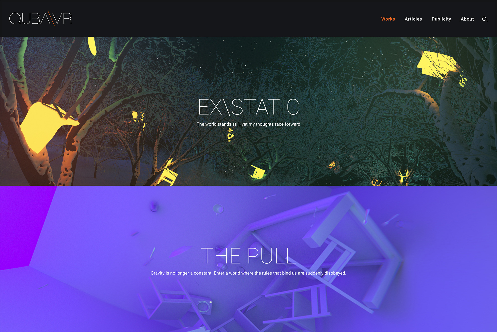
It was around the same time I decided to rebrand and establish QubaVR – which was the first of my sites to benefit from this theme.
What features of Uncode do you appreciate the most? How is the theme contributing to improving your business?
I’m gonna be honest with you – the feature I appreciate the most right now – is the one I initially extremely disliked. It is the color and typography management system. I am quite used to being able to easily throw any color or typeface on the page and experiment with them. With Uncode I need to first “register” new colors to the site’s palette, or add fonts to the typography presets.
At first it was making me furious – I felt my creativity hampered by this UX decision. Over time, however, I realized how much better my site has become thanks to this limitation. Instead of constantly introducing new visual grammar to the site’s identity, I have zeroed-in on the color and typography palette that’s consistent, clean and instantly recognizable. I am still able to do whatever the hell I want – but Uncode’s UX protects me from making hasty decisions – supplementing my workflow with a healthy dose of decision-making maturity.
Other stuff I really like – well, media management and oEmbeds are just fantastic. Still remembering my first website, designed for 640x480px monitors, I just love being able to use full-width 4K imagery on the site, and then re-use the same uploaded file for smaller elements. Layout tools are great – especially enjoying the ability to save presets for pretty much any element. Integration of Font Awesome and other icons, portfolio details for easy credits creation, dark-and-light themes, individual navigation loops, easy responsive toggles – there’s a lot there to like!
What are your thoughts on working with Uncode? If you purchased licenses for more than one project, why are you a returning customer?
As I mentioned before – Uncode does not force me to design in a certain way. It’s quite strict about its grid structure, but provides the tools to break it. It keeps close watch on type and color use, but if you wish to – you can put all the colors of the rainbow and all sizes of Comic Sans all over your page… if you really, really have to.
With Uncode, I was able to design my own site (https://qubavr.com) which features full-width images, lots of text, crazy embeds (images, video, VR, 360° imagery), festival listings and carousels full of download options. It also clearly separates the work portfolio from experiments and blog by using dark theme for the former and light one for the latter. It also helps me save up space by collapsing many sections using either tabs or accordion layouts – something I’m a big fan of.
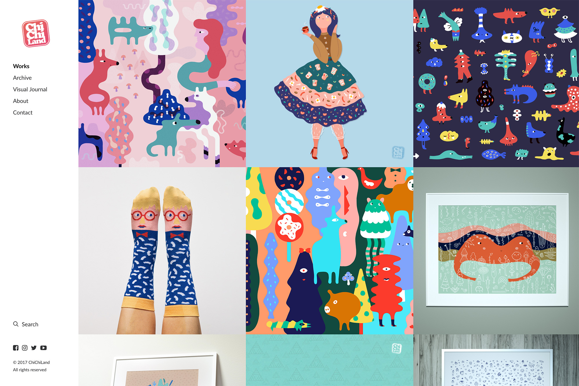
Having enjoyed the process, I then helped my wife and fellow artist, transition her site (https://chichiland.com) into Uncode. Seeing these two sites side-by-side it’s hard to believe they both run on the same theme. ChiChiLand is built on no-margin square grids full of illustrations, very little text, and plenty of lightboxes. The theme allowed us to easily vary the grid size for different sections. The main “works” section features large imagery in a 3-column layout. The Archive has more items, so the layout shrinks the individual sizes, going with 4 columns. Finally, the “Visual Journal” (blog) packs tons of content in a 6 column layout and some typography.
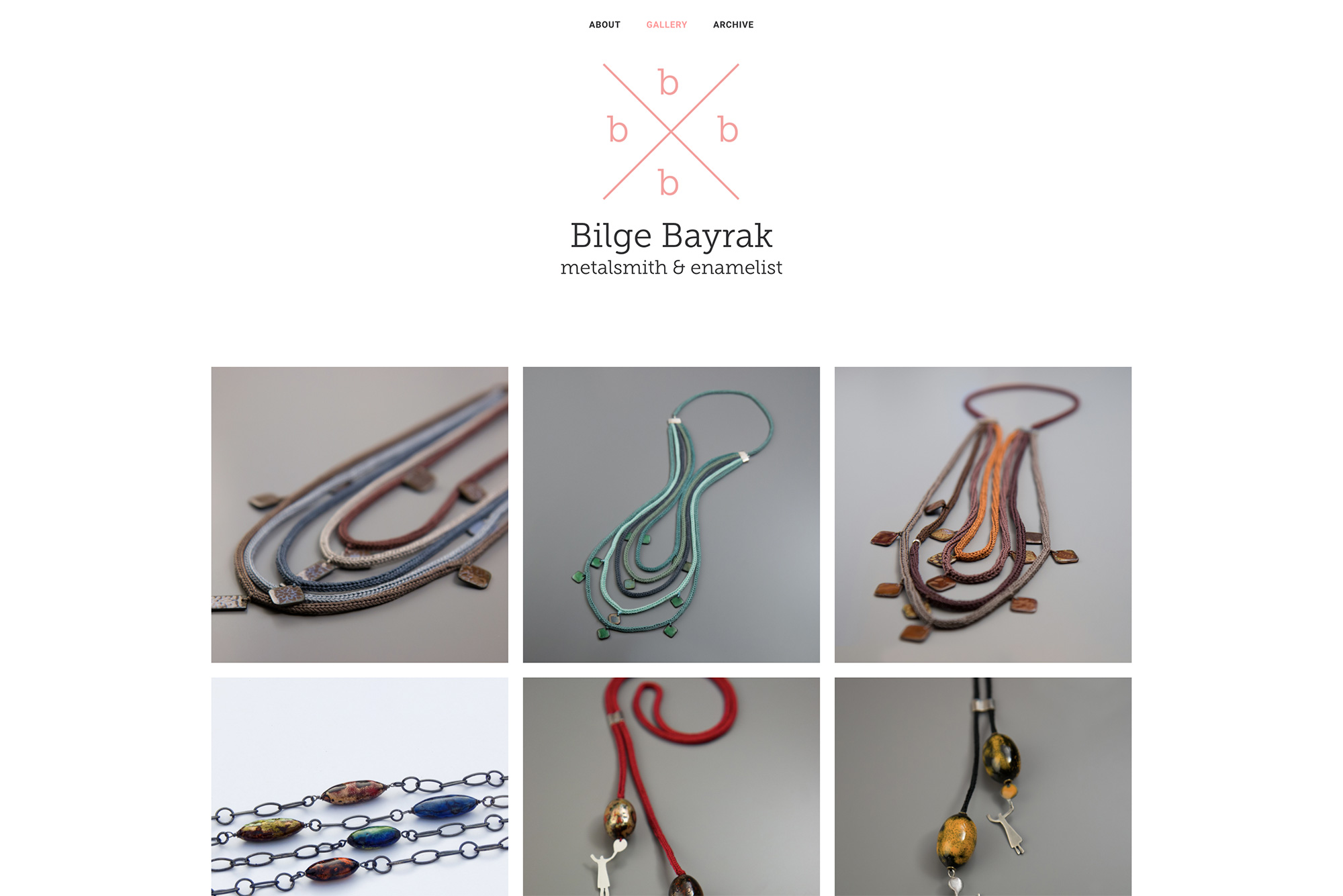
With my filmmaking and my wife’s illustration, we’re a pretty creative family. It goes even further – my sister and step-father are painters, while my mother-in-law is a metalsmith and enamelist. It was for her website (https://bilgebayrak.com/) that I came back to Uncode for the third time. It is much simpler than the other two – fewer sections, just the main gallery and archive – both running on a very clean, neatly spaced layout. Again – the site looks nothing like the other two, and makes use of small tasteful touches, such as gradient mouseover titles or animated thumbnails that slide into the view.
Most WordPress themes force a certain look onto the site – and as such, could be referred to as “skins”. The versatility of Uncode makes it something more than a theme – it’s a modular design system, open to creativity and interpretation.
In the past I’d often avoid talking about the themes I used on my website – wanting to avoid other sites looking just like mine. With Uncode, I am happy to recommend it to anyone, but especially to experienced designers who understand the design process and know what they want to achieve. I am confident each one will take the theme is a slightly different direction, creating a plethora of looks and styles, powered by the same engine.
What would you like to see in future versions of Uncode?
I’d love to see some sort of system for easily switching CSS of various elements depending on the width of the window. At the moment I often duplicate some elements on my page and then have them hide/appear in responsive fashion. It would be awesome if I could achieve the same result with a single element – just telling it how to adapt based on desktop/tablet/phone screens.
I’d also really like to see Visual Composer get a UI makeover – to make it a bit more lean. It’s a matter of personal aesthetic preference though – I just find its windows to be too big 🙂 – also, I don’t really think that’s in the hands of the Undsgn team.
Other than that – maybe the ability to easily define my own presets for image/thumb aspect ratios? I am really trying hard to find something! Uncode mostly already has everything I need.
See more of Quba Michalski’s stunning work here: https://qubavr.com/ or follow him in social media: Twitter, Facebook, LinkedIn, YouTube and Vimeo.