Introduction
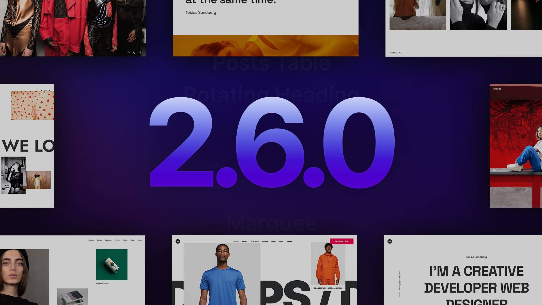
We are pleased to bring you Uncode 2.6.0 latest and greatest version of our pixel-perfect, creative, and WooCommerce WordPress theme. Uncode version 2.6.0 adds several options to help you create a stunning website.
In this update, we have paid attention to all users who creatively use Uncode for their portfolio, especially photographers. So arrives, the long-awaited new Lightbox with mobile touch gesture and the Load More option for the Media Gallery module.
This update also introduces three new modes for the Posts and Media Gallery module. The new performant CSS Grid method (for the creation of simple grids without the use of JavaScript), the modern Sticky Scroll (that adds horizontal contents scrolling), and the new Pattern mode (which allows you to create compositions of thumbnails freely for the Posts and Media Gallery modules).
In this update, also the new custom Navigation with which you can use to create efficient navigation between posts, projects, and products with the Page Builder.
In addition, the new Menu Transparent on Scroll allows you to have a transparent Navbar when you scroll the page, which automatically changes Skin according to the Skin of the main column of the Row next to the Menu so that you always have optimal readability.
Following the final release, we will publish 8 new demos and a lot of new sections wireframes.
We thank you in advance, and we kindly ask you to keep this information strictly confidential. Thank you!
New Lightbox
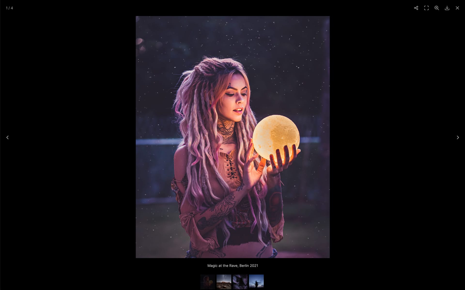
From Uncode 2.6.0 version, it is possible to use a new lightweight, modular, JavaScript image and video Lightbox gallery plugin. We have received over the years requests to update the old Lightbox plugin with a new plugin with touch events on mobile and new modern options. So we are proud to present to all users and especially to all photographers who use Uncode the new Lightbox based on the Premium script LightGallery. The new Lightbox is based on the most modern technologies to achieve the best performance and quality.
Modular: The new Lightbox is built with a modular architecture. Advanced transitions, options such as share, thumbnails, and others are added if requested.
Mobile: The new Lightbox is highly optimized for mobile and tablets to get a native look and feel with the Pitch and Zoom gesture options.
How to activate it
Please note that the old and new Lightboxes are not options that can coexist simultaneously. It’s necessary to choose one from the Core Settings, [ screenshot ] .
When the new Lightbox plugin is activated, Uncode will use the new script. If you migrate to the new Lightbox and have pages already created with the old Lightbox, the compatible core options will be automatically migrated to the new script.
It’s recommended in any case to visit your pages, set the specific settings of the new plugin, and save the pages.
Options
Below you will find a list of the available options:
- Skin: Specify the Lightbox Skin.
- Transparency: Specify the transparency style of the Lightbox background.
- Arrows: Specify whether to have navigation Arrows or not.
- Title: Activate this to add the media title.
- Caption: Activate this to add the media caption.
- Social: Activate this for the social sharing buttons.
- Deeplink: Activate this for the deeplinking of every slide.
- Actual Size: Set the magnification to real pixels of the image.
- Fullscreen: Set the fullscreen magnification on the monitor viewport.
- Download: Enable image downloading.
- Counter: Show the counter with the count of images in the gallery.
- Zoom Origin: Set the zoom effect from the thumbnail, this only works if you are using the image with the original ratio.
- No Thumbnails: Activate this for not showing the thumbnails.
- Transition: Slide, Fade, Zoom In, Zoom In Big, Zoom Out, Zoom Out Big, Zoom Out In, Zoom In Out, Soft Zoom, Slide Circular, Slide Vertical, Lollipop, Lollipop Reverse.
Differences from original LightGallery
Please note that the new Lightbox is based on the premium LightGallery script. The version present on Uncode is tailor-made, and it’s customizable according to the theme author’s taste to better fit Uncode needs. There is no way interest or support to replicate other functions offered by the plugin than those presented on the official demo of Uncode. Any customization, if required, should be done by users themselves.
Links
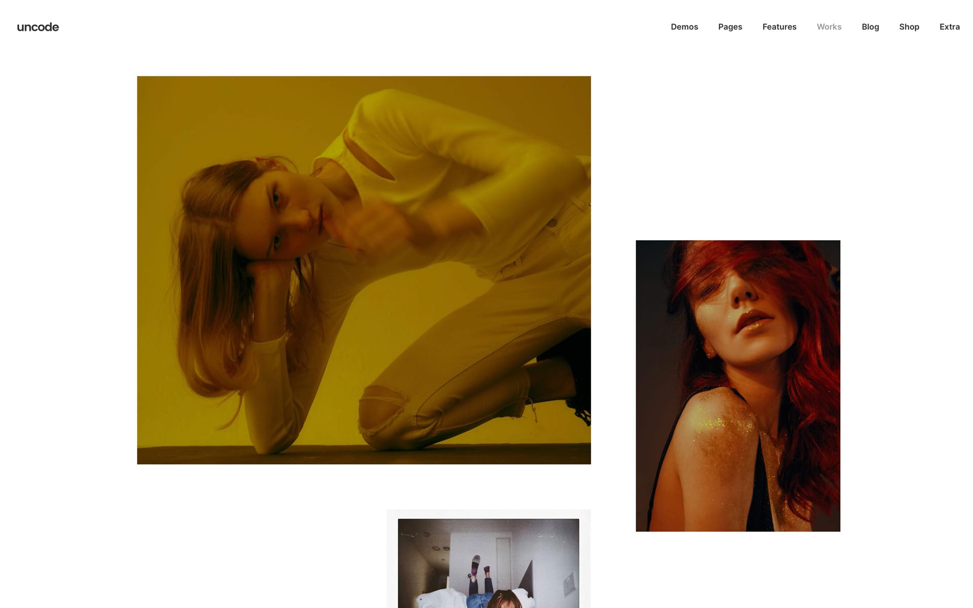
Pattern for Posts and Media Gallery
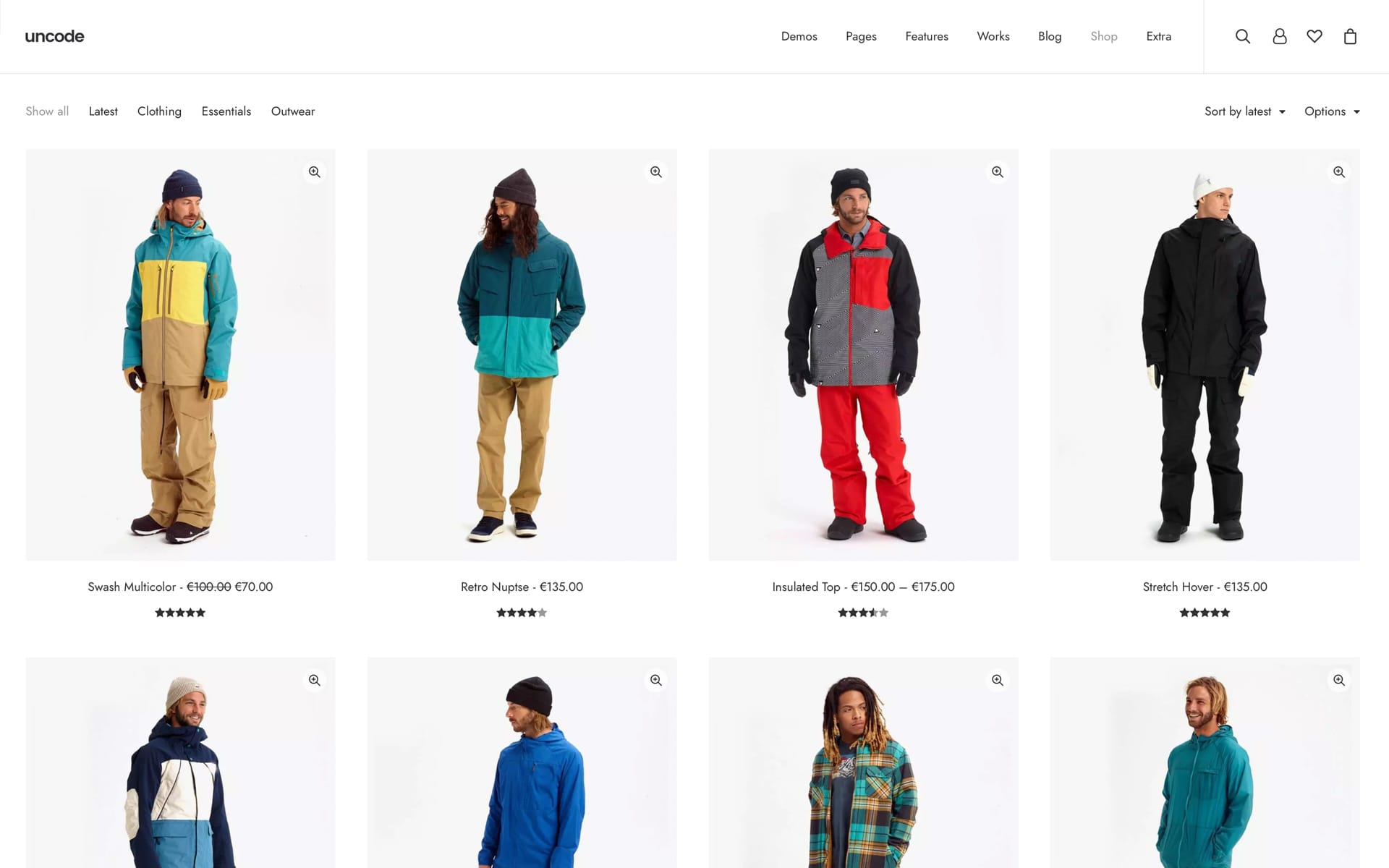
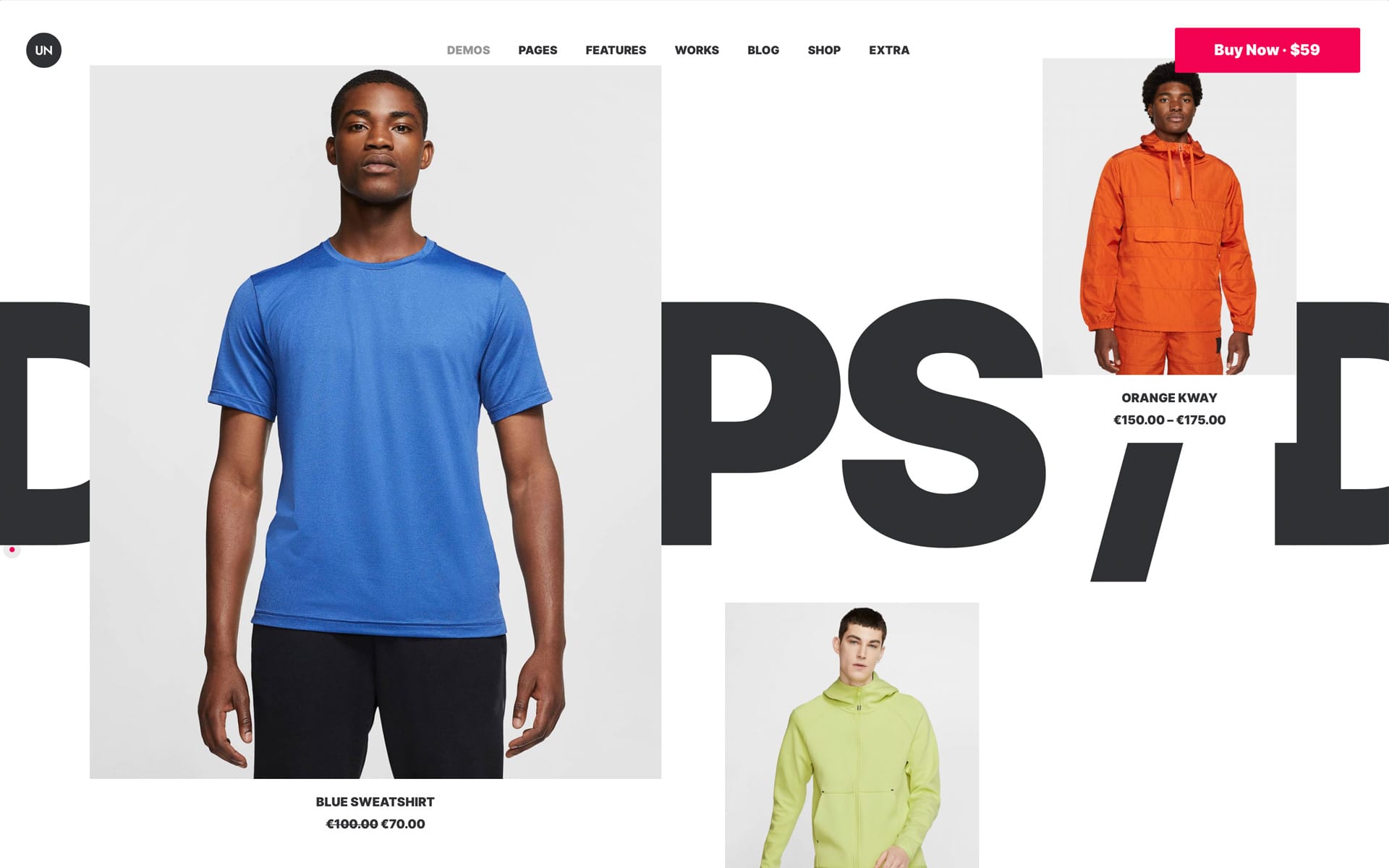
From Uncode 2.6.0, the Posts and Media Gallery modules offer a new layout variation named Pattern. With the custom Pattern, you can create modern and creative procedural grid layouts based on a Content Block with no limits on creativity. This new mode allows you to create creative and modern layouts, in complete freedom, with high visual impact, for your Portfolios, Blog Posts, Products, and Media Galleries.
Custom Pattern allows you to create a custom grid through the Page Builder and use it as a matrix to display your elements through an advanced procedural system.
How it works
Creating a Pattern layout is very easy because you take advantage of all of Uncode’s grid options, so plenty of design and responsive settings are available. Let’s see how to do it.
- First, you need to create the Pattern using a Content Block. Please note that once a Pattern is created, it can be used to display both Post Types (Blog, Portfolio, and Products) and Media Galleries of images. Create a grid to your liking, which will become your Pattern structure. Please read the specifications in the ‘Pattern and Rows Structure‘ section, [ screenshot ] ;
- Insert a ‘Placeholder‘ module in the columns where you want to display a thumbnail. The Placeholder module represents the position occupied by an element part of the referenced Query, so a thumbnail will be shown where the Placeholder module is placed. To better understand the functioning of the Placeholder module, you can read the corresponding section, ‘Placeholder Module‘. Please note that if you create a design of 3 Rows containing 6 Placeholder modules, and your Query or your Image Gallery contains 24 posts or images, Uncode will procedurally repeat your Pattern until all elements are shown. In this case, four iterations will be created (24/6 = 4). In a few words, the Pattern you have made will be used as a matrix to display all the content of the Posts or Media Gallery module, [ screenshot ] ;
- Now that the Pattern has been created, please open a page and insert a Posts or a Media Gallery module, select the Pattern mode and link the Content Block with the Pattern, [ screenshot ] ;
- Set the design options in the Block tab to your liking to define the layout of the thumbnails that are part of the loop, as is usually done in Uncode with all other design modes.
Note that once you have created a Pattern, it can be used from the Posts module and the Media Gallery module. In addition, the same ‘Pattern’ can be used by multiple pages and populated with different content.
Pattern and Rows structure
When creating a Pattern, you must create a container Row with Inner Rows to house the content (note that this is a requirement). However, the external Row is not considered when rendering the page because it is replaced by the Row that contains the Posts or Media Gallery module, [ screenshot ] ;
In a few words, when the page is rendered, the External Row contains the Posts or Media Gallery module, and the Internal Rows are the ones defined in the Content Block. Any kind of modification that is applied to the parent Row of the Content Block is non-influential.
So if you want to change the Background of a Pattern layout, you have to work on the Row that contains the Posts or Media Gallery module. If instead, you want to modify, for example, the spacing, the Skin, or the Background of the columns, you have to intervene on the Inner Row of the Content Block. Please note that if you want to space the columns on the vertical rhythm, you have to work on the Column of the Main Row.
To summarize, the Content Block first level parent Row acts only as a ‘technical’ container that is replaced in the rendering phase by the Row of the parent page.
Wireframes
From the Wireframes Plugin, it’s possible to import several ready-to-be-used Patterns. Please note that the Wireframe Pattern should be imported into a Content Block and then linked from a Posts or Media Gallery module on the main page. If you want to use one of the Patterns of the Wireframes plugin, please follow these simple steps:
- Create a Content Block, import a Pattern, and save the Content Block;
- Insert in the page where you want to display the Pattern a module Posts or Media Gallery;
- Activate the Pattern mode and associate the Content Block Pattern.
Placeholder module
Please use the Placeholder module to build custom layouts using the Posts and Media Gallery modules Pattern display feature. Once a Content Block with a Placeholder is associated with the Posts and Media Gallery modules, all Placeholders will be procedurally replaced by the elements part of the Query (Blog Post, Portfolio, Products, or Images).
In a few words, a Placeholder element represents the position of a thumbnail on the final page.
NB. Please note that the Placeholder is only visible as a stylization when used in a Content Block via the Frontend Editor to create a Pattern; this happens because the same pattern can be used on the final page to create loops of different Posts Type. When rendered via a page that uses the Pattern, it faithfully represents the real page’s rendering.
Notes
- Due to technical limitations, it is impossible to insert modules with animations inside a Column with Parallax. For example, please don’t use a Placeholder module with Opacity animation inside a column with Parallax since it is impossible to correctly calculate the position and instantiate the animation at the right moment.
- The Pattern method is not compatible with Sticky Scroll.
Links
Sticky Scroll for Posts and Media Gallery
From Uncode version 2.6.0, you can use a new interactive model for the Posts and Media Gallery module named Sticky Scroll. Sticky Scroll creates a jaw-dropping horizontal scroll-based animation.
Sticky Scroll offers a different and modern user experience when users scroll down the page. In fact, during the scrolling moment, the standard vertical scroll of the content is interrupted, and a horizontal scroll is automatically triggered. You’ve probably seen this effect on some recently awarded design sites.
The following section takes up the whole viewport and sticks on top until the horizontal scrolling ends. The section then unsticks, and the scrolling resumes.
How it works
To activate Sticky Scroll on your page, insert a Posts or Media Gallery module in your page, and in the General tab, set the option Sticky Scroll, [ screenshot ] ;
Next, you can define the Wrapper method:
- Row: other modules inserted in the same Row will scroll together with the module’s contents.
- Column: other modules inserted in the same Row will remain fixed to the layout and will not scroll together with the module’s contents. This option, for example, can be helpful if you want to insert a title always visible.
In the Module tab, there are different options to define the thumbnails ratio. Please note that it is essential to find the correct thumbnail size according to your layout because if the thumbnails go out of the viewport (i.e., are cut at the bottom), it will not be possible to show it.
Please find the possible settings:
- From ‘Regular’ to ‘9:16’: this method defines thumbnails with a fixed ‘ratio’. With this method, it’s possible to determine for the three main breakpoints the number of visible elements, ex:
- Fluid: this method defines thumbnails with a ‘fluid’ layout. With this method, it’s possible to determine both the number of thumbnails and their height for the three main breakpoints, ex:
- Relative: through this method, thumbnails with original ratio but the fluid height will be defined, ex:
Requirements and notes
To best understand how to use Sticky Scrolling, what are the best scenarios in which you can use this mode, and the scenarios in which not to use it, it is essential to understand how this script technically works.
- The width of the contained div is equal to the height of its parent section. The parent section is used as a trigger and controller for horizontal scrolling the content div. The same scrollable size, thanks to the Scroll Trigger element, makes the scrolling feel natural, [ screenshot ] ;
- It is highly recommended always to use a Posts or Media Gallery with Sticky Scroll with 100% height Row. This is required when using Fluid and Relative heights;
- Note that you can’t insert another module in the same Row after a Posts or Media Gallery with Sticky Scroll option;
- If you use it in a Header Content Block, it must be the only Row;
- It can cause problems with the boxed site layout because it goes in position fixed, and you can’t apply the ‘overflow: hidden’ property;
- Please pay attention if you use to embed videos like Vimeo and YouTube because they are designed to have a specific ratio format.
Links
CSS Grid for Posts and Media Gallery
Available from Uncode 2.6.0 version, the new CSS Grid mode for Posts and Media Gallery module. This model is a simplification of Masonry designed with performance in mind.
Thanks to CSS Grid is possible to create simple grids without using JavaScript. According to our tests, there is a significant increase in Google PageSpeed:
- With Filters and Animations: CSS Grid 68, against Masonry 64;
- Without Filters and Animations: CSS Grid 85, versus Masonry 78.
The CSS Grid can be activated from the tab General → Layout, [ screenshot ] .
CSS Grid seems to not differ a lot from Grid layouts made using Masonry (even if it’s a complete code rewriting). When working in the admin the only real difference is how you define the number of thumbnails for each Row. There are in fact, 4 breakpoints where you can choose for each the number of thumbnails to show and the size in pixels (down) from which the value is applied, [ screenshot ] .
Suppose you wonder why the Masonry and Metro layouts don’t have such simple controls. In that case, it’s because these are based on a calculation of 12 divisions on the container’s width (operations necessary to allow to realize all the variations of Posts and Media Gallery layouts for which Uncode is famous).
Please note that CSS Grid is recommended in all basilar layouts where thumbnails are perfectly aligned with each other, and there are no variations. You can notice that it is impossible to change the ratio and the width per single thumbnail in the Single Block tab as it happens for Masonry. The new CSS Grid method is the best choice if you need to create a classic Grid design.
Links
Custom Navigation
From Uncode 2.6.0 version, it’s possible to design the Navigation Bar with the Page Builder. Thanks to good navigation between posts, portfolio items, and products, it’s possible to increase the number of pages viewed on a website.
With Uncode, you have maximum flexibility to create your own Custom Navigation. This can be made using the new and helpful Navigation module or creatively using the Posts module (so you can have dozens of layout combinations).
Navigation module
The Navigation module allows you to create a custom navigation with several design options. Thanks to these options, you can replicate most of the navigation designs. It is possible to configure Title, Label, Index, Thumbnails, Loop, and related Responsive Settings (both through Stacked options and visibility settings), [ screenshot ] .
Posts module Navigation
The Posts module (Grid, Grid CSS, and Titles methods) can be used to design creative navigations by activating the Dynamic Query → Navigation, [ screenshot ] .
When activating this option, a new tab, Navigation, is presented with the specific options needed for the Navigation setup, [ screenshot ] .
Please note that the options present in the Build Query tab are not taken into account when activating this option. The Query automatically refers the previous and next Post to one of your pages.
Note that it’s also possible to choose whether to show only the Next or the Prev if you want to show only the next Post.
The other options of the Module and Block tabs, useful to define all layout variations, remain unchanged and will allow you to customize the design to your liking.
Loop: When using this mode, the ‘Loop’ is always active; when you arrive at the last element, the first element will be presented as Next (and vice versa). It is not technically possible to modify a custom layout by excluding an element. If a Navigation without ‘Loop’ is a requirement, you need to use the Navigation module of the Page Builder.
Dedicated Theme Options and Page Options
The new Navigation (both realized through a dedicated module and Posts module) can be inserted in a Content Block to be easily presented on more layouts. It’s possible to associate the Content Block Navigation to a template from the Theme Options (general) and the Page Options (for a single diversified page). Please note that Navigation is active for Posts, Portfolios, and Products. You can find the Navigation option, for each Custom Posts Type, in:
- Theme Options → Navigation → Navigation Type/Navigation Content Block, [ screenshot ] .
- Page Options → Navigation Type/Navigation Content Block, [ screenshot ] .
Wireframes
In the Wireframes Plugin, you will find some different configurations of the Navigation module and Navigation Posts module ready to use. You can search for them by typing ‘navigation’ or through the appropriate category. Note that it is suggested to import them into a dedicated Content Block, as explained above.
Links
Menu Sticky Transparent with Skin change
Thanks to this new option, it is finally possible to have a completely transparent menu even when you scroll the page.
Moreover, the menu Skin will adapt to the Skin of the Main Column of the Row adjacent to the Menu. To activate this option please activate the
Theme Options → Navbar → Animations → Menu Desktop Transp. Scroll and Menu Mobile Transp. Scroll, and the Theme Options → Navbar → Visual → Menu Skin Changing Scroll.
Please note that this option works if enabled by Menu Sticky or Menu Hide options.
Links
Media Gallery new options
Matrix on Media Gallery
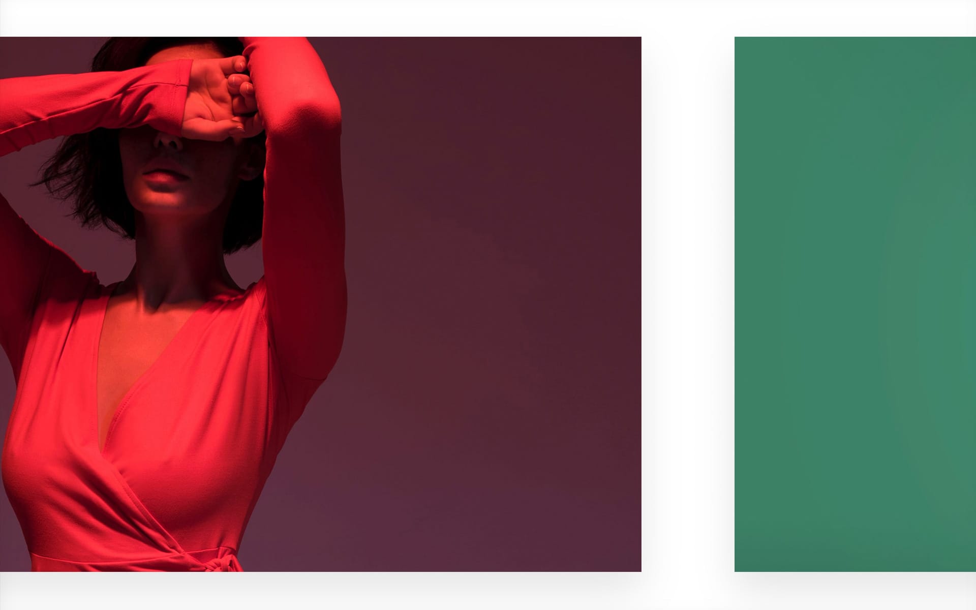
Finally, it is also possible for the Media Gallery module to apply variations through the Matrix option. Through the Matrix method of the Single Block tab, it is possible to use variations to specific grid positions and not to the elements themselves. This means that it is possible to create a replicable pattern, [ screenshot ] .
Load More on Media Gallery
Since Uncode 2.6.0, it is possible to create image galleries using Load More. This option is handy when you have many images to show and you want to speed up the page’s loading. In the Module tab, you will find the Load More Preloaded (defines the number of elements shown when the page loads) and Load More Loading (defines the number of elements loaded with each iteration of the Load More), [ screenshot ] .
Filters on justified Media Gallery
This update also makes it possible to use filters on galleries with
Justify layout. The Justify layout is an excellent choice for professional photographers who want to create a modern image gallery that fluidly manages thumbnails of various sizes.
Sticky Heading and classes
From Uncode 2.6.0, it’s possible to take advantage of a new ‘Sticky’ option for the Heading module.
Thanks to this option, it is possible to have a heading that remains stikcy in the center of the Row when you scroll this Row. You can find this option in the settings of the Heading module, [ screenshot ] .
Associate it with the Marquee option to create a modern design effect.
You can also choose two modes when you enable this option, Relative and Absolute. With this option, you can decide whether the title should preserve its footprint in the layout or be positioned absolutely. Please note that the ‘sticky-trigger‘ and ‘sticky-trigger-absolute‘ classes are also available if you want to replicate the same effect on other modules, such as the Single Media module, [ screenshot ] .
Fixed Elements (formerly Vertical Elements)
In Uncode version 2.6.0, the Vertical Elements module has been renamed
Fixed Elements. This version introduces the possibility of having horizontal texts that remain fixed in the viewport when you scroll the page.
Clipboard Plugin on Frontend Editor
Since Uncode version 2.6.0, it’s possible to take advantage of valuable Clipboard plugin enhancements that can help you speed up your workflow.
Clipboard is a helpful plugin for copying and pasting WPBakery modules into the same or other pages, that can be installed or updated from Uncode → Install Plugins.
With the newly introduced options, it’s now feasible to use the Clipboard plugin even when working on the Frontend Editor.
Let’s clarify the functionalities:
- C : Copy an element;
- C+ : Copy an element and add it to the clipboard stack;
- X : Cut an element;
- X+ : Cut an element and add it to the clipboard stack;
- P : Paste the current copied element or paste the clipboard stack;
How it works
Click Paste on any section/row on the same page or on any other page to paste the section/row from the Clipboard below the section/row. You can paste the same section/row as many times as you want.
If you want to copy and paste a stack of sections/rows, click Copy+ to add a section/row to the clipboard stack (click Cut+ to cut). When you click Paste, all sections/rows will be pasted in the same order as they were added to Clipboard. Please note that when you want to create a stack of sections/rows, you have to start with Copy/Cut and continue with Copy+/Cut+.
Copy/Cut will clear the current stack before adding a section/row to Clipboard.
If you want to copy/cut the content of the column, Copy and Cut commands above the column will show up when the mouse pointer is placed above the column. If you click Copy, the content of that column will be placed on the Clipboard (click Cut to cut content elements). Go to some other column and click Paste to paste column content from the Clipboard.
Place a mouse pointer over the element toolbar to get clipboard commands for individual elements in columns.
Toolbar
In the main Toolbar, there are a few new icons. Let’s see how these work to understand how to get the most out of Clipboard, [ screenshot] .
- A: Copy icon;
- B: Indicates how many items are saved in the clipboard stack. If clicked, it empties the clipboard stack.
- C: Paste copied items from the clipboard stack.
Note: Pending on the front end can be slower than on the back end, depending on the number of elements (and subelements) in Clipboard.
Note on Row and Inner Row on Frontend Editor
Please note that it is NOT recommended to copy and paste whole rows or inner rows of content when working with Frontend Editor. In fact, the plugin rebuilds the copied Row or Inner Row, inserting one shortcode at a time in a progressive way. This involves waiting times that can be longer if you paste structures with many elements.
If you want to copy and paste a Row or Inner Row on the same page is recommended to use the clone command that, in this case, is much faster and performance, [ screenshot ] .
New Demos
As always, new pre-made designs are ready to be imported. The new designs take advantage of the new options.
New Portfolio single pages
This update presents a restyle of the Portfolio single pages. With Demo Contents, it’s possible to install many more variations of custom designs created with the Page Builder.
New Wireframes
We could not miss the new Wireframes. Ready to be imported new designs for ‘CSS Grid’, ‘Sticky Scroll’, ‘Fixed Heading’, ‘Navigation’ and many ‘Patterns’.
How to update Uncode
There are three methods to update your theme: the easiest way is the Automatic Update which requires you to register your purchase, the Envato Market Plugin update method and the traditional method that involves more steps via WordPress or via FTP. Please find more info in the dedicated documentation:
Links
Change Log
2.6.0 (2022/04/11)
ADD:
- New Lightbox
- Sticky Scroll
- Custom Pattern
- CSS Grid
- Navigation module
- Navigation query for Posts
- Transparent menu on scroll with Skin change
- Native Media Player option
- Sticky Heading
- Matrix on Media Gallery
- Load More on Media Gallery
- Filters on Justified Media Gallery
- Semantic Titles for Media Gallery
- WooCommerce Default Product Gallery
- Fixed Element horizontal option (old Vertical Text)
- WooCommerce 4.6.0 compatibility
- New Wireframes

IMPROVEMENTS:
- Theme Options performances
- Compatibility of some scripts when jQuery Migrate is disabled
- Frontend Editor animations on shortcode updates
- Some touch events for old mobile devices
- Sticky menu on load
- Modules UX on Frontend Editor: Tabs, Buttons, Maps, Accordions
- Filter scroll and items animation
- New Gutenberg styles and SVGs removed with performance option

FIX:
- Default color for selects dropdowns (Win issue)
- "uncode_transient_users" optimisation
- Autoload set to nowhere not necessary
- Theme Options optimization when saving and loading
- Theme Options and WPML unnecessary filter removed
- Optimize CSS selectors for grids
- Isotope optimization that prevents from being called unnecessarily
- Parallax minor JS improvements
- Stripe gateway with Apple Pay payment method
- CSS Blockquote
- CSS Load More area
- WPML with PHP 8.0+ and Horizontal Center Menu
- Default value for carousels with PHP 8.0+
- Share issue between Theme Options and Page Options
- Album Gallery with Poster video image
- Media Library list mode with SVG
- Simplify Single Block tab with Metro height
- Multiple Posts module with Dynamic Query on the same page
- Product filters display issues on mobile devices
- Search results content including shortcodes
- Dynamic text formatting
- Carousel height and vertical alignment
- Better targeted product filter selectors to avoid conflicts Main Menu
- Single Portfolio and Content Width
- Full-screen mode for self-hosted videos in sticky columns
- Carousel autoplay in Sticky Columns
- Safari and print dialog events
- Window resize event issues
- Body frame on Safari
- Shadows in Titles post layout
- Safari mobile and window height (address bar problem)
- IE javascript issues
- Overlay Menu close icon with Sticky Navbar
- Safari and wrong Navbar re-position on scroll to top
- Instagram browser and background image width
- Icon Box module and SVG images vertical alignment
- Color Changer issues: z-index and position detect
- Search icon Skin
- Overlay text animations
- Product quantity in Cart and stock availability
- Dropdown menu on top Navbar
- Center Double Menu glitch with SVG logos
- One Page Scroll navigation
- WooCommerce quantity variation width
- Highlighted and animated texts
- Overlay Blend Mode dependencies
- Single Tab on Vc_Gallery
- Slider fields on WP Bakery modules
- Big Text on Frontend Editor

UPDATE:
- Uncode Core 2.6.0
- Uncode WPBakery Page Builder 6.8.0
- Uncode Wireframes 1.4.0
- WPBakery Page Builder Clipboard 5.0.2
- Revolution Slider 6.5.19
- LayerSlider 7.1.3