
Introduction
We are pleased to bring you Uncode 2.4.0 latest and greatest version of our pixel-perfect, creative, and WooCommerce WordPress theme.
This is Uncode’s 15th major update, and with this update, we are pleased to present a new unique and exclusive system for creating and managing responsive images named Dynamic Srcset. This can be considered the performance update Step 1 of a significant optimization we are preparing on Uncode.
This system can be considered an evolution of the Adaptive Images that you already know. As it was for Adaptive Images, this is one of the most advanced systems for responsive images present on a WordPress theme. Without using Ajax and then server-side resources, the Dynamic Srcset, only by taking advantage of native features of modern browsers, can provide perfect responsive images for every viewport and device with pixel-perfect precision.
The update also introduces new features for your workflow, such as the Color Picker for all Page Builder modules, and in addition, new creative features such as Background Color Changer, the Vertical Elements, the Parallax scroll for Page Builder modules, custom and special Cursors, and new options for your menus.
Dynamic Srcset Images
Uncode 2.4.0 introduces a new option for responsive images named Dynamic Srcset. The Dynamic Srcset creates responsive cropped images and serves only the appropriate version depending on the visitor’s viewport and device based on the ‘srcset’ attribute. Different visitors have different devices (laptops, mobile phones, tablets), each with its screen resolution. The Dynamic Srcset considers the device’s resolution, updates the ‘srcset’ value, and then serves the right-sized image for each situation.
The Dynamic Srcset assigns first a transparent placeholder to the ‘srcset’ attribute, calculates the size of the container, and updates the ‘sizes’ attribute with the correct dimension. As soon as this calculation is ready, the ‘srcset’ attribute is replaced with the original list of images that WordPress generates so that the browser can pick the most appropriate responsive image.
Native browser support: Dynamic Srcset takes advantage of the modern browser’s native ability to choose the most appropriate image using the ‘srcset’ attribute. This attribute allows defining a list of different image resources and size information so that the browser can pick the most appropriate image based on the actual device’s resolution. The new system is developed without the use of Ajax calls, as previously done by Adaptive Images.
Custom Breakpoints: As for the Adaptive Images, it is possible to define how many and which breakpoints to set through the “Image Sizes Range” option. Each breakpoint corresponds to creating a new ‘srcset’ value and, therefore, a new responsive image size; having many breakpoints involves increasing responsive thumbnails on the server. A good compromise can be to use the default “720,1032”, or increase them to “210,250,360,480,720,945,1032,1350,1500”.
Crops and Thumbnail Size: Also, with the Dynamic Srcset method, it is possible to use the numerous crop options within the Uncode modules (example 1:1, 2:3, 3:4, 9:16). All themes have a small set of available crops (thumbnail size). During the creation of a design, designers are then bound to use only these sizes or use the native upload ratio; this is a limiting process for which designers must prepare the images with the right crop before uploading them into their WordPress installation. On Uncode, this process is automated since the Dynamic Srcset system creates on-demand all the responsive versions depending on the crop chosen inside the module.
Srcset on container: WordPress uses the ‘srcset’ attribute taking into account the size of the browser and not the actual size of the container in which a set of images is used. Uncode solves this problem by updating the ‘srcset’ attribute in real-time, calculating each container’s correct width, reaching an incredible level of perfection.
WordPress native and plugins: The Dynamic Srcset system creates and returns images according to native WordPress standards, albeit through a set of fully configurable options that isn’t present on any other theme. This means that new versions of responsive images will be found, handled, and processed by external plugins, such as ShortPixel, to optimize final files.
Lazy Loading: Another great advantage is that thanks to Dynamic Srcset, you can take advantage of the native Lazy Loading of WordPress. Lazy Loading allows your website to only load images when a user scrolls down to the specific image. So if you have a very long page with many images, the images below the fold will be loaded only when the user scrolls down to that position. This means faster loading times.
How it works
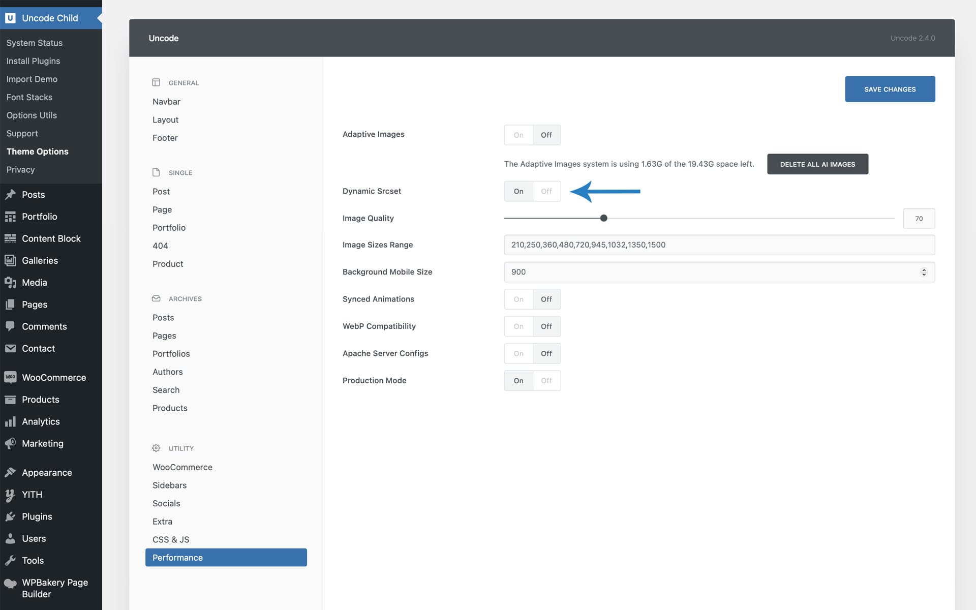
The Dynamic Srcset can be activated in the Theme Options > Performances tab. To activate this option, it is first necessary to deactivate the Adaptive Images and delete the Adaptive Images that have already been created using the “Delete all AI Images” button as prompted by a dedicated notification popup.
Settings
Image Quality: This option adjusts the image’s compression quality. 70% is a value that, according to our observations, represents an excellent compromise between image quality and optimization.
Image Sizes Range: This option defines the different breakpoints that Uncode will use to create responsive image versions; each breakpoint corresponds to the creation of a new value in the attribute ‘srcset’ that will be available for the browser.
Background Mobile Size: Unlike standard images embedded in a page via the “src” attribute, backgrounds do not yet have native cross-browser support (something similar to the ‘srcst’ attribute). With this option, you can define an alternative size to be used on mobile devices.
Synced Animations: This option makes sure that possible animations are triggered only when the image itself is loaded. This option synchronizes the start of animations with the actual loading of the images.
WebP Compatibility: Enable this option to serve WebP images to compatible browsers. NB. Uncode doesn’t create WebP images automatically; this is a feature reserved for dedicated plugins or custom server scripts. To create WebP images, we recommend you use the ShortPixel plugin.
Notes
Dynamic Srcset images are created when you first load a page and not when you work with Frontend Editor, so please visit a page after completing it to create all responsive versions of the images used. Suppose you experience a waiting time when you visit a page for the first time. In that case, this is caused by your server that is creating all necessary crops (for example, if you have inserted 5 breakpoints and have 20 images, the server will have to complete 100 images). It takes no more than a few seconds, and only the first time a new page is visited.
The new Color Picker
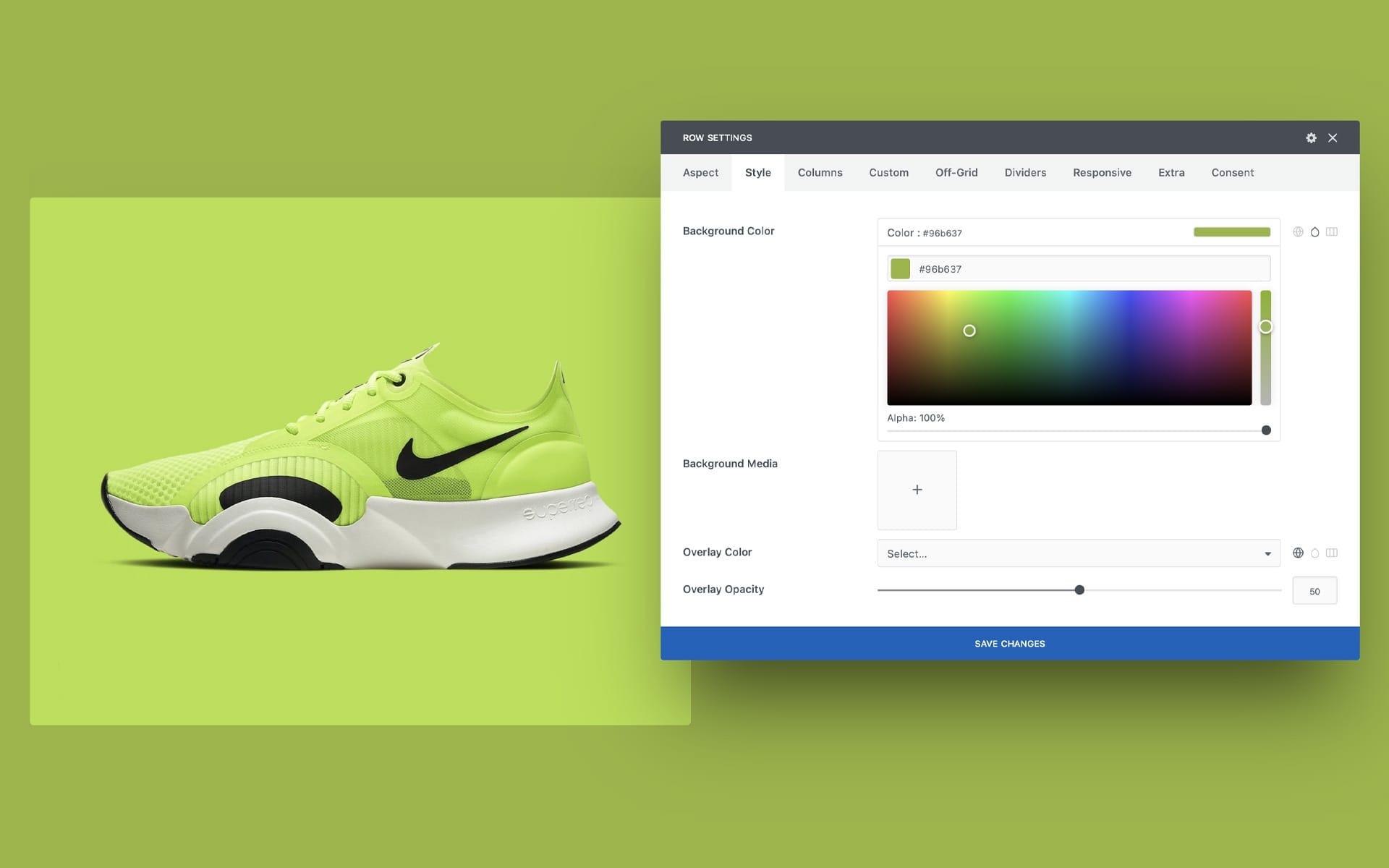
With this update, we introduce a brand new Color Picker to Uncode. This feature will scale up and differentiate your workflow experience.
If you’ve built Uncode sites before, you know that Uncode uses a centralized system for color management named ‘Palette’. We always think that having centralized colors is a huge advantage. Still, we also decided to allow the users to create colors to be used only in a particular situation to make your workflow more efficient.
From this update for all Page Builder modules, you will be able to use the Color Picker. The Color Picker allows you to create at the moment solid colors or gradients. So the color selection is enriched with a powerful three-choice system: the Palette colors (or also known as Global Colors), the Color Picker flat colors, and the Color Picker gradients.
You can find the new Color Picker in the Page Builder modules, for example, in the Row Background and Overlay or in the Heading or Text settings.

Background Color Changer
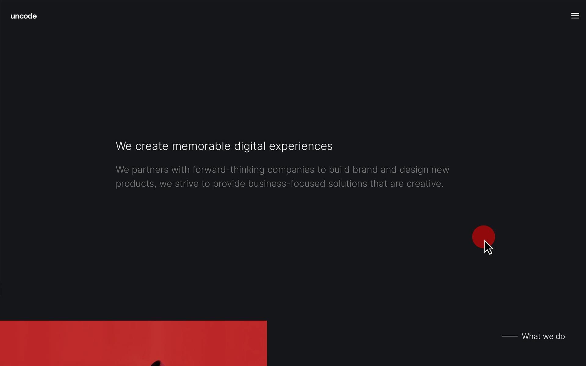
The Color-Changer is a new and modern effect that you’ll find helpful in creating phenomenal landing pages that capture the visitor’s attention by emphasizing the content you’re presenting. As the name suggests, with Color Changer, it’s possible to smoothly fade your sections’ background color and Skins while scrolling the page and creating a brand-new dynamic experience.
With the Color Changer, you can change the background color every time a new section with this effect applied enters the viewport. By softly changing the background color, you can highlight your content and focus the attention of your visitors.
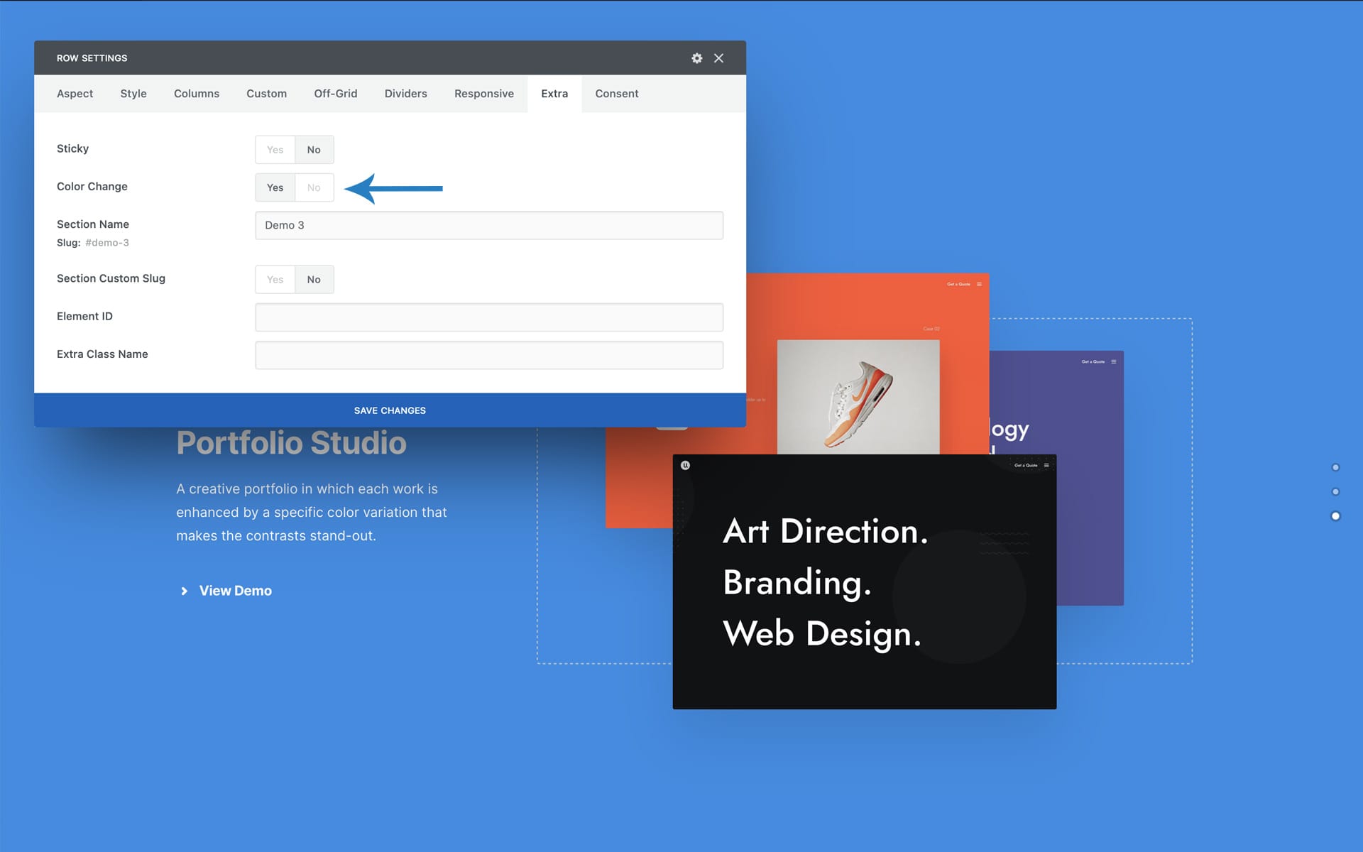
How it works
To use the new Background Color Changer, please follow:
- Create at least two Rows (it is recommended to have rows high enough to fill the viewport);
- Choose two different background colors for the Rows;
- Apply for each Row the Color Changer option that is located in the Extra tab.
Note: Please note that the Background Color Changer effect is disabled in the Frontend Editor, and that it’s not available when a Gradient Color is selected.
Vertical Elements
The Vertical Element module, available from Uncode 2.0.4, allows you to insert in your designs vertical texts (or social icons) to create creative layouts that go out of the ordinary.
These can be used in the natural flow of the layout (with different positioning options) or the “fixed” position (i.e., absolutely on the viewport).
With these options, it is possible to enrich the design of your sections with new typographical elements, but it is also possible to create modern Call to Actions that will be presented on the side of your page.
Please note that the Vertical Element is an element inserted in a Column, so it inherits the Skin, possible Font Family, and optionally the visibility on mobile devices.
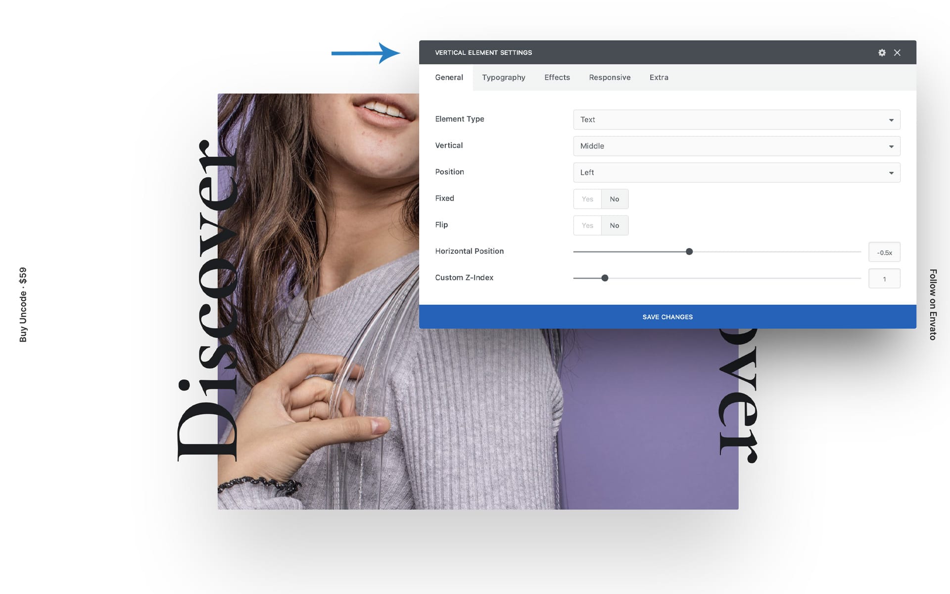
Options
Here are the options available to decide the positioning of the elements and other properties:
- Fixed: Applies the fixed and absolute positioning to the viewport;
- Vertical: Specify the vertical alignment;
- Position: Specifies the position;
- Flip: Specifies the orientation;
- Horizontal position: Specifies the horizontal position of the elements;
- Vertical position: Specifies the vertical position of the elements if this is different from Middle;
- Custom Z-Index: Sets a custom z-index to ensure the element’s visibility (only if not fixed);
- Typography: In this tab, you can define all typography controls.
Effects
For the ‘Fixed’ option, there are several effects and animations that allow the vertical elements to be used in different situations:
- Show After Scroll: Activate to show the element after scrolling the viewport;
- Difference: Applies the Blend mode ‘Difference’, useful to make an element always visible, especially recommended on white and black layouts.
Same Vertical Elements on all pages
To create fixed vertical call to action present on all the pages of your site, we suggest inserting your Vertical Element module inside the Footer Widget Content Block Area, or any other Content Block element repeated on all the pages of the site. you can place these elements in an existing column of your footer or for more control in a dedicated Row:
In your Footer Widget Area please:
- Create a new Row;
- Insert a Vertical Element;
- Collapse the Row height (setting 0 on the Custom Padding value) so that the Row does not affect the layout;
- Set the Fixed option;
- Set, if necessary, the Column options (Skin, Font, Responsive Visibility).
Parallax on Columns, and Modules
The Parallax effect is a modern design feature commonly used to create an engaging homepage or a landing page that stands out. For the Text, Single Media, Heading, Button, Posts, Media Gallery, and Icon Box modules, it’s, from Uncode 2.0.4, possible to apply a Parallax animation at 10 different speeds.
To activate Parallax scrolling navigate to the Animation tab, to one of the elements that support it, and choose a Parallax speed as an animation.
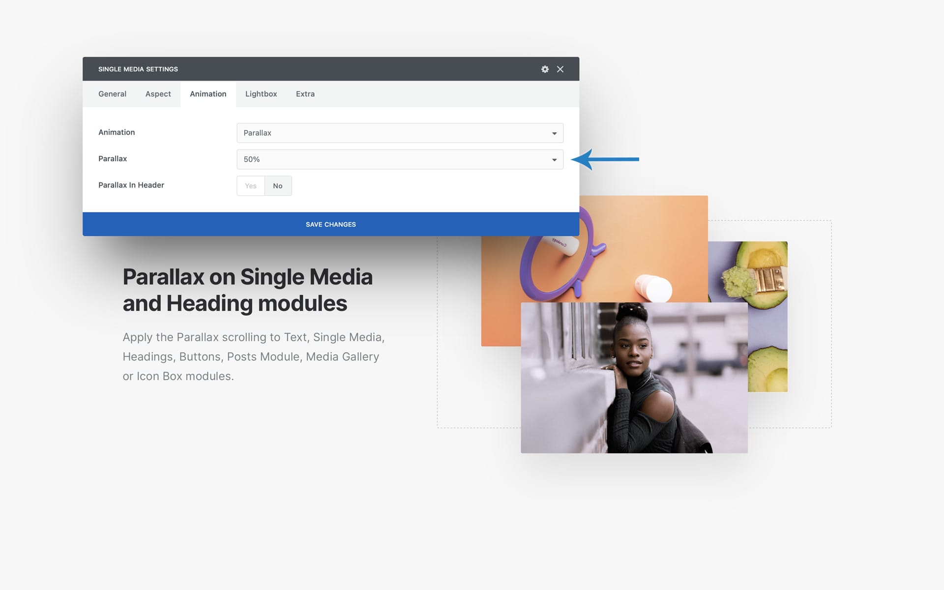
The ‘Parallax in Header’ option should be used when the elements you are animating are located as the name suggests in the page’s header and are therefore immediately visible. In this way, the script will leave the elements unchanged, and the Parallax will be activated only at the first scroll. In all other cases, the script will move the elements to create the Parallax effect, and they will be in their natural design position when in the center of the viewport.
Don’t underestimate the creative options that can come from using Parallax animations combined with the Matrix option of the Single tab of the Posts module. In fact, by applying different animation speeds as a pattern in the Matrix creation, it is possible to create Grids or Carousels in which the elements move in Parallax with various independent speeds.
Notes
- The Column is the only element that can combine canonical animations (Opacity, Zoom, etc.) with Parallax animations. For all other modules, Parallax is one of the animation options.
- Note that due to technical limitations it is impossible to insert modules with animations inside a Column with Parallax. For example, please don’t use a Heading module with Opacity animation inside a column with Parallax since it is impossible to correctly calculate the position and instantiate the animation at the right moment.
- Note that Parallax does not work with Slides Scroll and Scroll Snap, as these effects are not authentic browser scrolls.
New custom and special Cursors
Since version 2.0.4 of Uncode, you can choose different types of creative trendy cursors for your web pages:
- Basic
- Accent
- Asynchronous
- Difference
You can choose a specific Cursor from the Theme Options > Customise > General or per page from Page Options > General.
With the option “Custom Cursor On Links Only” you can display the custom Cursor only an user hovers an elements with a links or on elements that mimic a link; in this way, you can emphasize each interactive element with a minimal but effective effect.
Special Cursors
For the Posts, Media Gallery, and Single Media modules (in Advanced mode), you can activate, from the Extras tab, a unique creative Cursor whose style you can choose from:
- Light
- Dark
- Accent
- Difference
Magnetic Image and Background
Magnetic is the new hover effect that can be activated on the Post module, Media Gallery, and Single Media (in Advanced mode). Magnetic creates a smooth animation that moves with the mouse when hovering over an image.
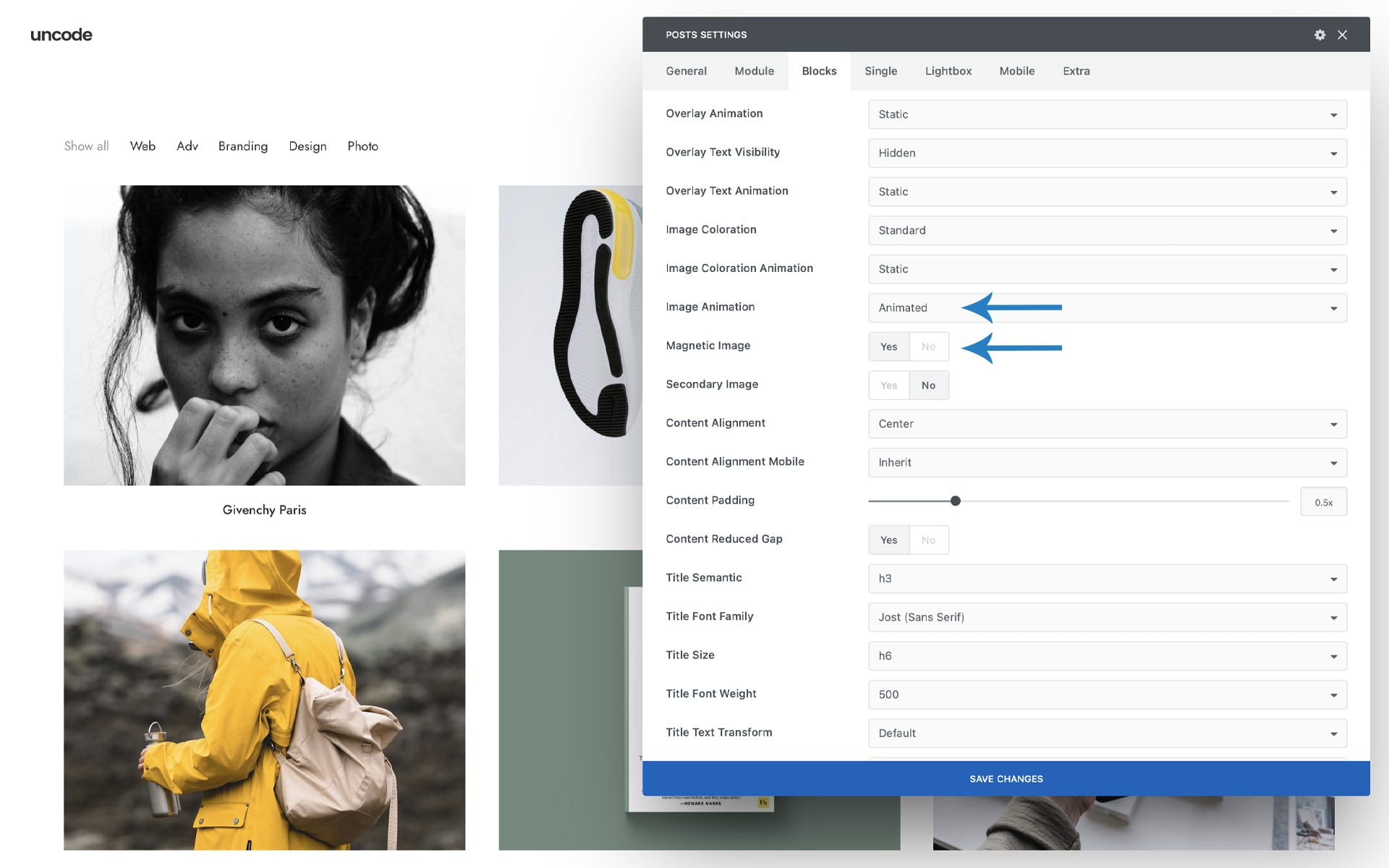
To enable Magnetic, set the ‘Image Animation’ option to ‘Animated’ and select the new ‘Magnetic option.
The Magnetic effect can also be enabled as a Row background option to create animated page sections or headers that follow the movement of the mouse. You can find this option in the ‘Zoom Effect’ dropdown of Rows and Columns (along with Ken Burns and Zoom Out).
Division to 5 for Posts and Media Gallery
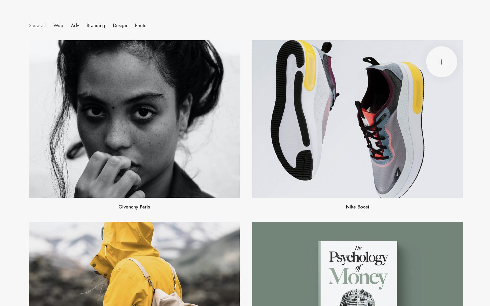
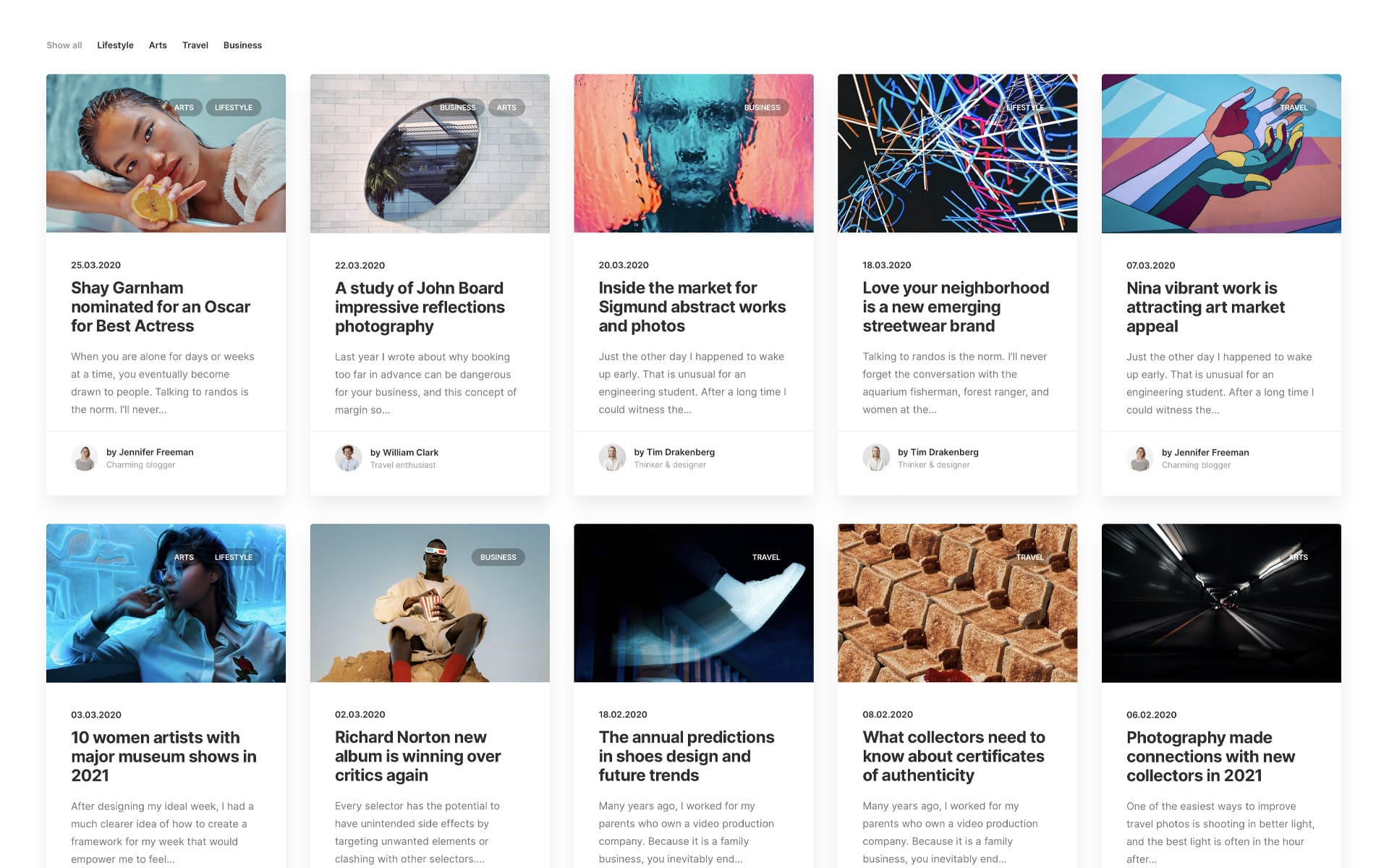
By popular demand, from Uncode 2.0.4, it’s possible to have a division to 5 for the Posts Module and Media Gallery for new layout combinations. The particular division 1/5 makes it possible to create grids based on a division of 5 columns, great for bridging the gap that existed between 4 and 6 columns, and this will probably be the choice of many bloggers, creatives, and shop makers for the creation of their indexes and their archives!
Menu Options
Megamenu Options
With this release, the Megamenu is enriched with a new type of layout, named “Enhanced”. This new type of layout is excellent even when you have fewer columns and little contents to display. In fact, unlike the legacy version that distributes the Megamenu columns across the full-width, this new version distributes the elements starting from the center according to fixed dimensions.
In addition to this new style, there is also the “Focus” option. This option primarily colors the transparent menu bar when hovering over a menu item and, at the same time, adds an overlay layer over the body of the page, which serves to remove any distraction and to better focus on the choices proposed in the Megamenu dropdown.
You can activate the new option in Theme Options > Navbar > Visual > Dropdown Style and Menu Focus. Please note that these options are active when you select a horizontal menu.
Overlay Options
On the Overlay Menu, you can choose the overlay color and transparency. Thanks to these combinations, you can create different creative solutions with high impact. Also, from this update, the logo will be displayed above the overlay.
Badges on Menu
From this update, it’s also possible to add badges to your menus. To activate the option, please insert this code in your Child Theme functions.php file. After that, you’ll find in every menu item the fields Badge (where to insert the text of your badge) and Badge Color (where to insert the hexadecimal value of the color of the tup badge). Please note that since this adds two new fields for each menu item in the WordPress Menu Editor, it is suggested to have another Max Vars value in the presence of menus with many menu items.
/**********************
*
* Activate badges in menu
* @return bool
*
**********************/
add_filter( 'uncode_activate_menu_badges', '__return_true' );
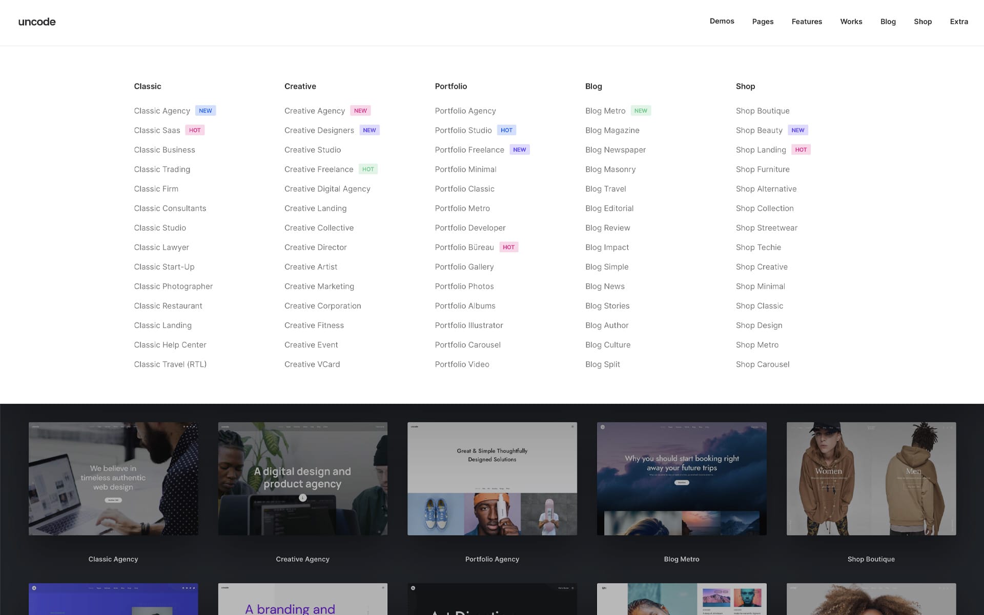
New Layouts and Demo Contents
With this update will be published a massive restyling of the Uncode demo. New 15+ demos, 20 revamped demos, and 18 new pages to start your new creations! Lots of inspiration and trendy designs ready to be used!
How to update Uncode
The easiest way to upgrade your version of Uncode is to activate the automatic theme update. If you don’t know how to do this, instructions are available in our documentation. You can also update manually if you prefer. Please remember to update both the theme and the incorporated plugins, such as Uncode Core and Uncode Page Builder.
Change Log
2.4.0 (2021/07/21)
ADD:
- Compatibility with WordPress 5.8
- Compatibility with WooCommerce 5.5
- New Dynamic Srcset Images system
- New Background Color Changer on scroll
- New Color Picker for Page Builder
- New Parallax animations for Column, and some modules
- New Vertical Element module (Text and Social)
- New special Cursors for pages
- New special Cursors for Posts, Media Gallery
- New Megamenu style
- New Magnetic effect on mouse move for Images and Backgrounds
- New Menu Badges
- New style for Privacy Banner
- Overlay Menu with logo
- Overlay Menu custom Background and Opacity
- Overlay and Off-Canvas Menu Transparent Sticky option
- Posts module Carousel Dots position and padding
- Posts module Meta typography options
- Posts module 1/5 Width Size
- Updated Icon List (socials)
- Hide Back To Top in Page Options
- Text Icon shortcode
- Contact Form 7 inset button style
- Add to Cart Button inherited styles from columns
- Diffuse Shadows preset in Theme Options
- Dynamic options for Buttons in Theme Options
- Typograhy options for Filtering Menu in Theme Options
- Various Hooks

IMPROVEMENTS:
- Various scripts and code optimization
- Better Carousel initialization
- Headings Animations
- Share and Tags position
- Add to Cart notices
- List module font size
- Copyright module font size
- Avatar image size
- Category badges style on Posts module
- Do_Action module indipendent from WooCommerce
- Copyright area global option
- Removed old platform from share links
- Widget filter dropdown animation
- Background repeat in Page Options
- Firefox cookie issue
- Various layout adjustments
- Comment Form new inline layout
- ManageWP and multisite Uncode Core update compatibility with Hook

FIX:
- Paragraphs added by TinyMCE around WPBakery modules
- Footer on Firefox with Slides Scroll
- Isotope with Carousels inside thumbs
- Font loading on Safari and Isotope layout issues
- Shadows for thumbs without background color
- Quote element Skin
- Button linked to Galleries
- Button inherited styles
- Remove content padding issues
- Copyright position on lateral menus
- Footer with Off-Canvas menu
- Social icons animation
- Border radius on secondary images
- Scroll to section with carousels on page
- Center Split Menu dropdown

UPDATE:
- Uncode Core 2.4.0
- Uncode WPBakery Page Builder 6.7.0
- Uncode Privacy 2.1.3
- Revolution Slider 6.5.4