When it comes to web page design, the trends are constantly changing. If you want to have the best website, you have to keep up with the new elements and styles that keep emerging every year.
If you are looking for website ideas or web design inspiration, you should try comparing best websites 2017 to the best websites 2016 and the best websites 2015 and you’ll see how much website designs have changed over the course of just a couple of years.
However, it’s not all just about designing beautiful websites. Many of the new elements have been incorporated into the modern website design because they help improve visitor’s experience and the site’s functionality.
So let’s break it down to the 8 key elements of best website designs!
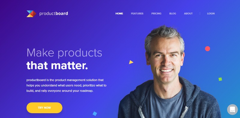
The Right Font and Typography
Choosing the right font and typography is an important part of branding and letting your customers know who you are. Are you serious or fun? Classical or edgy?
Lately, the font selection is greater than ever which makes it easier for the designers to get creative with the typography. However, one should make sure the fond of their choosing is supported by all browsers to avoid an awkwardly-looking web page design.
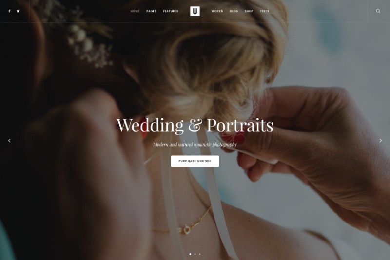
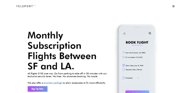
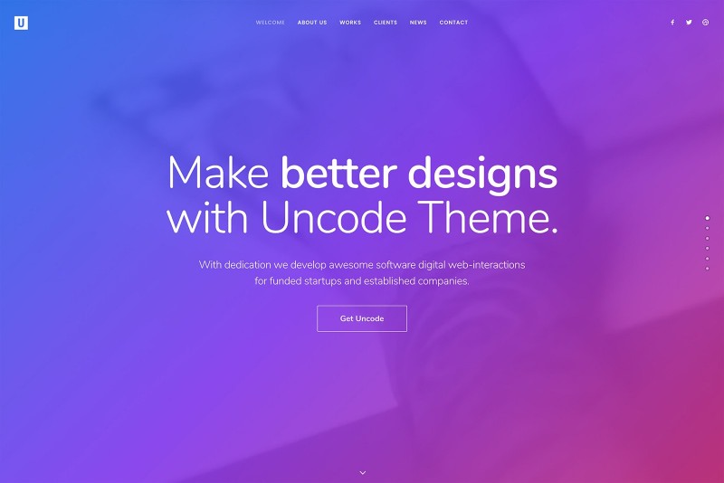
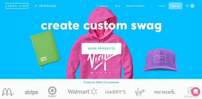
The best websites use large, distinctive, and unique typography that is automatically connected to the brand and makes it easily recognizable.
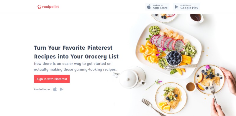
Large and High-Quality Images
An image is often worth a thousand words and it helps in creating a strong visual identity for your web page design as well as a strong visual experience for the visitor.
Good websites use large hero images, often placed in the background to get the visitors’ full attention and tell the story the company/brand wishes to share with the customers without using a lot of text which the visitors may or may not read.
Also, keep in mind that the best website design has to be optimized for all devices and the images are also highly helpful when it comes to that.
Mobile device visitors might be in a hurry and/or not in a situation to read a lot of text when they visit your website, but if you offer them a number of high-quality images, they will still have the experience you intended them to have.
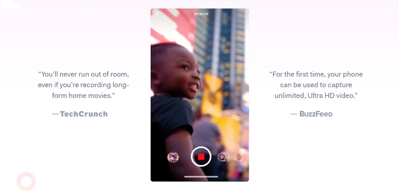
Videos Instead of Text
Background videos can significantly improve your visitors’ experience by telling them a story about your company without forcing them to go through a bunch of text.
Our brain processes videos and text in a very different way; a video is processed roughly 60,000 times faster than text, not to mention the fact that the visitors are often hesitant to read a huge block of text that appears in front of them.
Today’s cool website designs use videos to offer a lot of information fast while the whole experience is perceived as effortless by the visitors.
Web design trends 2017 have often incorporated videos as one of the key elements to good website design not only because of their practicality but also because the internet connection speeds have been constantly growing and loading a video on a professional website is no longer an issue.
Flat or Semi-Flat Design
While we’ve all been preoccupied with switching to 3D over the course of the last couple of decades, Apple decided to take the opposite direction and they shifted entirely to flat design in 2013.
Basically, flat design is a design that doesn’t use elements of 3D perception, for example, shadows and similar.
Also, it is practical to use for more than one reason. Not only can a human brain comprehend this kind of design faster and more easily than more complex design, but it is also quicker and easier to load on websites.
Check out Apple’s website for website design ideas that use either completely flat or semi-flat design. Great websites often combine both and use flat designs with some elements of depth like shadows.
Just keep in mind that you should be consistent with your web page design and all the pages on your modern website should use the same design cues.
Keep Things Minimal
Best looking websites are often simple websites that stick to the minimalism.
Minimal doesn’t mean boring and it definitely doesn’t mean you can’t get creative with your website design inspiration.
Keeping things minimal means keeping them focused and making simple clear points instead of creating clutter on your web pages.
The most creative websites and best-designed websites are often those that abide by the rule that less is more.
Not only is a website like that pleasant to look at, but it also makes the navigation much easier. The clean design is the best web page design.
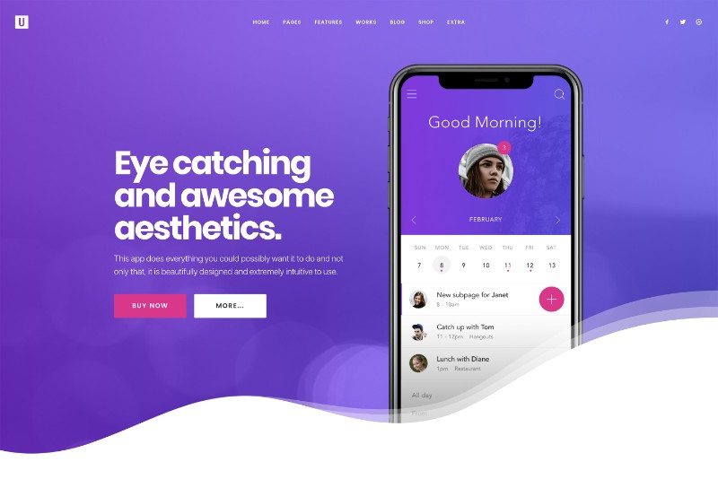
Responsive Design
We’ve mentioned this before and now it’s time to talk about it in more detail.
Your web page design HAS TO be mobile-friendly. In fact, it has to be optimized for every possible device there is.
We are living in a highly competitive world and there is no space for errors like this because you don’t want your customers to go to your competitor’s website simply because they aren’t able to access yours through their phone.
A top best site needs to be available to everybody everywhere and the best web design is one that looks and works equally as good on your desktop computer, phone, tablet or whatever it is that you use.
About Us
If you want to design websites, on your search for the best website inspiration, you can’t forget about the fact that people like working with people.
Having a good About Us section as a part of your website design can be very helpful because it lets your customers know who you are, what’s your company’s vision and mission, and what they can expect from working with you.
Apart from that, it can also be used as a gateway to your social media profiles which can help you keep in touch with your customers and create the sense that you are always there for them.
However, try to keep things short and concise; offer enough information without boring your visitors out of their minds.
You can also stick to your modern web design and offer your visitors an “About Us” video.
Contact Information
All well-designed websites have highly visible contact information. If you take a look at top 10 websites of this year or at any of the award-winning websites, you’ll notice you have no problem whatsoever finding their contact information.
If you aren’t sure how to do it, you can always search for modern websites or design trends 2018 to get the best website layout ideas or general web design ideas.
However, keep in mind that if your customers can’t find your contact information immediately, there is a chance they will get frustrated and visit your competitor’s website instead of contacting you.
Ending thoughts on web page design
If you want to design a website that immediately catches your visitors’ attention, you will have to keep up with the newest trends and all the new elements and styles that keep emerging every year.
To make it easier for you, we brought you 8 key elements for creating the best web page design that will help you in creating beautiful designs, as well as web designs that are highly functional.
The Undsgn Newsletter
Sign up to stay up to date with the latest news!
(You will be forwarded to our subscribe form hosted by Mailchimp)
You might also like...
March 19, 2018
White space in web design: how to take advantage of it
We have all seen those websites with an off-putting layout filled…
May 30, 2018
Web Design tips for a Startup Website
For entrepreneurs taking their first steps into the business arena, a…
April 24, 2018
How to design a website like a professional
Having a well-weaved mix of the designer style and the website’s user…

