
Having a well-weaved mix of the designer style and the website’s user experience and functionality is essential for knowing how to design a website.
Different people and clients will prefer one style over the other, but the thread that binds them is the basic ground rules of site designing.
Keep in mind that there is no single best way to design a website since every client is different, but there are some web design tips which can make a difference between a successful and unsuccessful website.
Without further ado.
Plan the website
Depending on your client’s business, some websites can be complex while others are simple to make. Whatever the case is, you should never start designing it first because you do not know your visitors.
Two things that you know are where the visitor will start his digital journey, and where should it end.
In case of an e-commerce site, the goal is to make them purchase a product. If the website is a photographer’s portfolio, the finish line should be on an opt-in or contact page.
What do you not know is how will the visitor get to that last step? What pages is he or she going to view, what content will he or she read, and what offers will make him or her convert on?
This is where planning the website comes in handy.
After you found the answers to these questions, you are ready to start designing a website.
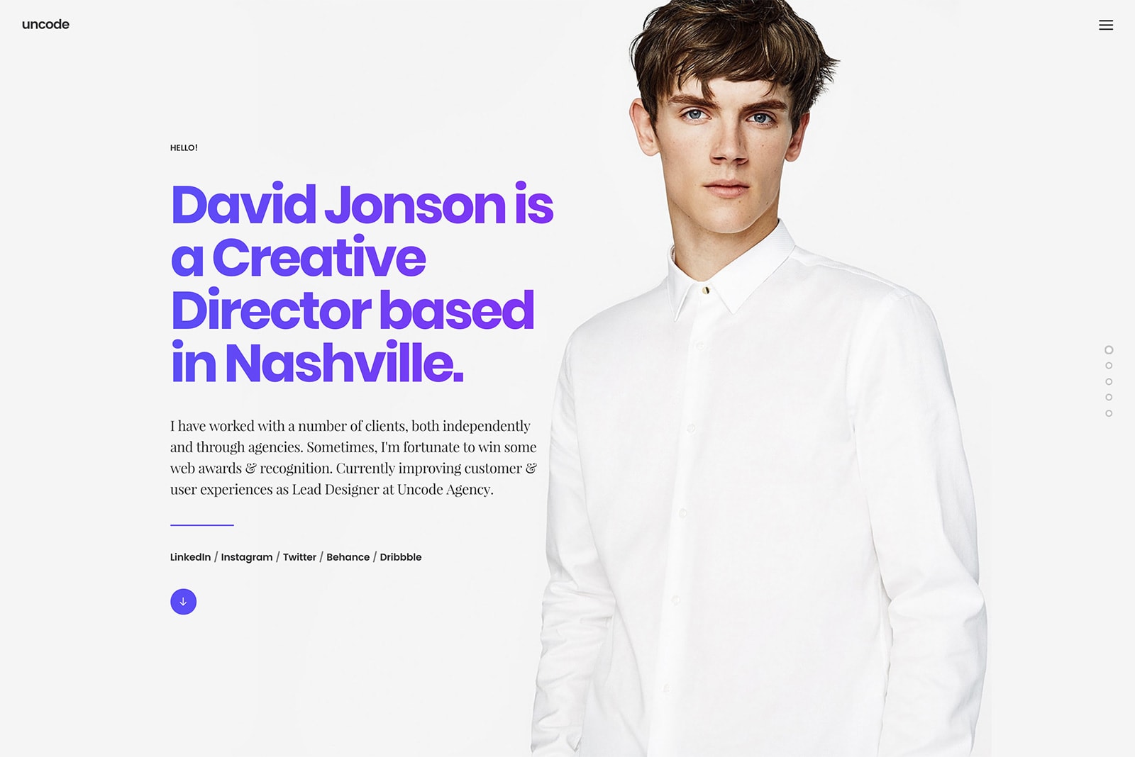
Clean and readable homepage

No matter how beautiful and professional your web page design is, people still will not read every single displayed word. When visiting a page, our human brain quickly scans the text and finds keywords and sentences that we think are relevant.
Professional website designers are well aware of this fact, and they practice appealing to emotions rather than word count. The reasoning behind this is that if a website has less text to read, the visitor will be able to process and evaluate what is displayed quickly.
Wait, shouldn’t the visitor take his time and actually read what my website is all about?
Unless you are reading a web design blog, the answer is usually no.
Having a decluttered homepage makes the visitor immediately notice what you want them to see. Of course, text and call to action are necessary, and you should break them up with large subheadings or legible paragraphs.
We strongly advise using icons and images as an additional way of communicating your point to the visitor.
List of things you should remove from your website
Continuing on our previous point, there are certain elements on your website which can be sending mixed or bad signals to your visitors. According to a research, your average visitor will have an attention span of eight seconds, so your first impression has to be outstanding.
Designing tips that you should implement on your websites are:
- Remove complicated animations
- Remove long content
- Remove stocky website images
You have very little time to convey your message to a visitor, and you do not want to draw attention from that message. Use short, explosive and powerful sections of content and meaningful photographs or icons that are separated by clear and straight to the point headers.
Imagine that your visitor is standing in the shallows and wants to see a seashell that is laying underwater. If the water is dirty, muddy and filled with seaweed, he will not be able to see it.
Keep your water clean.
Make it easy to scan
Professional website design is always built with the website’s hierarchy in mind. Arranging the content in a clear manner is mandatory since, as we already mentioned, you only have seconds to grab the visitor’s attention and tell him or her what your website is about.
Design elements such as color scheme, contrast, size, and spacing are invaluable in this case since it improves the readability of the content that serves to convey the message to a visitor.
We advise using strips, as they can help organizing your website into clear sections.
Content readability
We stand by it when we say that readability is one of the most important features in web design, and if you want to learn how to make a good website, start by researching other simple and easy-to-read websites.
A page’s readability shows how, well – readable, your text content is. If a user is not able to recognize words, phrases, sentences, and is unable to find the information he or she is looking for efficiently, the text has poor readability.
There are several ways to improve on this point:
- Use contrast – Find the perfect balance between your text and the background, while keeping to your brand identity.
- Adequate font size – If the font size is too small, visitors will struggle to see your text content. A font size of 16pt is good for body text, so you should start with that setting. Sometimes depending on the font family, you may have to alter the size. While we are at it…
- Font family – For online texts, you should always be using Serif and Sans Serif font family as they provide the best readability. Handwritten script fonts really look beautiful, but unfortunately, they will reduce the readability of your website.
- Three types of fonts – Unless you want to learn how to design a web page badly, using more than three different typefaces will certainly impact your readability. Badly.
Navigation without a map and a compass
The website plan that you made should navigate visitors from the homepage to your client’s desired goal – whether it is a product purchase or contact page.
Of course, the journey must be pleasant.The last thing you want to do is to make visitors going around your website, clicking links that redirect them to a page they do not want to go to before they eventually leave the website.
Having a site with solid navigation helps search engines index your content (and your rating).
We found some blog designing tips that can be used basically for every website:
- Clicking on logo should lead to your homepage.
- Place the menu in the header of your website.
- Use vertical navigation such as anchor menu for long-scrolling web pages.
- Add important links to your footer such as social links, terms of use, FAQ, contact, blog and so on.
- Your important content should always be above the fold.
Use keyphrase-focused headlines on your homepage
Clear and concise headlines that have keyphrases in them are essential to your website because it tells its visitors that they are at the right place.
Instead of writing fancy and vague headlines, you should write something descriptive about the company and its business. Of course, it should always be high up on the page, above the fold.
Make a tall page FAQ
The taller the page, the more space you will have for answering the questions. Having a tall page makes visitors scroll down until they find the answer they are looking for.
Ending thoughts on how to design a website
Designing a website is a creative process that is not easy as it looks, and from time to time you will find yourself hitting a creative wall.
In case that happens, here is the last tip for you: always be looking for inspiration.