
Sometimes the dark website design is not the appropriate solution for the client or the client’s business.
Yes, it does leave a lasting visual impression when done right, but unless a web designer does not know how to pull it off, the website can come off as unappealing to a visitor’s eye.
The elegant black background comes at a price of less readability and less opportunity for conventional design elements. According to a recent poll, the general audience prefers light designs because of better readability.
In the end, there is no right answer to it. Both dark and light designs have their uses. This article will help you use the dark background design while expressing your creativity, while also making yourself and your client happy and satisfied with the design.
Are you ready to become the ambassador of black websites and convince the pooled audience that dark backgrounds can be as readable and user-friendly as the light ones?
When should you choose dark over light theme?
There are some factors that a designer must consider when deciding to design a dark theme website. You have to keep in mind is the theme or subject of the client’s business, the choice of colors and their contrast which serves as a way to convey emotion.
You would not want to have dark backgrounds on wedding websites, right?
Nowadays, the best web designers even take into consideration who is the average visitor of the website and look for a way to satisfy their possible preferences. They are tailoring their website to the visitor’s social level and even the age group.
The tip here is to create a portrait of your client’s website visitors,so you know which colors and contrasts you should use, which elements to add or subtract, which fonts and general layout styles will be best for the targeted group.
We mentioned age as one of the things you should consider, and the danger here is that many web designers jump to conclusions and think, for example, that older people prefer a light themed website because of readability.
Over time, people develop habits which influence their perception – they may prefer a specific website layout simply because they are used to seeing it and have gotten accustomed to.
Lastly, if you want to implement a black website background, you must consider the purpose of the website, which, in a way, is similar to the website’s subject and theme.
If you are creating a website for a photographer, making the cool dark background will make every color on the client’s photograph stand out.
If you are making an informative website that has announcements and news, black website background is not the way to go.
Elegance or readability?
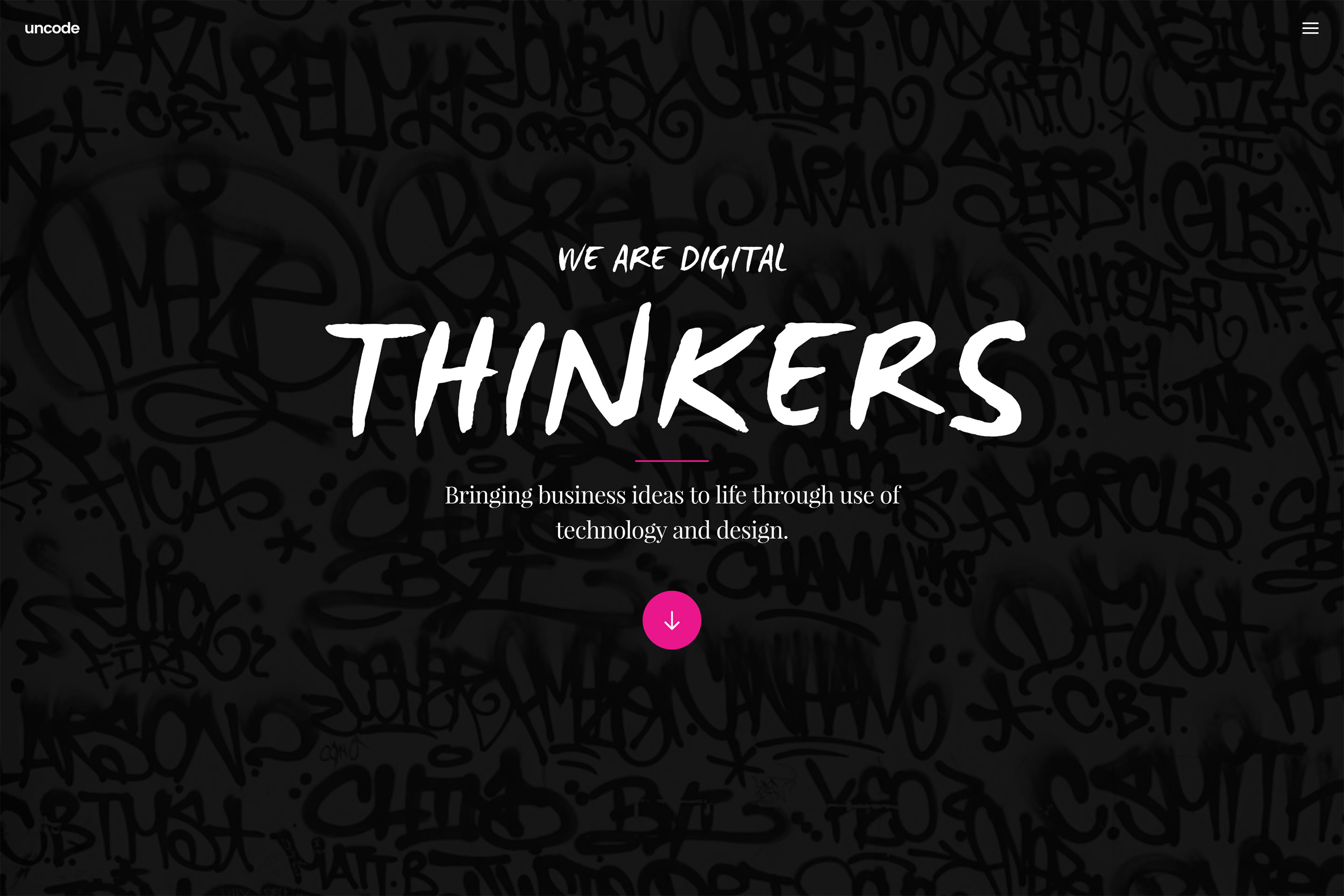
The internet users and even some designers are criticizing dark designs for their main flaw – bad readability and poor website usability. They all claim that it is difficult to read light text on the dark-colored background, and we agree.
However, there are ways to counter this problem, and if you are interested, continue reading.
Is there space for white space?
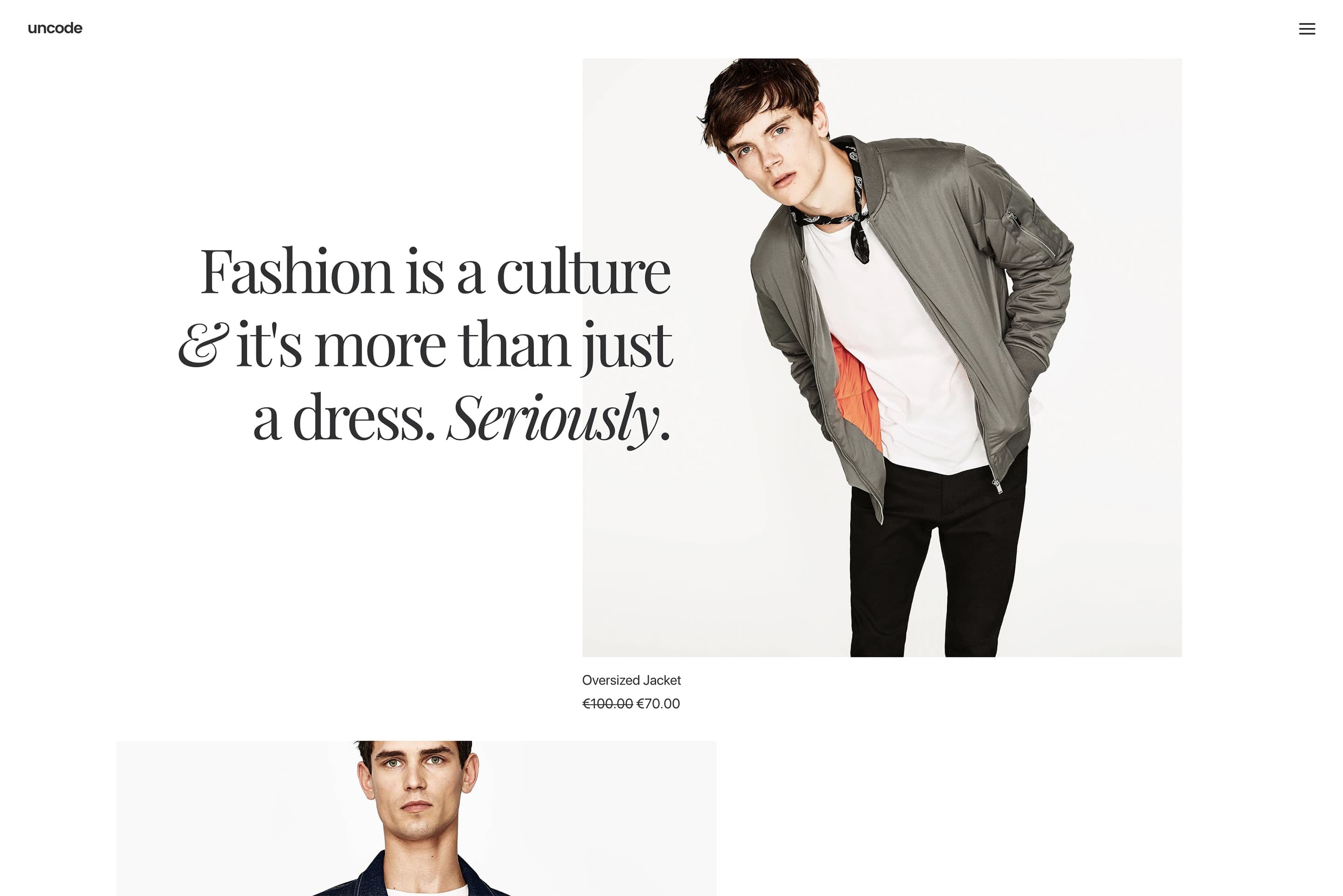
One of the latest design trends is the use of white (blank) space, and even if that was not the case, using it is mandatory for all websites that have dark aesthetic background. Without it, the visuals would feel heavy and overwhelming.
Text options for a website with a black background?
The main concern of dark designs is readability, and if it is not done right, the visitors and even your client may find it unappealing. With this in mind, you should pay extra close attention to the text – its format, style, font and compatibility with the background color.
We suggest increasing the white space in the text by adjusting paragraph size, kerning, and leading, as they will certainly improve readability.
The contrast between dark background images and text
We think that this possible text formatting issue should be talked about separately from the ones we previously mentioned.
The rationale behind it is that having too much or too little contrast between the text and the background causes eye-strain, which is the number one reason for visitors closing the page immediately.
The solution lies in balancing the scales between the dark background and the light text.
Eye-friendly fonts
As with any other website background, font choice and format has a big role in a design layout. We noticed that sans-serif are more readable than the elegant serif fonts.
Knowing how to put them together to make the text more legible comes with practice, and we advise you to put larger text in serif fonts.
Rich color scheme is a no-no
The rule of thumb is that the dark designs do not go well with a rich color scheme because of the sharp contrast between the background and the colored elements.
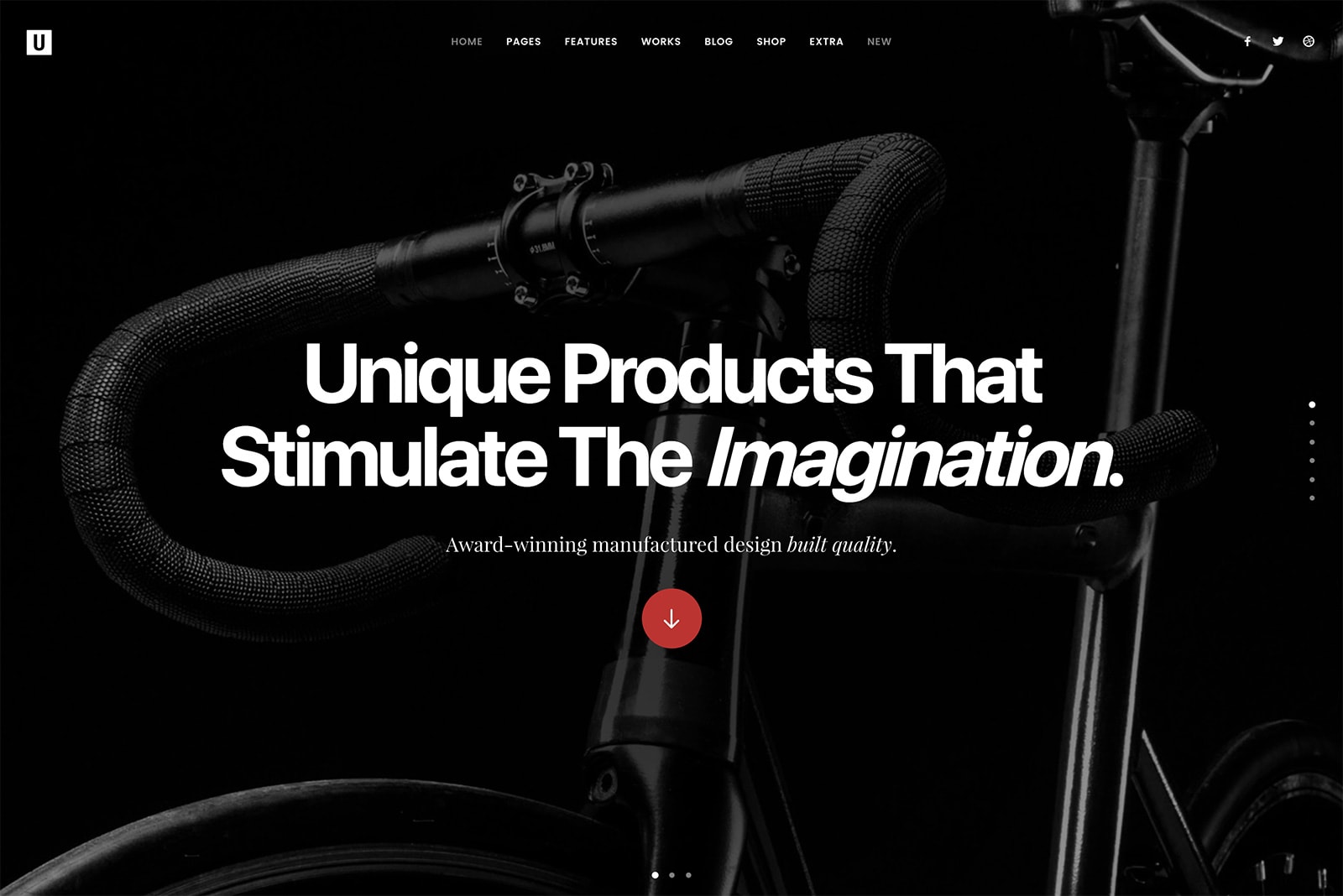
What you should do is stick to one or two colors, play with them and see how they work with your background. We are quite impressed with the combination of red and black background designs!
Both light and dark
If you have enough time and resources, you can create a design that takes two birds with one stone. Implementing a style switcher is a good way to allow visitors to choose their preferred design, whether it is light or dark.
Best use of a dark website design
Since there is no definition of what for and when you should use dark backgrounds in your web design, we have to mention at least the type of websites that can benefit from such choice.
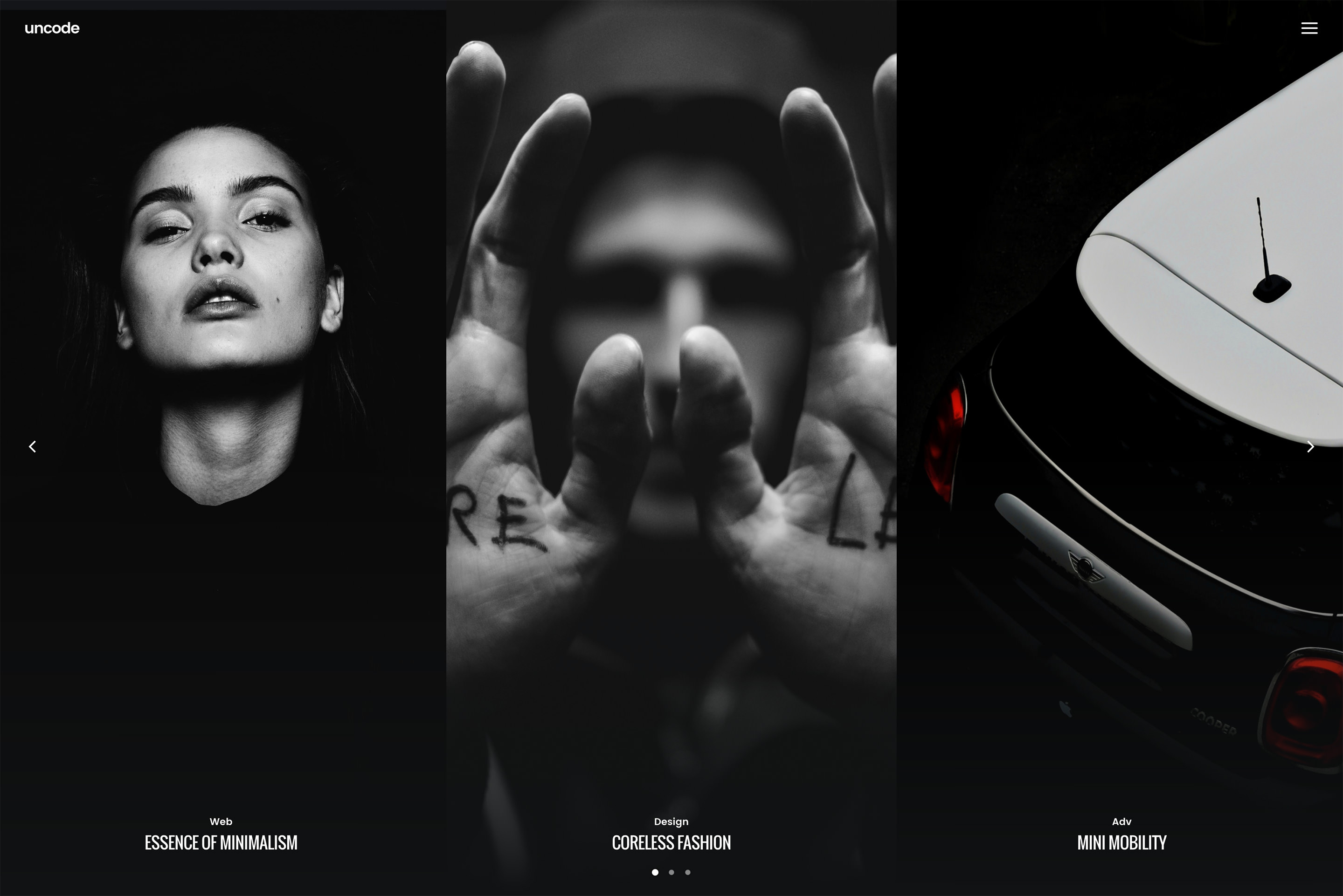
As we already mentioned, dark color schemes work best for creative, modern, grungy and elegant websites.
Ending thoughts on dark backgrounds
Many people consider darkness and dark colors to be mysterious, gloomy, and unknown. It can be much more than that. Websites that are using a dark theme can convey powerful feelings which leave a lasting impression on visitors.
Moreover, for a web designer, and the particular client’s business, that first impression is the most important thing.