How did we come to this point in time where grid layout design became a staple for every well-structured website? Well, let us start by defining the grid.
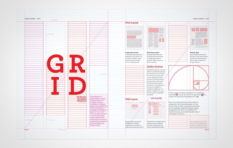
In web design, a grid is a two-dimensional structure which serves as a framework in which a designer can put various content and elements. But what is a grid system? The system it is used to align and size content within the grid.
It offers a great way to organize the content on the page, whether or not the grid system itself is fluid. Grid systems in graphic design work similarly to the systems in web design. Some of the grid examples are:
- Diagonal grid – As CSS and CSS3 gained popularity, so did diagonal grids. They are used to make an off-center appearance to your layout. Grid design examples we saw usually have the slant in the header of a page.
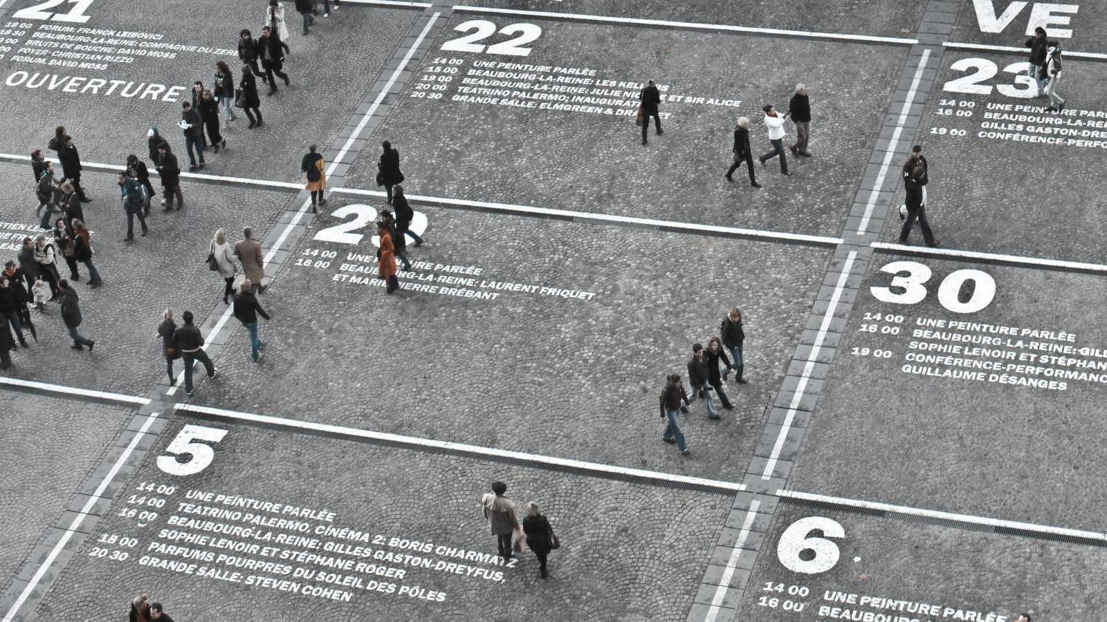
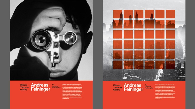
- Poster grid – This one is usually used in flyers and posters (duh!) as a way to successfully communicate your message to a viewer. A good poster grid has a focal point, respects the rule of thirds, and aligns text elements for creating balance.
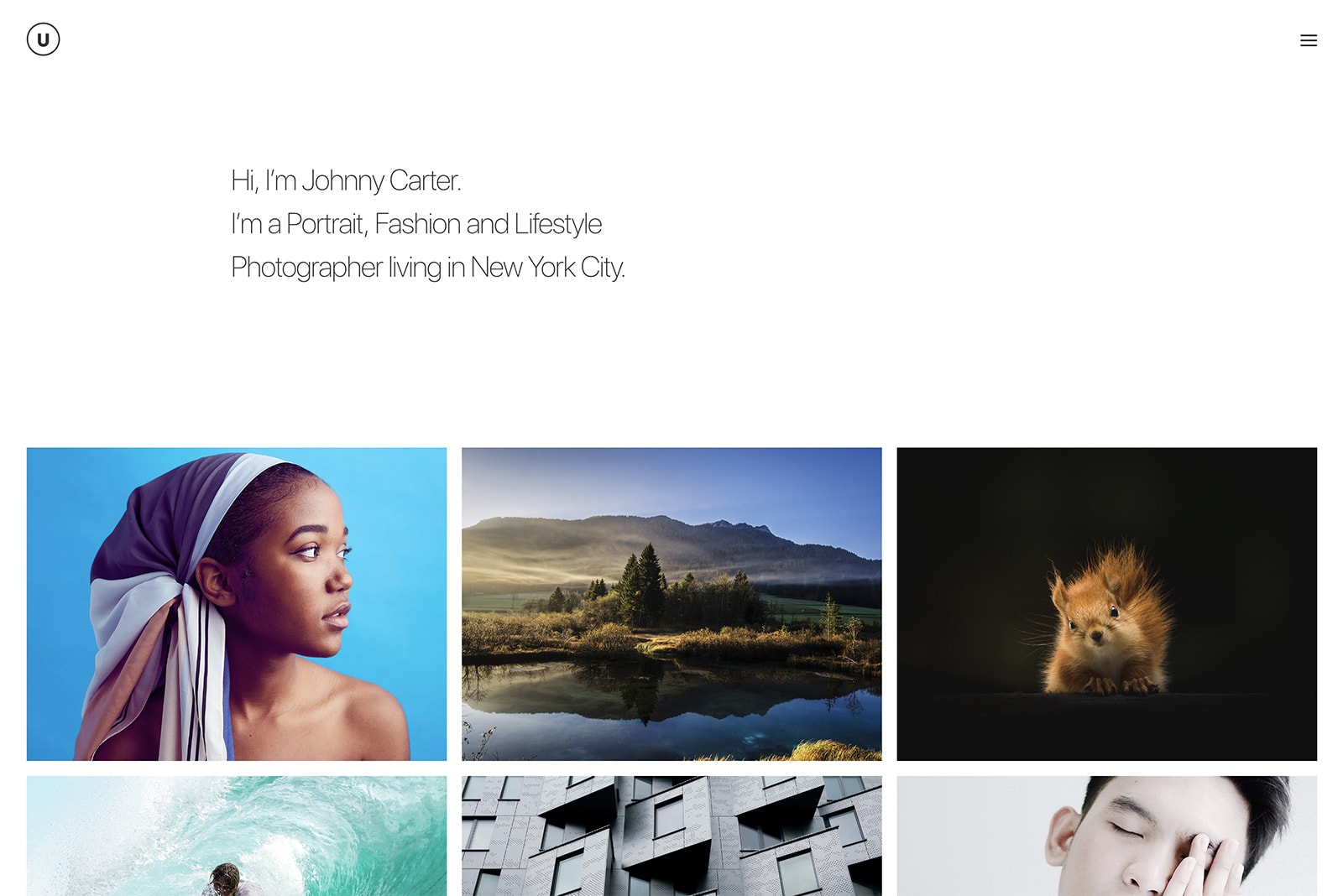
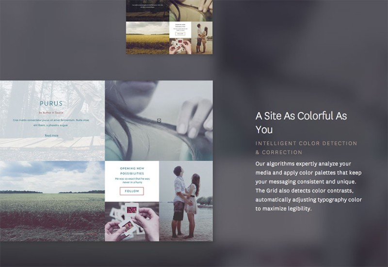
- Magazine grid – Also known as column grid, can be found in informative websites with a lot of Similarly how newspapers are designed, a webpage which has a magazine grid can increase readability and make your text content stand out without being cluttered.
Okay, so what are the benefits of a grid design? Grab a cup of tea or coffee and let us dive into the grid theory.
1) More organized content
The main reason for using a grid-based design is to keep all of your elements aligned, making your page look clean and organized. This way you are setting up a good structure for your website.
2) Improves your efficiency
Time is money, and everyone is looking to get things done as fast as possible. Grids can speed up and improve your design process because they are guiding you where to place your content. You no longer have to keep repositioning the content until you are satisfied with the composition
3) Better text-readability
There are tons of websites which have text woven into their grid system, and when done right, the impression that it leaves on a viewer is breathtaking. Alignment in graphic design and grid systems function the same way.
Type-heavy layouts will appear neater and more structured, enhancing the readability of the text within. Adding a baseline grid to your text layout creates narrow horizontal rows which take a role of the ruled lines in a notebook, allowing your body text to be perfectly aligned.
4) Great for collaborations
In case you have to work another designer, using grids can help remove miscommunication and therefore save time and nerves. As we already covered, grids are there to show you (scratch that, not just you – both you and your new designer) where certain elements should be placed.
5) Gives you a better understanding of webpage structure
When you are a newbie web designer, having some sort of guidelines is extremely helpful, no matter what is the skill you are improving on.
The same thing goes for grids: they can teach you where to place your content while also giving you an understanding of how webpage structure works. Once you get the hang of it, you can use the grid itself to express your creativity.
Establishing a grid template
a) DIY Grid
Some web grid layouts do not fall into any mentioned category. That leaves many beginner web designers scratching their head.
Of course, you can find a plethora of different pieces of advice on setting up your own grid. There are discussions on whether you should use In Design grids, Photoshop grids… It does not really matter! Always use what works best for you and your current project.
Sometimes you will take a mathematical approach to your design, creating an odd or even number of columns, while also integrating gutters into your grid system.
If you choose an elaborate approach to your grid system, you will have more freedom within it, while, on the other hand, if you decide on having a simple layout, the viewer will have more room for interpretation.
How complex you grid layout is depending solely on you.
b) Download a pre-made grid
In case you are looking for a simple and standard grid without being too creative, look them up on the internet. There are more than enough databases which help you develop your website.
Truth be told, it takes less time to download a standard grid than to create a custom one. In the end, it is all about what your project needs.
Rules are made to be…
That is right. Now that you know the basics of grid design let us talk about when you should forget everything you know and take a leap of faith with your alignment design. When you finally master the grids, will discover that they have a hidden creative use.
You start thinking outside the borders that were trapping you this whole time, and suddenly you see that content that you purposely misplaced out of a grid told a new story. Your design appears more organic and free-flowing. And that is the end goal of every web designer.
Image alignment woes
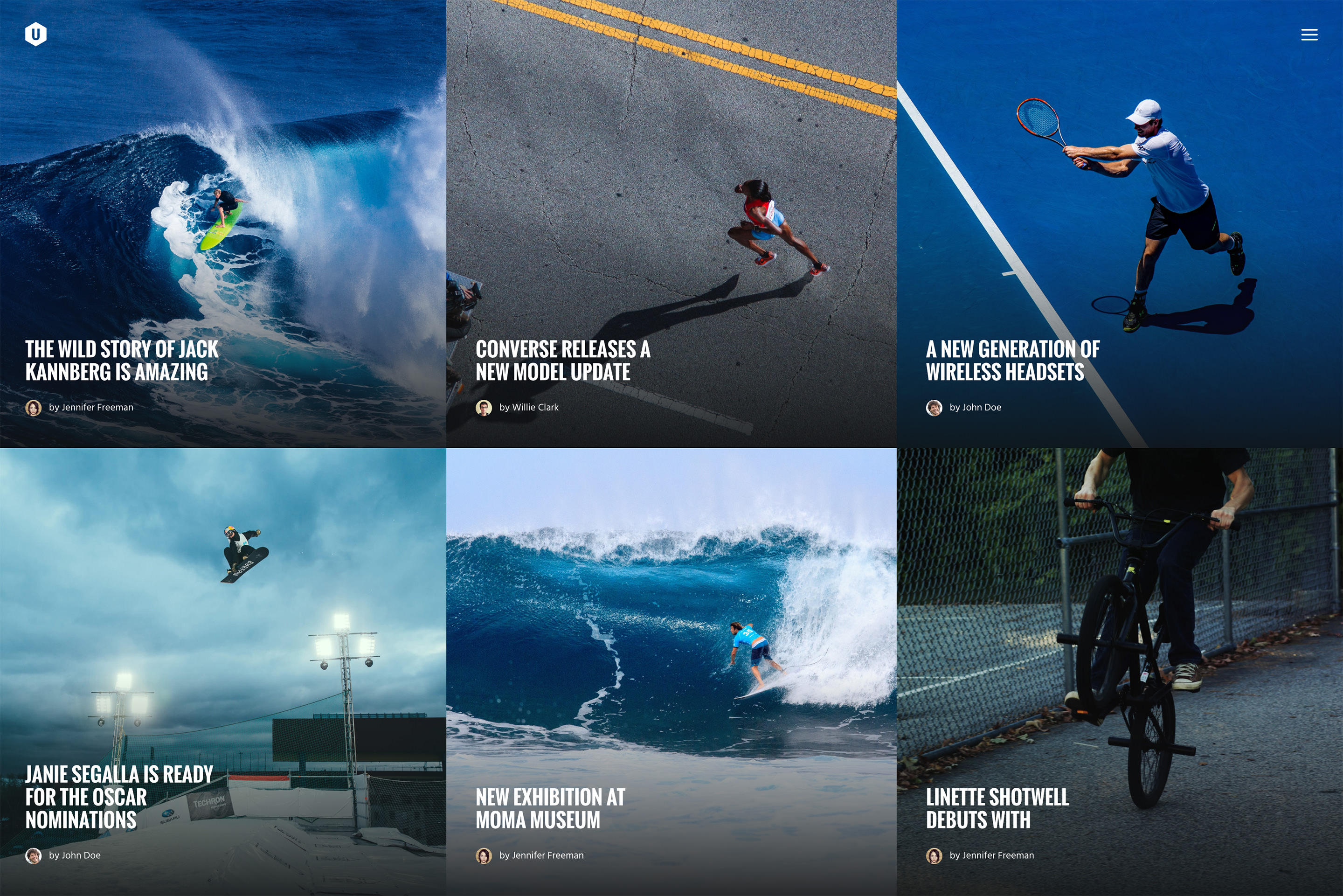
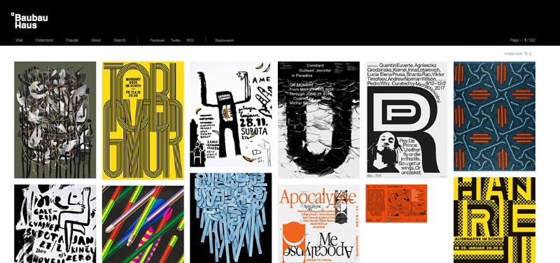
One thing that bothers both beginners and more experienced web designers are images, more specifically, image alignments. Small images are much easier to place in your layout, and they do not disrupt other content, while larger ones can spell catastrophe for your design.
People usually take one of the two options:
- Place the image outside of the content – The simplest way to do that is to put the image between paragraphs or at the beginning or end of your content.
- Perfect alignment – You can choose to set align your images on the left or right of your texts, or slightly below the edge of the content.
Ending thoughts on grid design
If you think that grids are a new and cool trend specific to the web or graphic design, you are wrong. The fire of this trend was lit all the way back in 13th century, and it is no wonder why.
Graphic and web design have gained so much from grids, and creative minds such as yourself are pushing the boundaries of its use.
From one and two-column texts to diagonal typography, grid design will always be a solid foundation for the structure of your website.