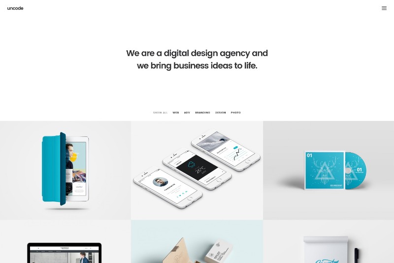
This is the age of mobility that we are living in and people mobile devices are becoming the preferred means to access the world wide web all over the world. Within this context, the concept of responsive web design is key to delivering visitors a coherent mobile experience.
Responsive design entails much more than a consistent mobile experience; responsive design influences general screen design promoting unsophisticated layouts and efficient experiences. This article presents a set of tips and tricks to help build a responsive website.
Navigation: Keep it Simple
If you want to know how to design a website that is responsive when accessed on smaller screens, go back ten years ago and check out the sites of the time. Immediately, you feel besieged by the incredible number of categories stacked into the leftward navigation.
Responsive web design is adapting your design to the dimensional restrictions of smaller screens, typical for mobile devices. Reduce navigation to bare bones via in-page links, icons, and collapsible menus that make it easier for the visitors to find what they want.
Using hidden navigational elements is not a good idea for a designing a website that is responsive. Such choices are difficult to discover and require more time to perform tasks. Responsive web design is making navigational choices visually recognizable.
Making your website design responsive to smaller screens involves restricting the number of links to 4, maximum 5, which means that you must make sure that you provide your visitors with the most relevant 4-5 links to take them to the most relevant content on your website.
Most responsive websites have eliminated sidebars because smaller screens don’t allow that much horizontal space to work with and that affects website dimensions. With sidebars gone, you offer visitors distraction-free navigation on your responsive site.
A vertical design used to be a poor choice in conventional websites. Going mobile has changed that, and long-scrolling web pages are an integral part of responsive website design.
To make your responsive web design mobile-friendly all the way, use either a back-to-top button or a sticky navigation bar, which you can place either at the top or the bottom of the page. Bottom navigation is ideal to make your website friendly to one-handed navigation.
CTA Buttons: Go Finger-friendly

The components of responsive web design include: simple navigation and popped out CTA buttons. It is very important the buttons assigned to your calls-to-action are prominent as far as style and color. Color and style are just as crucial for responsive web design.
- Shape: stick to familiar CTA button shapes, such as rectangular or circular shapes. Creativity is good, but don’t push it when it comes to button shape.
- Size: stick to finger-friendly size for your CTA buttons, making sure that people with disabilities can hit them just as easy. Recommendation: 36dp height for buttons and 48dp height for touchable targets.
- Dimension: add gradients, shadows, and other stylistic features to your CTA buttons to prevent misclicks, which can be very annoying and frustrating for visitors.
Responsive Web Design Tip: If you want to know how to make a responsive website, leave enough space between text and buttons to eliminate miss-clicks!
Responsive Web Design: Think Mobile First
![]()
When it comes to responsive web design, less is more. You have to adhere to simplicity if you want to learn how to make a responsive website. Build your design with mobile-friendliness in mind, and you will make your job so much more efficient along the way.
A significant advantage of responsive design is that if it looks great on a smartphone, it will look just as great on larger-screen devices. Focus on creating navigation, content, and graphics that make sense on a smartphone if you want to know how to make a website responsive.
Starting your design with mobile in mind forces you to reduce content and functionality to what is necessary and nothing more. Again, less is more. This practice improves user experience so much that it has become the philosophy behind responsive web design.
If you embrace a mobile-first approach, where you design a mobile version of your website first, you will be able to adapt your design to desktop or tablet screens quickly. As long as your design displays well on a smartphone, changing to large screens is a piece of cake!
Images: Optimize for Mobile-friendliness

You should fully comprehend the importance of images in building an emotional bond with your viewers. Also, pictures are dimension-lending design elements that allow visitors to visualize better your products/services. One rule of responsive design says optimize your images.
Optimizing your images for the web means that you should save them in the correct format, i.e., logos and icons should be saved as PNG and scenic, and photographic images should be saved as JPG.
Another image-related aspect you need to attend to is adapting image size to mobile devices. You can use TinyJPG, a specialized tool that allows you to reduce images. You can also optimize images for mobile phone breakpoints to cut bandwidth and scaling problems.
Media Queries: Responsive Design’s Best Friend

An essential part of responsive web design, the media query allows you to apply the specified CSS depending on the device and if it matches the media query criteria.
In essence, using media queries will enable your content to respond to specific conditions on different devices. It’s responsive CSS. The media query checks for width, resolution, and orientation of any particular device and shows the correct CSS rules.
Forms: Use Keyboard Triggers for the Ultimate Mobile Experience

Responsive web design entails forms adjusting to screen size, among others. To make forms even more mobile-friendly, you can include input elements to form fields, which will ensure that input fields activate the appropriate type of keyboard.
Simply put, input fields where users should type text such as an address should trigger/activate the ABC keyboard on their mobile device. On the other hand, an input field where visitors should enter number should trigger the numerical keyboard.
Responsive Web Design Tips:
- Updates are essential in responsive web design. If you are not the one to be handling the updates in the future, make sure you leave all the information necessary for those who come after you to be able to make the updates.
- Text is important but when it comes to smaller screens, use only relevant text and not a reproduction of the text content on your desktop version. Too much text leads to long-scrolling web pages and those could drive users away.
- Themes, such Thesis or Genesis, can save you a lot of time if you choose to generate your responsive design on them. It is a fast way to create a responsive web design.
Ending thoughts on responsive web design
The mission of responsive web design is to deliver performance. As a designer, you have to focus on testing template elements, creating accurate coding, and optimizing images to improve the overall performance of your website, including loading time.
The Undsgn Newsletter
Sign up to stay up to date with the latest news!
(You will be forwarded to our subscribe form hosted by Mailchimp)
You might also like...
April 22, 2018
Responsive Web Design: Tips and Best practices
Having a responsive web design is a necessity nowadays, compared to…
August 16, 2016
Web Design 101: Make sure your site is responsive
More than 50% of searches on Google are done with smartphones or…
May 30, 2018
Web Design tips for a Startup Website
For entrepreneurs taking their first steps into the business arena, a…


