
In the following text, we will cover some responsive web design examples, as well as a couple of tips and tricks that you may or may not know.
What is responsive web design?
What does exactly responsive design mean? The term is related to a feature which allows website layout to change according to the user’s screen resolution – whether it is a computer monitor, tablet screen or smartphone display.
Common issues
A designer has to take a different approach when making a responsive website, as the task is more complicated and difficult to pull off than when making a traditional site.
Instinctively those of you who know a bit about coding may think that using CSS media queries is the way to develop a responsive web design template that you can use on all platforms. And you are not wrong.
One of the issues with this method is that new queries can pop up from moment to moment, leaving an unprofessional impression on the visitor. That is unless you cover it with a CSS transition to make the pop up less sudden.
Another challenging feature for a web designer is successfully creating a responsive page with data tables. These are nightmarish to deal with since zooming out on a very wide table makes the entire thing very difficult to read, and if you try to zoom in, you will have to scroll both horizontally and vertically.
We advise reformatting the table into a pie or a mini-graph.
As for the images, when developing a responsive website, you should make context-aware images. In a sense, they are customizable on the spot and can adapt to any display screen by having different resolutions, and when paired up with some coding, they can look sharp on any device.
Advantages of responsiveness
As we already mentioned, having the ability to create one design that will automatically adapt itself depending on the device your visitor is using is something that every web layout must have.
Creating a responsive website allows you to:
- Save time and money – You will not have to maintain separate sites for desktop users and mobile users.
- Improve your SEO – Having a single page URL for each of your website’s pages will rank the site higher in the search engines.
- Have better insight into Analytics reports – You will have a wholesome picture of your site’s usage since the data from mobile and desktop users will be merged. Same goes for your social sharing statistics.
- Maintain it easily – Since such websites do not involve any server-side components, all you have to maintain and modify is the CSS of a page or layout on a particular device, and that is it!
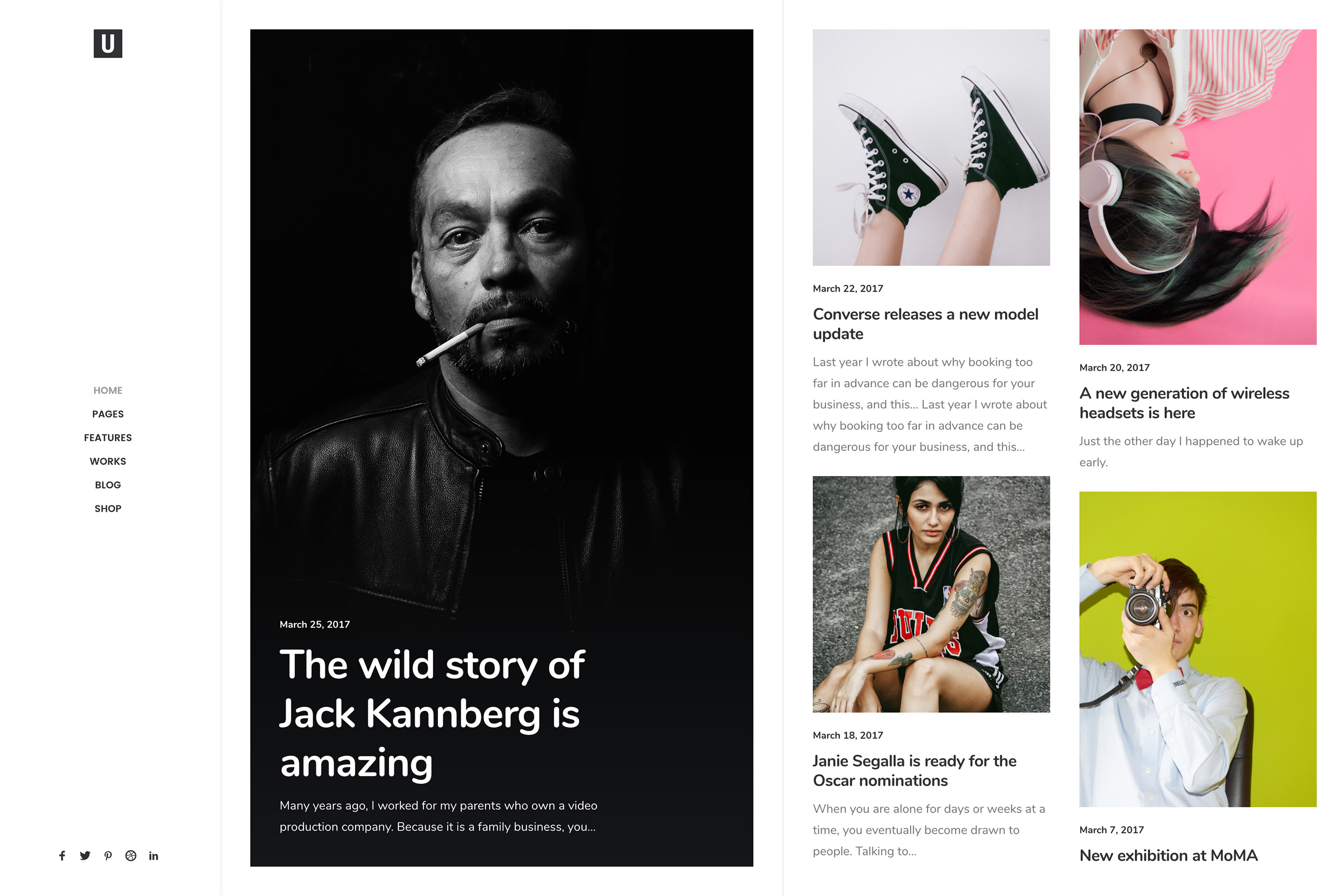
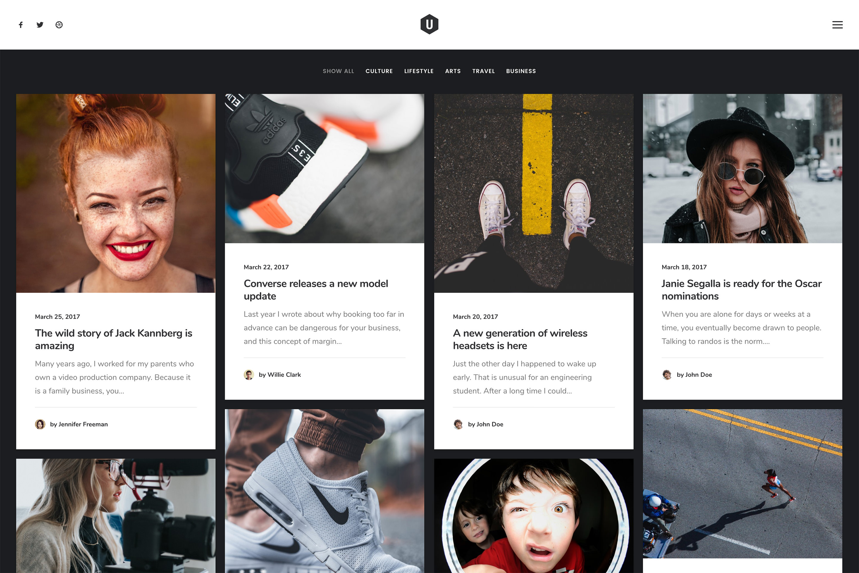
Navigation and web design examples from the past

We are thankful that we left behind the overwhelming pile of categories in navigation that nearly all pre-2007 websites had. Responsive websites nowadays use icons paired with text, drawer menus, dropdowns, and in-page links which makes navigating a breeze.
On average, you have enough space for up to five core links, which affects navigation itself and the webpage architecture. Remember that you should use the links to guide visitors to your desired “goal” page, as well as presenting them opportunities to dig deeper into your website.
Different responsive breakpoints
One definition of a breakpoint treats it as the media query value which marks the transition to a new type of devices. In more technical terms, it provides a series of conditions which when triggered change your website’s design.
These breakpoints are based on the minimum viewpoint widths which scale up as the viewpoint changes.
You guessed it – you will need at least one breakpoint for each device: mobile, tablet, and desktop.
Fluid Images

Uploaded images are not naturally fluid. Instead, they keep their original size and orientation when displayed on all devices. Sometimes a picture will be cropped out or appear unnaturally large on a mobile browser.
To prevent that from happening, you must use CSS to make an image display their original dimension as long as it has enough space to do so. As space – the browser window – narrows, the image should scale to fit.
Using fluid images allows you to have crazy website layout ideas!
Fantastic Typography
When designing a website, people often look for elegant, readable, and sometimes whacky fonts. Choosing the right typeface or a typeface combination can leave a great aesthetic impression on your viewers. There are plenty web design articles out there that address this subject.
The reason we brought it up here is that some fonts do not work well with responsive websites, so make sure that your typeface selection is scaling-friendly.
Work your way up!

The best responsive websites are created for the smallest screen first! This approach allows you to separate what is essential to your webpage from everything else. Developing your website for other devices will be much easier once you have made a layout for the smallest ones.
You should keep these things in mind throughout the development process:
- Use small graphics – They are much more readable and mobile-friendly.
- Preview your website – This is the best way to make sure that your sample website design is working perfectly on all devices.
- Scalable and smart navigation – Your website navigation is the most important thing on your webpage, therefore you cannot allow it to break on any of the devices. Creating scalable and smart navigation, including labels used on buttons, is a must!
Pre-plan your content
Before you get to the wonderful creative process of designing, you must plan out how and where to display the content. Armed with pen and paper, you should make a list of messages that you or your client wants to convey.
A website with proper content organization subconsciously leads the viewer from point A to point B. In a way, visitors are curiously driving on a highway, and you are placing all the road signs.
Driving straight from your homepage to the “goal” page will lead to better conversion rates and will keep your visitors engaged.
Ending thoughts on responsive web design
The internet is full of good website design examples, especially with the responsive ones. More and more designers are creating their websites to be friendly for all devices, and why shouldn’t they?
With mobile browsing finally overtaking the desktop, there is the incentive for developing responsive websites. Using the tips above will definitely help you improve your design.