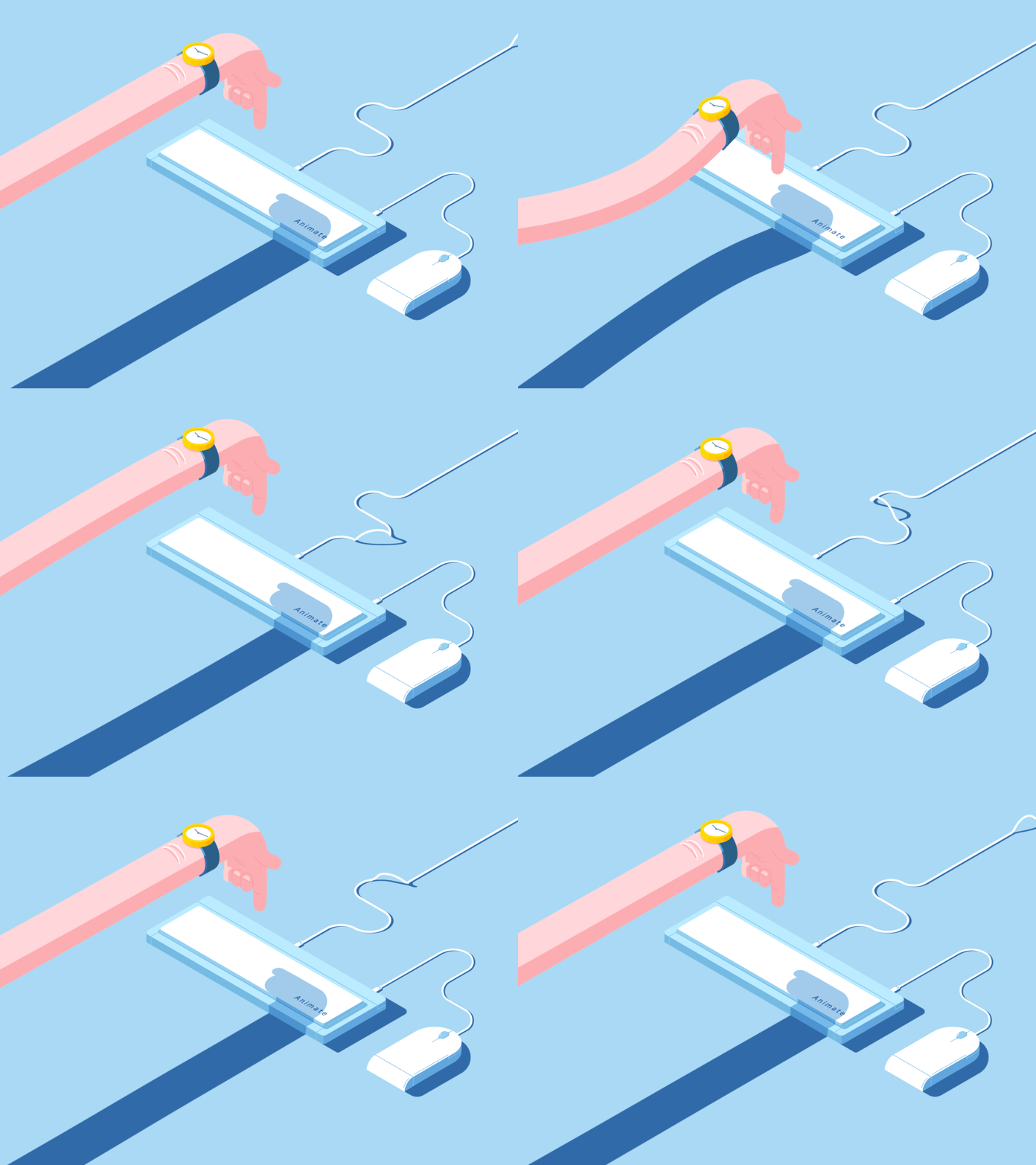
We love seeing an animated website background, silly gifs, or even small effects when we hover over a button.
Web animation allows a website to come alive and offers a more user-friendly experience. When visitors click on a button, the animation tells them that they have successfully interacted with the user interface, creating an illusion of real-world interaction.
With high-speed internet connections, obstacles for cool website animations are now a thing of the past. But how was it back then when animation design just started to take off?
A short history of animation graphics

We got to moving animations thanks to .gif files which were introduced back in the 1987 – in the very, very early days of the internet as we know it. They quickly gain popularity, and in a short period of time, people wanted them on their web pages.
Back then no one even considered using animation as a way to enhance usability. It was more about expressing your style and adding a bit of life to a static web page.
After the .gif hype, people were looking for new and better ways to add animation to their websites, which in the end resulted in JS animation! It quickly became a storytelling medium, both in film and in web design.
Nowadays, the main feature web designers are looking to improve on is the usability.
The time before Google animations

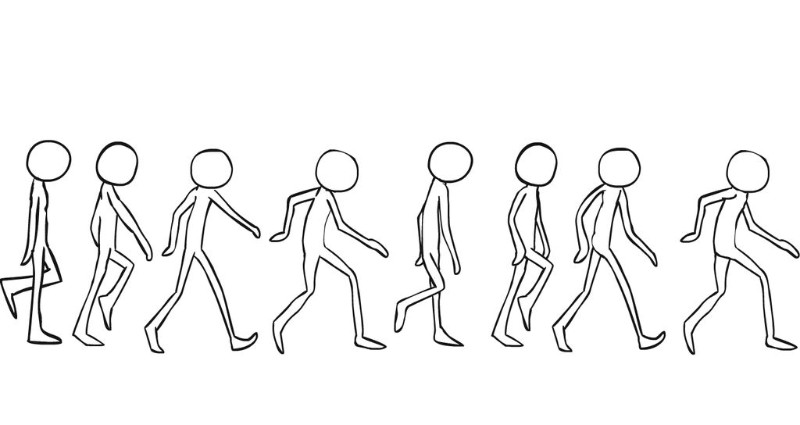
An animation is a two-dimensional form coming to life and performing a certain task, whether it is a character running across the screen, or an hourglass icon rotating while the page is loading.
Speaking of characters, one name is always going to come up when talking about animation – Disney, and for a good reason. Two animators that worked for the company wrote a book in which they detailed twelve principles of animation. These principles are:
- Squash and stretch
- Anticipation
- Staging
- Straight Ahead Action and Pose to Pose
- Follow Through and Overlapping Action
- Slow In and Slow Out
- Arc
- Secondary Action
- Timing
- Exaggeration
- Solid Drawing
- Appeal
Different type of web animations
Nowadays, animations are no longer a surprise – they are expected. As you may expect, throwing all kinds of animation over your web page elements will not improve your conversion rate.
How, when and for what purpose you should use one is up to web designers. Will you use them as a way to enhance the interface, or simply as a tool to tell your client company’s story?
Simply put, what is the purpose of animation on your website?
Carefully considering the possible answers to this question will help you define which type of web animation you should use. Stay away from resource-heavy animations as they will slow down your users’ page loading time on both desktop and mobile devices.
You should look for smaller file sizes, saved as GIF, CSS, SVG, WebGL, or video. The last one here can impact your loading time, so be careful.
Once you have found or made adequate file formats and sizes, it is time to have a look at the different types of animation used in web design:
- Navigation and interface animation – The animation starts when a user clicks on a button which immediately comes to life or opens up a menu list when he or she slides or taps the screen. This type of animation offers a great user experience, enhancing the flow of the website.
- Waiting or loading animations – These are the oldest uses of animation in web design. The user has something to look at while waiting for a page to open, improving the experience.
- Story-telling animations – This type of animation engages audience no matter the medium. It is a powerful tool which, when done right, can convert users more effectively than any kind of optimization or visuals.
- Decorative animations – In this case, the animation is a decorative and supportive element of the website. It should still reflect the content, but it is not critical since its purpose is to be aesthetically pleasing for the viewer.
- Animated advertising – Using beautifully animated banners and call to action elements can improve conversion. It serves to influence the visitor to purchase your product or subscribe to your mailing list.
Know which things you should animate
Using CSS animate can be a great way to add a layer of enjoyment to your websites. Things like bubbles popping up and rising on a soda business website are both entertaining and memorable. A Javascript transition can also be used for this purpose.
Some of the javascript animation examples are drawing lines and writing on your headline, rotating a planet on an astronomy blog, opening up a safe as a loading screen for a bank, and so on.
Nowadays, you can animate anything you like – widths, heights, positions, colors, backgrounds, you name it! Overloading your website with animations can lead to stuttering, so be careful when you use them.
Animations as a way to support interaction
Using too much animation will leave your user annoyed and will take his attention away from the message you are trying to send to your website. Instead, you should use animations to support your user interface and place them where they are actually needed.
Just like we said in navigation animations, tapping the menu icons should reveal a navigation drawer. It should never obstruct the users’ activity. To better paint the picture, we must explain easing definition (also known as CSS easing).
Two-dimensional objects are made to replicate real life, and when it comes to movement, they never stop or start instantly or move at a constant speed. Animations are made to create the illusion of real life in the digital realm, and so they must behave in such a way.
Using the above example, the navigation drawer should first move quickly, then slow down as it comes out. This is why CSS transition ease is used.
One of the more popular ways of coding the animation is using CSS ease-in-out:
- Ease-in makes the animation move slow at the beginning and gets faster at the end.
- Ease-out makes the animation move fast at the beginning and slows down at the end.
Animation overload
We have to cover this topic separately even though we already talked about it. A poorly placed animation which causes a page to stutter will leave your users frustrated, unhappy, and will certainly make them close the page.
Animating expensive elements such as changing the box-shadow of an element, are most likely going to cause page stuttering and longer load times. On the other hand, changing the color of the text inside the box-shadow is not.
As a rule of thumb, stick to transforms and opacity changes instead of animating expensive elements.
Ending thoughts on CSS and Javascript animation in web design
We all love seeing a creative animation. It communicates positive emotion and makes a memorable experience when used right. And that is the whole point of animation – enhancing the experience.
Knowing how to use CSS for your animations will also help you gain a better understanding of this creative element, and will allow you to reverse-engineer other websites that you research.
The Undsgn Newsletter
Sign up to stay up to date with the latest news!
(You will be forwarded to our subscribe form hosted by Mailchimp)
You might also like...
January 24, 2017
10 WordPress Design Trends that Will Dominate 2017
Astonishingly, WordPress powers over a quarter of all the world's…
June 26, 2018
Key Elements for the Best Web Page Design
When it comes to web page design, the trends are constantly changing.…
August 16, 2016
Web Design 101: Make sure your site is responsive
More than 50% of searches on Google are done with smartphones or…


