Your website plays a key role in shaping potential clients’ impressions of your business. If you run a marketing site, it’s especially important to have the features you’ll require to convert visitors, get them invested in your company, and prove you can deliver what they need.
Fortunately, with the right WordPress theme, you can easily build a website that draws leads in and convinces them to become clients. With our multipurpose theme, Uncode, you’ll have access to a variety of features, demos, and customization options to help you build the perfect marketing site.
In this article, we’ll point out some of the features Uncode provides that are useful to marketing sites. Then we’ll introduce you to six top-quality examples of sites that were built with Uncode, and show you how they’ve put the theme’s features to work. Let’s get to it!
Why Uncode Is a Strong Foundation for Marketing Sites
There are several key website features that can help you encourage visitors to become leads and vice versa. Call To Action (CTA) buttons and contact forms, for example, make it easy for visitors to subscribe to your newsletter or reach out for more information:
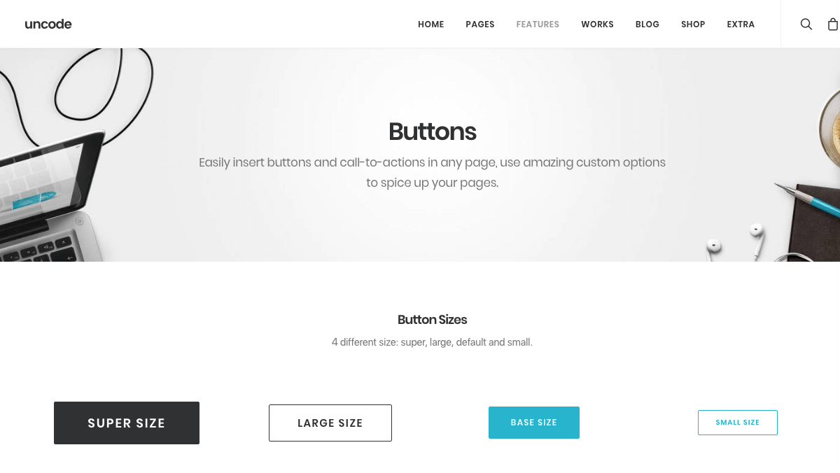
Uncode helps you add these features to your site using pre-built forms and buttons. These elements are customizable enough to fit in with your site’s design, and provide a seamless brand experience for your visitors as well.
An About page is another staple for any website, but on a marketing site it’s especially important. It helps inspire trust from your visitors, and encourages them to hire you. A section explaining your services can also provide clarity regarding your skills to leads who are still on the fence about your company:
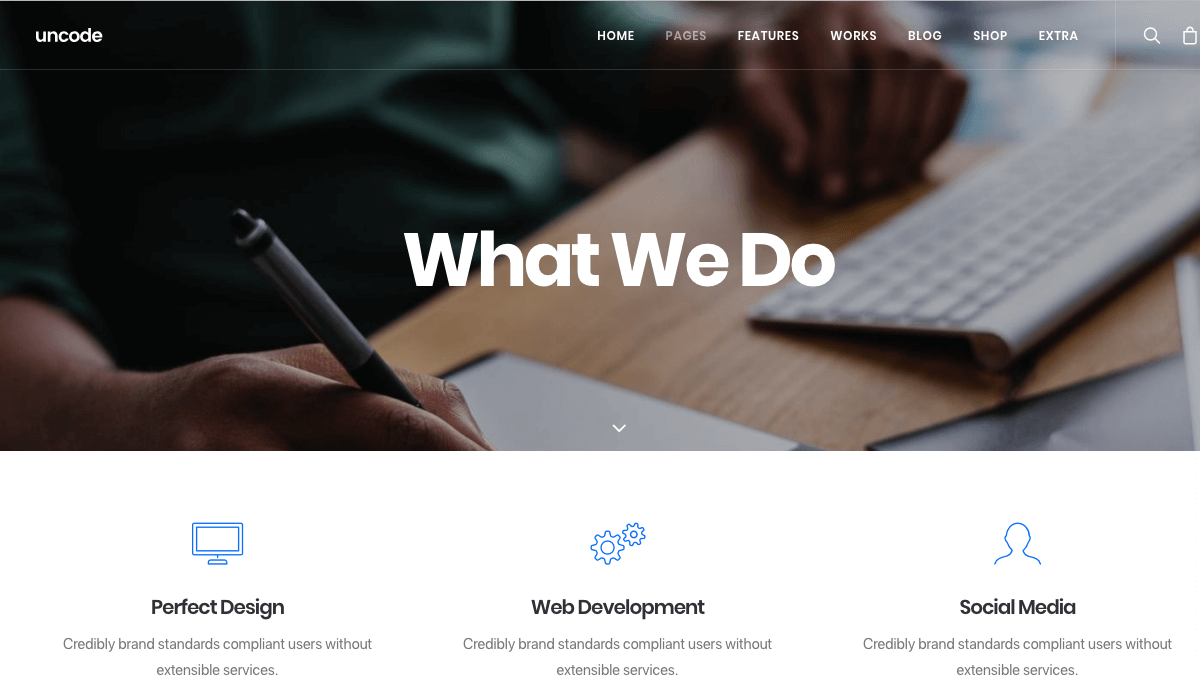
Having access to pre-built page and section layouts for About pages, lists of services, and other key site areas makes including the right information fast and easy. What’s more, Uncode’s design will make sure your pages and sections are organized and easy to read.
Finally, it’s important to remember that your site is also an example of your abilities in action. Displaying your marketing expertise with a well-branded site is vital to attracting clients. If your own content isn’t both consistent and clear, leads probably won’t trust you with their marketing needs.
The customization options in Uncode enable you to add your own branding – including images, slogans, logos, and color schemes – to both your site as a whole and its smallest features. Not only can you build a unique site, therefore, you’ll also have full control of your branding and image.
6 Top-Quality Marketing Sites Built With Uncode
To put everything we’ve discussed so far into context, let’s look at some of the successful marketing websites that use our theme. Each of these six sites has put Uncode’s features to good use, and found a creative way to show off the company’s skills to potential clients.
1. Cohort

Cohort uses digital marketing platforms and superior customer service to connect clients and businesses. With offices in New York, London, and Sydney, this marketing company has grown significantly since its founding in 2008.
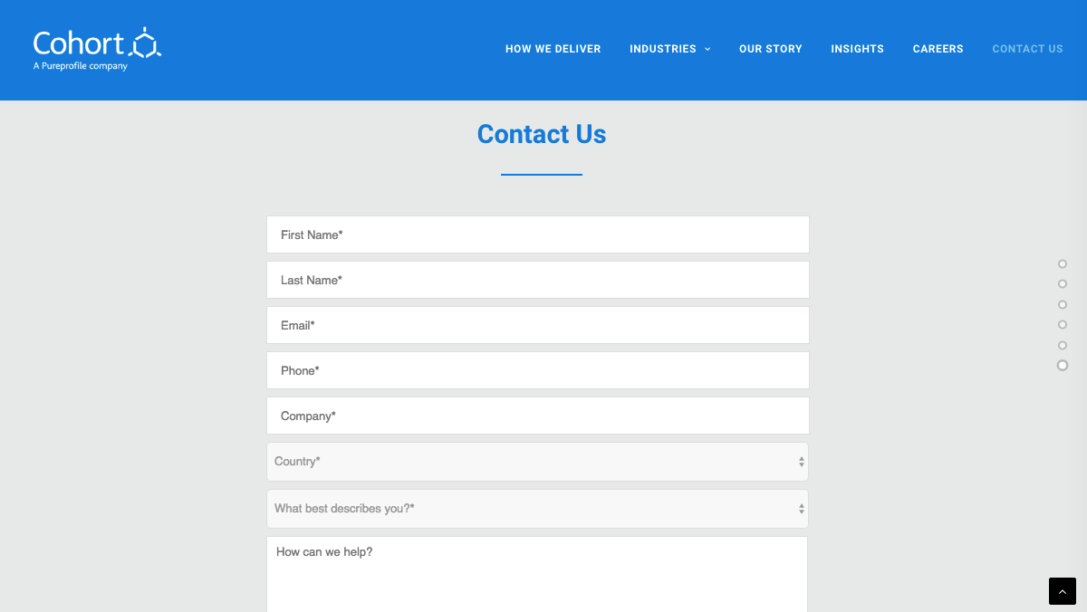
Given that it emphasizes customer service and empowerment, Cohort’s easily-accessible contact form is no surprise. It provides clear and easy direction to any visitors who are looking for more information, regardless of their role or location:
This site also includes a pre-built About section, to tell the company’s story to customers. This enables Cohort to show off its successes, and demonstrate how it’s grown over time. The designers have even used high-quality team member photos for added authenticity:
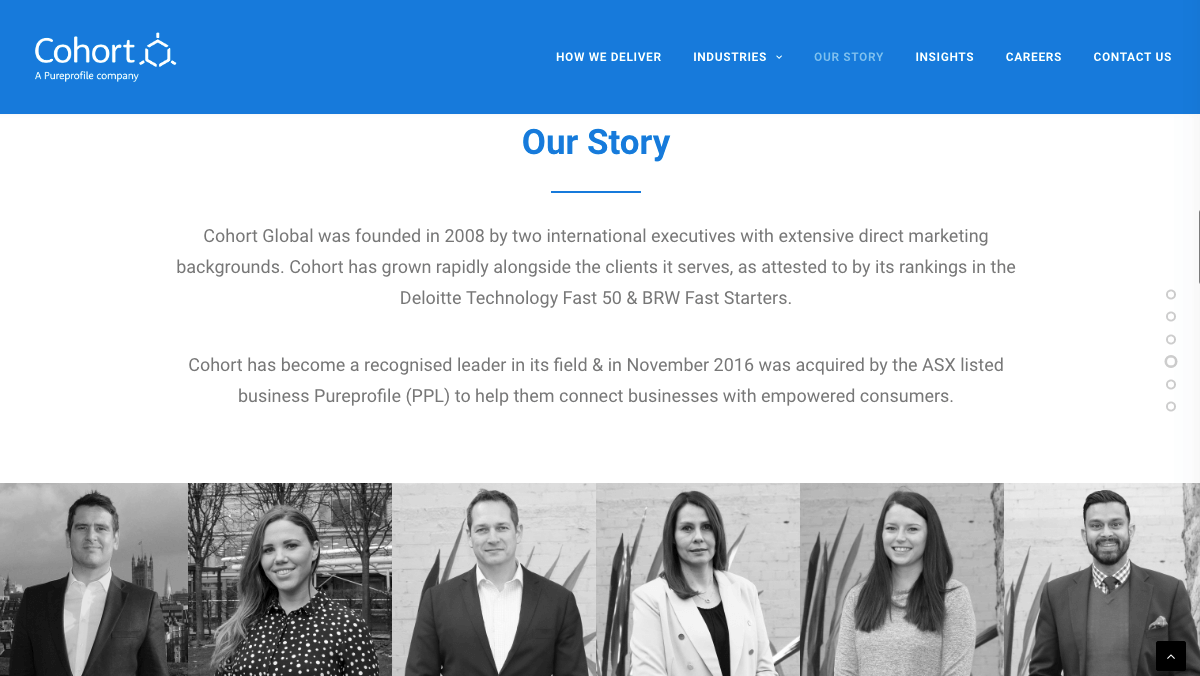
Shining a spotlight on the people who work for your marketing agency is one of the best ways to ‘hook’ visitors. It shows that there are real people behind your branding, and helps to promote trust.
2. FervorWorks
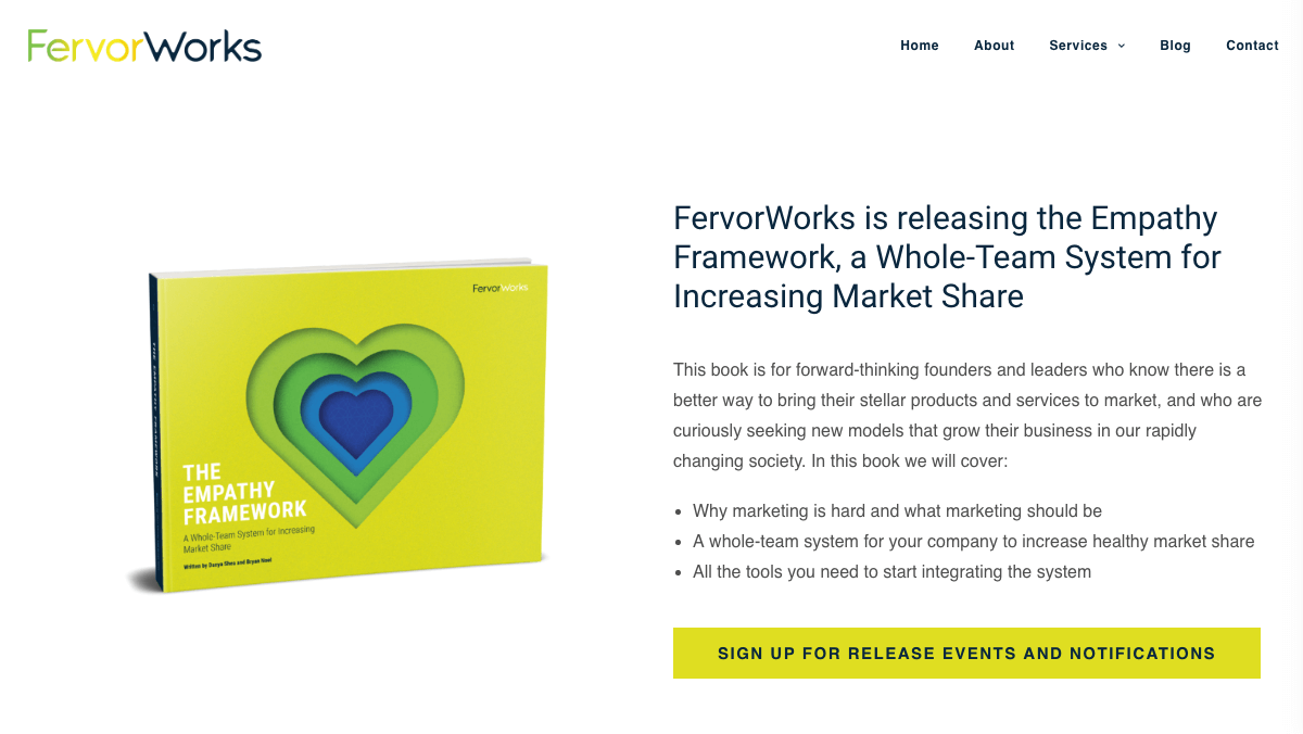
Empathy is the main focus of FervorWorks. The company trains its clients to deliver top-notch customer service through workshops, interim CMO positions, and implementing systematic frameworks.
Considering the wide range of services on offer, FervorWorks has made smart use of custom CTA buttons. Using Uncode, the designers were able to add several buttons across the site that encourage potential clients to learn more about everything the company can do for them:
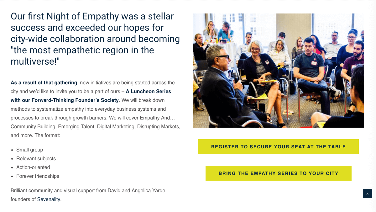
Additionally, they’ve made use of Uncode’s pre-built ‘services’ sections to clearly communicate what FervorWorks can provide. On each Service page (there are three), there is a clearly marked section that sums up what FervorWorks will deliver:
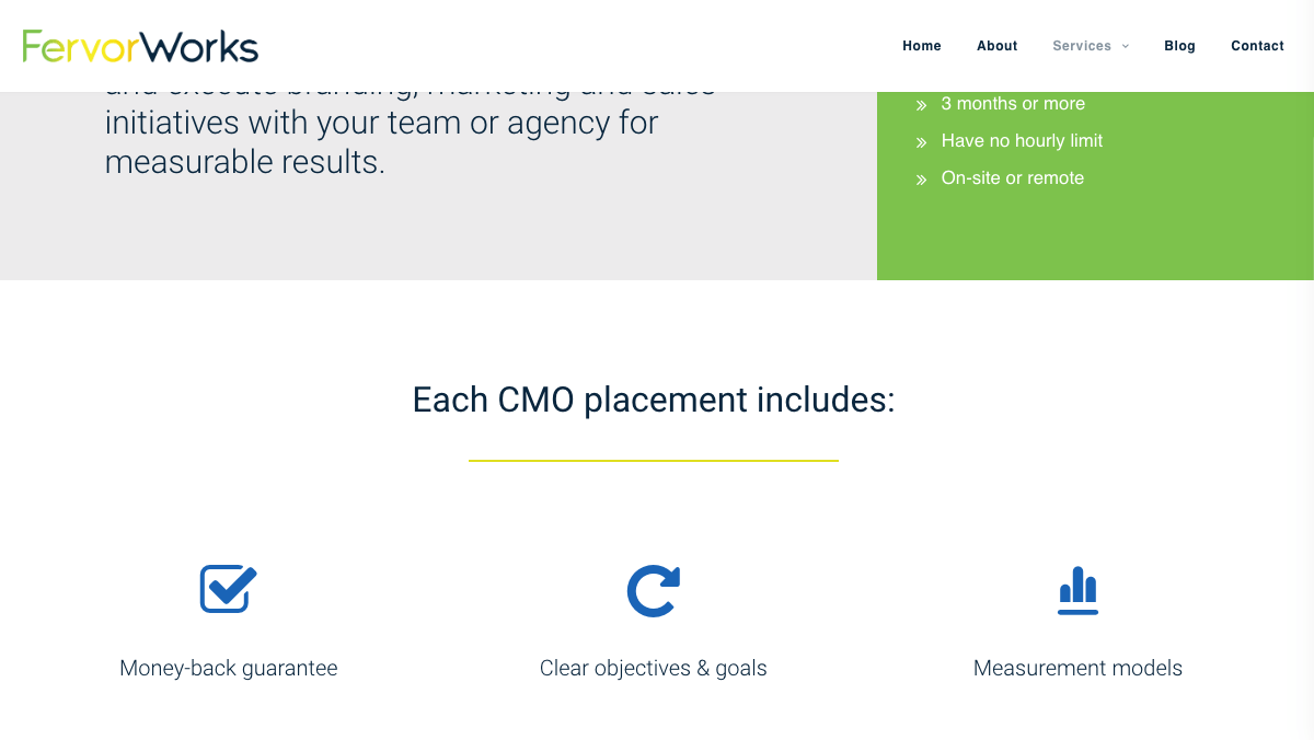
It’s also worth noting that the distinctive and bright color scheme helps this site stands out from the crowd. With Uncode, FervorWorks was able to easily incorporate its memorable yellow accent color throughout the site, using the theme’s custom buttons.
3. Broaden
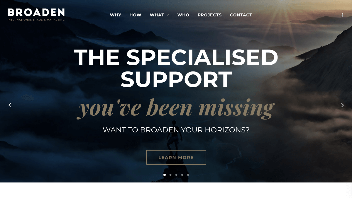
This international marketing company focuses on solving export marketing problems. Broaden helps companies on both local and international fronts, offering a wide range of services to improve branding.
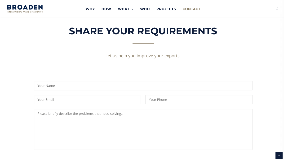
By working with Uncode’s pre-built features, Broaden created a unique form that speaks to its distinct clientele. The designers also included custom fields to elicit the most useful information from prospective clients:
Broaden also displays the expert skills it offers using services section templates. The Find Out More links give potential clients the option to learn quickly by reading the brief descriptions, or dive deeper for more detail:
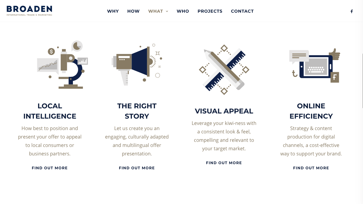
In addition, this company’s site takes brand consistency to new heights. Its blue and bronze color scheme extends even to the fine print, and to the icons in its services sections. The site is an excellent example of the work Broaden is capable of, clearly demonstrating its abilities to visitors.
4. VMGROUPE
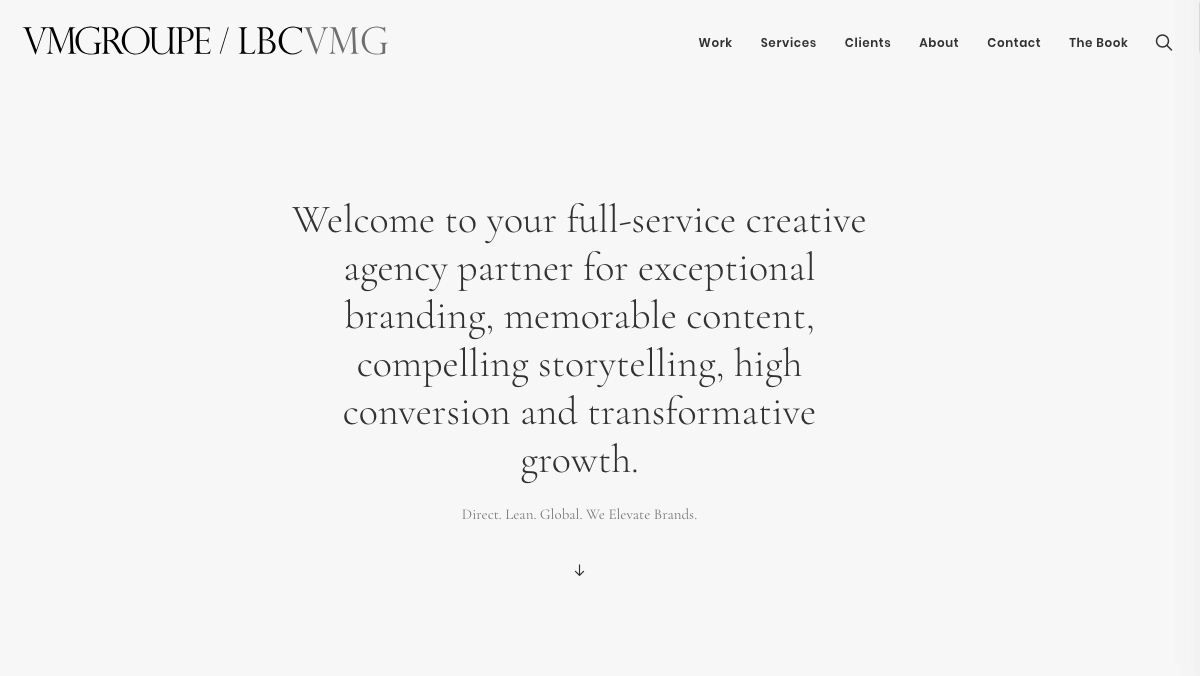
Specializing in beauty, fashion, and luxury branding, VMGROUPE produces strategic content and helps clients with brand development. It also provides insights on public relations and events, offers strategic consulting, and designs digital environments.
When you pride yourself on your storytelling abilities, a well-crafted About page is key. VMGROUPE combines Uncode’s pre-built page layout with quality content, to produce a result that should impress any potential client:
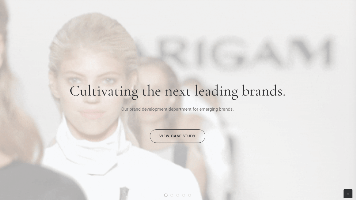
Plus, CTA buttons linking to case studies and other other key content prove that this company knows how to direct users around a site. The buttons are customized to blend seamlessly with the site’s design as well, maintaining a luxurious aesthetic:
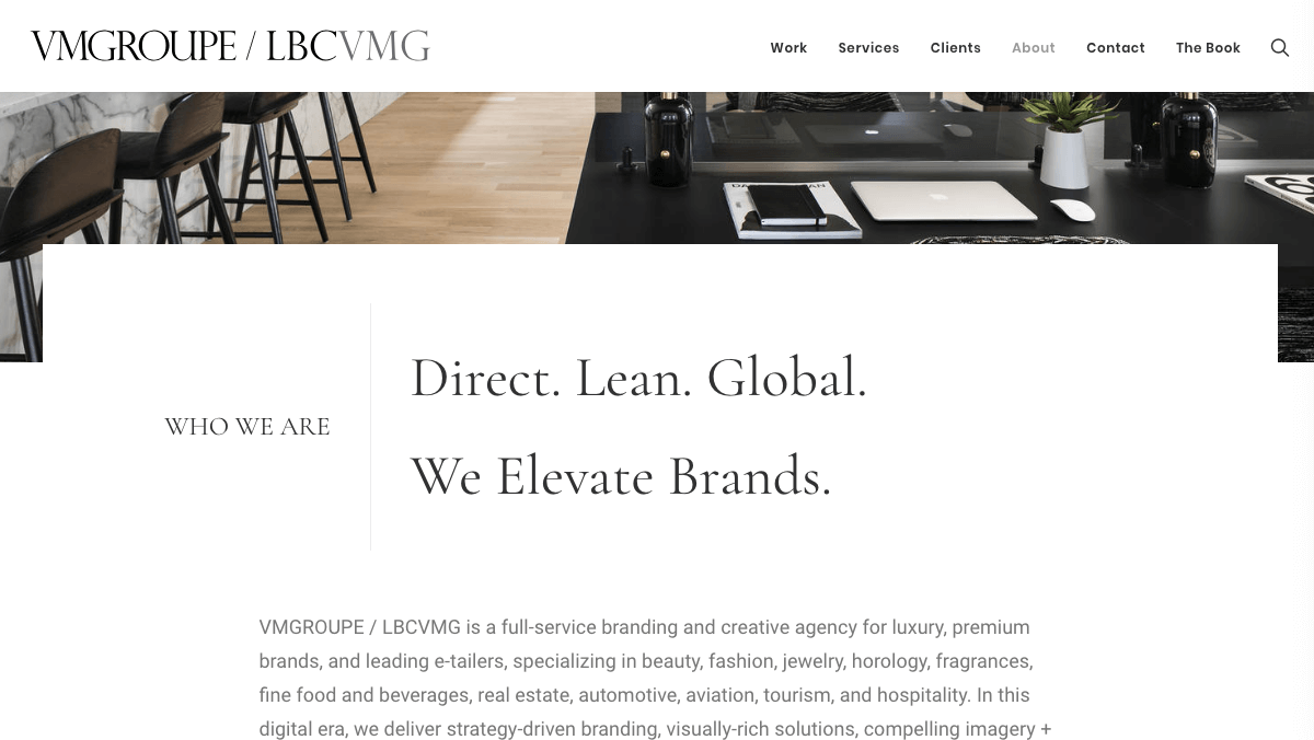
Speaking of aesthetic, VMGROUPE has also incorporated images in a way that creates a feeling of beauty and luxury. This results in an undisrupted brand experience, and the well-selected visuals look natural within Uncode’s layout. Plus, those images are adaptive – meaning that they’ll look and perform just as well on mobile devices.
5. Bell
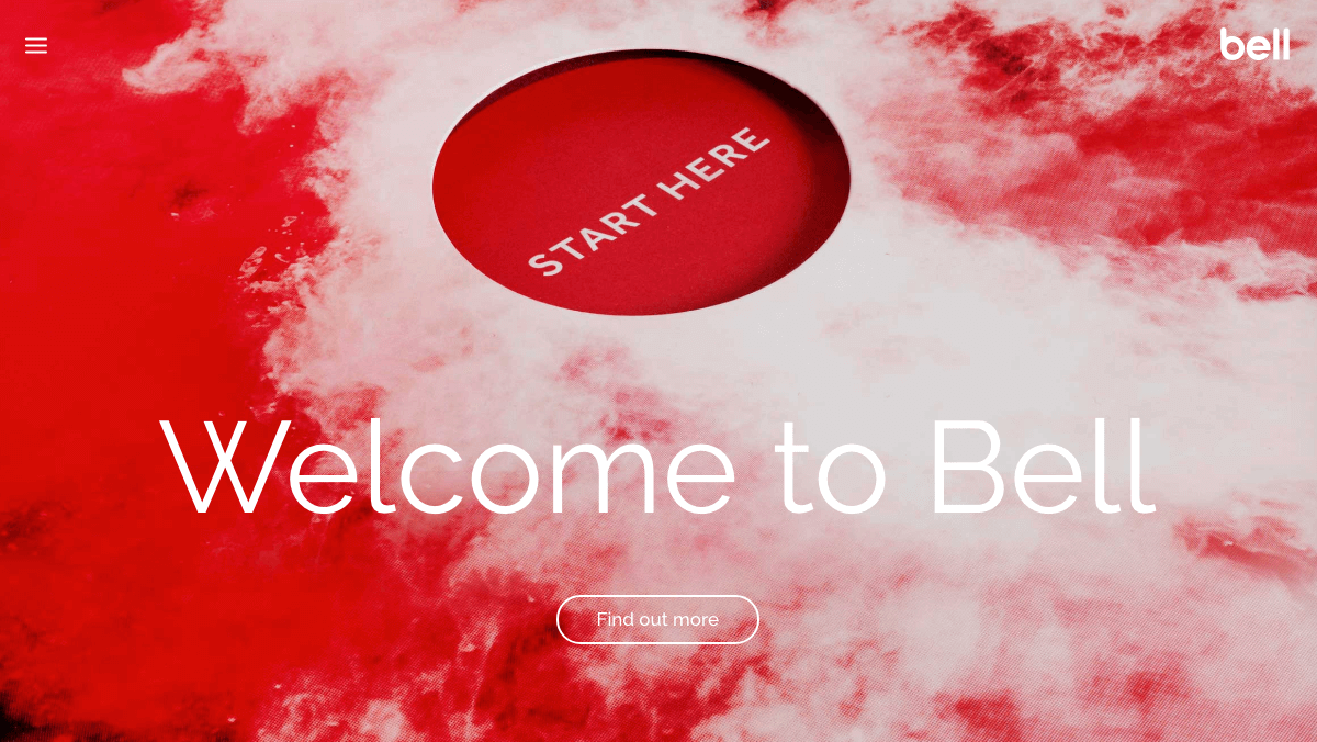
Bell combines branding, design, and communications to help clients run successful long-term marketing campaigns. Its site lists extensive skills and areas of interest for potential clients, yet avoids overwhelming them with information.
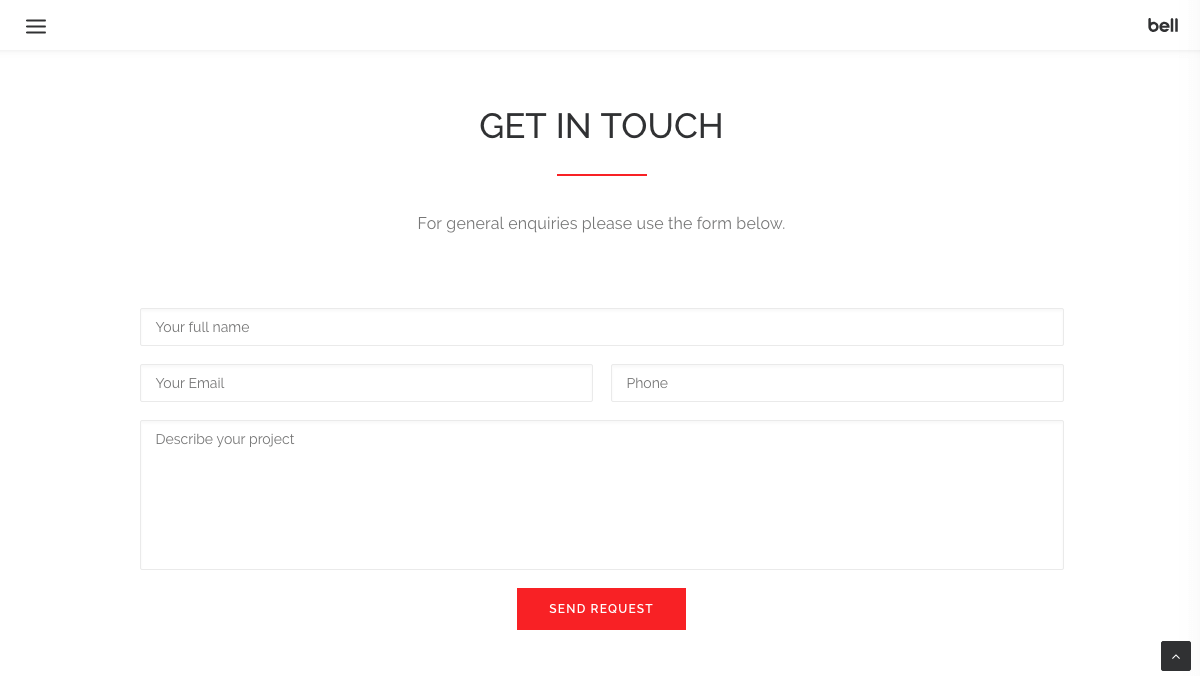
Sometimes, simpler is better. With a straightforward contact form, Bell gives clients the space to explain exactly what they need from a marketing agency. The custom coloring helps the Send Request button stand out, encouraging visitors to take the first step:
With such a wide range of available services, Bell was smart when putting together its Services section. Keeping the design clean and easy to read, the designers also made sure to be thorough with the list, so the company wouldn’t miss out on potential clients looking for specific types of help:
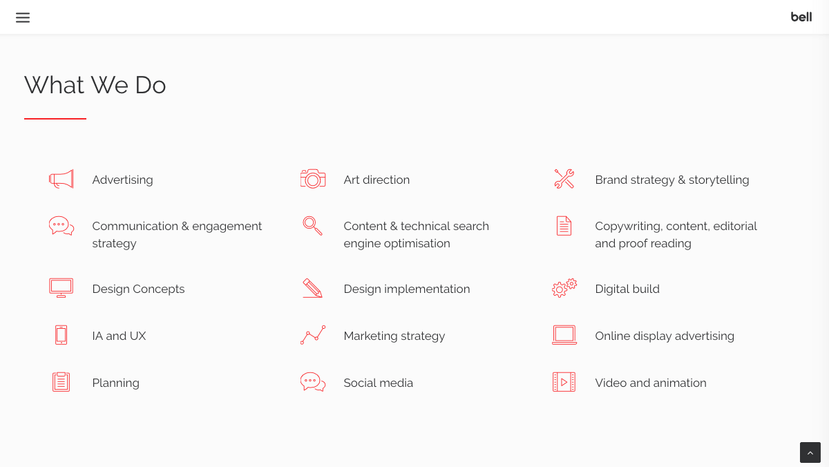
The bright red accent color and sleek, modern typography support Bell’s brand identity as a bold and innovative company. By using Uncode’s features to their fullest, Bell demonstrates its ability to provide clear and helpful information.
6. Atom
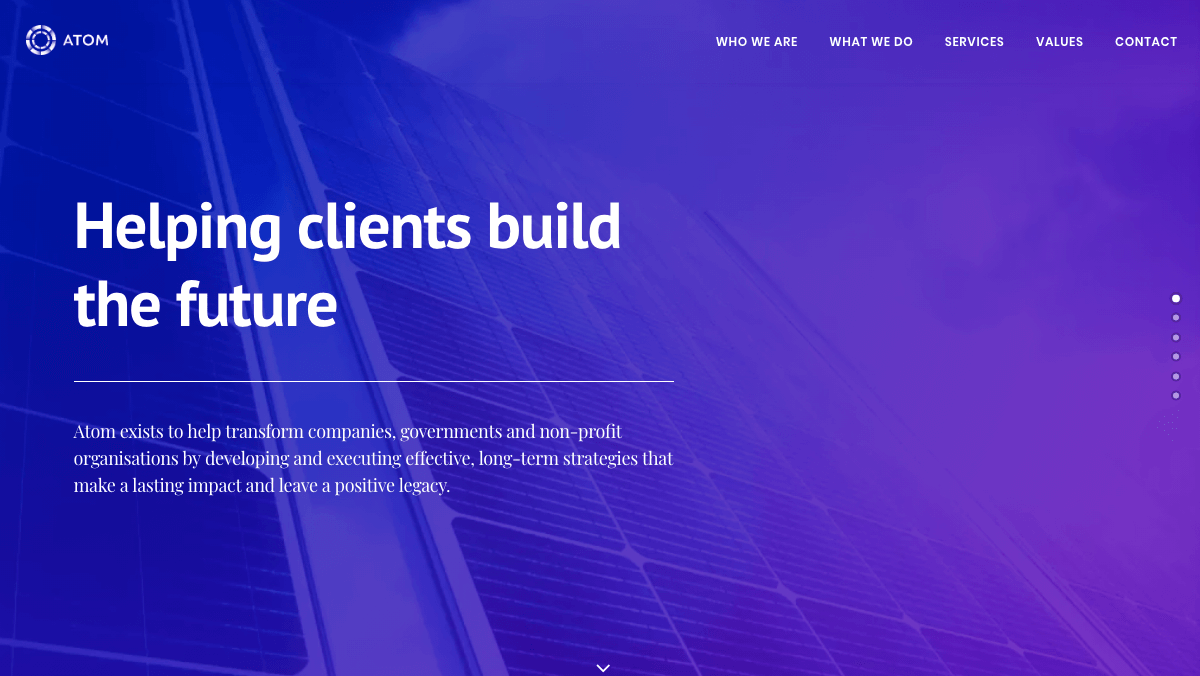
Drawing on its experience with multinational businesses, start ups, and nonprofits, Atom delivers effective marketing strategies to its clients. It also recognizes the importance of technology in today’s climate, and strives to produce innovative solutions to its clients’ problems.
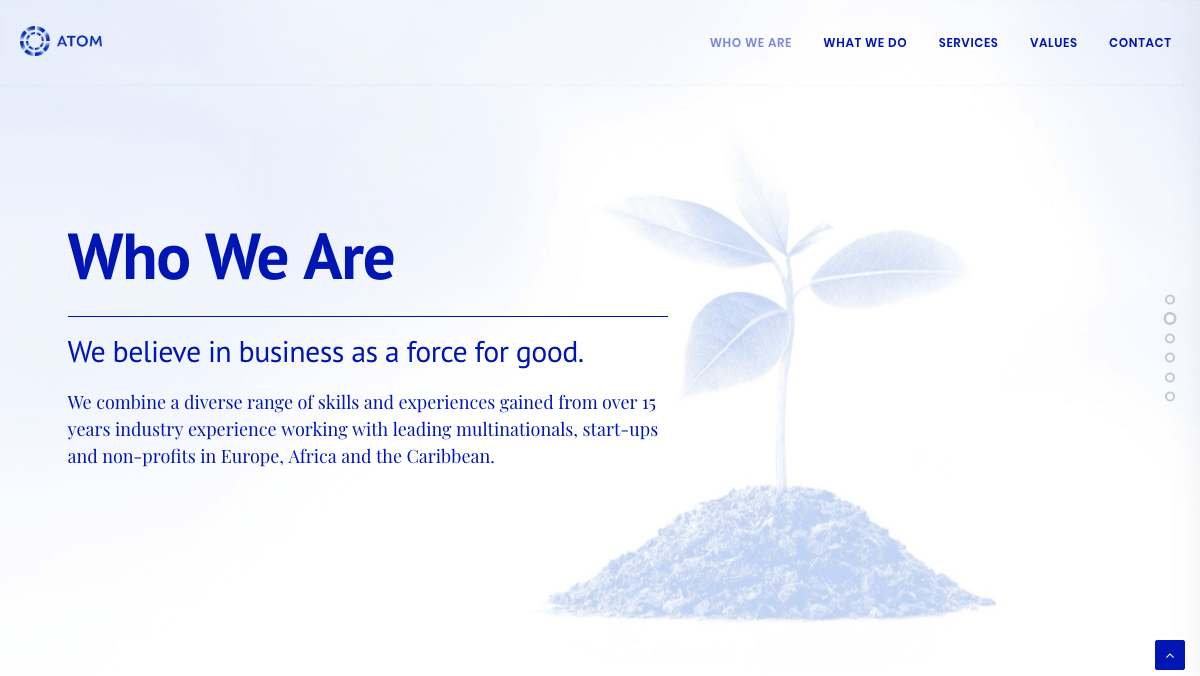
This one-page marketing site stresses simplicity and ease. The same sentiments are applied to the company’s About section, where the business is described with economy and minimalist typography:
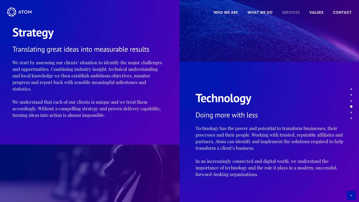
Atom’s take on the grid-style Services section is similar, stressing the company’s highest priorities and getting to the point quickly. The clean, modern design of the grid layout emphasizes the idea of “doing more with less”:
Overall, Atom’s choices when it comes to using Uncode’s layouts support its claims about valuing efficiency. By highlighting its priorities through web design, this company presents an effective and consistent brand experience.
Conclusion
A strong marketing website should be built to reflect your agency’s approach to serving clients. With Uncode, you can create an engaging and unique marketing site that leverages features such as CTA buttons and contact forms, and gains visitors’ trust through well-designed About pages and services sections.
Although each of the sites we introduced above was built with Uncode, every one was distinct and true to the individual company’s mission and values. Thanks to its extensive customization capabilities, our flagship theme can help you create a site that shows off your brand just as effectively.
Do you have any questions about using Uncode to create your marketing site? Leave them in the comments section below!
The Undsgn Newsletter
Sign up to stay up to date with the latest news!
(You will be forwarded to our subscribe form hosted by Mailchimp)
You might also like...
December 1, 2018
7 Outstanding Agency Websites Built with Uncode
If you're using your website as a way to introduce yourself to…
October 30, 2017
10 Modern Store Websites Built Using Uncode
Online stores are a fantastic way to build a business from the ground…
October 22, 2017
10 Top Portfolio Websites That Run on Uncode Theme
A professional-looking portfolio is crucial for any freelancer or…


