
Most websites you encounter have more than one page, because they need plenty of space to fit in all the information the creator wants to share. However, sometimes a single page can be plenty of room, if you know what you’re doing.
One-page websites aren’t exactly new, but these days they’ve become something of an art form. What’s more, with Uncode you get access to a lot of features that enable you to create stunning one-page designs. It’s just a matter of knowing what they are and how to use them.
In this article, we’re going to talk about when it makes sense to use one-page designs. Then we’ll show you five outstanding examples of one-page sites built using Uncode. Let’s jump right in!
When It Makes Sense to Create a One-Page Website
As the name implies, one-page websites pack everything they have to offer onto a single page. Nowadays, one-page sites are somewhat common, and when done right they can look stunning:
At first, the idea of one-page website can sound like a gimmick. After all, most of your favorite sites probably include a lot more than a single page. However, when it comes to web design, there’s no rule book. As long as your site looks good, fulfills its purpose, and is easy to use, you’re good to go.
Therefore, the question is: When does it make sense to use a one-page design instead of a more traditional setup? Neither option is the right choice for every project. For example, if you run a blog you’ll probably want to stick with a multi-page design, unless you want to pack every post onto a single page. That might be doable, but wouldn’t be beneficial to your site’s usability or Search Engine Optimization (SEO).
In our opinion, one-page designs tend to work best for two types of projects:
- Landing pages. With this type of site, your primary goal is to encourage conversions. You can think of a landing page as a long-form sales pitch.
- Portfolios and agency sites. If you’re using your website to showcase your work and land new clients, it helps to be concise and only present the most important information.
Of course, there are plenty of other situations when using a one-page website might make sense. To spot them, you’ll need to know what purpose you want your site to fulfill and what elements you need to include to get you there. Websites with tightly-defined scopes are the best targets for this types of design.
If you think you can pull off a one-page website, you’ll want to take a look at some examples to learn what works and what doesn’t. For example, in most cases single-page sites can get away with not having navigation menus. Others will use simple navigation that links to each section within the page. You can even use scrolling animations and microinteractions to help your design stand out.
In the next section, we’ll show you some examples of Uncode-powered websites that do all those things and more. Hopefully, these can serve as inspiration for your own project.
5 Stunning One-Page Websites Designed Using Uncode
In the following sections, we’ll present five examples of one-page websites from various types of industries. After all, one-page designs can be highly versatile. Let’s take a look!
1. Atom Consulting
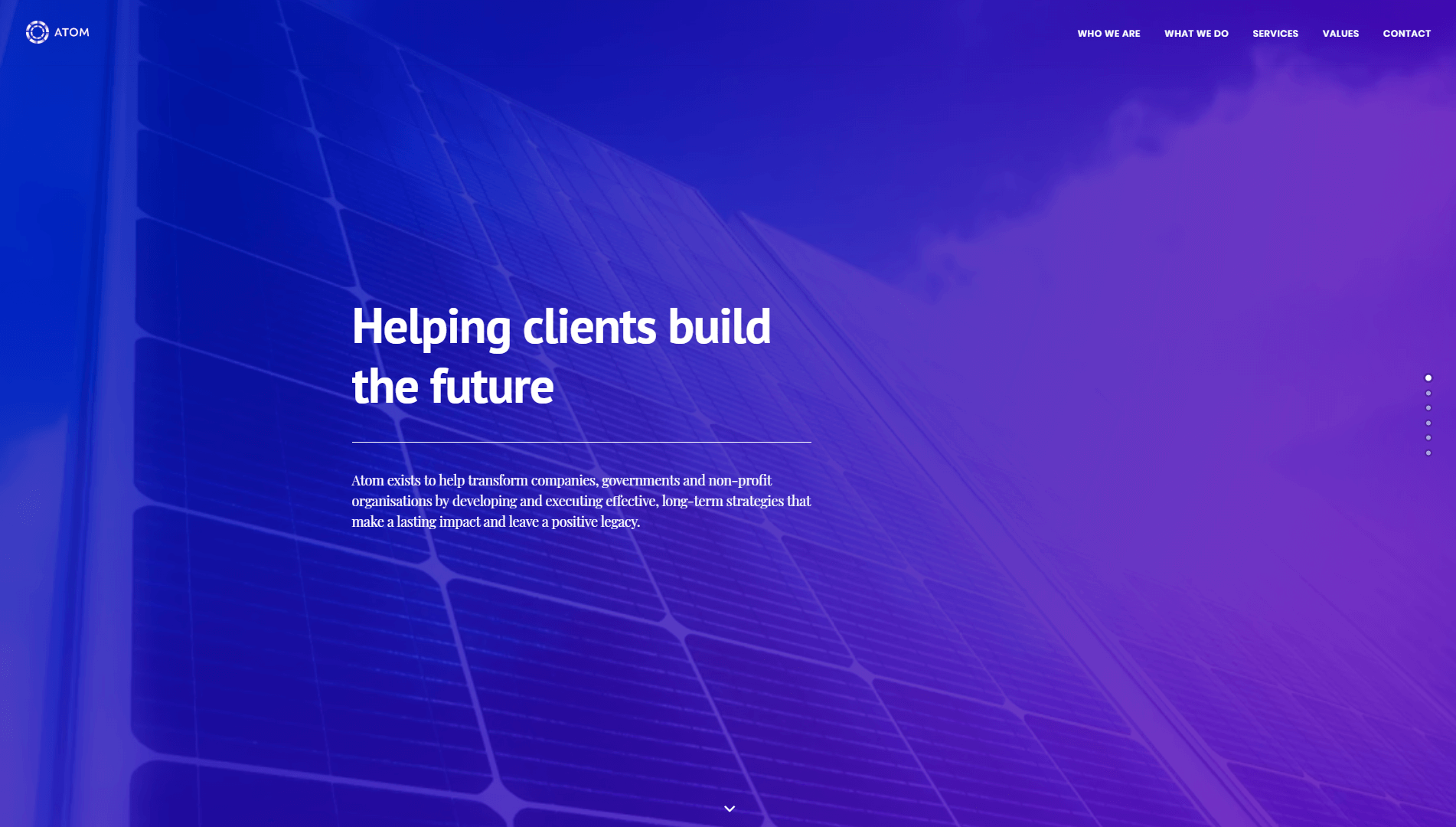
At first glance, Atom Consulting looks much like any other site. It has a navigation menu at the top, a big hero image to welcome you with some information about the company, and so on.
However, once you start moving through the page, you’ll notice that all the information you need is right there in one place. If you click on any on the menu items at the top of the screen, you’ll be taken to that specific section.
Moreover, there are small buttons to the right of the page that show you when you’re moving from section to section. You can also use them to jump directly to each part, and to see where you’re at in relation to the full page.
This ‘dot-navigation’ system makes you feel like you’re visiting different pages, thanks to the clean transition effects. It’s achieved using an Uncode-powered feature called one-page scrolling, and is easy to set up.
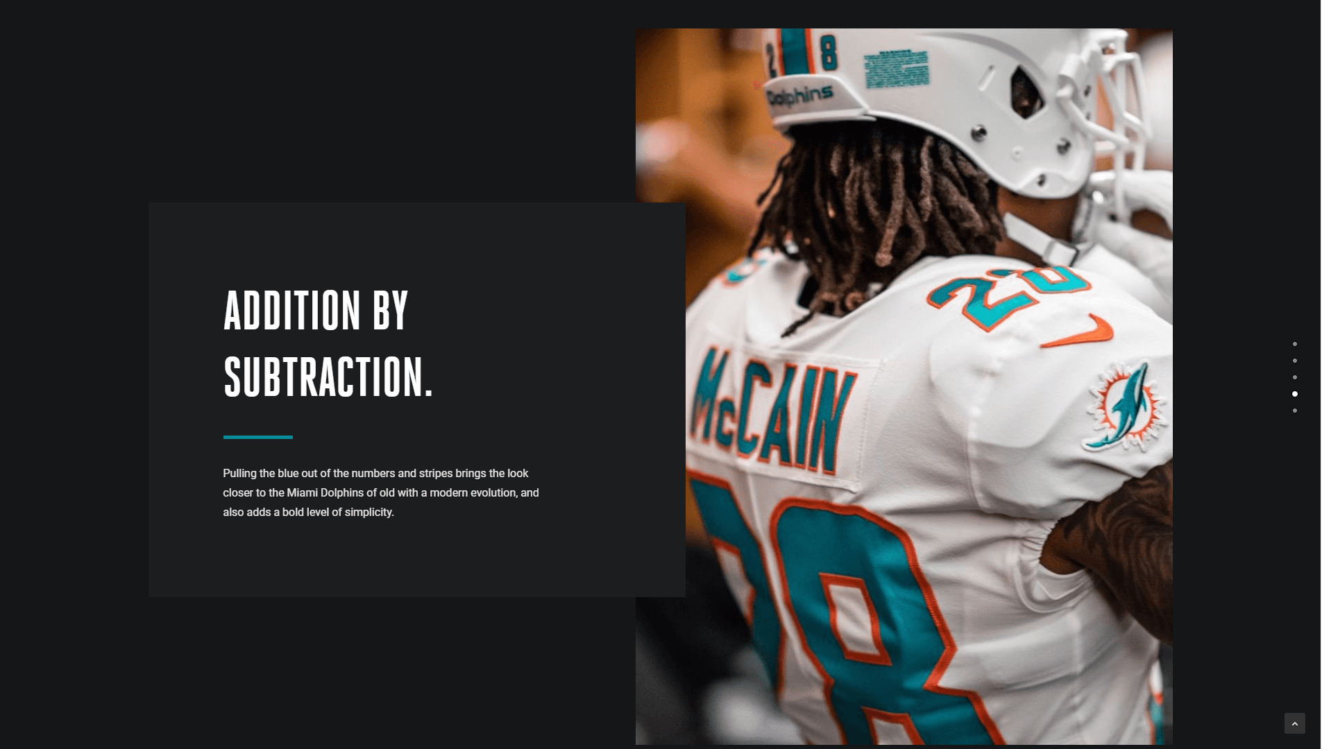
2. Miami Dolphins Uniforms

Yes, that’s right – there’s an entire website dedicated to the Miami Dolphin’s uniforms. Even more surprising is that the site itself is a joy to look at. Right away, you’ll notice that it welcomes you in with a stunning background header video, which is something you can quickly implement using Uncode.
Dot-navigation makes an appearance on this website as well. However, the implementation is a bit different than in our previous example. If you compare both sites, you’ll see that the scrolling animations here are a bit ‘snappier’. That’s because Uncode enables you to customize the behavior of these animations within the theme settings.
Another difference is that each section of this one-page website includes its own animations, which play when you navigate to a new part. This makes the site feel dynamic, even though it’s quite light on content.
If this were a multi-page website, the topic is so niche that it would have a difficult time keeping visitors engaged. However, by condensing everything down into a single page, you can create a story that users can scroll through and enjoy.
3. The Revenant
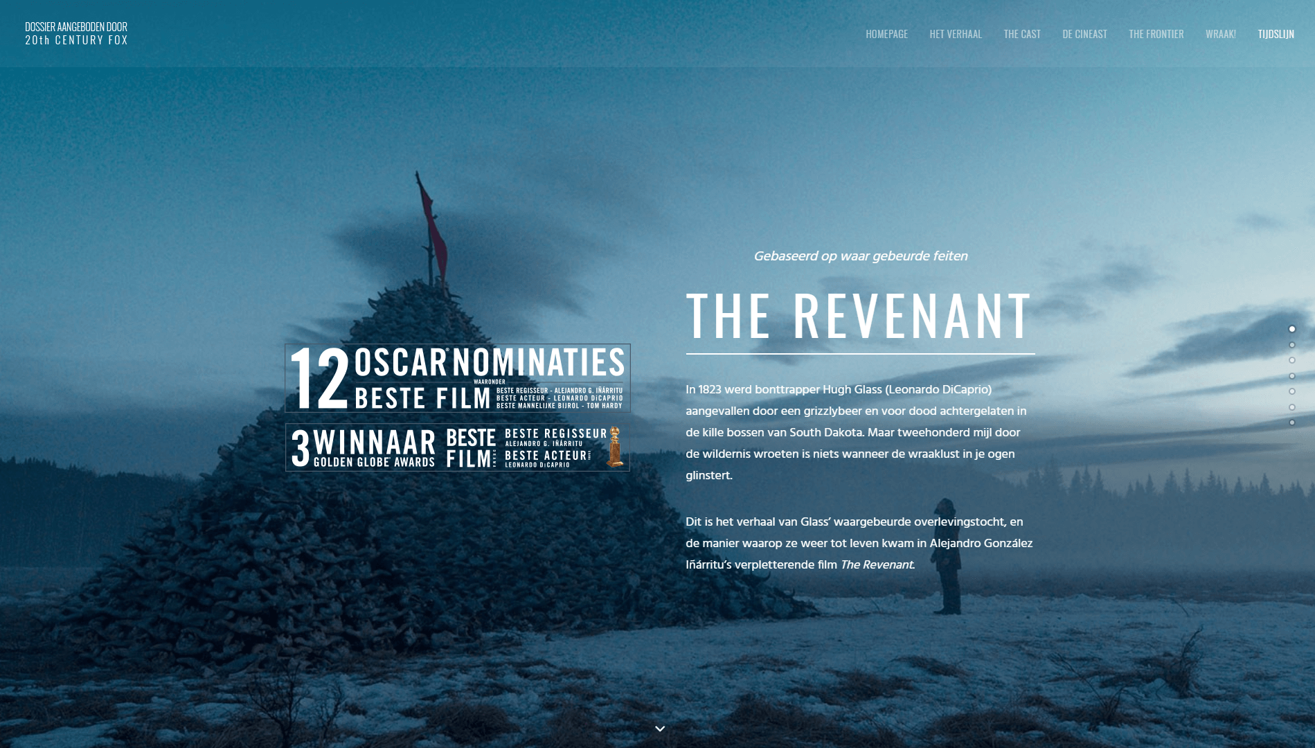
You might remember The Revenant as the movie that finally won Di Caprio his Oscar. However, what you may not know is that the film also has its own one-page website – at least for its release in Belgium.
If you think about it, a one-page website is perfect for highlighting a film or other creative work. You can use the page to show off trailers, cast information, a synopsis, and even a picture gallery. This particular website makes excellent use of Uncode’s Team Members feature to create a cast section, including headshots of the most important actors.
Aside from that, The Revenant website also incorporates dot-navigation and parallax backgrounds. With Uncode, you can add parallax to any of your site’s sections, which makes them look dynamic. That sense of motion is particularly useful for one-page designs, as it helps them feel more fleshed out.
4. Tauderma
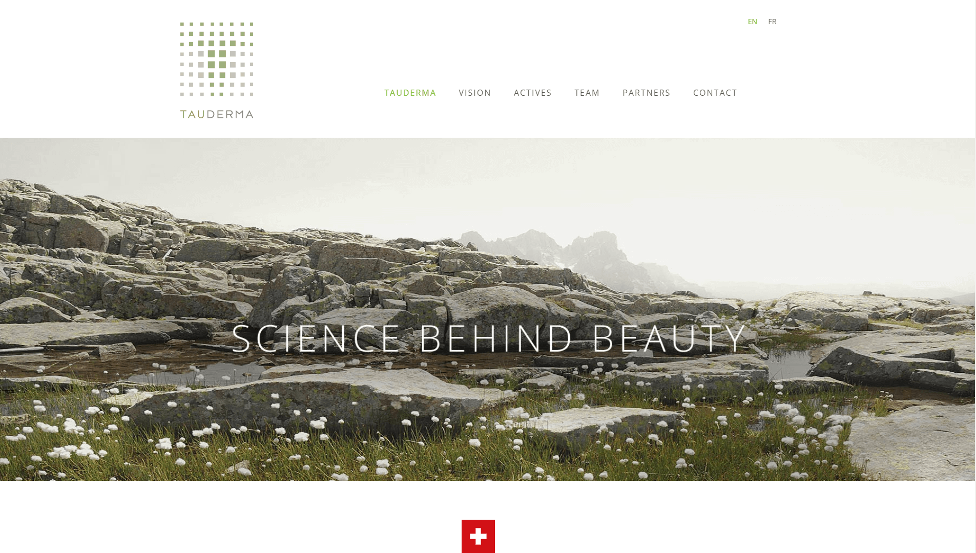
Technically, Tauderma is a two-page website. However, that’s only because there are both English and French versions of the site. In both versions, Tauderma does an excellent job of packing a lot of information onto a single page.
The design here is not as flashy as our previous examples. Still, this website does a lot of things right. For example, it hides additional information using tabs, so the site doesn’t look text-heavy as you scroll down. When you want to read about a specific topic, all you have to do is click on the More Information button.
Tauderma also features Uncode’s Team Members module, which it uses to display some of the people in charge of the company. More importantly, this is the first site in our showcase to also include a contact form.
The Contact Form 7 plugin is integrated into Uncode’s site builder. This lets you add complex forms to your website, without needing to use shortcodes. There’s no better way to help visitors to your one-page website get in touch.
5. Dust
So far, most of the sites we’ve checked out include just a handful of sections. However, Dust breaks with that trend, by packing nine distinct sections onto a single page.
On this website, you’ll find a contact form, a gallery, a team members section, upcoming events info, and more. This sounds like a lot, but in practice it works because none of those sections are particularly dense. Once more, you get to see Uncode’s video backgrounds, contact form, and team members features in action.
The site itself looks compelling, and the only downside is that the video it uses causes a slight dip in performance. With one-page sites, performance is vital, because all of your visitors will only interact with that single page. In other words, you need to make sure your website is well optimized, no matter how large or small it is.
Conclusion
When you’re working on a new website, it can be tempting to pack in as many pages as possible. However, sometimes it pays to be succinct. One page can be plenty even for a professional website, depending on what your site’s goal is. Plus, the fewer pages your visitors have to navigate through, the more likely it is that they won’t miss anything important.
If you’re using Uncode, you get access to a lot of cool features that interact perfectly with one-page designs. Some examples are dot-navigation, video headers, team member sections, and more. Designing a successful one-page site takes a little work and planning, but the job is a lot easier with the right tools, and the results can be well worth it.
Do you have any questions about how to design your own one-page website using Uncode? Share your thoughts with us in the comments section below!