The choice between a single or multi-page website is a tough one. Making sure that your site has the precise number of pages it needs is essential – otherwise, users may not be able to find the content they’re looking for, or they’ll have to jump through hoops to get it.
As far as we’re concerned, each approach comes with its own sets of pros and cons, and neither is perfect for every project. The key is to figure out which design will be a better fit for you and which types of content you want to feature. For example, one-page websites are often better suited to promoting a single product, whereas a multi-page approach is ideal for websites with lots of content.
With that in mind, we’re going to take a look at each option’s pros and cons, and check out which types of websites would benefit from implementing either approach. Finally, we’ll introduce you to some outstanding WordPress themes for of each type of design. Let’s do this!
One-Page Websites
While multiple-page sites have long been the industry standard, now there’s a fast-growing trend towards simpler web designs. As such, single-page (or ‘pageless‘) websites are becoming more popular, especially for landing pages and portfolios. However, as we mentioned earlier, this type of design isn’t ideal for every situation. Let’s take a look at this trend’s pros and cons to figure out if it fits your needs.
Pros:
- Increased user engagement. When combined with good copy, one-page designs tend to be more effective at drawing audiences in and encouraging them to convert.
- Higher conversion rates. For businesses selling only one product or service, a single page is usually all it takes to showcase it. One-page designs are more focused, which can translate to higher conversions.
- Easier navigational experience. Navigation doesn’t get much simpler than with single-page websites. All visitors need to do is scroll up or down and click on the occasional outbound link – easy as pie!
- Better structure. One-page websites enable you to structure information more cleanly. For example, if you’re selling a product, you could kick things off by introducing it, then move on to talking about its benefits, and finally, hitting visitors with a compelling Call to Action (CTA).
- Simpler development and maintenance. Updating and maintaining a single page is easier than taking care of several – you can’t argue with math!
Cons:
- Inferior Search Engine Optimization (SEO). Optimizing a one-page website for search engines can be challenging since you have less room to play around with keywords.
- Limited length. There’s no hard rule for how long any page should be, but chances are no one will make it to the end of your one-page website if it’s thousands of words long. That means you’ll need to keep things concise in order to avoid overloading your visitors with information.
- Narrow focus. One-page websites tend to be focused on a single topic, product, or service by their very nature. If you ever feel like expanding your website to feature other topics, you’ll either need to add more pages or risk confusing visitors by tackling everything within the confines of your one-page design.
Recommended For:
Throughout this section, we’ve mentioned a few examples of websites that work particularly well with one-page designs. Let’s check them out once again and discuss why they work well with this approach:
- Portfolios. A portfolio can have as many pages as you want, but presenting all the key information on a single page can help clients find what they need faster.
- Landing pages. Working with a single page enables you to present a narrative that explains why people should be interested in your product. This works particularly well for digital items, or niche products where there isn’t much competition.
- Event-related websites. If you’re working on a website for a one-time event – like a festival or a wedding – the chances are that you don’t need to go overboard with the number of pages you’ll include. As long as all the important information is in there, visitors will be happy (and impressed!).
Naturally, these examples don’t represent the only use cases for one-page designs, but they do share one thing in common – they are only as large as they need to be. The main question you need to ask yourself when considering a single-page design is, Is one page enough to cover all the information I want to deliver? If the answer is yes, then by all means, go for it.
3 Top One-Page WordPress Themes
At this point, you should have a clear idea of whether one-page designs are a good fit for you. If the answer is yes, take a look at some of our favorite options.
1. Uncode ($59)
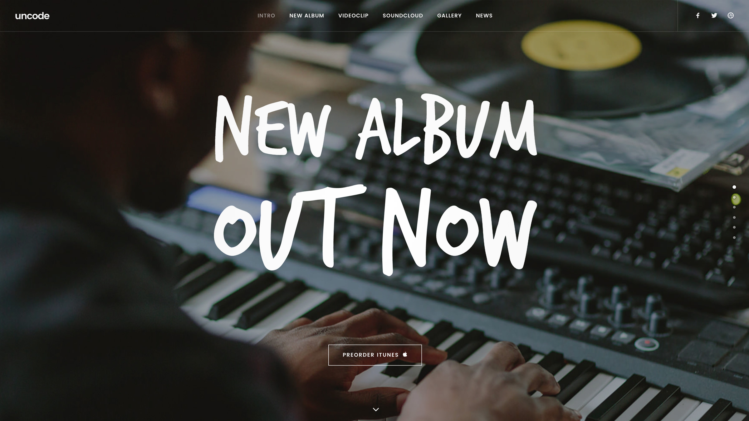
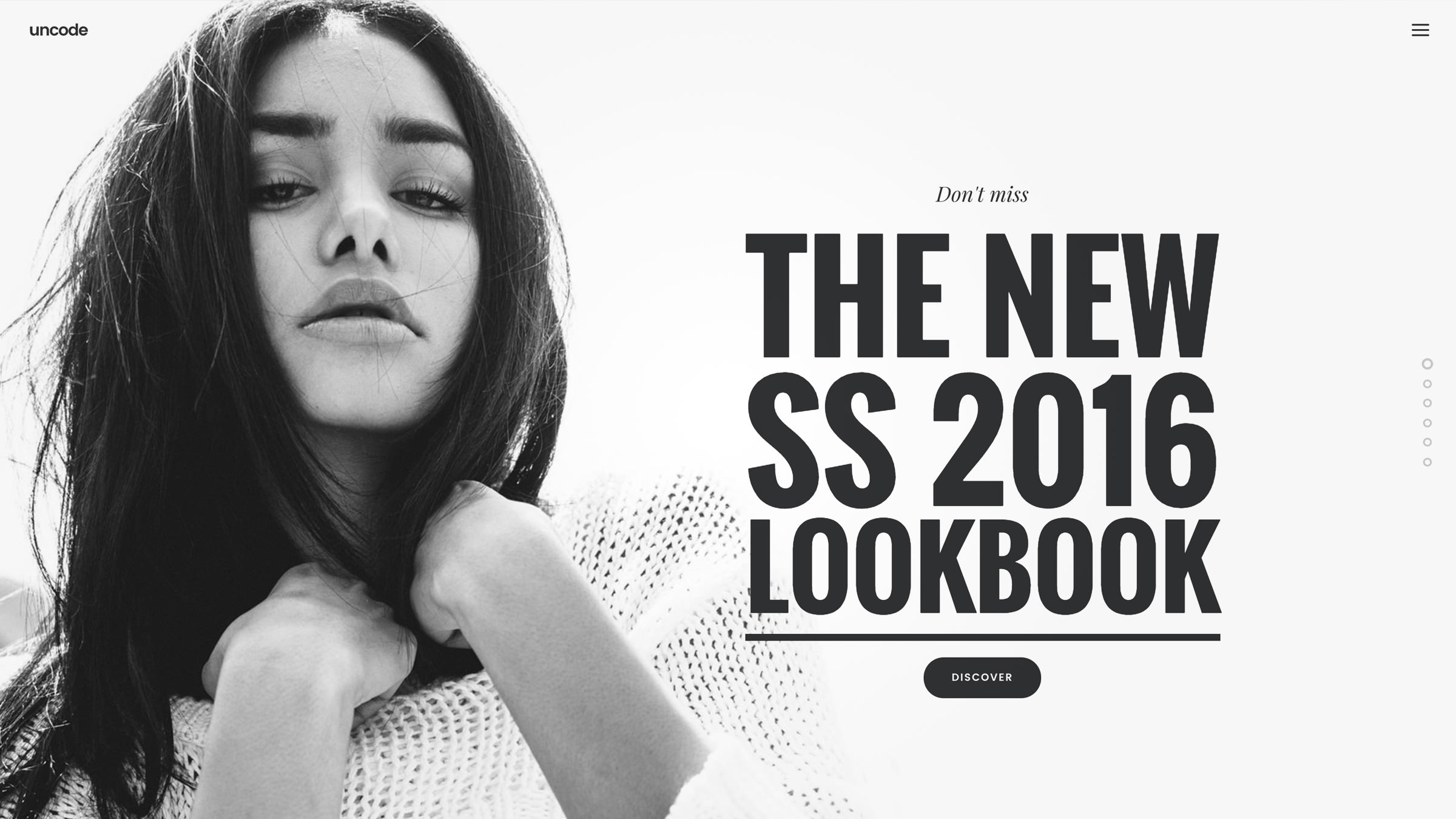
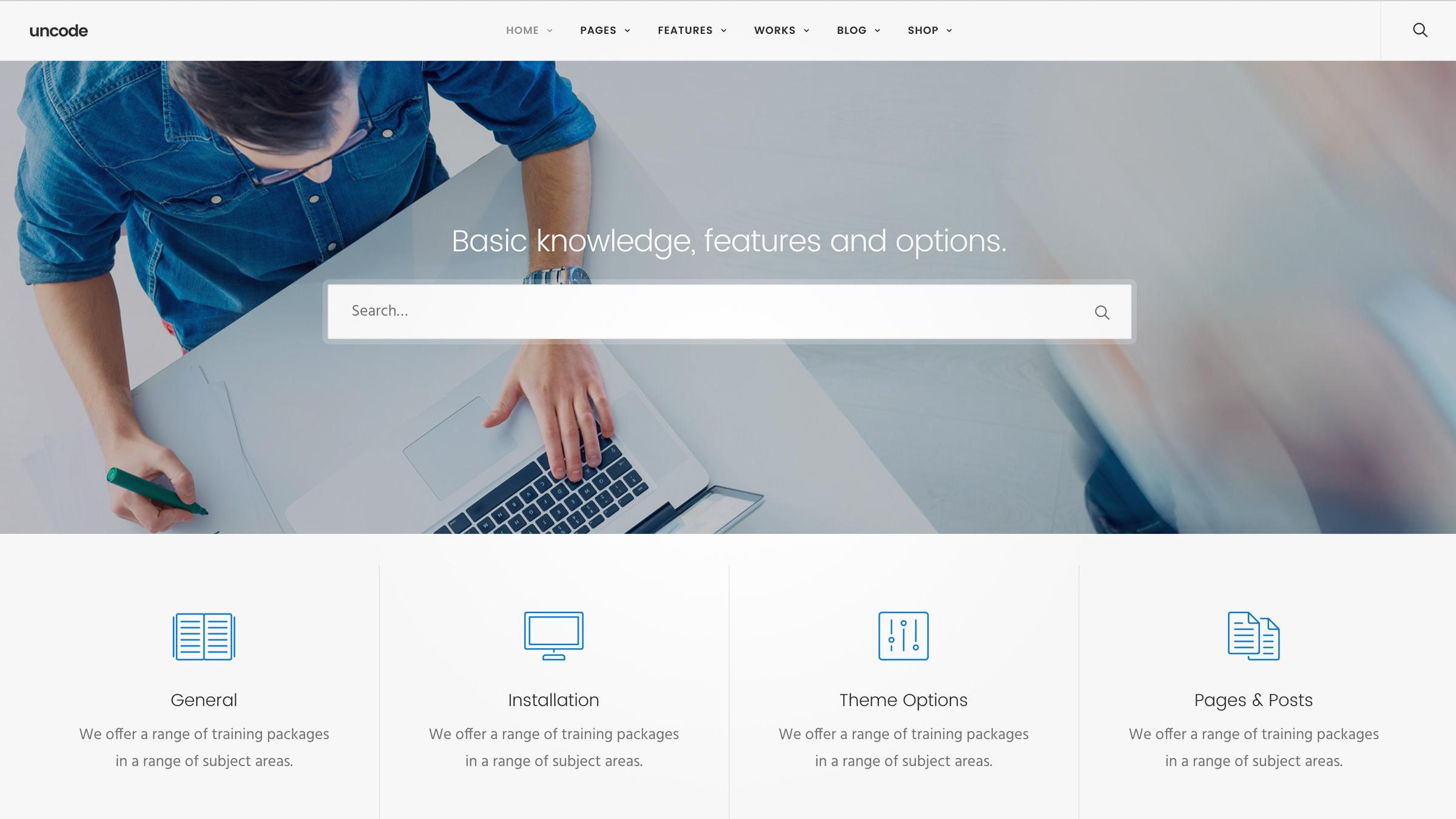
Uncode is a multi-purpose theme that comes with a tailored version of the Visual Composer plugin, which enables you to easily create modern layouts. It isn’t a one-page theme per se, but it does come with several layouts that fit the bill, such as Creative Artist and Classic Studio.
2. Parallax ($49)
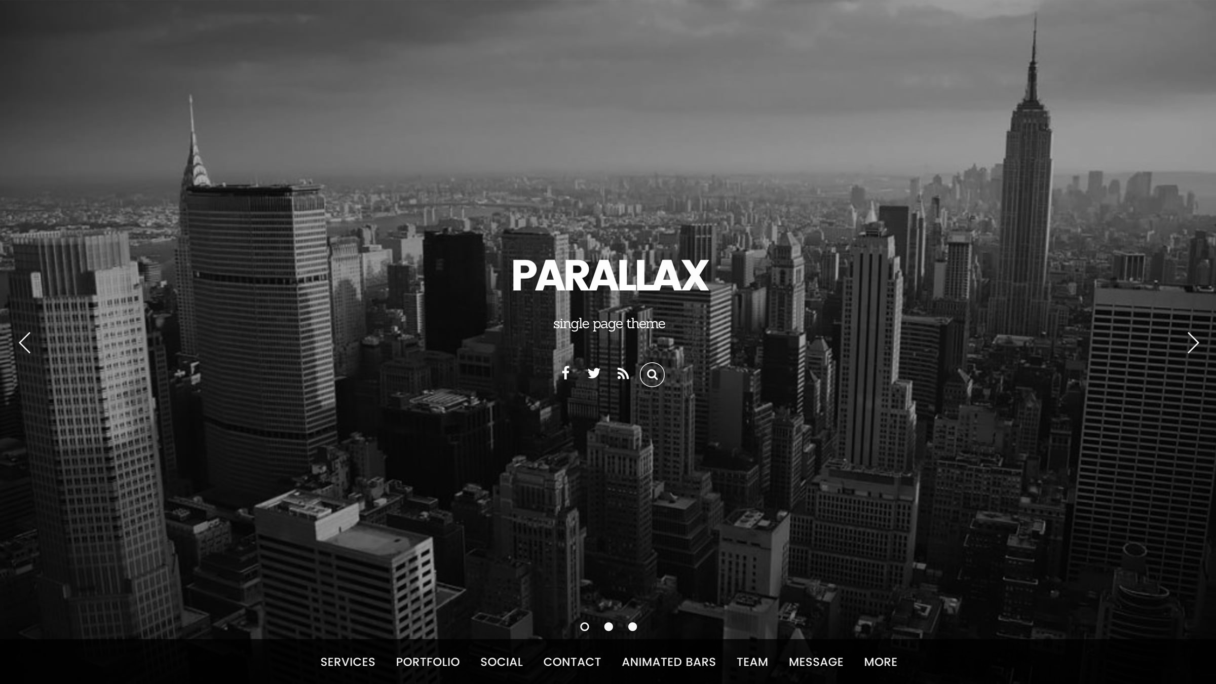
The Parallax theme combines single-page design with an eye-catching parallax scrolling effect. Furthermore, it comes with over 40 pre-designed layouts that you can set up with a few clicks.
3. Jarvis ($60)
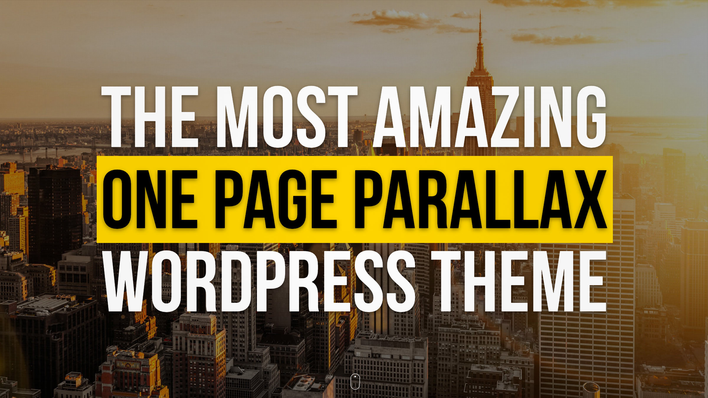
Jarvis is another one-page theme that sports a design built around parallax scrolling. It features a high-contrast color scheme by default, and it comes with over 12 layouts that are perfect for single-page designs. Furthermore, it features a couple of advanced options, such as support for video backgrounds, and WooCommerce integrations.
Multi-Page Websites
One-page websites might be all the buzz these days, but you should never let the desire to be trendy overshadow the need to deliver a good user experience. Multiple-page websites might have been around since the dawn of the web, but they’re still every bit as relevant now as they were back in the 90s. In many situations, there’s simply no other practical solution, as you’ll find out below.
Pros:
- Unlimited scalability. Any business that’s seeking to expand into new markets or constantly adding items to their portfolio needs to have a scalable solution at their disposal. Multiple-page designs are the obvious choice in these cases.
- Excellent SEO potential. Thanks to the ability to target different keywords for each page, multi-page designs enables you to rank for multiple key phrases. That means you have more flexibility when it comes to SEO.
- Ease of use. Although one-page websites may be easy to use, most people also know how to find their way around a traditional navigational menu (as long as it’s well-structured!)
Cons:
- Multiple pages to maintain and update. Maintaining and updating multiple pages can be a chore, and things only get worse the larger your website becomes.
- More distractions. Whereas a one-page design is great for taking people on a journey by getting them involved in your story, multiple-page websites provide visitors with many opportunities to get distracted.
- Less suitable for mobile devices. Navigating around a multi-page website can be a frustrating experience if you’re using a mobile device, particularly when there are multi-level menus involved.
Recommended For:
Multi-page designs are well-suited to nearly every type of project. They’re what most people picture when they think of a modern website, and it’s easy to understand why (check out the pros section above!). With that in mind, let’s go over a few use cases that work particularly well with a multi-page approach:
- Authority websites. If your goal is for your website to become the go-to resource for a particular topic, you’ll need the flexibility that only a multi-page design can provide as your content grows.
- E-commerce websites. While it’s entirely possible to set up an online shop using a one-page design, the approach doesn’t hold up if you intend to add a wide catalog of products. Furthermore, a good e-commerce site should also include additional pages, like terms of use, wishlists, individual product sections, etc.
- Service websites. Depending on the scale of your service, you might get away with a one-page website for this one, but it’s not typically recommended. A professional service website should include pricing information, contact details, feedback forms, testimonials, etc. It’s simply too much information to cram into a single page without overloading your visitors.
Of course, there are plenty more examples of websites that are suited to multi-page designs, but the above are our favorites. To put it simply, if you think your website will need to expand over time, a multi-page design is the most logical route to take.
3 Top Multi-Page WordPress Themes
1. Uncode ($59)
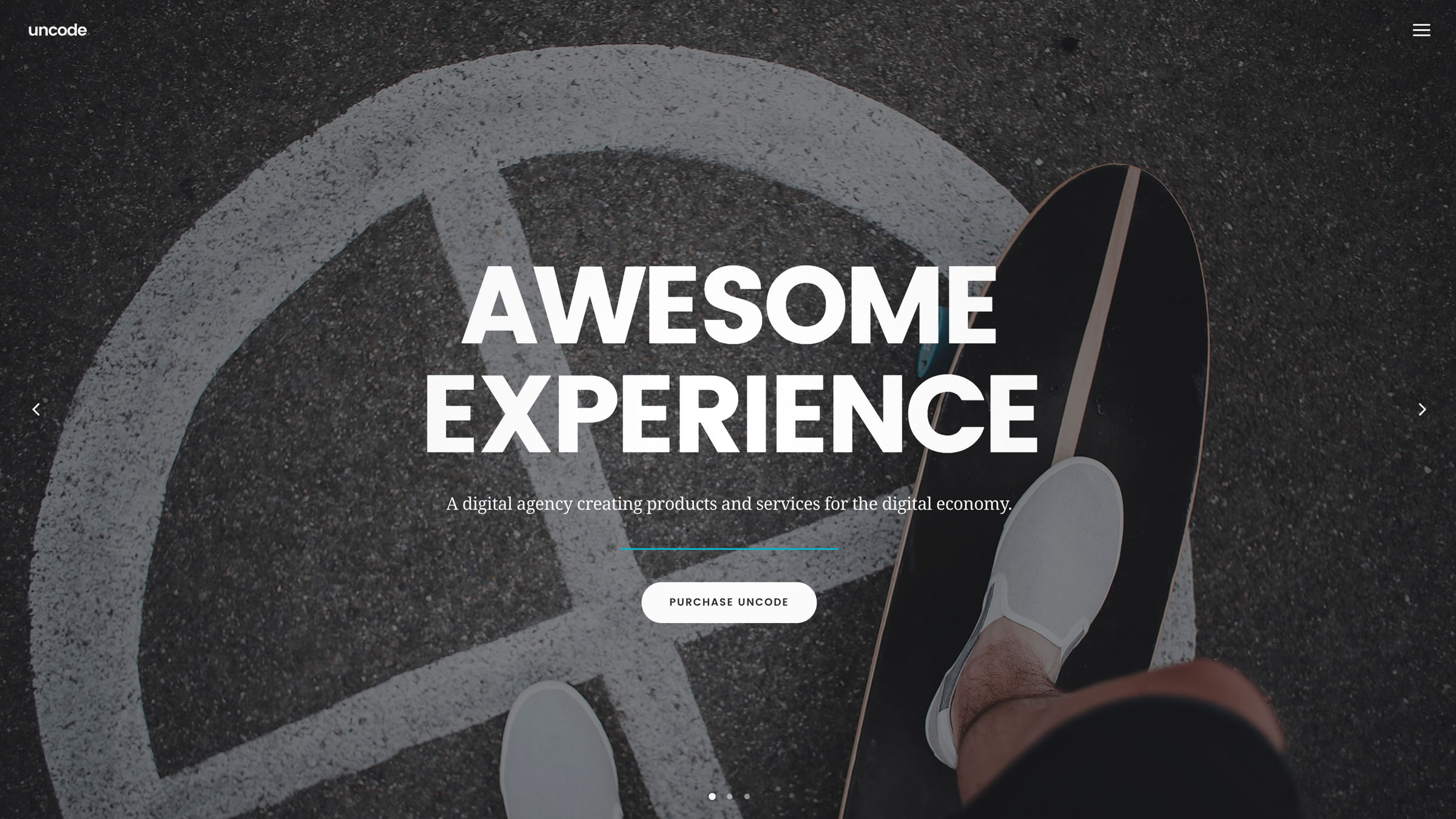
Uncode is one of the few themes that is suitable for both single and multi-page websites, thanks to its wide range of features. It also comes with dozens of pre-designed – and fully customizable – multi-page layouts that make setting up a website simple.
2. Divi ($69)
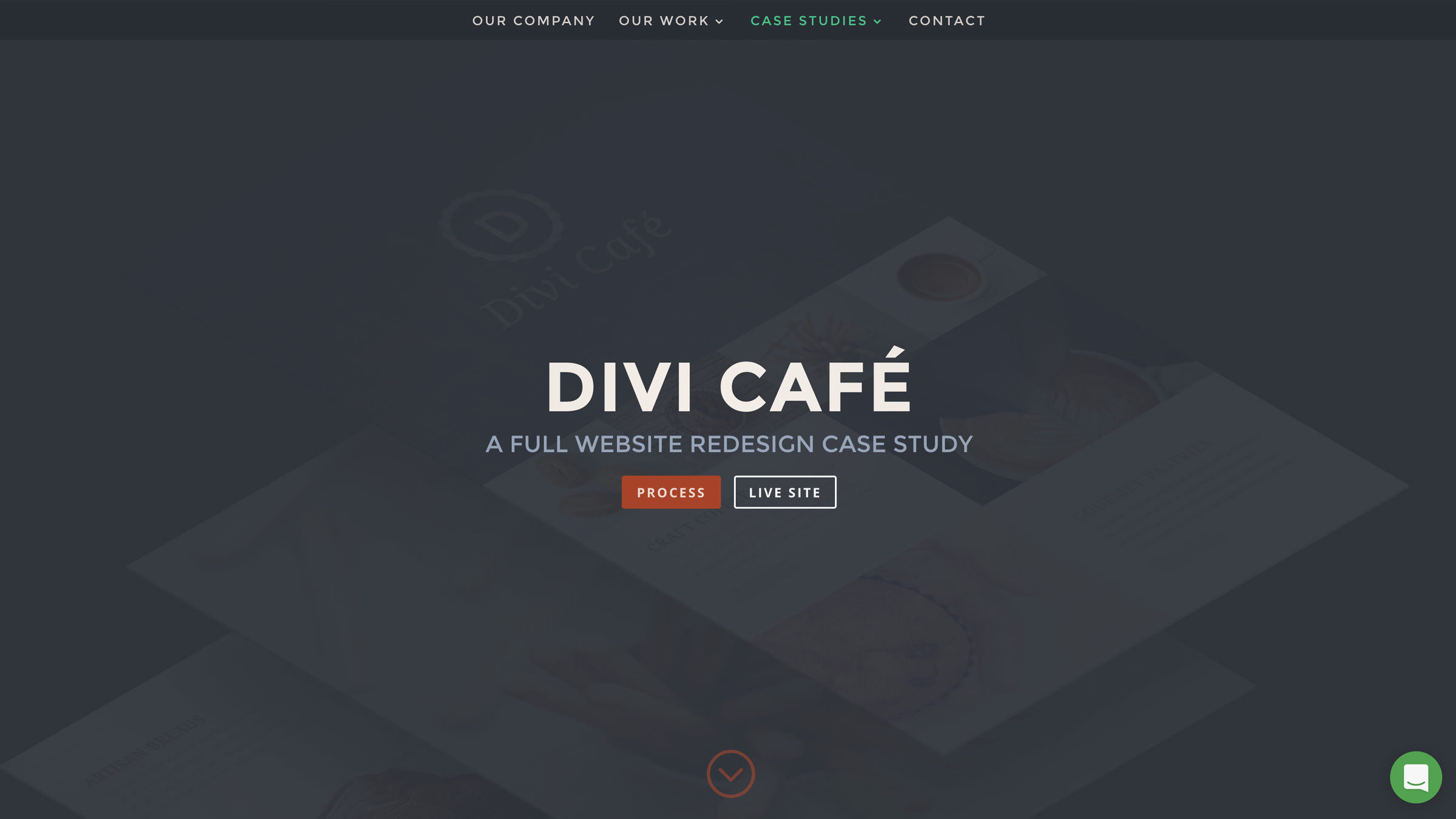
Divi enhances the already-great WordPress platform with a fully-featured live editor of its own. You can use this tool to create just about any type of website imaginable, including complex, multi-page e-commerce stores, and other sites.
3. Boundless ($49)
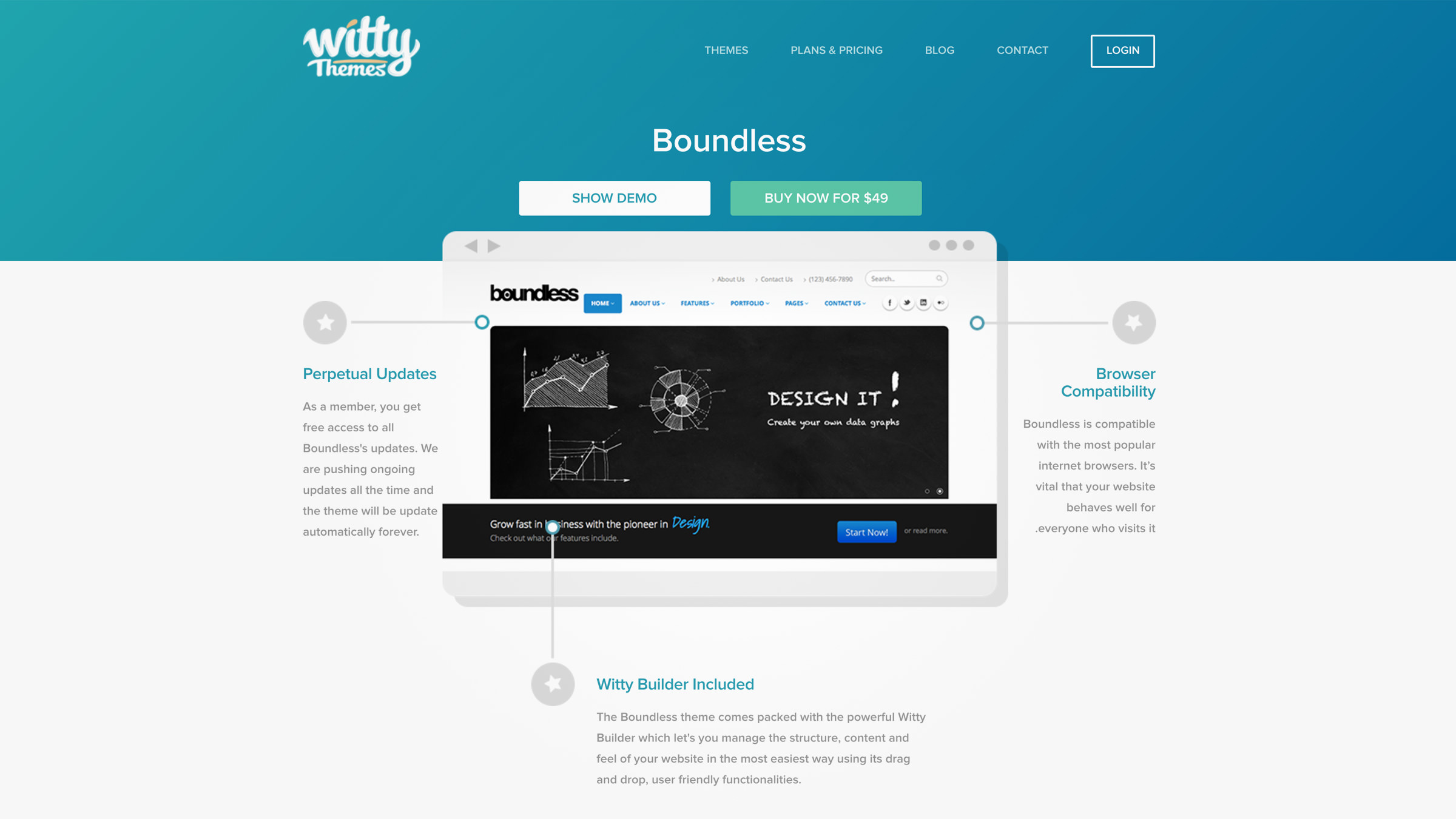
Boundless is a highly scalable theme that ships with a visual drag-and-drop builder to help you design your website with ease. The theme features two unique menus, which makes it suitable for sites with complex navigational schemes.
Conclusion
There is no clear winner in the debate between single and multi-page designs. For example, the simplicity of a one-page website can be ideal for an artist’s portfolio or for a one-product online shop. On the other hand, a multi-page design can be the only practical approach when it comes to websites with large libraries of content.
Depending on which type of design you’re leaning toward, you should check out our recommendations for one-page WordPress themes…
- Uncode: A fantastic theme for both single and multi-page websites.
- Parallax: This theme ships with over 40 pre-designed layouts, so you’ll have plenty of options to choose from.
- Jarvis: Perfect if you’re looking to set up a simple, one-page online shop.
…or their multi-page counterparts:
- Uncode: You’re already familiar with this one!
- Divi: This multi-purpose theme ships with an intuitive live editor.
- Boundless: A highly-scalable theme, perfect for websites with complex navigational structures.
Do you favor one-page or multi-page design? Let us know in the comments section below!
Image credits: Pixabay.
The Undsgn Newsletter
Sign up to stay up to date with the latest news!
(You will be forwarded to our subscribe form hosted by Mailchimp)
You might also like...
June 26, 2018
Key Elements for the Best Web Page Design
When it comes to web page design, the trends are constantly changing.…
September 1, 2016
Tricks & Tips: how to create the perfect modern landing page
You’ve built most of your site’s pages, and you’ve got your message…
April 24, 2018
How to design a website like a professional
Having a well-weaved mix of the designer style and the website’s user…


