
When it comes to the web, text is king. For many (if not most) websites, text makes up the bulk of their content. That means your choice of font can have a significant impact on the way people perceive your site.
The simple fact is that some fonts are easier to read than others. With the right font choice, you can even make your website look more professional. Therefore, it pays to spend some time considering your options carefully, before settling on which typefaces to use.
In this article, we’re going to dig deeper into why your choice of web fonts is important. Then we’ll cover four simple tips to help you choose the perfect fonts for your WordPress website. Let’s talk about typography!
Why Your Choice of Web Fonts Matters
Chances are, you wouldn’t be reading this article right now if we decided to use a ‘fun’ font instead of this one. Here’s a quick look at what such a font might look like:
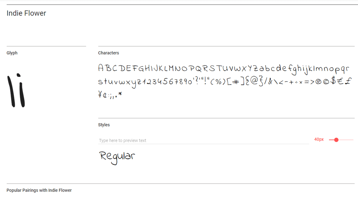
This may appear memorable, but it’s not the type of font to use when you want people to pay close attention to what your text is actually saying. There is a time and a place for every type of font, and knowing what those are is important when you’re working on a website.
If you pick the ‘wrong’ font, you’re likely to run into a whole host of problems. For instance:
- Your visitors may have a hard time reading your content.
- The overall experience might scare some users away.
- Your website could end up looking unprofessional or unreliable (or both).
Naturally, there are a lot of factors that impact the way people perceive your website, beyond just the fonts you use. However, typography is a basic and essential element that merits close attention.
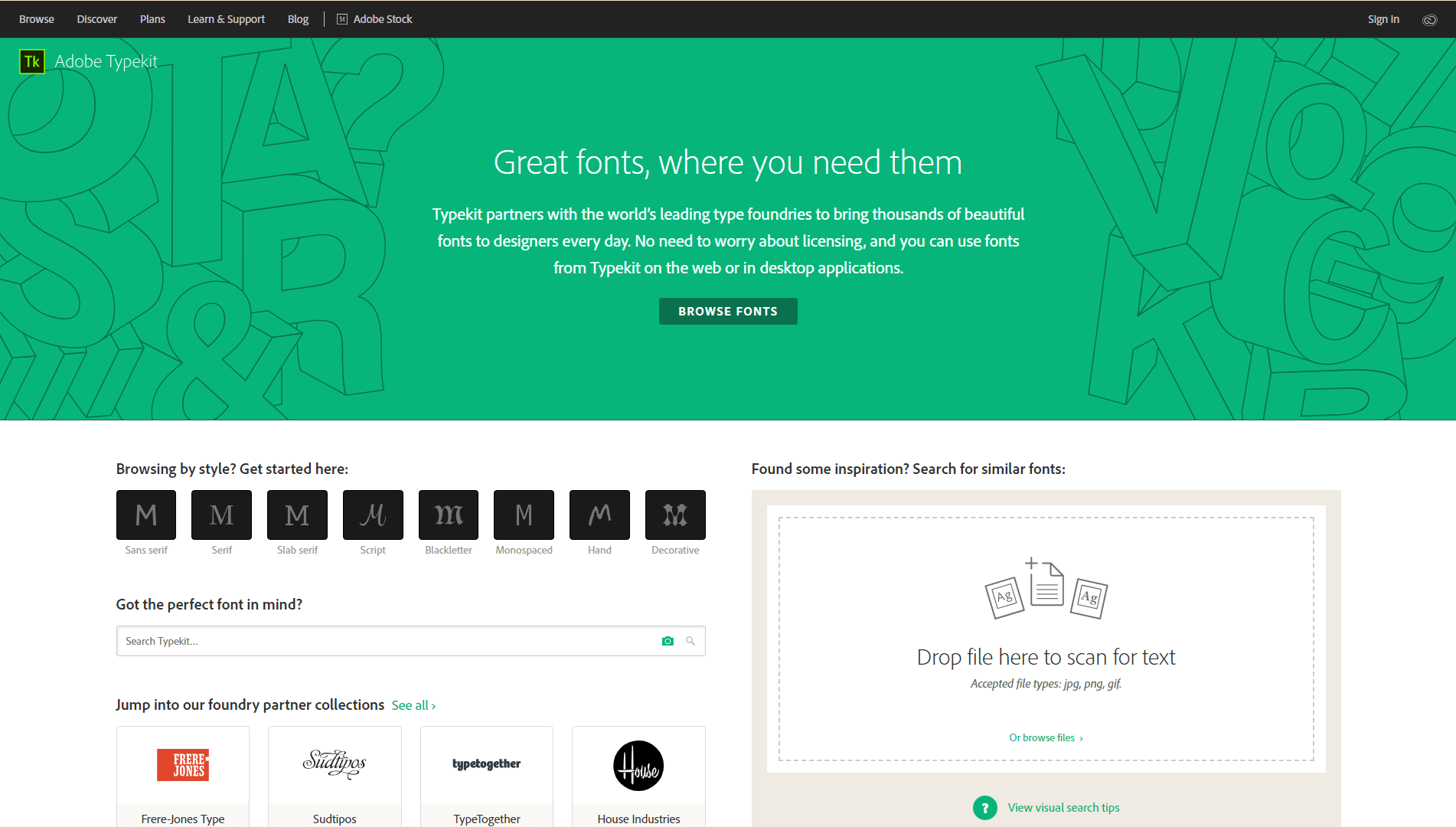
What’s more, you now have so many options when it comes to fonts that you don’t need to settle for the same choices most websites use (we’re talking about you, Times New Roman). Google Fonts and Adobe Typekit alone provide thousands of free choices:
If you want to look off the beaten path, you can find even more free fonts online.
Most importantly, WordPress makes it relatively easy for you to add new fonts to your website. Plus, if you’re using our Uncode theme, you’ll get access to a built-in feature that can help you import fonts from several platforms:
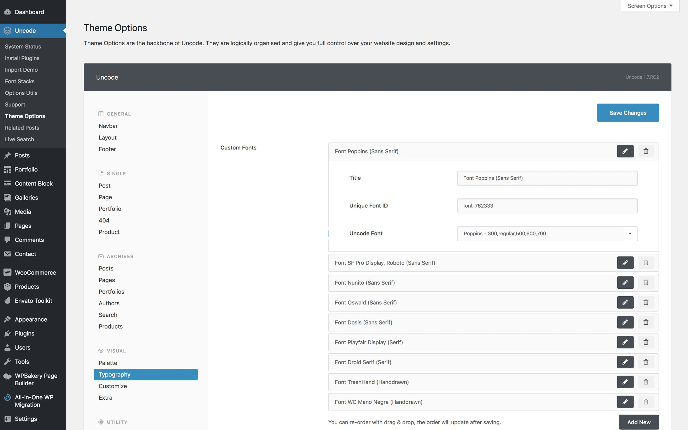
Along with the aforementioned Google Fonts and Adobe Typekit, Uncode also enables you to import options from Font Squirrel. If you’re feeling brave, you can even add custom fonts from other sources through your style.css file. In other words, the sky is the limit here.
4 Tips to Help You Choose the Best Fonts for Your WordPress Website
With so many fonts to pick from, it’s important that you don’t base your decisions on appearance alone. Otherwise, you might end up with a website that looks great, but is a pain to actually read. Let’s go over a few simple tips to help you find the best typefaces!
1. Focus on Readability
The first question you need to ask yourself when you’re choosing a font is what you intend to use it for. If it’s going to be part of a design, such as a logo, then it’s okay to have some fun with your picks. However, if you intend to use a font for your content, subheadings, or menus, your primary focus should be on readability.
As you might expect, ‘readability’ refers to how easy content is for a person to read. If you choose to use a font that’s hard for visitors to make sense of, your site’s readability will suffer. In turn, this can negatively affect the overall user experience.
Here’s how to spot fonts that are solid choices when it comes to readability:
- Opt for serif fonts whenever possible (those are the fonts with little ‘feet’ at the end of each stroke).
- Look for fonts with decent spacing between each character, which makes them easier to distinguish (we’ll talk more about this in a moment).
- Keep an eye out for fonts with a little ‘weight’ to them, rather than light fonts with thin lines.
There’s a healthy debate around the use of serif or sans-serif fonts for text on the web. The more popular school of thought says that sans-serif fonts are better for headlines, while serif typefaces are ideal for regular text.
However, you may have noticed that we use sans-serif fonts throughout our entire blog, and this doesn’t affect its readability. The font we use for our blog is called Proxima Nova, and it’s from Adobe Typekit. This just goes to show that you can play with the rules of typography a little, as long as you make sure the user experience doesn’t suffer as a result.
Ultimately, the best way to test any given font’s readability is to try reading it yourself, on both desktop and mobile devices. If you feel like it impacts your site’s usability, keep testing until you find a better match.
2. Keep an Eye on Kerning
The term ‘kerning’ refers to the spacing between each individual character in a font. There’s no global standard when it comes to kerning, so once you start paying attention, you’ll notice that most fonts use different amounts of space.
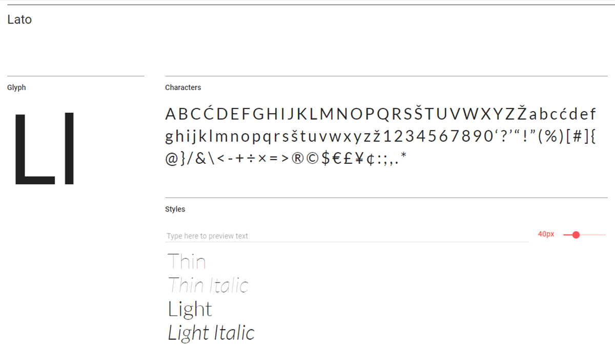
Take a look at the Lato font, for example:
Now, compare it with Karla:
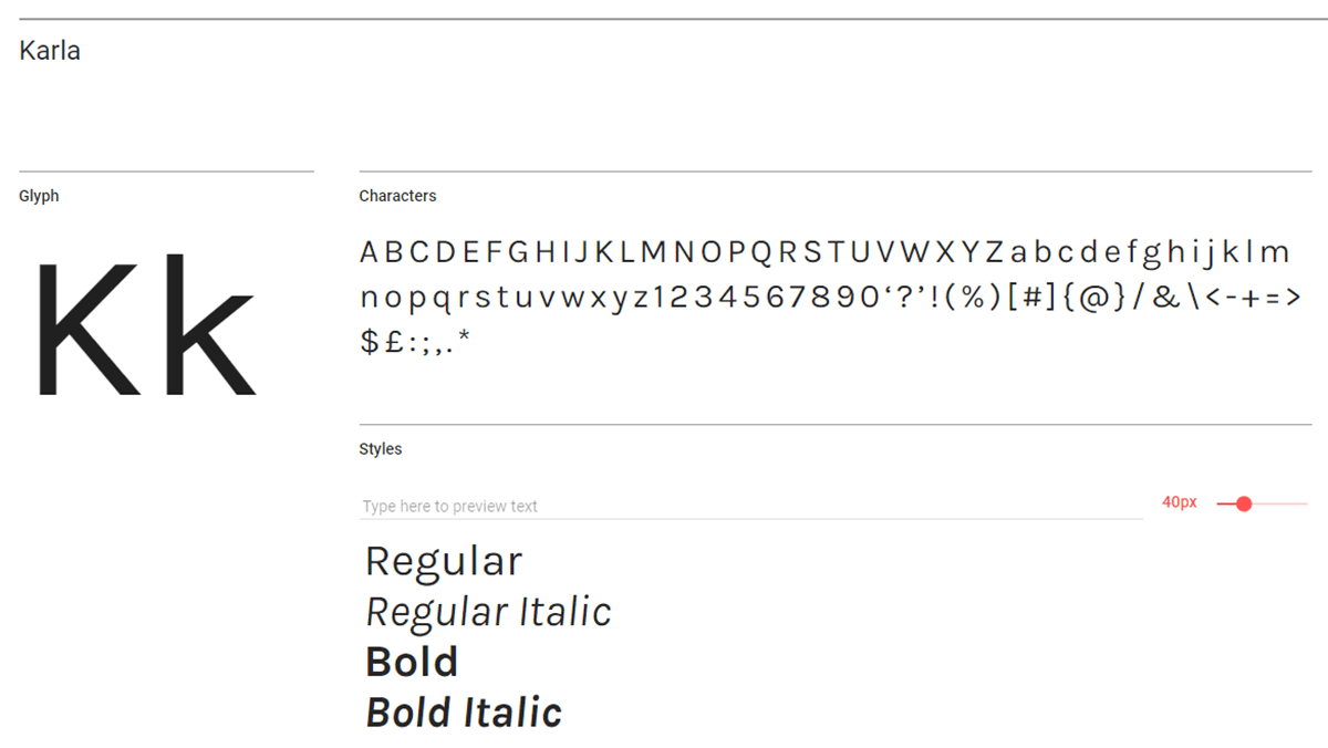
There’s a slight but noticeable difference in kerning between these two fonts. The spaces between letters are more generous in Karla than with Lato.
When it comes to readability, you want there to be a bit of space between characters, so they don’t all blur together. However, once kerning starts getting too wide, it can start to look messy, particularly when it comes to large paragraphs.
Let’s return to the same two fonts, this time using full paragraphs. First up, we’ve got Lato again:
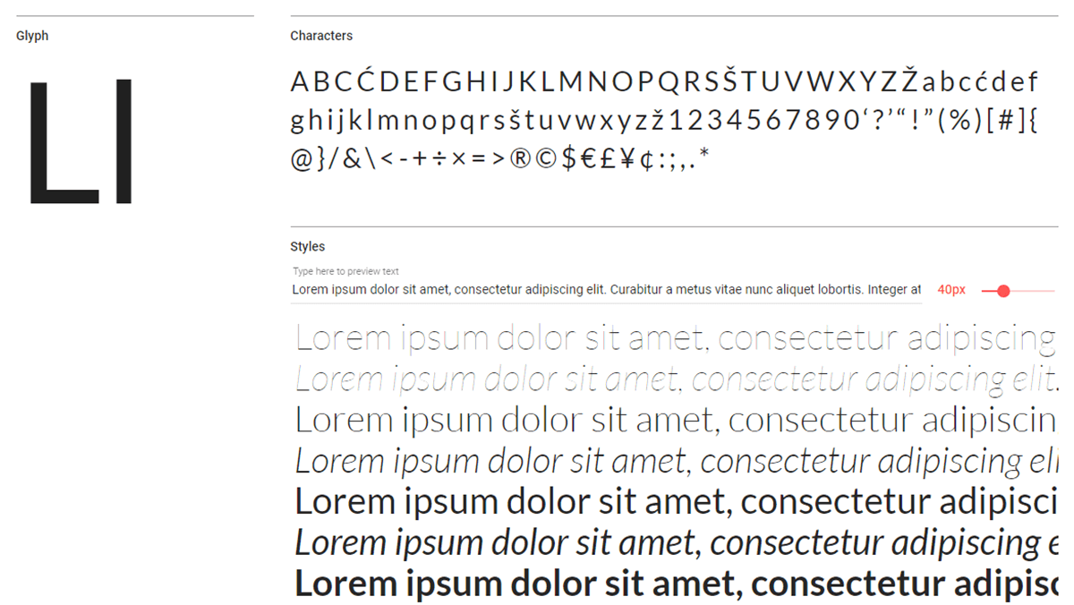
Now, here’s the same paragraph using Karla:
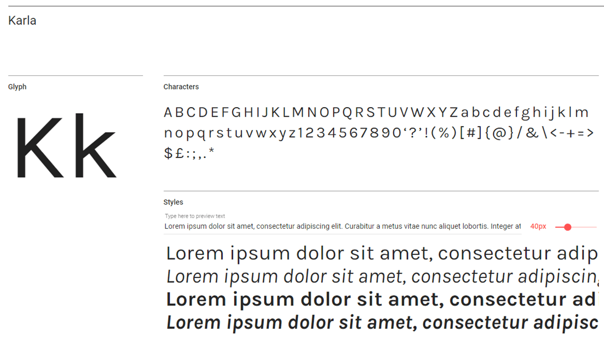
You can probably see that Karla is a bit harder to read, and starts to look very spread out when there’s this much text on the page. With longer paragraphs, more kerning means there’s a lot of empty space on the page. As a consequence, it becomes harder to skim over the content.
As we mentioned earlier, there’s no consensus on what value makes for perfect kerning. The shape of each font also impacts how much space you want between each character, so in the end it comes down to a subjective judgment. Just as with our last tip, we recommend that you take any font you want to use for a test drive, creating some longer paragraphs and checking to see if the kerning negatively affects readability. If the answer is yes, you’ll want to try a different font.
3. Avoid Overused Fonts
Earlier on, we mentioned that most websites tend to use the same fonts. You’ve no doubt heard of these mainstays, such as Times New Roman, Helvetica, Verdana, and so on.
There’s nothing inherently wrong with any of those fonts, but they’re so common that they can get boring. They can also make your site look a little too much like everyone else’s. Plus, you have so many options to choose from these days that limiting yourself to these few fonts doesn’t make much sense.
So in addition, you’ll probably want to stay away from Courier, Georgia, Garamond, and (of course) Comic Sans. Instead, take your time checking out all the different types of fonts you can find on the many sites and platforms that are available.
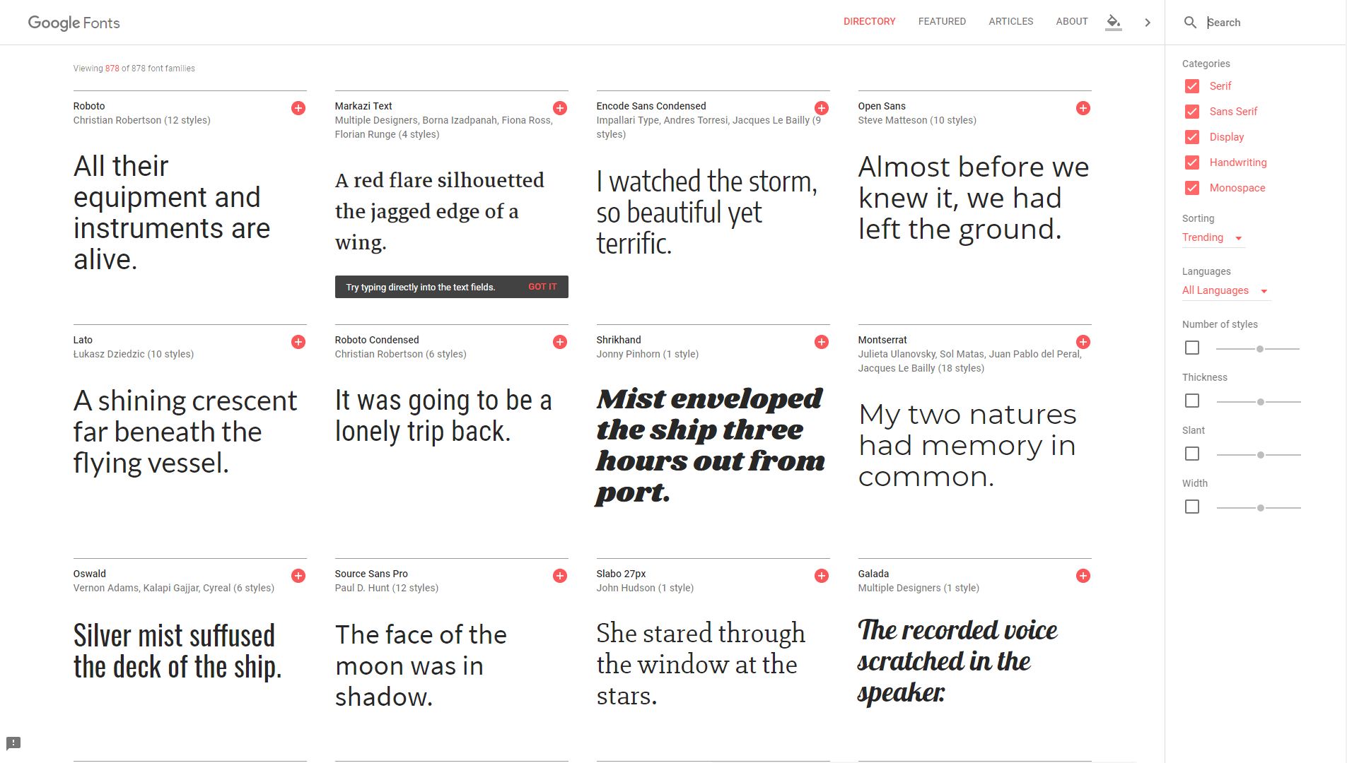
Our favorite place to start is Google Fonts, which offers a truly massive library:
Once you’ve found a font you think will work well with your website, don’t stop there. For most sites, you’ll want a little contrast in your typography. So, for example, you may want to use one font for your content and another for your headings.
That means you’ll want to pick at least two fonts, which shouldn’t look too much alike. With this added contrast, it will be easier for your visitors to differentiate between your site’s key elements. Just don’t go overboard – if you’re using five different fonts on the same page, it’s probably time to simplify.
4. Opt for Fonts With a Large Family
Most fonts come in different styles, the most common of which are italic and bold. However, some typefaces include a lot more variations. This collection of styles is called a ‘family’, and its size can vary depending on which font you’re working with.
Ideally, you’ll want to look for fonts with a large family, so you have plenty of options you can use on your website. The Poppins font, for instance, comes in a whopping 18 varieties:
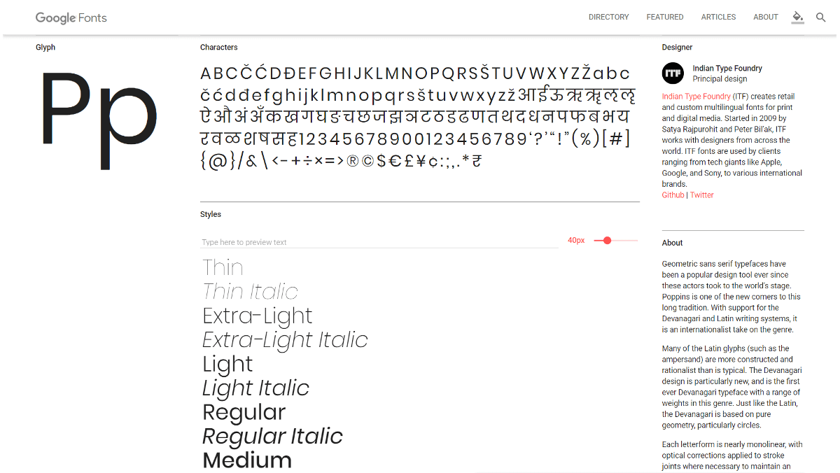
You probably don’t need that many choices, but it never hurts to have plenty of options you can play around with. We’d suggest keeping an eye out for fonts that include at least three styles.
As a rule of thumb, you should always use a font’s ‘normal’ style for your website’s main text, since it tends to be the easiest to read. You can use other styles for special types of content, headings, emphasis, and other elements you want to stand out.
Conclusion
There are thousands of fonts you can use on your website. A lot of people stick to the default options WordPress provides, but doing this is only limiting yourself and your site. Fortunately, if you’re an Uncode user you can import fonts from a broad variety of libraries quickly and easily.
If you want to make sure you pick the perfect fonts for your website, here are the four tips you’ll want to keep in mind:
- Focus on readability.
- Keep an eye on kerning.
- Avoid overused fonts.
- Opt for fonts with a large family.
Do you have any questions about how to pick the right fonts for your site? Let’s talk about them in the comments section below!