When it comes to blogs, content is king. However, that doesn’t mean you can throw together your blog’s design in five minutes and expect people to love it. Just as with any other type of website, visitors will pay attention to style and usability. If your blog looks like a mess, chances are few people will bother to read your posts.
If you’re using WordPress, the most important thing you can do to help your blog stand out is to choose the right theme. Some themes include a lot of features that make it easier to create and customize your site. Uncode, for example, enables you to use a custom page builder to design a professional-looking blog quickly.
In this article, we’re going to cover five ways you can use Uncode to make your blog’s design stand out. Let’s get to work!
1. Pick the Perfect Layout
Every website you frequent has a unique layout. In most cases, you’ll see a navigation bar, different sections for each kind of content, a sidebar or two, and so on. Although you’ll find a lot of the same elements throughout most websites, you can arrange them in almost any way you like to create attractive and attention-grabbing designs.
The problem is that adding the elements you need to your website can be complicated if you’re not a developer. For example, even creating a simple menu requires you to use HTML, and probably CSS to style it. However, you can also use a page builder, which will provide you with an interface that enables you to customize your content’s look without the need for technical know-how.
Uncode includes a custom version of the WPBakery Page Builder plugin, which you can use to create dynamic content. This page builder lets you design each of your pages and posts using a grid-based layout, and place dozens of pre-built elements within the various rows and columns:
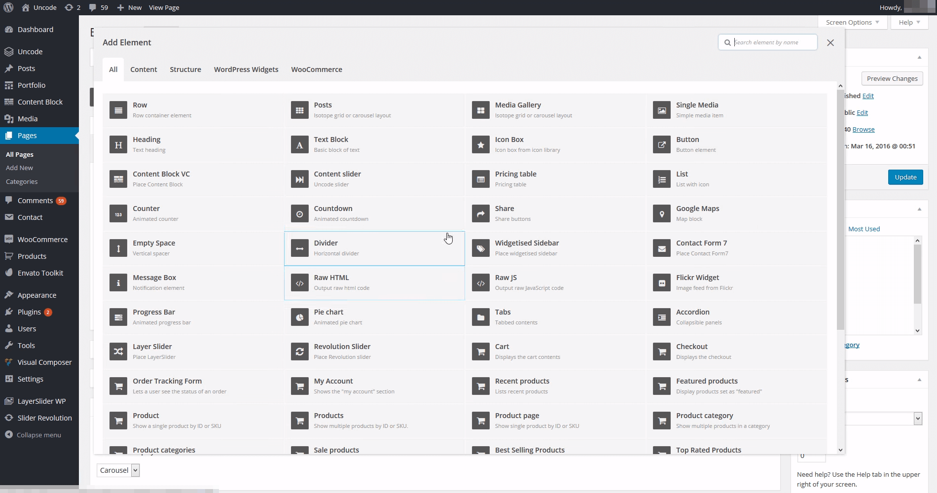
In practice, this enables you to create just about any layout you want. Plus, you can also configure the general settings for your site’s layout by navigating to the Uncode > Theme Options tab within your dashboard:
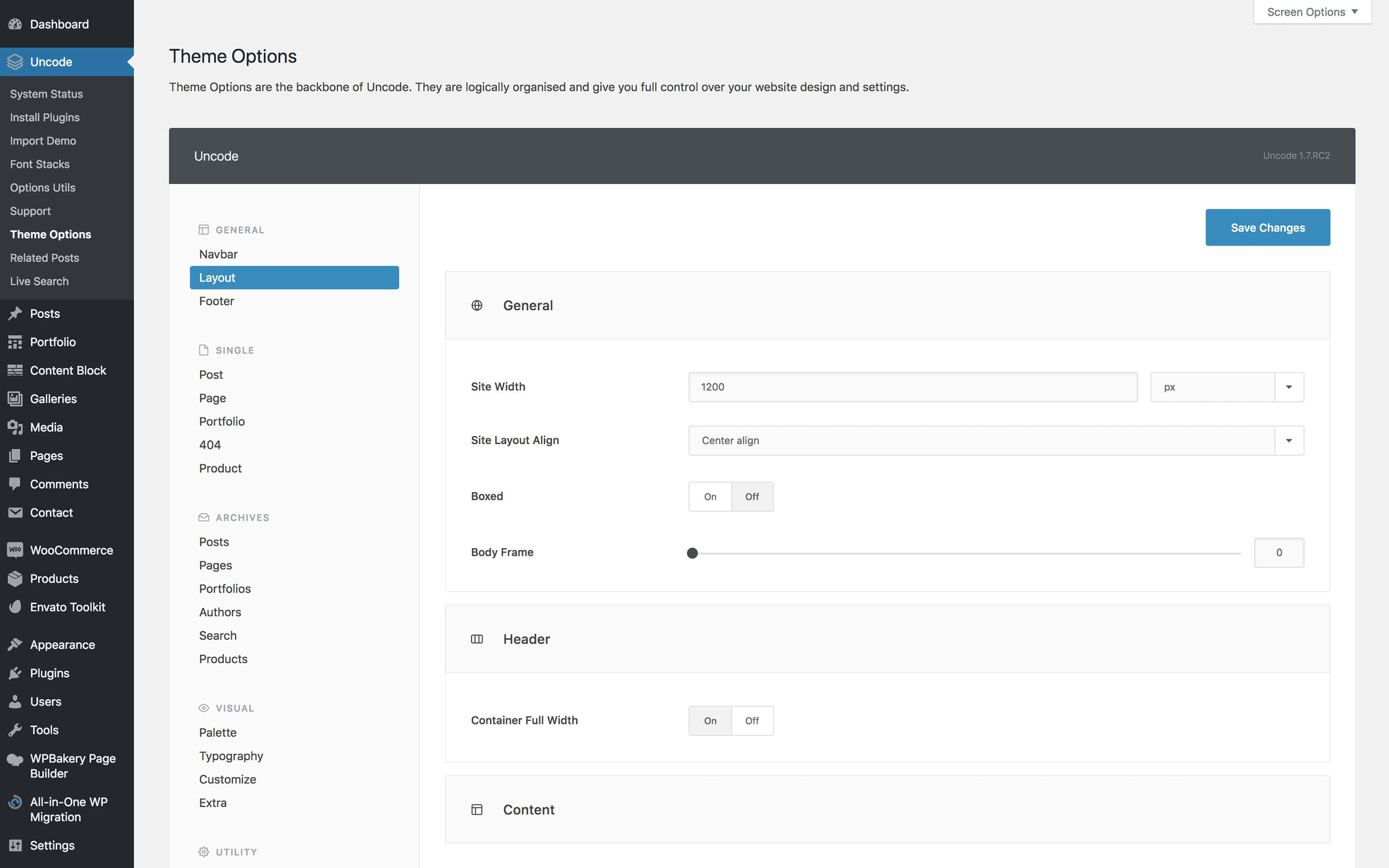
There, you can tinker with your site’s width, alignment, header, and more. Thanks to this inherent flexibility, there’s no limit to what kinds of layouts you can create for your blog.
2. Separate Your Sections with Shape Dividers
Usually, when you move from one section of a website to another, there’s some type of divider in between. It may be noticeable, or it might just be empty space. Either way, the goal is to differentiate each section clearly, as in the example below:
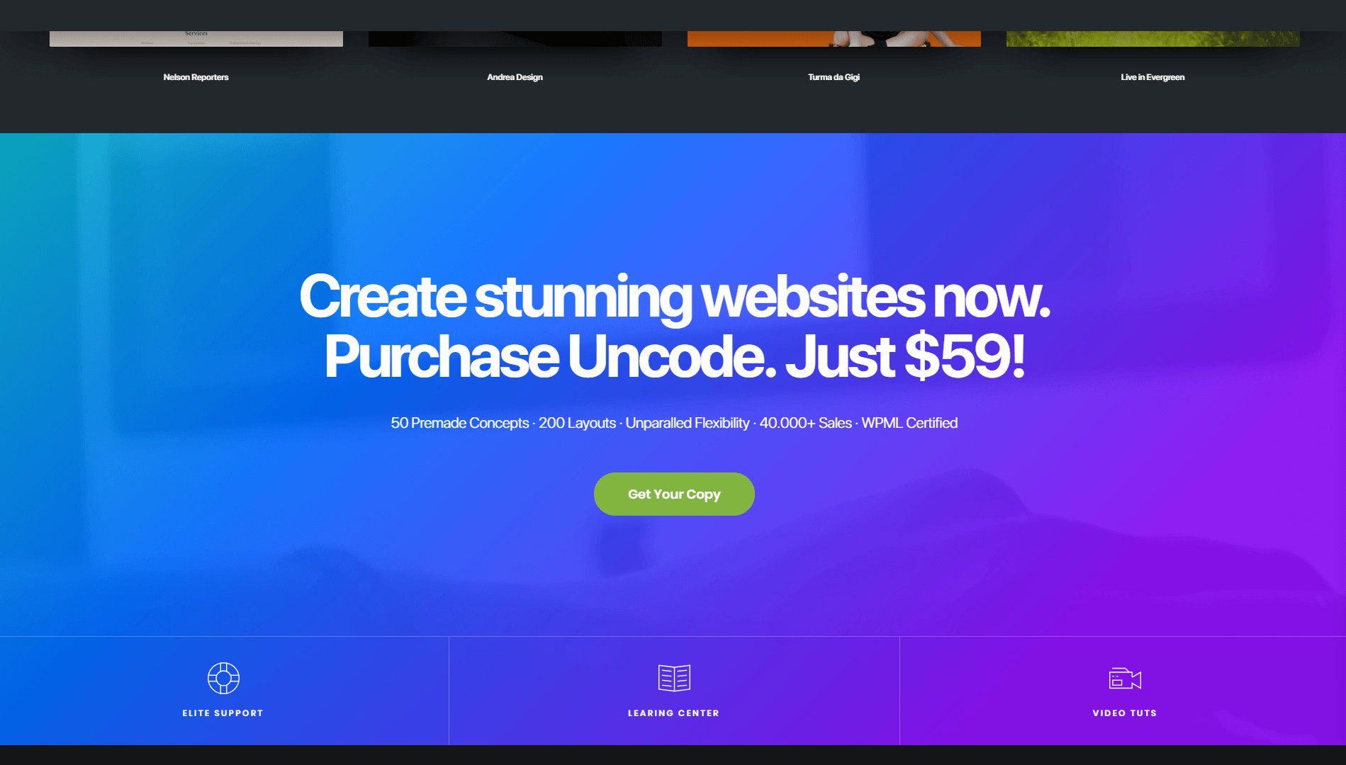
In most cases, these dividers are straight lines. Using straight dividers is easy, and you’ll often have few other options unless you make manual changes to your site’s CSS.
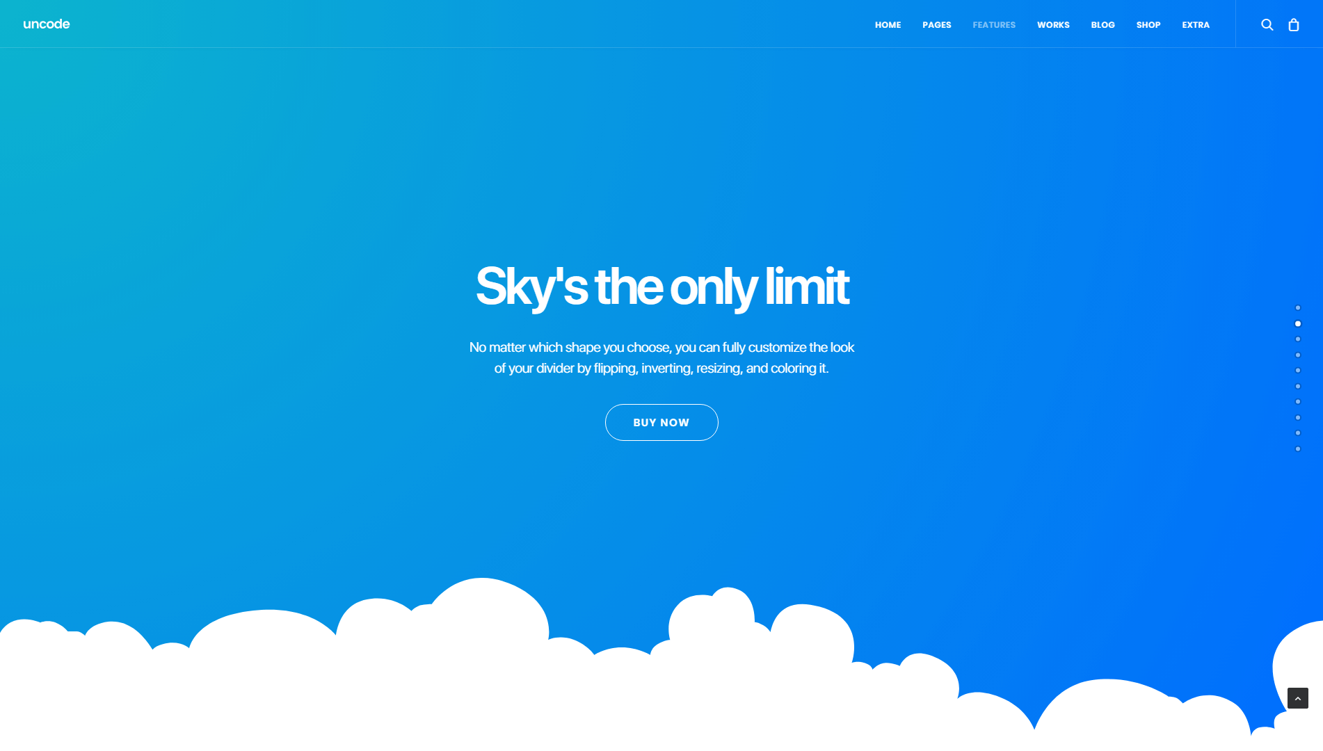
If you want to try something unique for your blog, however, you can check out Uncode’s ‘Shape Dividers’ feature. With shape dividers, you can add over 20 styles of separators anywhere you want on your site, including unique designs such as this one:
Creating shape dividers is simple, and you can do it from the page builder we mentioned earlier. All you have to do is open up the Row Settings section for the location where you want to place the divider:
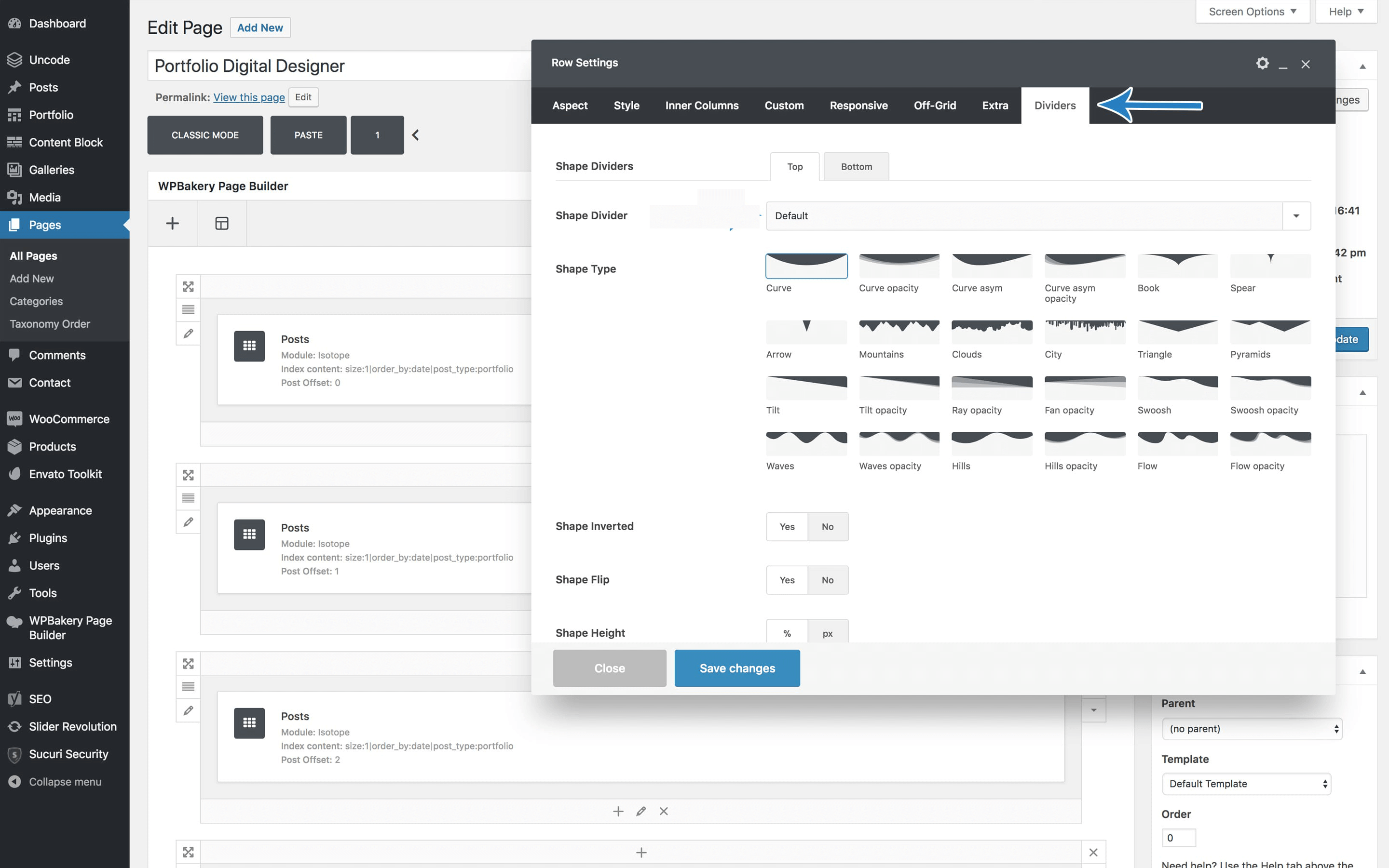
From that screen, you can choose what type of divider you want to use, and customize its style even further. This gives you plenty of options for designing your blog’s various sections. You can use shape dividers to highlight your posts’ intro sections, for example, or as a cap-off before the comments section. They also work well for designing your Contact and About pages, as well as your static home page if you choose to use one.
3. Use a Grid to Display Your Blog Posts
Grids are a clean and appealing way to display your blog posts. In fact, that’s what we do with the Undsgn blog, which features a balanced, minimalistic grid:
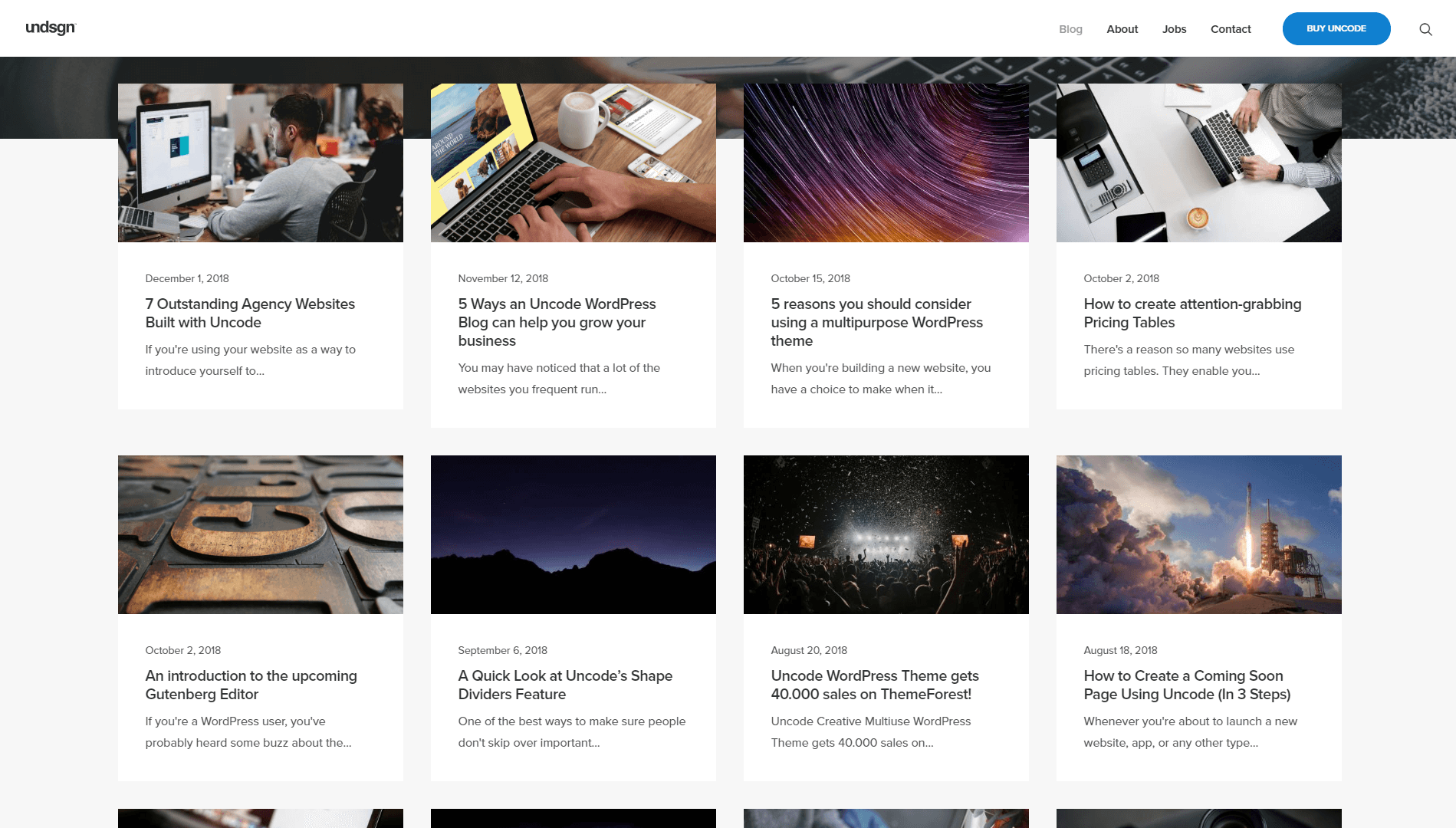
If that’s the kind of look you want for your blog, the good news is that it’s easy to achieve using Uncode. Our theme features several types of grid-based galleries you can use to display your content in a fashion that’s both organized and stylish.
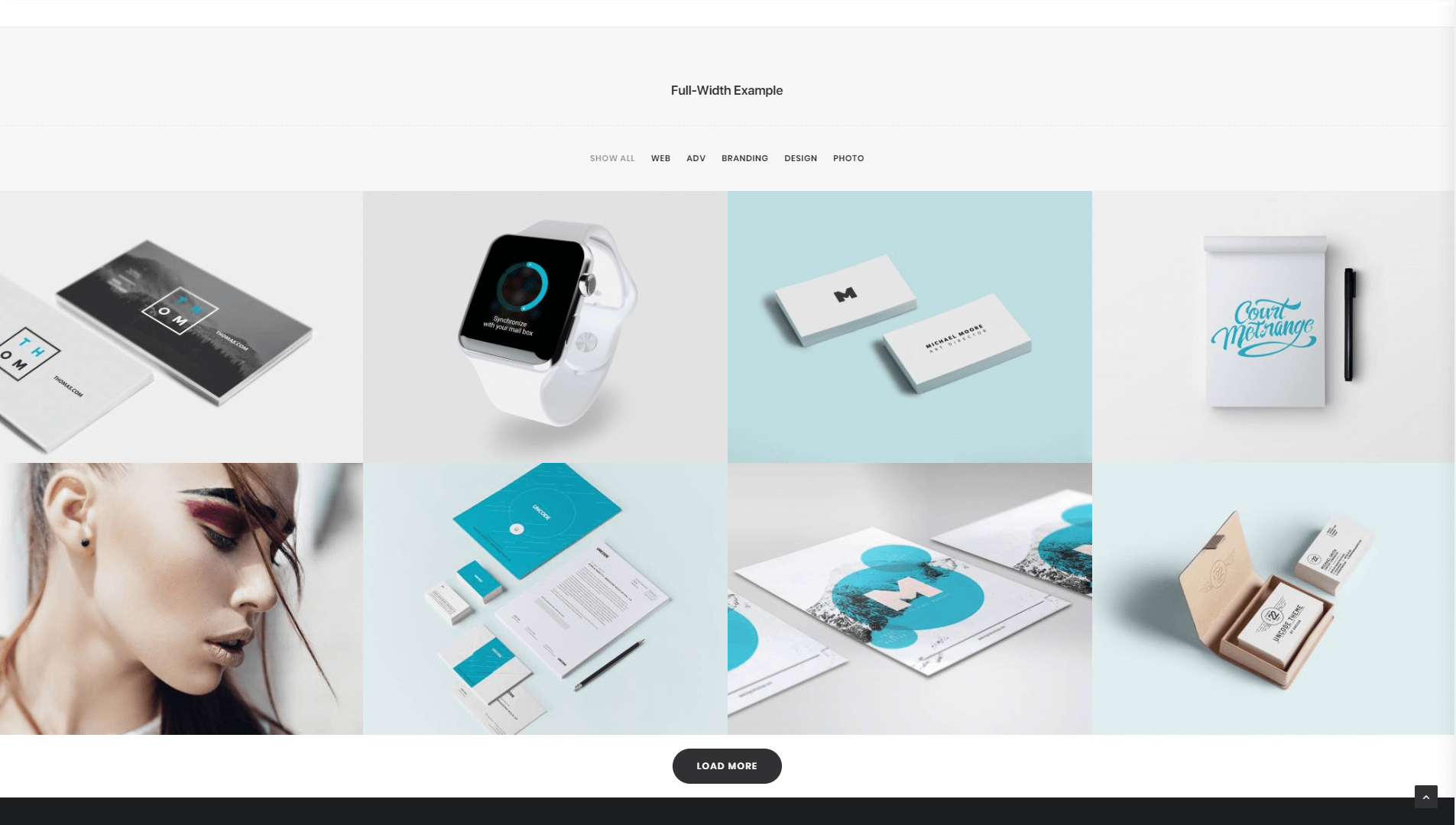
For example, you can use masonry or metro designs, which look very modern and can help your blog stand out visually:
To set a custom style for your blog, all you have to do is add the Posts module to one of your pages. Once you place it, you can open the Post Settings screen and take a look at the Style menu, which contains all your various options:
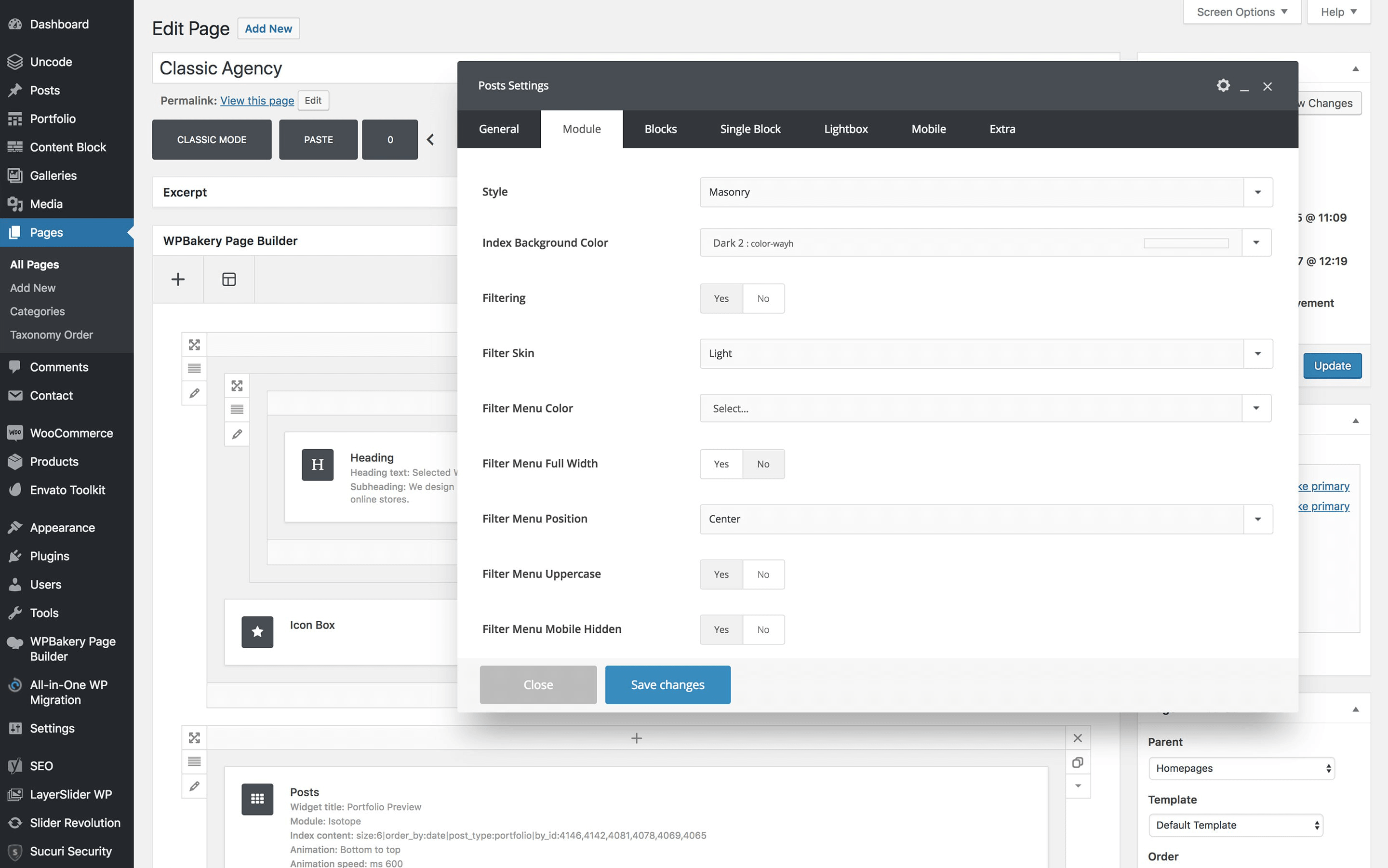
Our recommendation is to try out every style Uncode has to offer, and preview it to see the effect in action. Plenty of blogs play it safe when it comes to displaying their content, so if you try something bold, you’ll be sure to stand out.
4. Stylize Your Content with a Unique Font
There are quite literally thousands of fonts to choose from online. Even your most basic word processor application will offer you dozens of options. However, a lot of blogs stick to the same tried-and true-fonts for all of their content.
Of course, one of your primary considerations when running a blog should be readability. Your blog’s design needs to make it simple for visitors to understand and engage with your content. If you choose a font that’s too unusual, it can make your posts more difficult to read.
However, that doesn’t mean you need to stick with Arial or Times New Roman. There are plenty of fonts that are ‘safe’ for the web, which you can use on your blog without fear. Finding the right balance between readability and style is key, and will result in text that grabs the reader’s attention without scaring them away.
Usually, importing new fonts to use with WordPress takes a bit of work. However, Uncode enables you to import and switch default fonts in a matter of minutes, and it includes plenty of options you can choose from:
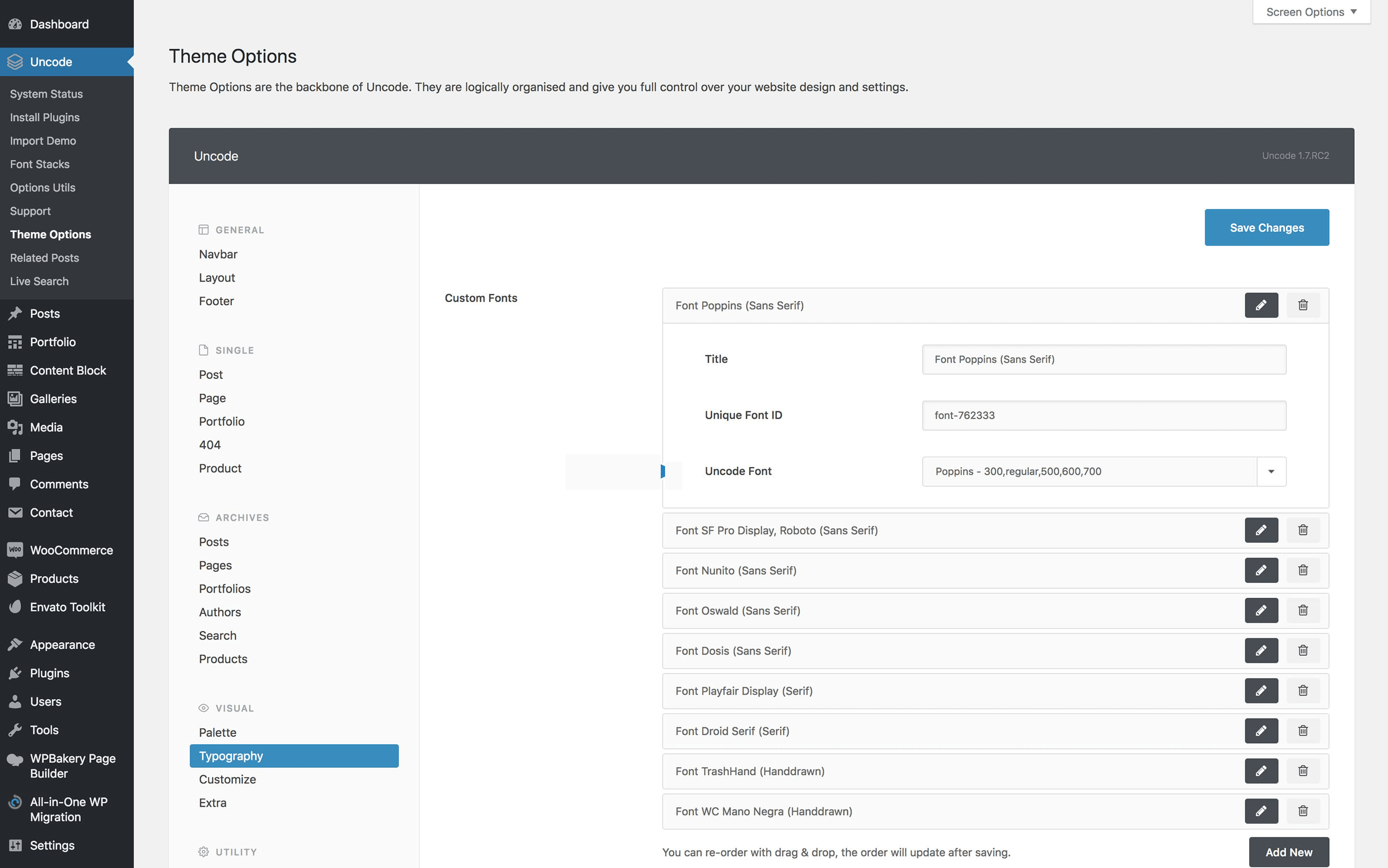
The process of importing new fonts varies depending on their source. If you want to play around with some new typefaces for your blog, check out this tutorial on how to add new options to your Uncode website.
5. Create Stylish Author Profiles
Whether you’re running a one-person blog or a multi-author publication, it’s always a good idea to give your readers some insight into who you are. Helping visitors put a name to your content is a smart way to add a human element to your blog, and encourages people to become loyal readers.
Many blogs add brief author blurbs at the end of each post. That works just fine, but if you really want people to pay attention, you’ll need to make your author profiles ‘pop’. To that end, Uncode includes an Author Profile module that you can add anywhere on your posts and pages.
Here’s what a basic Uncode author profile looks like on the front end:
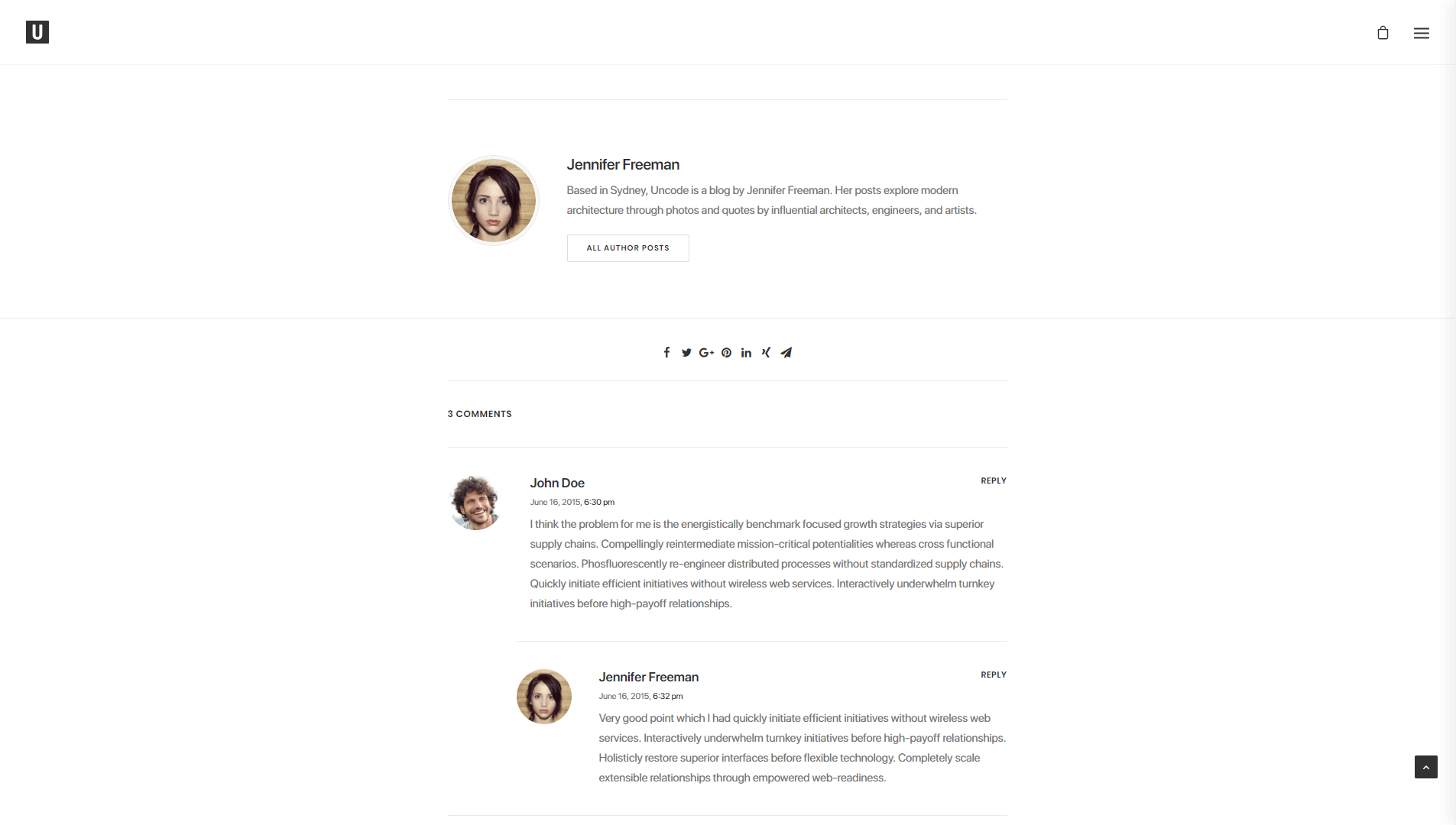
There’s plenty of room there for a photo, bio, and description, which tells readers who you are without overwhelming them with details. You may notice that this profile also includes links to all of the author’s social media profiles, which is key for engaging with readers.
Of course, on your own blog you can customize your profile module in any way you like. If you want to go the extra mile, you can also tinker with your full author page, which is something WordPress generates by default for each writer. WordPress author pages tend to look a bit boring, but not so if you’re using Uncode:
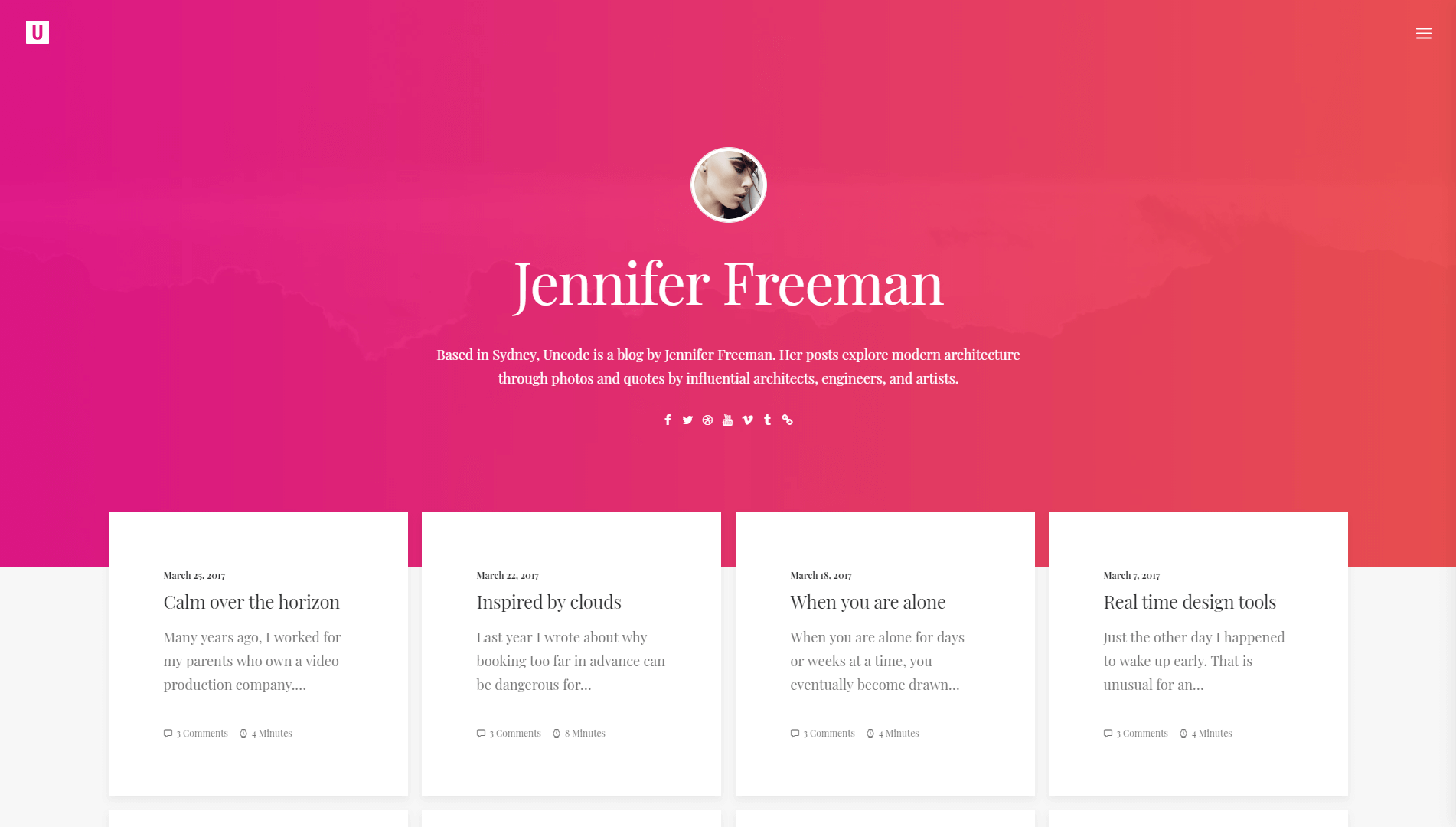
The more stylish your author page is, the better the chances are that visitors will pay attention and maybe read a few more of your articles – which is exactly what you want.
Conclusion
When you’re running a blog, it’s critical to put a lot of effort into every post you publish if you want your audience to grow. If your website looks boring and old-fashioned, however, readers are less likely to pay attention to what you have to say.
If you don’t have any experience with web development or design, your best option is to use a WordPress theme that gives you all the tools you need to create a unique website. As a blogger, Uncode can make your life a lot easier thanks to its diverse collection of built-in layouts, along with features such as shape dividers, author profiles, and more.
Do you have any questions about how to use Uncode to create a stylish blog? Let’s talk about them in the comments section below!
The Undsgn Newsletter
Sign up to stay up to date with the latest news!
(You will be forwarded to our subscribe form hosted by Mailchimp)
You might also like...
November 12, 2018
5 Ways an Uncode WordPress Blog can help you grow your business
You may have noticed that a lot of the websites you frequent run…
September 17, 2017
10 Top Blog Sites Created With Uncode WordPress Theme
WordPress was born as a blogging platform, so it makes sense that…
August 20, 2018
Uncode WordPress Theme gets 40.000 sales on ThemeForest!
Uncode Creative Multiuse WordPress Theme gets 40.000 sales on…


