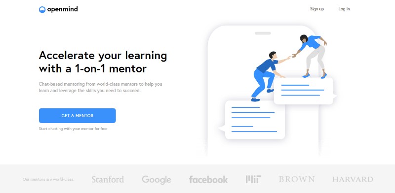
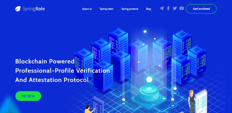
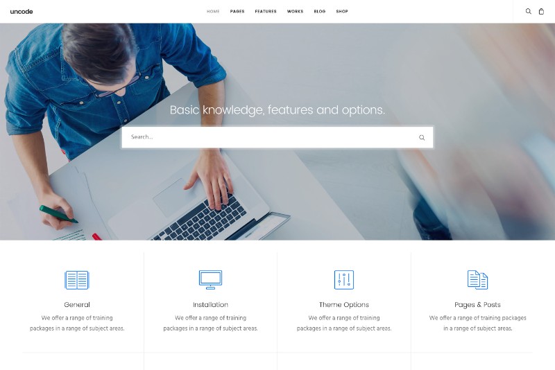
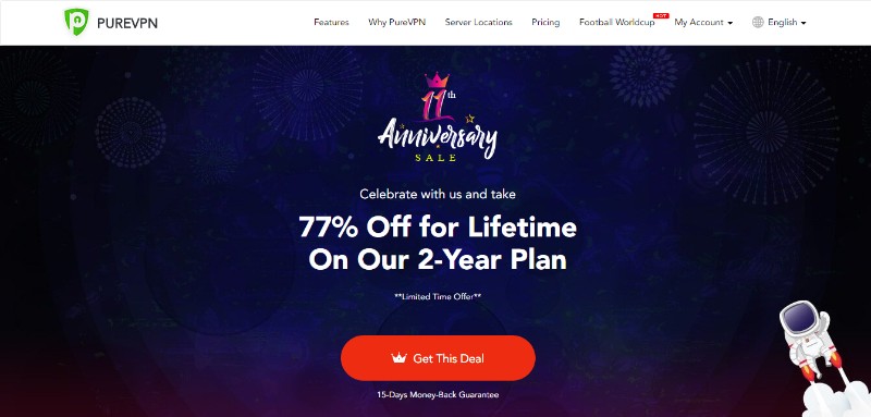
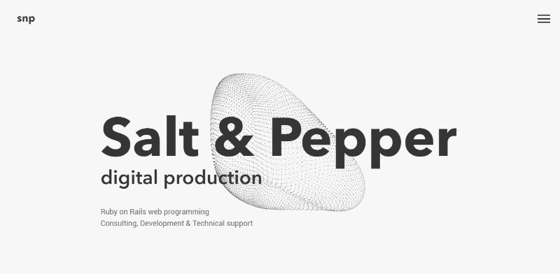
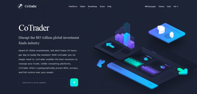
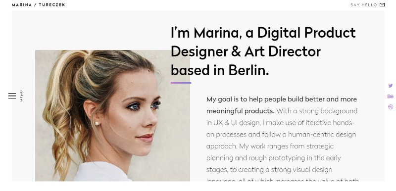
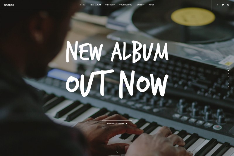
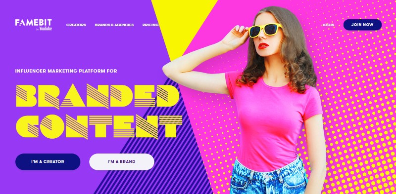
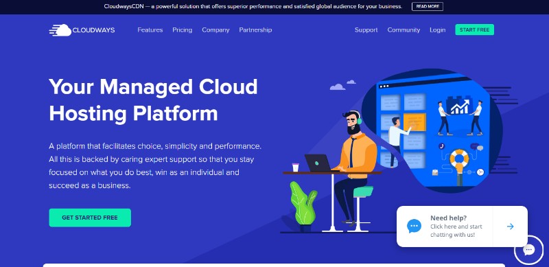
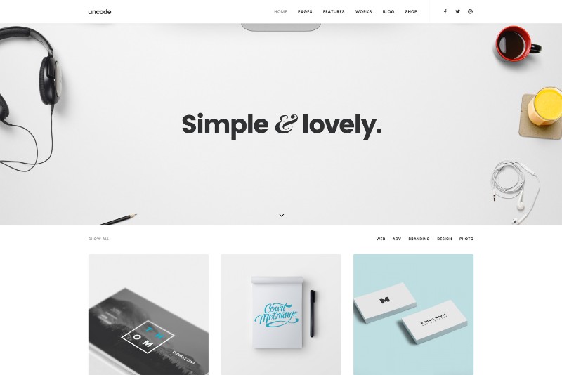
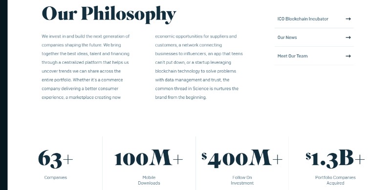
Having the best home page possible can in many ways make or break your business. You can have one of the most beautiful website designs out there, but if your home page isn’t eye-catching enough, most of the people will never go through the trouble of seeing the rest of it.
Making a great first impression is the key to keeping people interested in finding out more about you and/or your brand.
So what makes a good website? What are the key elements for designing a homepage that will immediately catch the new visitors’ attention? Well, you need just the right combination of looks and brains.
A perfect home page, as well as the best web design, is neither the one that looks best nor the one that works best – best designed websites are those that do both.
Make the Visitors Familiar with You and/or Your Brand
There are few brands and companies in the world that need no introduction; the other 99%, however, need to explain to their new visitors who they are, what do they do, and what they can do for them (the visitors). Home pages are the best place to do so.
By making the visitors familiar with you, your company, and/or your brand, you can easily let them know they have come to the right place as soon as they open your homepage.
Know Your Target Audience
“Less is more” – you’ve heard that rule before and it’s an oldie but goodie. When it comes to designing best home pages, one should make sure they know their target audience, address them in their preferred language, and keep things clear and focused. A clear point is the best point.
Value Proposition is what Makes the Visitors Stick Around
One of the main goals of well-designed websites is getting the visitors’ attention to make them stick around instead of navigating to competitors’ website. You can easily achieve that by communicating a compelling value proposition.
The Design is Highly Usable and Easy to Navigate
If you want the best website design possible, you need to make sure it is highly usable, optimized for different devices, and easy to navigate.
Good website design needs to look and work equally as good on all devices and there shouldn’t be any distracting elements on the homepage, such as pop-ups, flash banners, and similar.
Call To Action – Get an Immediate Response
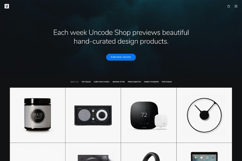
Call to action (CTA) is one of the best tools you can incorporate into your homepage to keep your visitors around by taking them directly to the next level of your webpage.
CTAs are created to get in immediate response from your visitors and encourage them to dig deeper through your website by pointing out the logical next step.
Not only it minimizes the chance of the visitors getting lost or overwhelmed, it also encourages an immediate purchase by calling them to take prompt action.
Keep Your Homepage Alive
Designing the best home page is a great start for attracting new consumers and customers, but if you want it to do the task in the long-run, you need to keep your homepage alive.
Take the feedback from the visitors into an account and always search for new ways to improve your website. Maintaining the latest update is crucial, but so is adding new content and information, and following the newest trends and progress.
Use the Images to Your Advance
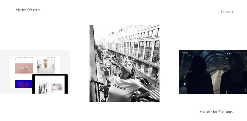
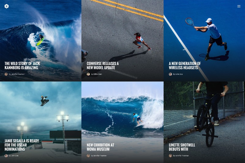
Images make for a very important part of every web page design so you will have to choose them carefully. Whenever possible, use your own unique images and make sure they are in high-quality.
When choosing the images for your website designs, make sure they don’t clash with the background color; the overall look has to be pleasant and easy to look at.
Take a look at some of the famous award-winning websites if you are searching for fresh website design ideas as well as website layouts ideas. Good website examples are often all the inspiration you need.
Choose Pleasant Colors
Today, we know that colors are capable of triggering all kinds of emotional responses in people. Certain moods are easily associated with certain colors and, moreover, colors can even affect one’s mood and the way they feel about a particular thing or situation.
With that in mind, choosing pleasant and balanced color scheme for your homepage shouldn’t be taken lightly. Work the colors to your advance!
Use Videos if It Benefits Your Site
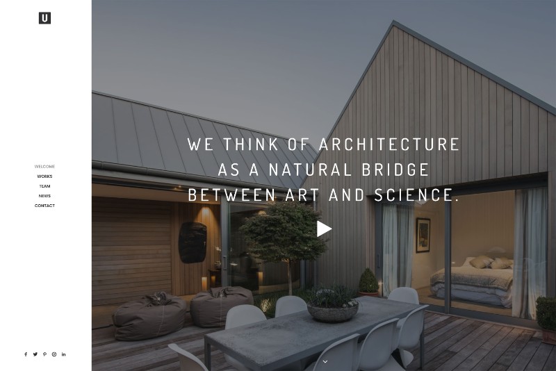
If a picture is worth a thousand words, a video is sometimes worth a thousand pictures – use it if you feel it would benefit your site.
However, always keep in mind that adding stuff to your homepage just for the sake of adding them is not the way to go. Everything that you decide to incorporate into your design has to have a purpose and a practical value; otherwise, it’s just clutter.
Load Time: the Shorter the Better
You already know from your own experience that waiting for a certain web page to load is no fun. In fact, in today’s time where everything is happening faster than ever, it is important to optimize the load time of your homepage as much as you can. There is no use in having the best home page if a visitor isn’t going to wait for it to load.
Build Trust with the Visitors
Building trust with your visitors and consumers early on is a great start for a successful and happy cooperation.
Your visitors need to know that you are responsible and reliable and you can easily prove that by displaying feedback from users, publishing customer success stories, displaying your accreditations etc.
People Like People – Introduce Your Team
Every company, brand, and organization has its own team of people, as well as its own story that makes it special and different from the competitors.
At the end of the day, people like to work with people rather than with a group of nameless task executors so it would be a smart thing to introduce the visitors to the team responsible for all that work; both the individuals and the organizational culture.
Don’t Underestimate the Social Media
Social media has made it easier than ever to stay in touch with your customers. Using social media can help you communicate with potential and current customers, answer their questions, as well as promote your products or services
Make sure your social media links are clearly visible on your homepage.
Easy Navigation = Better User Experience
If your visitors find themselves lost or confused the moment they open your home page, your website design needs some serious improvement.
The best homepages use intuitive navigation which is easy to understand without having to even think about it twice.
You can also use your website navigation to your advance by making the most visited pages most visible and easily accessible.
Help the Visitors Get in Touch with You
Contact information has to be on clear display at all times. After all, you created your website to attract your customers, haven’t you? Now that you’ve done that, they need to be able to get in touch with you!
The good websites offer all necessary contact information in the information section. The best websites, however, put them on the homepage as well. It immediately creates the sense of a good customer support and accessibility.
Have an Active Blog
Having an active blog and highlighting it on your homepage can help you strengthen the bond between you and your customers. Offering some kind of personal content to your visitors will help you build a better relationship between them and your brand.
Keep the blog active by adding new content and keeping your customers updated and informed about what you’ve been up to lately.
Put Your Awards on Display
You’ve been working hard and collected some awards or recognition for your great work? Well, it is allowed to brag a little!
Put your awards on display and let your current and potential customers know that you are an expert in your field and you really know what you’re doing. It is yet another proof that you are responsible and trustworthy!
Ending thoughts on designing the best home page
Designing the best home page can be easy if you know what you’re doing. The above-mentioned tips and tricks will help you turn an average homepage into an outstanding one and improve your visitors’ first impression.
From that point on, it up to you to keep your website updated and alive and things will only get better and better!
The Undsgn Newsletter
Sign up to stay up to date with the latest news!
(You will be forwarded to our subscribe form hosted by Mailchimp)
You might also like...
April 22, 2018
Responsive Web Design: Tips and Best practices
Having a responsive web design is a necessity nowadays, compared to…
June 26, 2018
Key Elements for the Best Web Page Design
When it comes to web page design, the trends are constantly changing.…
May 29, 2018
Responsive Web Design Tips & Tricks to use this year
This is the age of mobility that we are living in and people mobile…

