
Intuitive menu navigation is one of the most essential elements of good web design. In fact, bad navigation schemes are one of the most common reasons for people to leave a website or abandon an online shopping cart.
A navigation menu is an essential feature of any modern website, and making sure that yours is intuitive, responsive, and easy to use can help keep visitors on site for longer. Fortunately, WordPress provides us with several methods to create top-notch navigation menus, including a native creation tool, plugins, and even themes like our own Uncode.
In this guide, we’ll be taking a look at four of the most important characteristics of a good navigation menu. Afterward, we’ll walk you through creating custom menu layouts using both Uncode and WordPress’ built-in tools. Let’s jump right in!
4 Elements that Make for Excellent Navigation Menus
The primary function of navigation menus is, of course, to enable visitors to get around your site. How you decide to style your menus is up to you, but you should always value functionality as much as (or even more than) aesthetics – which brings us to the four elements that we decided to feature in this guide.
1. Intuitive Hierarchy
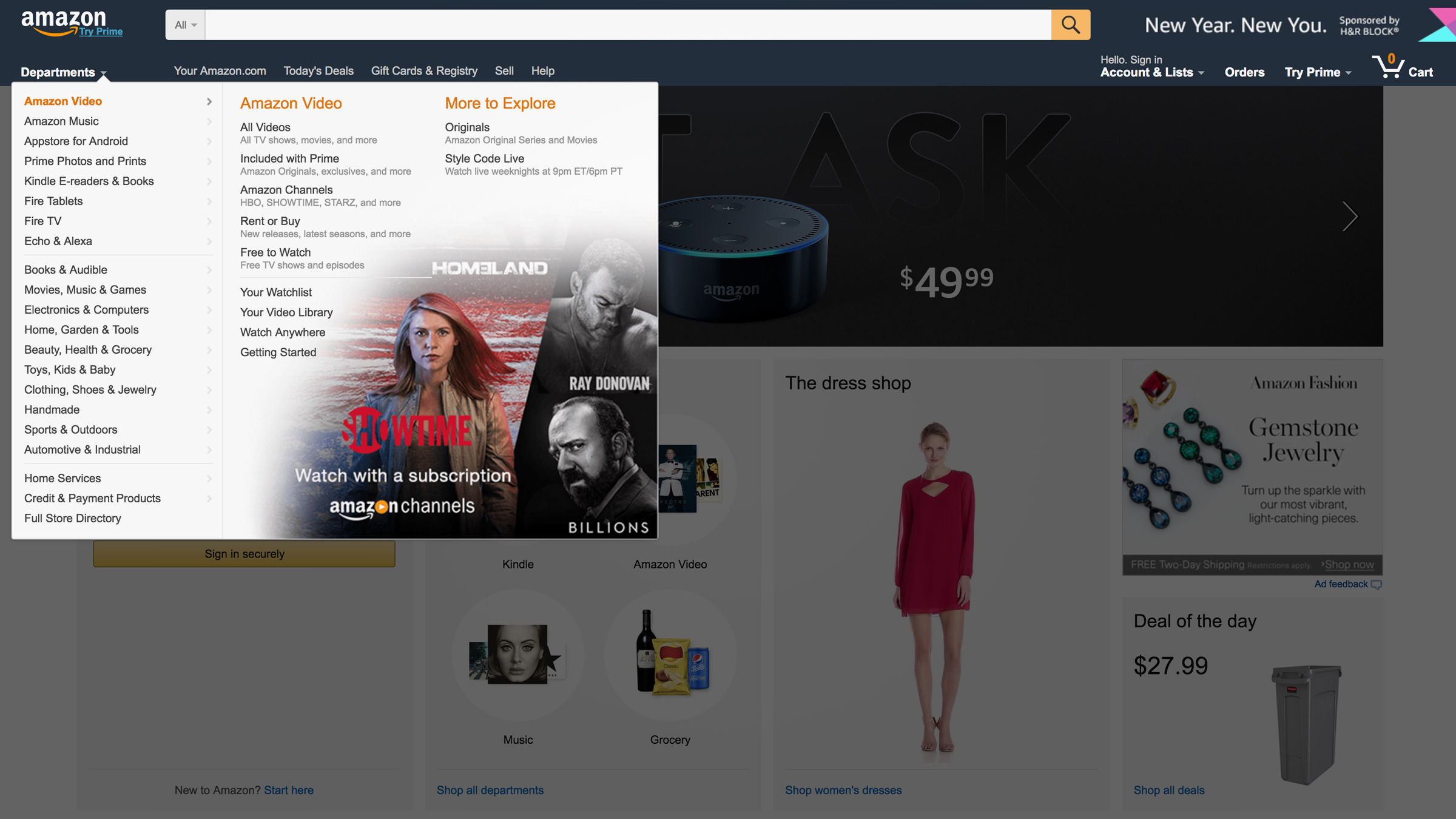
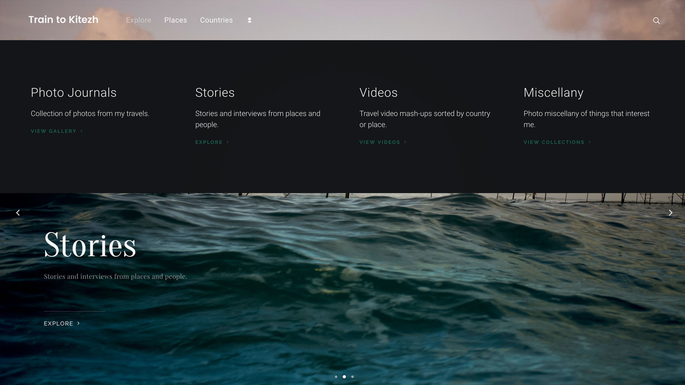
Simple websites that don’t deal with massive amounts of content can usually get by just fine with a single menu level. However, when you’re dealing with a wider variety of pages, it’s necessary to define a clear navigation menu hierarchy.
As seen in the screenshot above, Amazon uses a hierarchical navigation menu to help people quickly find the categories they’re interested in, and you can do so too. Once you’ve defined your site’s hierarchy (a pen and paper will do just fine for this), you can choose whether to implement either a flat or deep structure. We’ll cover the how later on, but for now, keep in mind that it usually pays to keep the number of levels to a minimum, to prevent visitors from getting lost.
2. Descriptive Titles
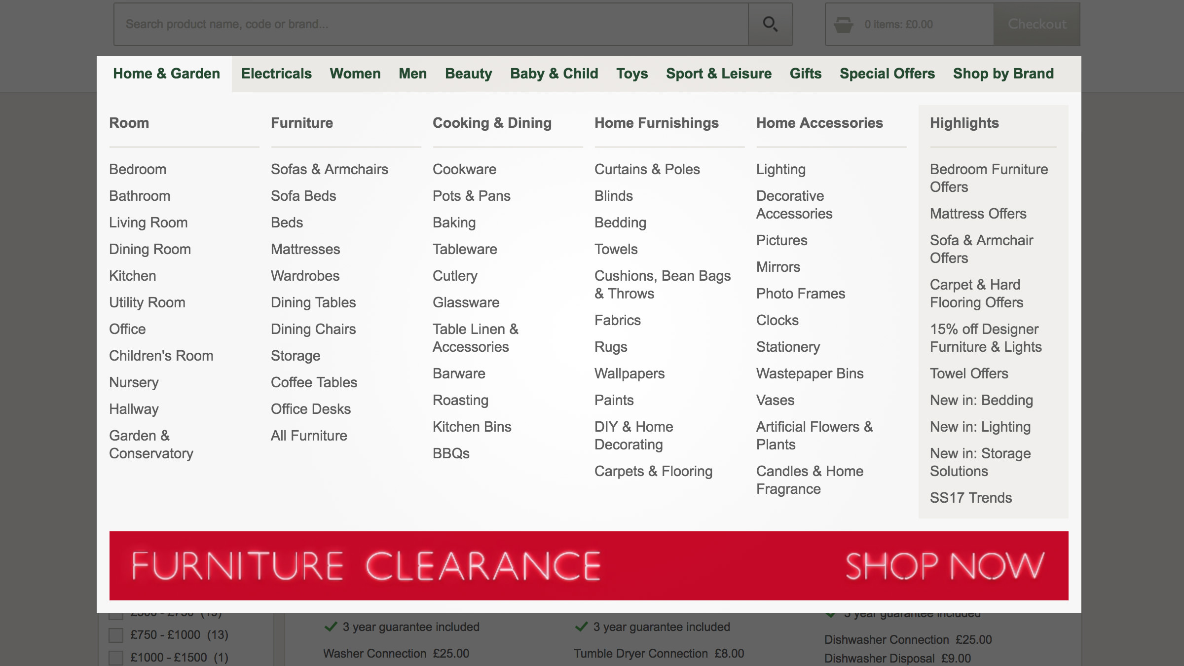
Navigation menus are supposed to make it easier for your visitors to move around your site. While there’s always some scope for creativity, it helps immensely if you use descriptive page titles. Ideally, each title should tell users exactly what they’re in for as soon as they click on it.
Furthermore, using descriptive terminology also helps search engines better understand what your website is all about, so it’s a win-win. As an example, British department store John Lewis (whose menu is pictured above) combines a hierarchical menu system with simple descriptive titles to great effect.
We recommend that you take a good look at your menus as they stand and consider if any of your titles could be misconstrued by your visitors. If the answer is yes, then try using simpler naming alternatives to make the purpose of each link crystal clear.
3. Responsive Design
Responsive web design uses CSS media queries and other methods to enable a web page to scale to the size of the display it’s being viewed on. These days, the majority of online traffic stems from mobile devices, so it’s critical that you accommodate those users to the best of your abilities.
The best case scenario is for all your website’s elements to be responsive, but menus are especially critical since they are what enable users to navigate between pages. Most modern WordPress themes provide you with responsive menus and multiple layouts by default. In case yours doesn’t, you should consider bridging the gap using a plugin like Responsive Menu:
Before we move on, it’s worth mentioning that if you’re stuck with a theme that doesn’t play well with mobile devices, it might be time to consider upgrading to a more modern alternative, like Uncode.
4. Integrated Search
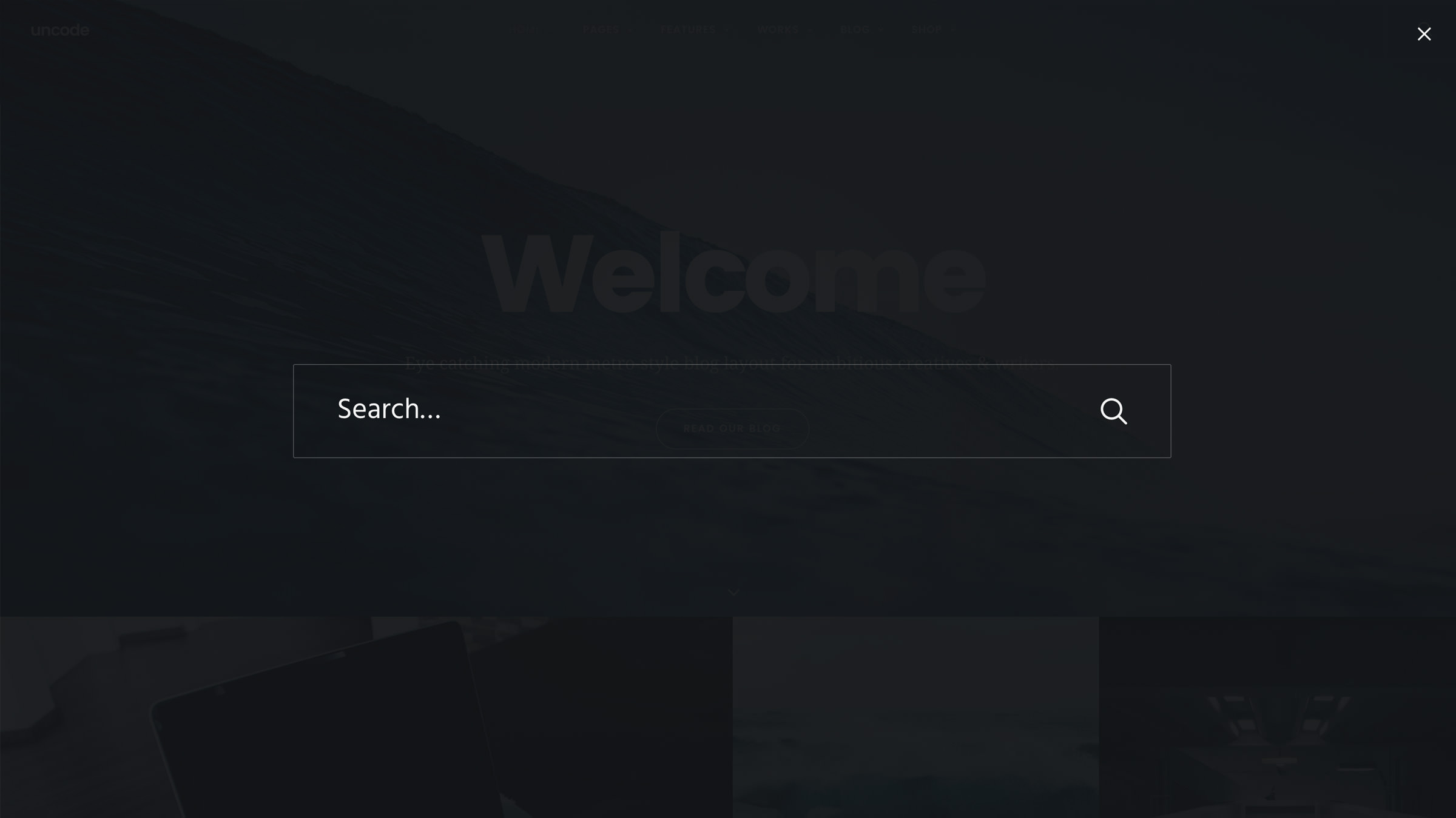
Search bars provide an alternative navigation method to your visitors, which is always a good thing. However, there’s no reason why search bars can’t be a part of the navigation menu itself, particularly on smaller screens where space is at a premium.
Having an integrated search function enables you to keep your website’s navigation clean and intuitive, and it provides users with all the options they might need in a convenient form factor. To keep things simple, we can re-use the plugin we got to know during the last section. The Responsive Menu plugin enables us to add an integrated search bar to our navigation menu with a few simple clicks.
Otherwise, you can always rely on a theme that provides this option right out of the box, such as – you guessed it – Uncode (pictured at the beginning of this section).
How to Create a Custom Menu Layout Using the Uncode Theme
Now that we’ve discussed the most important elements of a good navigation menu, we can start looking at options for implementing them.
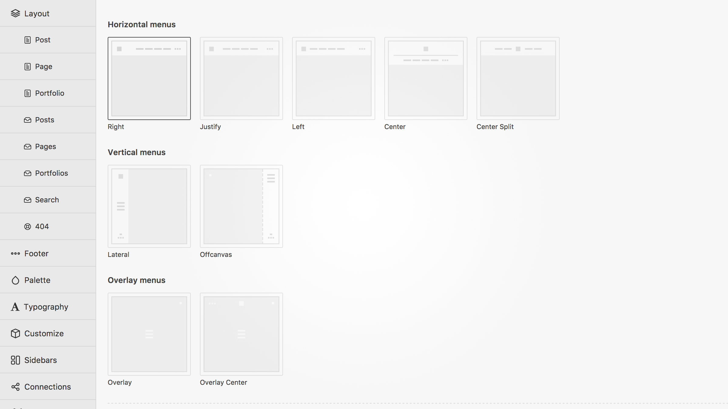
While most WordPress themes enable you to modify your menu locations and their appearance, few of them provide truly responsive designs. Uncode, by contrast, offers you nine menu layouts, all of which are fully responsive, and customizable.
You can choose which layout to implement by navigating to Uncode > Theme Options > Menu within your dashboard:
Furthermore, Uncode enables you to enhance your menus using preset animations, several typographic choices, and other similar options. It also supports integrated search bars (as we mentioned earlier) and even e-commerce features like shopping cart icons (through the WooCommerce plugin).
It’s worth noting that before using Uncode to customize your navigation menus, you’ll need to define their entries using the built-in WordPress tools, as we’ll explain below.
How to Create a Custom Menu in WordPress (In 4 Steps)
As soon as you set up a new WordPress blog, you’ll find a default navigation menu on your homepage. This menu is a placeholder, designed to give you an idea of how the functionality works in WordPress. In this section, we’ll explain how to add new menus and customize them, after which you’ll be free to optimize them using our previous advice.
Step #1. Add a New Menu
To create a new menu, navigate to Appearance > Menus in your WordPress administrator dashboard. Click on the Create a new menu link or select an existing menu to edit (if any are available). Enter a name and click on Create Menu:
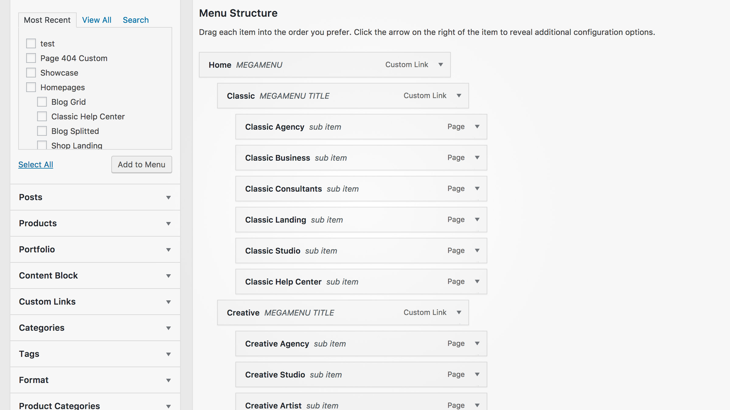
There are four types of items you can add to menus in WordPress: pages, posts, custom links, and categories. Go through each of these options and check the boxes for those you want to incorporate. Once you click on Add to Menu the option you chose will appear in the Menu Structure section to the right, as illustrated above.
Step #2. Customize Your Menu Structure
Now that you have a menu in place, you can design a structure – and possible a hierarchy – by rearranging your entries within the Menu Structure section. For the latter, you can use the drag-and-drop editor to define primary menus and submenus as necessary.
WordPress enables you to create as many sub-levels for your menus as you see fit, but remember that it’s always better to keep your hierarchy as tight as possible so as not to overwhelm your visitors.
Step #3. Set Your Menu Locations
Many themes only allow you to use a single menu, despite there being no limitations on the number of entries and sub-levels they can have. However, other themes such as Uncode enable you to insert up to two menus, which can be useful if you need to display critical information like addresses, opening hours, or a contact email.
You can assign different menus to specific locations by navigating to Appearance > Menus > Manage Locations and selecting where to place them as seen below:
Once you’ve assigned each menu to the locations you want, remember to click on Save Changes.
Step #4. Preview Your Menu
If you prefer, you can also create, edit, and manage your menus using WordPress’ live preview feature by navigating to Appearance > Menus > Manage with Live Preview. This functionality enables you to make any changes you want to your navigation menus and see them as your visitors would, in real time.
Keep in mind that any changes you make won’t be final until you hit the Save button on the top-left corner of the editor.
Conclusion

A solid navigational structure is crucial for the success of any website, given that poor navigation is one of the most common reasons for users to jump ship. While themes like Uncode enable you to enhance and customize your menus with ease, you can also use WordPress’ built-in tools to create perfectly functional (and stylish) alternatives.
If you aren’t familiar with WordPress’ menu features, here are the steps you need to follow to create (and optimize) your first one:
- Add a new menu to your website.
- Organize its structure as you see fit.
- Manage the locations for your menus (in case you choose to display more than one).
- Preview your menus using the Manage with Live Preview feature.
What do you think makes an excellent website navigation menu? Let us know in the comments section below!
Image credits: Pixabay.