E-commerce stores aren’t simple to set up. There is a lot of work that goes into ensuring that everything works, from product pages to the checkout process, so you need a theme that plays nicely with all of your store’s options.
Uncode, for example, includes multiple layouts for your store and product pages. With these features, you can get your store up and running quickly. All you have to do is set up WooCommerce, add your products, and you’re ready to start selling. This gives you more time to focus on improving your catalog.
In this article, we’re going to talk about what makes Uncode such an excellent pick for online stores. Then we’ll introduce you to 10 top e-commerce sites built using our theme. Let’s get to it!
Why Uncode Is the Perfect Theme for Your Online Store

Online stores are a fantastic way to build a business from the ground up. It doesn’t matter if you’re looking for a secondary income or a full-time project, e-commerce is a perfect fit for both scenarios. For one, online stores have a lot more potential than regular blogs or websites when it comes to monetization. Also, basically anyone can create an online store these days. That includes you, even if you don’t have a background in web development.
The key is to use a platform that simplifies the process, such as WordPress. While it doesn’t come with e-commerce features out of the box, you can add them using plugins. WooCommerce is the most popular option, since it enables you to create modern online stores with gorgeous catalogs and stylish product pages.
Once you’re ready to start building your e-commerce site, you’ll also need the right theme. Here are the features you’ll want to keep an eye out for:
- The theme offers you several ways to showcase your products. An online store lives and dies based on its catalog, and you’ll want a theme that provides you with multiple options for how to display items.
- It integrates with your e-commerce plugin. Most modern e-commerce themes work well with WooCommerce. However, if you’re using a different tool, you’ll want to make sure your theme supports it.
- You can use a variety of payment platforms. Just as with e-commerce plugins, your theme should be able to integrate smoothly with your chosen payment platform(s).
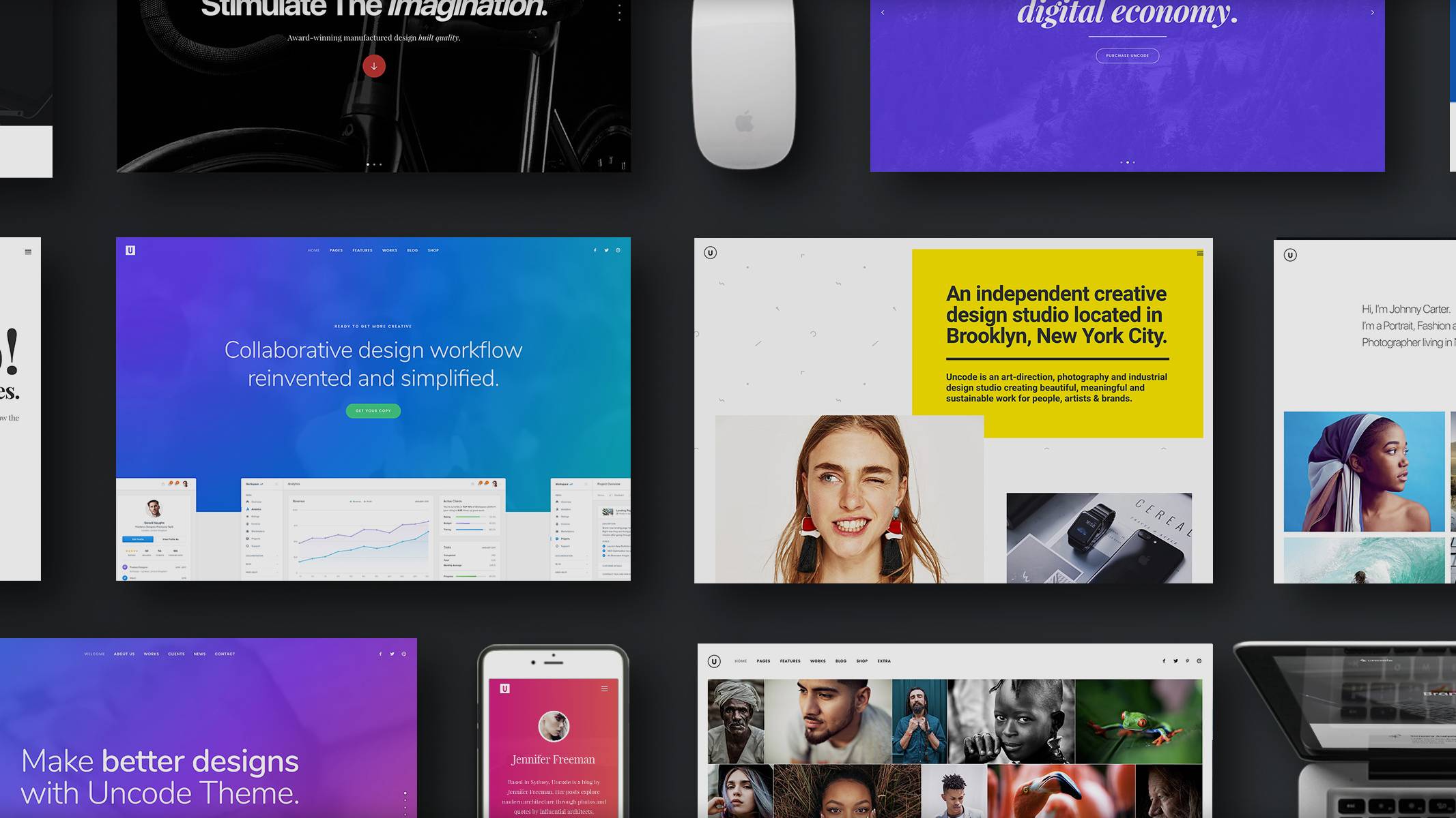
Our own Uncode theme fits all these criteria and more. It’s multi-purpose theme, so you can use it to create any type of website you want, but it also packs a ton of e-commerce features. Plus, it will ensure that your store looks fantastic, which is always important.
10 Modern Store Websites Built Using Uncode
Below, you’ll find 10 outstanding examples of online stores that were built using Uncode. They’re listed in no particular order, and are all quite different, so chances are at least one of them can help to inspire your next design. Let’s get started!
1. Monday Company

The Monday Company focuses on selling kid-friendly patches for clothes or backpacks, as well as fabric markers and crayons. All its products are made with children in mind, so it makes sense that the site features a very whimsical design.
Underneath all those colors, you’ll notice a grid-based layout that’s powered by Uncode. The store’s catalog is clean and features large images that catch your eye, and each product’s page includes multiple views and thorough descriptions. Overall, Monday Company is a textbook example of a modern online store with a unique style.
2. Champagne Corsets

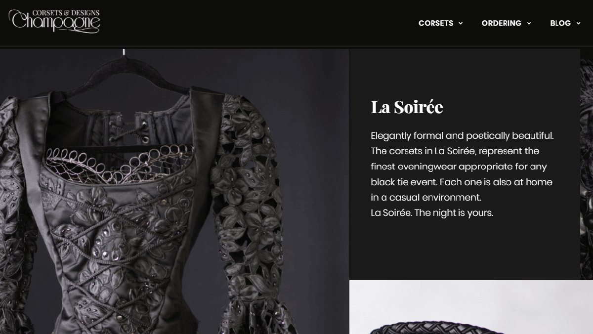
Just like Champagne Corsets’ main product, its online store’s design is a fantastic mix of decadence and elegance. It features a black, white, and pink color palette that suits its line of products perfectly, and makes you feel like you’re inside a luxury clothing store.
As for functionality, Champagne Corsets keeps things simple. It makes excellent use of calls-to-action throughout the site, as well as parallax images and full-width headers on each page. The site also features Uncode’s asynchronous adaptive images feature, which drastically decreases loading times.
3. Kuehnertova

Kuehnertova’s product catalog is very eclectic. It sells everything from clothes to pillows, handkerchiefs, sashes, and even scarves. The website is very minimalistic, however, which makes for a nice contrast with the colorful embroideries on offer.
This particular online shop makes excellent use of white space, and features one of our favorite menu designs on this list. You can check it out for yourself in the screenshot above. It features two levels, one with all the internal links, and another with store’s logo, social media buttons, and cart icons. Uncode enables you to implement menu customizations like these in a matter of minutes.
4. LOOVA

Our previous pick did minimalism very well, but LOOVA takes that style to a whole new level. Its entire website was designed to take as little attention away from the products as possible. Each of its pages features some of the best photographs we’ve seen, and the product pages themselves are even better. They include multiple pictures, customization options, and more.
This goes to show that you don’t need a complicated website to succeed in e-commerce. Ultimately, excellent product photography can help drive sales far better than a site that’s overstuffed with features. Uncode understands this, and provides you with plenty of options to display your images in all their glory.
5. Fold Accessories

Fold Accessories sells foldable sunglasses, and all the accessories you need to take care of them. This is a very niche market, but the website is outstanding. It features a pretty straightforward design, including a full-width slider, Uncode’s icon boxes, and even videos that show how the foldable glasses work.
One of our favorite things about Fold Accessories is its product pages’ design. They’re clean and informative, and include detailed measurements and social sharing buttons. When you’re working on your own Uncode product pages, you’d do well to use these as a reference point!
6. LaneFortyfive

LaneFortyfive features one of the boldest designs we’ve seen thus far for an online store. The entire website is almost devoid of text, aside from product descriptions and the sidebar menu (which is hidden at first).
Instead, all there is to see here are photographs of the company’s shirts, waistcoats, jackets, and pants. It’s common to hear that you should let your products speak for themselves, but rarely is that advice taken so far. In our opinion, LaneFortyfive’s homepage could possibly benefit from with some short descriptions for each section. However, the minimalistic effect is engrossing, and makes for an exciting store.
7. Verdad Snowboards

Verdad Snowboards’ online store opens right up to a short video of someone snowboarding off a cliff, and that intro sets the tone for the entire website. Almost all of its images enable you to see the products in action, and it makes excellent use of strong calls-to-action.
To help you make a purchasing decision, this site lets you see the front and back of each board before you settle on one. Each product page also includes detailed information about the materials that were used, and also offers a related products section. That last feature is something online stores often overlook, but it’s a great way to drum up more sales. Fortunately, Uncode enables you to implement such sections easily.
8. Karolin Studio

Karolin Studio’s online shop is all about beautiful jewelry. It features a simple slider on its homepage, displaying all its best product photographs, the latest arrivals to its catalog, and more.
Overall, this site features a very simple design, but it does stand out for a couple of reasons. First, it displays a popup sign-up module to new visitors, which enables the site to collect email subscribers easily. It also includes a live chat, which lets potential customers get in touch with support fast and receive answers to any questions they might have. Uncode does play nicely with most WordPress live chat tools, so this is a feature worth considering for your own store.
9. Taffy

Taffy’s catalog is full of hand-knit pieces and fine yarns. Its online shop is very colorful, thanks to its outstanding product images, and the style is a strong match to the products.
This site also makes excellent use of typography throughout, which is something we haven’t seen so far in the other online stores we’ve talked about. The use of subheadings throughout each page is excellent, as is the choice of fonts. Keep in mind that Uncode provides you with plenty of typography-focused features so you can do the same, including custom styles and fonts.
10. Traisikkha

Last but not least, let’s take a look at Traisikkha. This elegant online store sells rings, earrings, necklaces, bracelets, and more. Its jewelry looks stylish and classy, and the website itself follows that same trend. It features a soothing cream palette, which makes for a pleasing shopping experience and enables products to pop.
Furthermore, this store doesn’t include any unnecessary pages, which is something you don’t often see in e-commerce. If you’re running a small online shop, you’ll usually want to keep it lean so visitors don’t get distracted. Uncode can help you there, by enabling you to create elegant pages quickly using its store layouts. With a little work, your designs should look just as appealing as Traisikkha.
Conclusion
Online stores have a lot more moving parts than regular websites. Plus, since you’re dealing with other people’s money, you have to be sure you’re using the right theme for the job. In other words, you need a theme that plays nicely with e-commerce plugins, includes pre-built layouts for your shop and product pages, provides excellent security, and more.
Uncode fits the bill for all those features, and it includes a lot of additional functionality in case you want to expand your store’s horizons. For example, you can also use our theme to set up a stylish blog to accompany your store. If you want to revisit some examples of Uncode in action, check out two of our favorite stores built with it – Monday Company and Champagne Corsets.
Do you have any questions about how Uncode can help you create an online store? Let’s talk about them in the comments section below!
Image credit: Pixabay.
The Undsgn Newsletter
Sign up to stay up to date with the latest news!
(You will be forwarded to our subscribe form hosted by Mailchimp)
You might also like...
October 22, 2017
10 Top Portfolio Websites That Run on Uncode Theme
A professional-looking portfolio is crucial for any freelancer or…
November 28, 2017
Uncode Creative WordPress Theme gets 30.000 sales on ThemeForest!
Uncode Creative Multiuse WordPress Theme gets 30.000 sales on…
March 27, 2017
Uncode Creative WordPress Theme gets 20.000 sales on ThemeForest!
Uncode Creative Multiuse WordPress Theme gets 20.000 sales on…


