When you’re looking to source new work (either as an employee or contractor), it’s natural to worry about how to capture the attention of would-be employers or clients. With so many competing options and determined job seekers out there, how can you possibly hope to stand out?
One of the best ways to ensure your work or application is noticed is to create a portfolio website. A well-designed portfolio site quickly communicates to visitors who you are and what you do. It enables you to build a solid online presence for yourself, while showcasing examples of your skills and past accomplishments in a way that’s visually appealing and easy to browse.
You’ll want to plan your portfolio out carefully, of course, if you want it to be as effective as possible. With that in mind, this article will explore seven key tips for building a professional portfolio site with WordPress. Let’s start by examining your goals!
1. Determine Your Portfolio’s Purpose (and Stick to It)
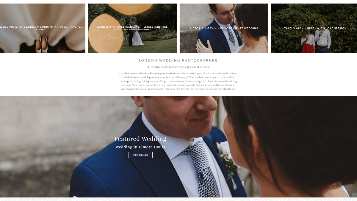
Why do you want to create a portfolio site? There are a number of potential answers to this question, and your response will help you narrow down the purpose of your site. As with any type of website, you’ll want to be very sure of your focus and audience before you begin to design it in earnest.
Here are a few of the primary reasons you might decide to build a portfolio site:
- You want to create an online resume for your job search – something to impress potential employers with.
- You need a way to generate new sales and leads as a freelancer or small business owner.
- You’re trying to build a stronger reputation or brand for yourself or your company.
- You’re looking for a better way to network online and form valuable connections.
Start by figuring out which of the above is your primary purpose. It’s okay if you want to focus on more than one, or something not on our list. The important thing is to know exactly why you are creating your site.
During the design and creation process, keep a close eye on your goal and make sure that everything you do supports it. When you’re thinking about whether to add a certain page or feature, ask yourself: “Does this addition further my main goal, or distract from it?” Then make a decision based on your honest answer to that question.
2. Keep the Focus on Your Work
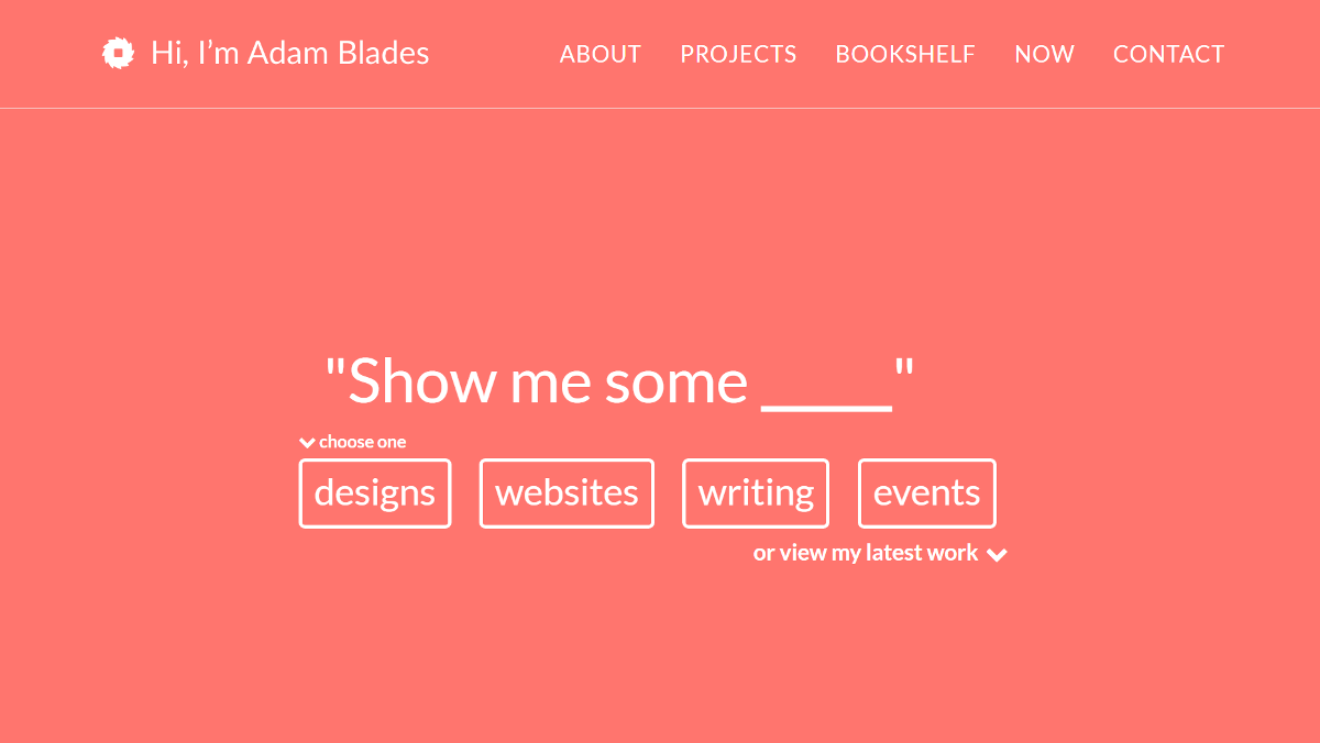
No matter what purpose you decide on for your site, it is very likely that you will want to focus on emphasizing content over form. An effective portfolio site is a showcase: it displays who you are and what you can do. The spotlight should be on your work examples, skills, accomplishments, and so on.
You’re trying to impress potential employers, clients, or connections with hard evidence and details that support your expertise. What you’re not trying to do is wow them with a flashy website (unless of course you are a web designer or developer by trade). This doesn’t mean you have to create something boring, but try to keep your design as simple, clean, and easy to navigate as possible. Avoid unnecessary flair or features, like lots of different fonts or too much personal information. Anything that doesn’t support your primary purpose and distracts from your main message should be avoided.
If you’re using WordPress to create your portfolio site, one of the easiest ways to ensure this base is covered is to select the right theme. Your chosen theme should ideally be designed specifically for portfolios, and should be customizable enough that it enables you to draw visitor focus towards what matters most. Check out Uncode for a perfect example – our theme has several layouts created specifically for portfolio sites (such as Portfolio Classic and Portfolio Minimal).
3. Prioritize Quality Over Quantity

Put yourself in your audience’s shoes for a moment. If you were an employee or a client looking for someone new to work with, would you spend hours combing though each portfolio you find? It’s not likely. There are too many freelancers, job seekers, and small businesses out there competing for attention.
This is why your portfolio site needs to impress visitors, and do so quickly. If you don’t catch their attention right away, chances are potential clients will leave in search of a better prospect. All the content in the world won’t help you if your audience never sees it. So prioritize the quality of your site and everything in it over the quantity.
Give special consideration to the areas where quality matters most:
- Work samples. Instead of including every project you’ve ever completed, deliberately choose the best or most representative samples – the ones most likely to impress.
- Text. Less is more when it comes to many things, including text. The dreaded ‘wall of text’ will turn a lot of readers away, so try to convey important information as concisely as possible and avoid rambling.
- Images. Large, high-quality images are essential, especially when showing off your work. People pay more attention when text is supported by images, but your credibility will suffer if your images are too small or not well optimized.
True quality takes some time and effort, but is well worth it. Simply using WordPress for your site will make your job easier, as will choosing a supportive theme like Uncode. And remember: if your portfolio site and its contents don’t strike you as impressive, they probably won’t wow your audience either.
4. Use Branding to Your Advantage
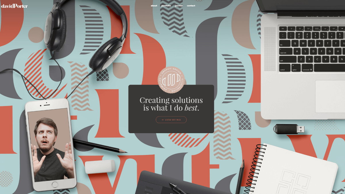
Even if you’re just one person, it’s a good idea to think of yourself as a business when trying to land a job or promote your services. Remember that vast sea of freelancers and job seekers we mentioned earlier? If you want to stand out, you’ll need to make yourself memorable. That means establishing a personal ‘brand’ that will get you noticed.
Consider including these key branding elements on your portfolio site:
- A logo. A professionally designed logo is a unique touch you can use on your site and in other places (business cards, letterheads, etc.) to establish a cohesive identity. It’s okay to keep your logo design simple, as long as it’s striking and suggests something important about yourself or your services. You can design your logo yourself, or hire someone else to do it for you.
- Colors. Choose a color scheme to represent you and your work, and use it in your site design, logo, and other documentation. This is another way to unify everything you do and associate it all with your identity or business.
- Tagline. This is a short, catchy statement that summarizes who you are and what you do – ideally in a memorable fashion. It’s a nice element to include in a prominent location, such as on your website’s header (alongside your logo).
Don’t be afraid to make your portfolio site fully your own, and to inject it with your unique style. Using the same branding elements consistently will go a long way towards making your site truly memorable.
5. Create an Effective Contact Page
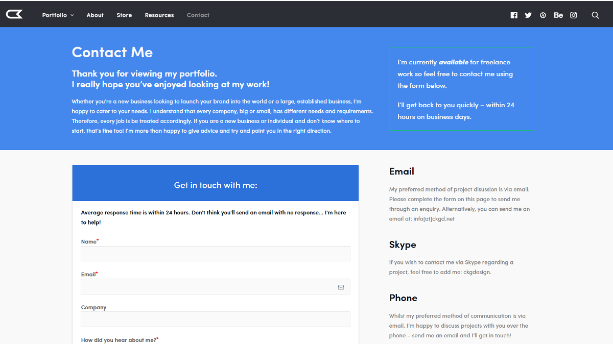
In marketing, a ‘conversion’ is when you successfully get someone to respond to a call to action – they turn from a neutral party into a subscriber or a paying customer. Most portfolio sites are designed around this concept. You want to convert as many visitors as possible into potential new employers, clients, or connections. However, that can’t happen if you don’t make it clear how to get into contact with you.
The best way to approach this issue is to create a standalone contact page for your portfolio site. It should be comprehensive, containing all the information visitors might need: email address, phone number, and physical address (if relevant). It’s also a good idea to include links to your social media profiles, which you can do using a WordPress plugin (such as Social Media). In short, you want to make it easy for people to get in contact with you using whatever method they prefer.
In addition, you might consider including a contact form so visitors can get in touch directly via your site. Contact Form 7 is a simple plugin that can enable you to do this, and it comes integrated with Uncode to boot. Either way, make sure your contact page is prominent and obvious, and include plenty of links to it throughout the rest of your portfolio site.
6. Include All Key Information

We’ve already covered some of the information you’ll want to include within your portfolio site, such as work samples and contact details. There’s a good chance you’ll need more than that, however. What content you choose to feature on your site is up to you, and will depend on your goals, field, and audience. This goes back to our discussion about focus – run everything you consider including through a mental check, asking yourself if it supports your site’s primary purpose.
With the above in mind, here are some suggestions to consider:
- A list of services and/or skills. A brief but comprehensive list can give visitors a solid idea of where your expertise lies. Be as specific as possible. Don’t just say you can write, for example: list ‘technical writing’ or ‘resume writing’ instead.
- Personal bio. A bio page is a personal touch that can make you seem more human and approachable. Think about providing a brief backstory about how you got started in your chosen career, some perspective on your work and your field, and a few concrete details (such as specific accomplishments, connections, and clients).
- Testimonials. This is an excellent way to enhance your credibility and give visitors some idea of what to expect from you. Solicit them from past and existing employers, coworkers, clients, and other professional references.
This is far from an exhaustive list, so seek out other suggestions and spend some time thinking about what information you want to make available. You don’t want to overwhelm your visitors, but you also want to leave them with everything they need to make an informed decision.
7. Update Your Portfolio Regularly
Your online portfolio shouldn’t be a static site – it should grow and evolve with you. Keep it fresh by adding and updating your information and samples regularly, and cycle out old projects so your portfolio never feels stale or out of date.
Another way to keep your portfolio site ‘alive’ is to add a blog to it. This may seem unintuitive for a site meant to showcase your work, but it’s worth considering for a few reasons:
- A blog lets you add new content to your site regularly, keeping it relevant for SEO purposes and making it more visible.
- You can show off your expertise and insights, positioning yourself as an expert in your field.
- Blog entries can direct incoming traffic over to your samples and contact page.
Fortunately, WordPress was built first and foremost as a blogging platform – so starting a blog should be relatively easy. It will take more work on a regular basis, but will pay off dividends in the long run.
Conclusion
You know that you have what it takes to succeed at that new job or project you have your eye on. All you have to do now is convince your potential employer or client to agree with you. That’s why you need a strong portfolio site that emphasizes your skills and past accomplishments, makes key information easily available, and lets your unique personality shine through.
As you build your portfolio site with WordPress, make sure you’ve implemented these seven vital tips:
- Determine your portfolio’s purpose (and stick to it).
- Keep the focus on your work.
- Prioritize quality over quantity.
- Use branding to your advantage.
- Create an effective contact page.
- Include all key information.
- Update your portfolio regularly.
Do you have any questions about how to get started with your portfolio site? Ask away in the comments section below!
The Undsgn Newsletter
Sign up to stay up to date with the latest news!
(You will be forwarded to our subscribe form hosted by Mailchimp)
You might also like...
March 24, 2018
Tips to fix the 403 Forbidden Error in WordPress
If you are dealing with the 403 Forbidden error on your WordPress…
June 20, 2018
Creating a Portfolio Website: tips on how to do it right
Creating a portfolio website is if the first step towards getting a…
February 25, 2018
How to add Google Analytics to WordPress: tips and plugins
Installing Google Analytics will give you the traffic statistics you…


