
According to a recent study by Reuters, mobile devices will account for 75% of all online traffic in 2017. With that in mind, a website simply cannot survive in today’s mobile-oriented world without being optimized for the small screen – unless they’re willing to suffer in terms of search engine visibility and visitor retention.
Making your website more mobile-friendly or (better still) prioritizing responsiveness from the ground up will enable you to tap into a massive audience. That’s why you need to take every possible step to ensure that your website offers an impeccable browsing experience on smaller screens.
In this article, we’ll discuss some tried-and-tested tools and methods for making your WordPress site more mobile-friendly, and show you how to implement them. Let’s get started!
1. Choose a Mobile-Friendly Theme
Mobile-friendly WordPress themes get their name from the responsive web design techniques developers employ to build them. Any theme worth considering, including the default WordPress options and almost all premium offerings, make use of responsive web design. This approach enables on-page elements – such as widgets and menus – to rearrange and resize themselves automatically in accordance with the resolution of the display they’re rendered on. As such, these types of websites can offer an optimal browsing experience across all screen sizes.
Before settling on any particular theme, you’ll want to test it thoroughly to determine if it’s mobile-friendly. Besides simply checking out a theme on multiple devices to see how it fares (any theme worth its salt should have a live demo available), we recommend StudioPress’ excellent mobile responsive design testing tool. You’ll find additional resources under “Test Your Website Thoroughly” below, too!
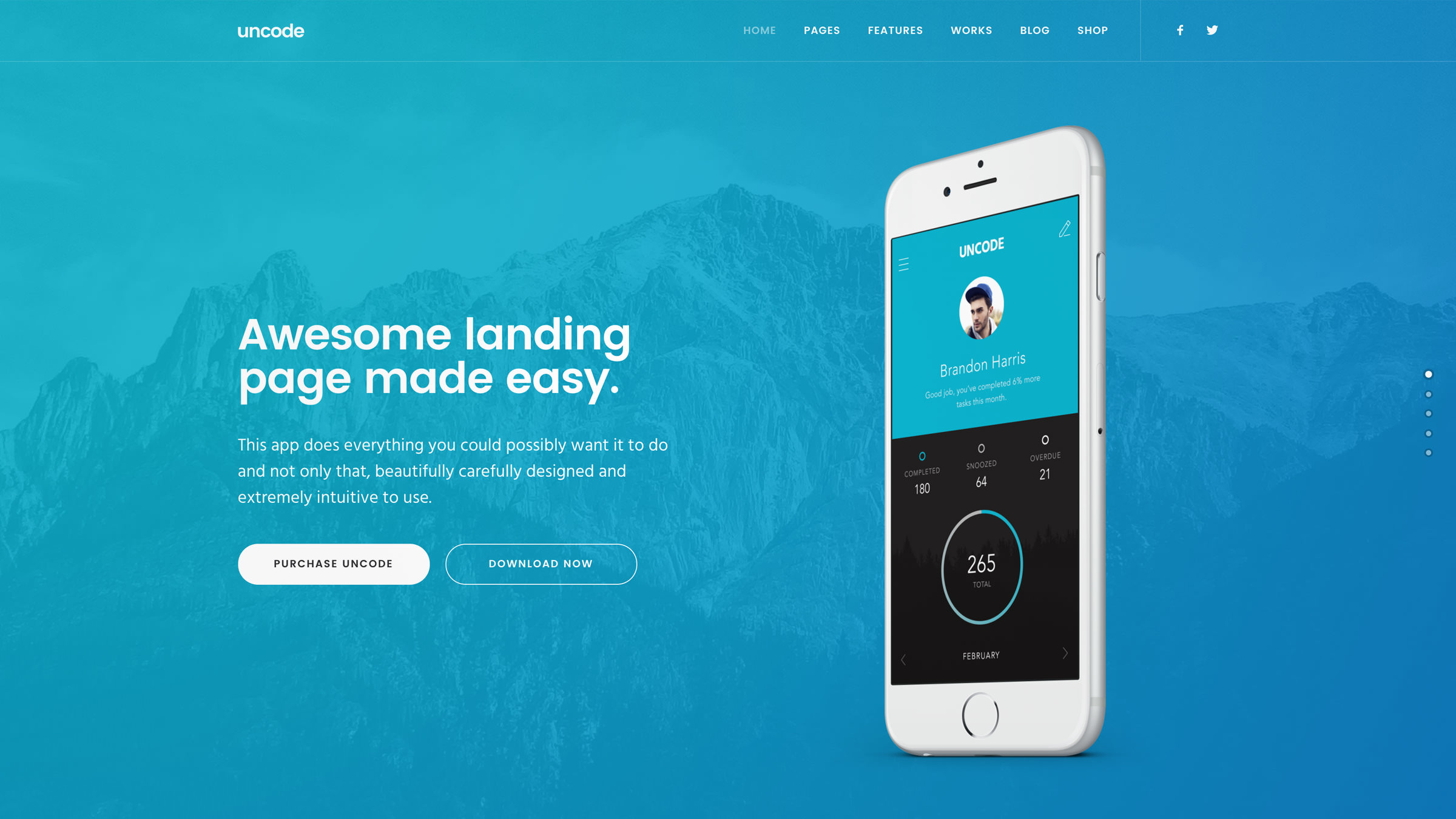
If you’re looking for a recommendation, our own Uncode theme is designed to offer an optimal experience on any device, thanks to its fully responsive architecture and multiple menu layouts.
2. Optimize Your Images
Mobile users often have to make do with modest data plans and slow internet connections. As such, there are few things more frustrating for them than poorly-optimized websites. In fact, if your site takes more than a couple of seconds to load, chances are good that a big percentage of your visitors will bolt.
Unsurprisingly, images consume much more bandwidth than plain text. By compressing and optimizing images on your website, you’ll be able to reduce loading times drastically and make your site more mobile- and user-friendly in the process.
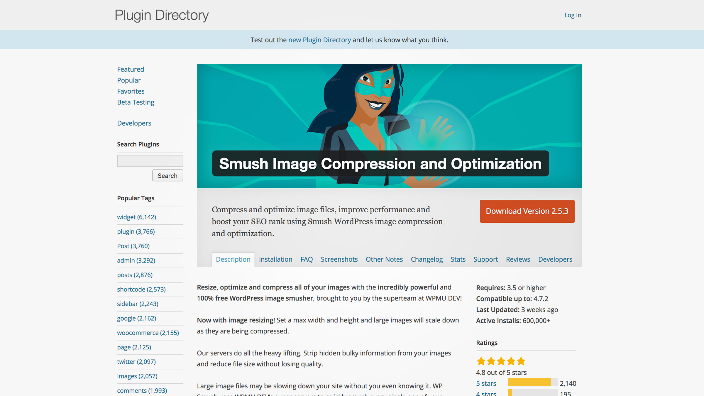
To this end, our Uncode theme provides a feature called adaptive images, which ensures that your graphics look great on any display size while keeping loading times low. Another great option is the Smush Image Compression and Optimization plugin, which permanently reduces file sizes without incurring any noticeable loss in quality.
3. Publish Scannable Content
Making your way through a long article online can be tiresome and slower overall when compared with printed content. Consequently, the rules of writing for the web are quite different than for traditional mediums – and even more so when it comes to mobile.
When people read online, they’re more likely to skip over portions of your content. Knowing this, putting together ‘scannable’ (i.e. easily readable) articles is an important part of making your website more mobile-friendly.
There aren’t any rules set in stone for what constitutes easily readable content, but these guidelines will point you in the right direction:
- Stick to short sentences and paragraphs whenever possible, for improved readability on small screens.
- Use different styles of text (such as bold and italics) and subheadings to highlight important elements and sections.
- Insert bulleted lists to break down information when it makes sense to do so (case in point!).
- Structure your content with plenty of white space to make it easy on the eyes.
At first sight, this might look like a compilation of random tips, but they all have one thing in common: they make it easier for users to scan your content quickly. Since visitors are going to be skipping over parts of your articles, it makes sense to structure them so they won’t miss any important information while doing so.
4. Use a Theme Switcher
These days, any WordPress theme worth its salt should already be mobile-friendly. However, some of you might still be stuck using not-so-modern themes, and overhauling your website can a big endeavor, hence the need for a theme switcher.
These tools enable your website to switch between themes when it detects different types of devices. That way, you can keep your favorite theme running for desktops and set up mobile-friendly alternatives for different resolutions. It sounds like a perfect compromise, but theme switchers – and mobile-specific websites in general – are not without their downsides. Most glaring of all, they can double your workload since you’ll essentially need to maintain two different websites.
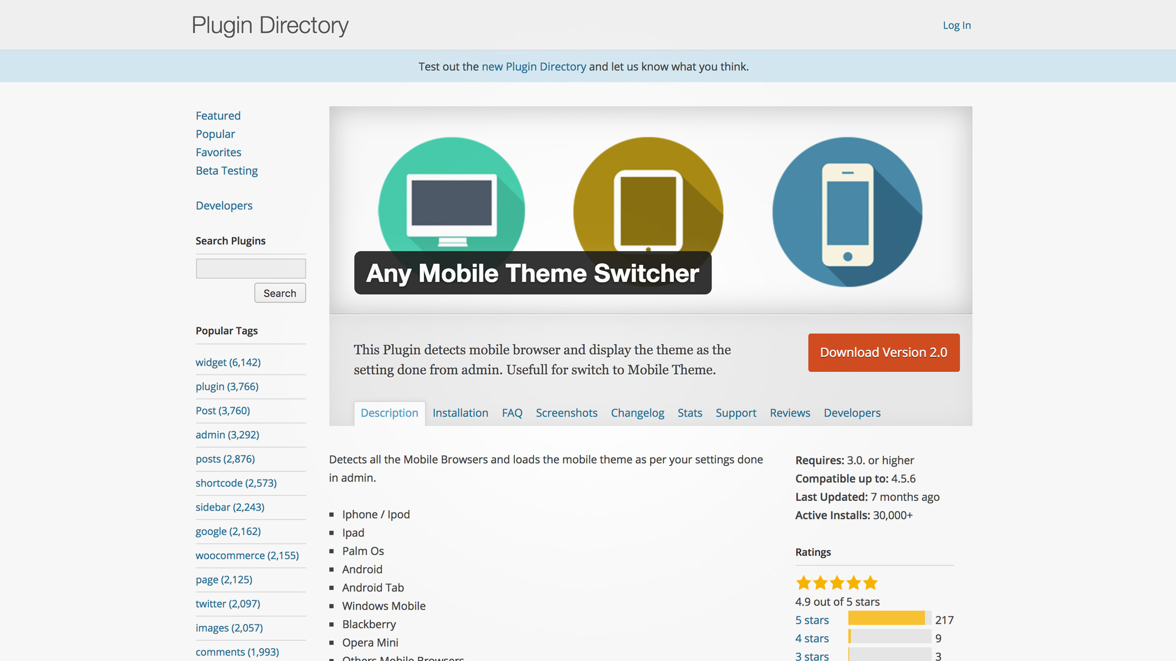
Implementing responsive design from scratch is by far the more elegant option, but if you don’t have the time or resources to do so right away, a good theme switcher can enable you to offer a decent mobile experience. Fortunately for you, WordPress makes it easy to implement theme switching functionality, thanks to plugins such as Any Mobile Theme Switcher.
5. Build a Responsive Menu
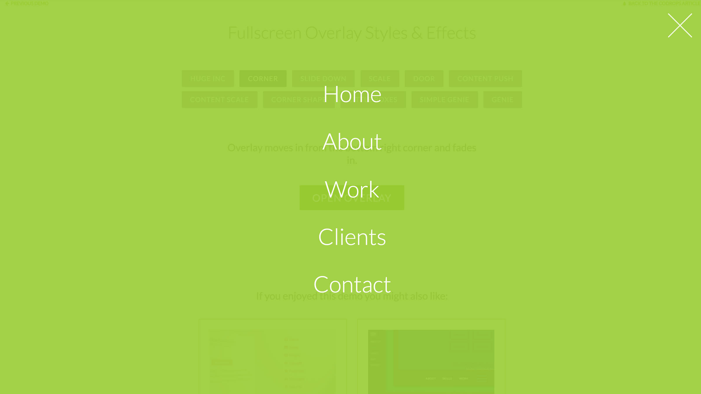
Sometimes, even mobile-friendly themes leave something to be desired when it comes to navigational menus. This can be a big deal, since poor navigation has been cited as one of the primary causes of website abandonment.
On the other hand, some themes (including Uncode) come with multiple responsive menu layouts, which enables you to choose one that will fit your site’s style. If you don’t want to go through the hassle of switching to an entirely new theme, you can always use a plugin such as Responsive Menu. This particular tool comes with excellent documentation, so you won’t be left wondering how to put any of its features to the test.
6. Stick to Mobile-Friendly Fonts
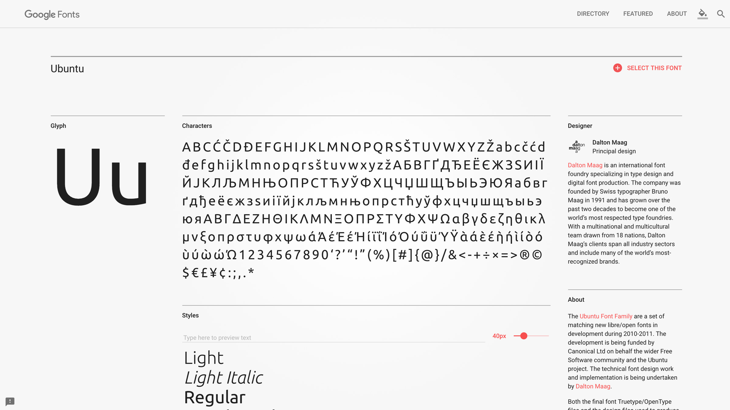
Gone are the days when web designers had to be content with a small selection of web-safe fonts. Nowadays, dynamically loaded responsive fonts are supported by virtually all modern browsers, which opens up an entire world of possibilities for you.
However, when designing a website with mobile users in mind, some typographic guidelines still apply. For example, while there’s no need to restrict yourself to common fonts like Ariel and Times New Roman, it’s still a good idea to avoid overly complicated alternatives.
Generally speaking, sans-serif fonts tend to be more readable on smaller screens, so you should definitely consider using them whenever possible. If you’re unsure where to start looking for options, check out the massive Google Fonts repository. Once you’ve found some good candidates, here’s how to integrate them with WordPress.
7. Test Your Website Thoroughly
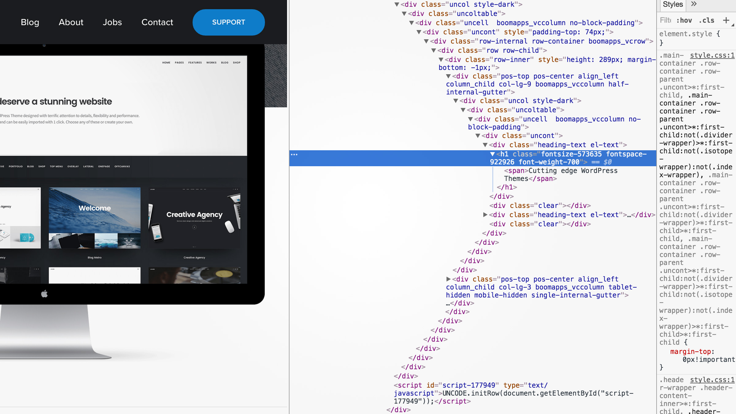
When it comes to determining whether your website is mobile ready, there’s no substitute for good old-fashioned testing. Fortunately, you don’t need to be a web developer to find out if your website is behaving as it should on smartphones and other devices. These days, most modern browsers ship with some form of testing functionality, which enables you to play around with websites and figure out what works (and what doesn’t).
If you’re Google Chrome user, you’ll have access to the Developer Tools feature. Access it by clicking on the menu button on the top-right edge of the browser and navigating to More tools > Developer tools (or by using the Ctrl + Shift + I keyboard shortcut). Once you’re in, you’ll find a button with a smartphone icon at the top of your console. Clicking on it will enable you to see how the site you’re browsing looks from a mobile perspective. Furthermore, you’ll be able to resize your testing screen at any time, which means you can also check out other resolutions.
For those of you that don’t have Chrome installed, Google also provides a fully free online Mobile-Friendly Test. All you have to do is enter your website’s URL and wait while the tool evaluates it. If your site isn’t considered mobile ready, the service will provide you with some recommendations on how to improve it.
Conclusion
WordPress is, by far, the most popular Content Management System (CMS) in the world. This widespread adoption means the platform, and most of its themes, have already been optimized to be mobile-friendly. However, given the importance of mobile traffic to the continued growth of your WordPress website, merely accommodating these types of users is not enough. You have to go a step further and optimize your website from top to bottom to provide a fantastic mobile experience.
If you’re not sure where to start, here are seven methods you can implement right away to make your website more mobile ready:
- Choose a mobile-friendly theme
- Optimize your images
- Write scannable, web-friendly content
- Consider using a theme switcher
- Build a responsive menu
- Stick with mobile-friendly fonts
- Test everything thoroughly
Do you have any questions about the items we’ve covered above, or perhaps some suggestions of your own? Let us know in the comments section below!
Image credits: Pixabay.
The Undsgn Newsletter
Sign up to stay up to date with the latest news!
(You will be forwarded to our subscribe form hosted by Mailchimp)

3 Ways to Secure Your WordPress Website Against Attacks
These days, every website needs to take security seriously. This is…

Uncode Creative WordPress Theme gets 30.000 sales on ThemeForest!
Uncode Creative Multiuse WordPress Theme gets 30.000 sales on…

Uncode Creative WordPress Theme gets 20.000 sales on ThemeForest!
Uncode Creative Multiuse WordPress Theme gets 20.000 sales on…